Danger vs Warning vs Caution Signs: Clear Differences and Correct Usage Guide
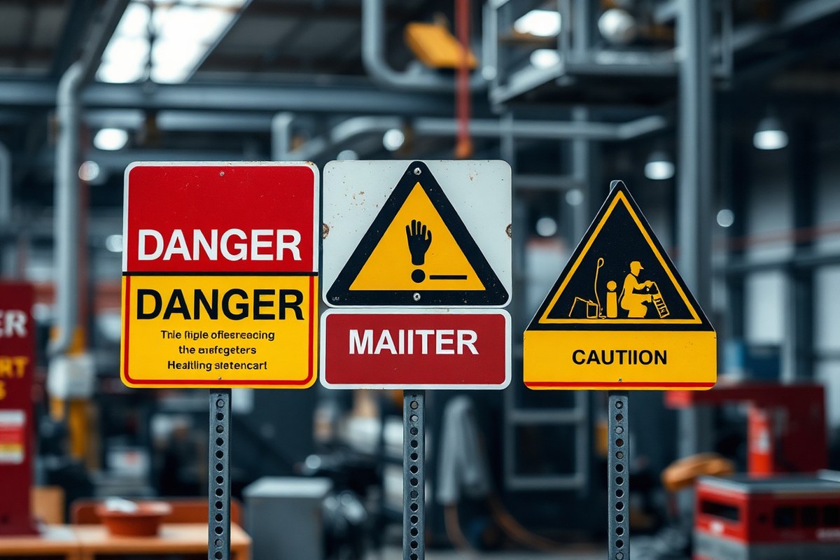
Danger, warning, and caution signs communicate different levels of hazard severity. Danger signs show risks that could lead to death or severe injury without avoidance. Warning signs point to possible death or serious injury situations. Caution signs relate to hazards that may cause minor or moderate injuries. Choosing the right sign helps avoid misunderstanding and meets safety regulations. Start by identifying the hazard’s severity and apply the corresponding sign according to OSHA, ANSI, or Australian standards for clear hazard communication.
Key Takeaways
- Danger signs warn of immediate hazards that cause death or serious injury if not avoided.
- Warning signs indicate potential serious injury hazards and go beyond OSHA 1910.145 requirements.
- Caution signs are for minor or moderate injury risks and must not replace warning signs for serious hazards.
- OSHA uses Danger, Caution, and optional Warning levels, with construction sites following ANSI’s four-level system.
- AS/NZS 1319:1994 mandates that caution signs cannot signal life-threatening hazards in Australian workplaces.
- Incorrectly using caution instead of warning signs risks understating hazards and may violate OSHA regulations.
What Distinguishes Danger, Warning, and Caution Signs?
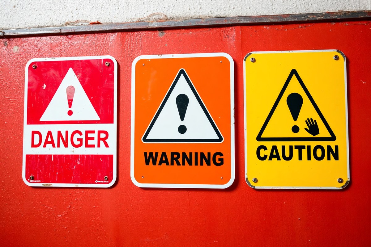
Danger, warning, and caution signs differ primarily by the severity of the hazards they communicate and the urgency of the response required. A danger sign signals an immediate threat that could result in death or permanent disability if not avoided. For example, an exposed high-voltage electrical panel often requires a danger sign. Warning signs indicate serious hazards that could cause significant injury or illness but may not be as immediately life-threatening as danger situations. An area with slippery floors or moving machinery might warrant a warning sign. Caution signs address minor to moderate hazards where injury is possible, such as potential cuts, bruises, or strains, and usually require basic care and precautions.
Colors and symbols reinforce these distinctions and help workers quickly recognize risk level. Danger signs feature a red background, often combined with graphics like skull and crossbones or flames to indicate severe, life-threatening dangers. Warning signs typically have an orange background and display symbols such as an exclamation point inside a triangle to highlight serious but less immediate hazards. Caution signs use a yellow background with similar exclamation symbols to represent lower-risk hazards. The use of these colors and symbols ensures fast understanding even with brief glances, which is important in busy industrial or facility environments.
The injury potential aligns with the sign type: danger signs warn of hazards that will cause death or serious injury, warning signs caution against hazards that could cause severe injury or illness, and caution signs relate to hazards that could cause minor to moderate injury. This hierarchy matters because safety officers and facility managers must apply the most appropriate sign based on the likelihood and severity of harm. Misclassifying a hazard can lead to complacency or unnecessary alarm, affecting compliance and worker safety.
Choosing the correct sign means evaluating the hazard’s severity and the required response. For instance, a chemical spill that could cause burns or respiratory failure demands a danger sign and immediate exclusion or protective gear. A noisy area needing ear protection but not posing immediate injury risk might require a warning sign urging attentiveness and PPE use. Areas where people might bump their heads or slip lightly call for caution signs recommending basic care like watchfulness or handrails.
This approach aligns with standards such as ANSI Z535 and AS/NZS 1319:1994, which define each signal word with precise severity levels. Danger means “will cause death or serious injury,” warning means “could cause death or serious injury,” and caution means “could cause minor or moderate injury.” Applying these definitions helps ensure consistent hazard communication, effective training, and regulatory compliance, reducing workplace accidents and liability risks.
How Do OSHA, ANSI, and Australian Standards Define These Signs?
Regulatory standards for danger, warning, and caution signs vary mainly between OSHA (Occupational Safety and Health Administration), ANSI (American National Standards Institute), and Australian standards like AS/NZS 1319. OSHA’s 29 CFR 1910.145 defines danger and caution signs explicitly but does not require or define a “warning” sign category, making it a simpler, two-level system. ANSI Z535 standards use a three-tier hierarchy of danger, warning, and caution, providing more nuanced hazard communication. Australian standard AS/NZS 1319 also distinguishes these levels and aligns closely with ANSI’s approach for workplace safety signs.
OSHA 1910.145(c) lists three main sign classes: danger for immediate hazard situations where special precautions are necessary, caution for potential hazards or unsafe practices, and safety instruction for general safety guidance. OSHA includes warning tags in 1910.145(f)(7) as optional, mainly in construction settings following ANSI Z535.2-2011. Most general industry workplaces comply with OSHA by following its simpler two-tier system, but incorporating ANSI’s warning level provides clearer hazard distinctions and improves safety communication.
ANSI Z535 sets specific signal words, colors, and design requirements for these signs. Danger signs use red headers with white letters, warning signs use orange, and caution signs use yellow. ANSI Z535.1 specifies these colors to optimize visibility and hazard severity recognition. OSHA relies on ANSI Z535.1 for color standards but only mandates danger and caution signs. Importantly, OSHA compliance officers accept ANSI Z535-compliant signs as meeting the 1910.145 requirements, meaning signs can follow ANSI layouts for better clarity while staying OSHA-compliant.
The Australian standard AS/NZS 1319:1994 outlines rules for danger, warning, and caution signs, following a hierarchy similar to ANSI. Danger signs highlight immediate hazards that can result in serious injury or death. Warning signs point out possible dangers that might cause severe injury or fatality. Caution signs warn about less serious risks or unsafe behaviors. This standard specifies particular colors, including red for danger, orange for warning, and yellow for caution, with exact requirements for size and location of signs. Employers in Australia and New Zealand are legally required to comply with these guidelines to ensure workplace safety and reduce legal risks. The table below summarizes key distinctions and overlaps in OSHA, ANSI, and AS/NZS 1319 requirements:
| Aspect | OSHA 1910.145 | ANSI Z535 | AS/NZS 1319 |
|---|---|---|---|
| Signal Words | Danger, Caution, (Optional Warning tag in 1910.145(f)(7)) | Danger, Warning, Caution | Danger, Warning, Caution |
| Hazard Level | Immediate (Danger), Potential (Caution) | Immediate (Danger), Serious (Warning), Minor (Caution) | Immediate (Danger), Serious (Warning), Minor (Caution) |
| Color Scheme | Danger: Red/White; Caution: Yellow/Black | Danger: Red/White; Warning: Orange/Black; Caution: Yellow/Black | Danger: Red/White; Warning: Orange/Black; Caution: Yellow/Black |
| Design & Placement | Like ANSI but simpler | Specific layout & color codes | Detailed size, color, and placement |
The differences matter because OSHA’s standard is less detailed and often leads to underuse of warning signs, which can downplay risk. Following ANSI’s clearer distinction supports better training and compliance. In Australia, failure to follow AS/NZS 1319 exactly can lead to legal penalties and increased liability. The time and cost to comply vary by workplace size and hazard complexity. Purchasing ANSI or AS/NZS-compliant signs can range from $20 to $100+ per sign depending on size and material, but they reduce the risk of OSHA citations or workplace injuries. Identifying hazards accurately and choosing the correct sign improves hazard recognition and worker safety, while using the wrong sign may cause confusion or violations.
Using a caution sign where a danger or warning sign is required can lead to regulatory citations and increase accident risk; always assess the severity and immediacy of hazards to choose the correct sign level.
Deciding When to Use Danger, Warning, or Caution Signs
Choose a danger sign when the hazard could cause death or serious injury and is highly likely if not avoided. Use warning signs for hazards that might cause serious injury or death but with less immediacy or lower probability. Caution signs fit hazards that may cause minor or moderate injuries. Always gauge the severity and certainty of the hazard to pick the right sign and avoid confusing workers or reducing compliance.
Severity Levels and Signal Words
Severity determines the classification of safety signs: danger, warning, or caution. Danger indicates an unsafe condition that will likely cause death or severe injury without proper action. Warning indicates a condition that might lead to death or serious injury. Caution indicates a hazard that could cause minor or moderate injuries but not death. According to ANSI Z535, danger signs use red headers with white letters, warning signs have orange headers with black letters, and caution signs feature yellow headers with black letters.
Use danger signs for situations where the consequences are severe and almost certain if precautions aren’t taken. Warning signs are for serious but less certain hazards, where the risk level is lower but still potentially deadly. Caution signs alert to less severe risks that, while unpleasant or disruptive, won’t be life-threatening.
Certainty of Hazard Assessment
Assess the certainty of the hazard before choosing a sign. For hazards with a well-documented, high likelihood of causing harm, danger signs are the proper choice. Use warning signs to indicate a possible, though less certain, threat of serious injury. Hazards with moderate risk or less clear outcomes call for caution signs.
Overusing danger signs when the hazard is uncertain can cause workers to ignore signs or become complacent, reducing overall safety. Underusing them risks inadequate hazard communication. Evaluating hazard probability, exposure time, and environmental factors helps decide which signal word fits best.
Using Caution and Warning Signs Correctly
Caution and warning signs should not be swapped casually. Caution applies to minor injury risks like slips, trips, or low-level chemical exposure. Warning fits hazards with serious injury potential but not an immediate fatal threat, such as moving machinery or sustained noise above exposure limits. Use this checklist to select your sign:
- Identify the hazard type and potential injuries
- Determine the likelihood and immediacy of harm
- Assess the severity: death/serious injury versus minor/moderate injury
- Choose danger for imminent threats of death or serious injury
- Select warning for serious injury risks that are less immediate
- Use caution for minor/moderate injury hazards
- Confirm sign placement allows early hazard recognition
Some regions, like Australia, allow more interchangeability between caution and warning signs, but consistently following ANSI or OSHA guidelines helps prevent confusion globally. Always align the sign choice with your workplace’s risk management policies and employee training to ensure the correct response.
Colors, Symbols, and Signal Words on Safety Signs
Safety signs use distinct colors, symbols, and signal words to communicate hazard levels quickly. Understanding these design elements ensures people recognize the severity of risks and respond appropriately in industrial settings.
ANSI and OSHA Color Standards
ANSI and OSHA have established standardized color schemes to identify different levels of hazards on signs. Danger signs display red and black on a white or red backdrop to show serious risks that may lead to death or severe injury. Warning signs present black text on an orange field to highlight hazards that are less critical than danger but still important. Caution signs use black letters on a safety yellow background to warn about possible risks that might cause minor or moderate harm.
These standards help workers identify the level of hazard at a glance, improving reaction time and compliance. Using the wrong color can cause confusion or reduce the sign’s effectiveness, so adhering to these codes is essential for workplace safety.
| Sign Type | Background Color | Text Color | Typical Use |
|---|---|---|---|
| Danger | Red or white with red | White or black | Life-threatening hazards, serious injury or death |
| Warning | Orange | Black | Moderate or serious hazards less severe than Danger |
| Caution | Safety yellow | Black | Minor or moderate injury risks |
Variations occur in specific industries or regions. For example, some OSHA rules use yellow for broad “caution” areas, whereas ANSI splits between warning and caution more strictly. Knowing your workplace’s governing standard ensures proper application.
Safety Alert Symbol Usage
The safety alert symbol is a black equilateral triangle with an exclamation point inside. It is used on all danger, warning, and caution signs to draw attention to the hazard message. This symbol acts as a universal visual alert indicating the presence of hazardous conditions or unsafe practices.
Placing the symbol prominently on the sign, typically before the signal word, improve recognition. The OSHA and ANSI standards require this symbol for all these signs except for general notice signs, making it a critical part of effective hazard communication.
Signal Words and Their Meanings
Signal words on safety signs state the hazard severity and urgency. “DANGER” indicates the highest risk level and is displayed in uppercase letters, often large and bold for quick identification. It warns of immediate threats that can cause death or serious injury. “WARNING” is used for serious hazards that are less severe than danger but still could result in injury or illness. The word is typically black on an orange background, also in uppercase letters but less prominent than “DANGER.” “CAUTION” signals hazards that may cause minor or moderate injuries and is presented in black text on a safety yellow background. This word emphasizes precaution rather than imminent harm and often accompanies instructions or behavior guidelines, like “Do Not Stack.” Using these signal words correctly helps workers assess risk levels quickly and respond appropriately. For example:
DANGER: “Danger: High Voltage” WARNING: “Warning: Forklift Traffic” CAUTION: “Caution: Wet Floor”
Mixing signal words or improper use dilutes the message, possibly putting workers at risk or reducing compliance with safety protocols.
Where and How to Place Danger, Warning, and Caution Signs
Place danger, warning, and caution signs where workers first encounter the hazard, such as entrances to restricted areas, near machinery, or at points where chemical exposure is possible. Position these signs at eye level, generally between 1.4 and 1.7 metres high, to ensure immediate visibility. Dangerous hazards require danger signs placed closest to the risk, with warning signs positioned slightly before the hazard to alert individuals of conditions requiring caution. Caution signs, on the other hand, should highlight less severe risks while standing out clearly against their background, often requiring contrast adjustments.
Signs need to be oriented so they face oncoming foot or vehicle traffic, minimizing obstructions like shelving or equipment. In noisy or high-traffic environments, add supplemental measures such as flashing lights or barriers alongside signs to improve hazard recognition. Avoid placing signs where they blend into the environment or where bright lighting causes glare, reducing legibility. Consistently maintain signs by cleaning, repairing, or replacing faded or damaged materials to keep messages straightforward and clear. Consider the specific type of hazard when planning placement:
- Electrical hazards: Place danger signs at all electrical panel doors and equipment, plus warning signs on approach routes within 10 feet.
- Chemical storage: Use warning signs at chemical storage entrances; place caution signs in adjacent workspaces highlighting spill risks.
- Machinery: Position danger signs at machine controls and pinch points, warning signs on the approach paths, and caution signs at floor areas with slipping or tripping risks.
- Fall hazards: Put danger signs directly next to open edges or drop-offs, warning signs 6 to 10 feet before the hazard to signal caution.
- Confined spaces: Display danger signs at entry points and warning signs along the access route; ensure signs are visible even in low light.
Do not rely solely on signs for hazard control, use them as part of a broader safety system including engineering controls and employee training.
Ensure the size of signs meets or exceeds minimum standards, typically, letters must be at least 1 inch (2.5 cm) tall for viewing at 10 feet, with larger text for greater distance. Use durable materials suited to the environment, such as UV-resistant vinyl or metal for outdoor areas prone to weather exposure. Maintain uniformity in sign design, colors (like yellow backgrounds with black text for caution signs), and symbol usage across the facility to avoid confusion and improve quick hazard recognition.
Common Mistakes Using Safety Signs and How to Fix Them
One frequent error in using danger, warning, and caution signs is mixing up their levels of severity. Danger signs, marked with red and indicating an immediate hazard that will result in serious injury or death, are often wrongly placed where a warning or caution sign would suffice. Conversely, some workplaces overuse caution signs, which are meant for lesser risks, diluting their effectiveness. Using these signs interchangeably can confuse workers, reduce compliance, and increase the chance of accidents because employees may either ignore signs that do not match the actual risk or fail to respond appropriately.
Another common mistake is placing signs where they don’t directly relate to the hazard or where visibility is poor. For example, putting a “DANGER” sign on equipment that only poses a moderate risk or placing signs behind obstacles where they can’t be seen immediately. This undermines the sign’s credibility and can lead to violations of OSHA or ANSI standards. Signs must be installed at eye level, at clear sightlines, and close to the hazard they are indicating. Failing to do this wastes resources and compromises safety.
Maintaining sign credibility means regular inspection and timely replacement. Signs degrade over time due to sunlight, chemicals, or physical wear, obscuring messages and colors. A faded “WARNING” sign may not provoke the necessary caution, rendering it ineffective. A good practice is to inspect all safety signs every six months and replace ones that show fading, scratches, or damage. This maintenance helps keep your workplace compliant and the safety message clear.
To fix these problems, start with a clear hazard assessment to match the correct sign type with the actual level of risk. Use danger signs only for hazards that could cause immediate life-threatening injuries. Keep warning signs for serious but less immediate risks, and caution signs for general hazards that could cause minor injuries. Customize signs within regulatory guidelines to address your specific hazards without confusing employees.
Training staff on the meaning and importance of each sign type also boosts effectiveness. Include sign categories in safety orientations and refreshers to reinforce their correct use. Sign placements should be verified during safety audits, ensuring visibility and relevance. Proper use and upkeep of safety signs cost relatively little compared to the potential cost of workplace accidents or OSHA fines, which can reach thousands of dollars per violation.
Fixing these common errors results in a safety culture where signs support rather than replace other measures, reducing risks and building employee trust in hazard communication. Workers will respond appropriately to signs when they understand the distinctions, see consistent application, and trust the messages are accurate and timely.
Examples of Correct Use in Workplace Hazard Scenarios
Correctly selecting and placing danger, warning, and caution signs depends on understanding each hazard’s risk level and then matching it to the appropriate sign category. These examples illustrate where each type of sign fits best, how to apply them effectively in typical workplace settings, and common mistakes to avoid so that safety messages are clear and legally compliant.
High Voltage Electrical Equipment
Areas with electrical panels or energized equipment posing risks of serious injury or death require danger signs. For instance, electrical panels housing voltages above 600 volts directly threaten workers with electrocution and therefore must feature Danger signs reading “Danger, High Voltage.” This signals an immediate life-threatening hazard to trained personnel and visitors. Areas with equipment operating at lower voltages, such as 120 volts, often call for Warning signs because the risk, while serious, is comparatively lower.
Placing these signs directly on or near the equipment at eye level ensures visibility. Avoid cluttering the area with unnecessary caution signs that may understate the risk. The cost mainly involves purchasing durable, weather-resistant signs ranging from $20 to $50 each, plus installation time. Correct usage reduces accidental contact and helps meet OSHA electrical safety standards.
Chemical Storage Areas
Chemical storage rooms contain varied hazards, from corrosive acids to flammable solvents, so the signage must reflect the level of danger involved. For toxic or highly reactive substances that can cause death or serious injury, Danger signs are appropriate. For less severe risks, such as skin or eye irritation, a Warning sign might be suitable. Areas storing non-lethal chemicals but posing slips or minor skin contact risks typically require Caution signs.
Signs should be placed at entrances and on containers according to both OSHA and Australian Standard AS1319-1994. This helps both trained staff and occasional visitors recognize and avoid hazards properly. Implementation includes training workers to understand each sign’s meaning and reinforce safe handling procedures.
Tripping Hazards in Walkways
Walkways with uneven surfaces or temporary obstacles like cables or tools commonly cause trips or falls but rarely lead to death. For these situations, Caution signs effectively alert workers and visitors to take care and reduce slips or falls. Warning or danger signs would overstate the risk and potentially cause confusion.
Proper placement involves situating caution signs on both sides of the hazard and updating their locations as the hazard moves or clears. The signs cost about $10 to $20 each and require periodic inspection to replace worn or missing units. Training new workers to respond appropriately to caution signs improve workplace safety culture and minimizes minor injuries.
- Identify the hazard’s severity by assessing the potential outcomes: death or serious injury signals the need for a danger sign, serious but not necessarily fatal injury fits a warning sign, and minor injury or inconvenience calls for a caution sign.
- Select the appropriate sign type consistent with OSHA, ANSI, or Australian Standard AS1319-1994 requirements, considering the hazard’s nature and exposure frequency.
- Position the sign where workers first encounter the hazard, usually at eye level on entrances, equipment, or along walkways to ensure immediate visibility.
- Use clear, concise wording and internationally recognized symbols to communicate the hazard effectively.
- Train employees during orientation to recognize sign types, understand the hazards they indicate, and know how to respond.
- Regularly inspect signage to ensure visibility, legibility, and accuracy, replacing any damaged or missing signs promptly.
- Document signage placement and maintenance activities as part of workplace safety audits to ensure ongoing compliance.
How to Maintain and Ensure Longevity of Safety Signs
Safety signs should remain legible and vibrant for at least 5 to 7 years, depending on their material and installation environment. Signs exposed to direct sunlight, chemicals, or harsh weather may fade or deteriorate faster. To maintain their effectiveness, establish a regular inspection schedule every 6 months to check for fading, peeling, or damage that could obscure visibility or comprehension.
Use durable materials designed for longevity, especially for outdoor or industrial settings. Marine-grade aluminum with UV-blocking 2mm polymer resin, commonly known as U3 signage, offers superior resistance to fading and corrosion. This combination helps Danger signs retain their bright signal colors and sharp lettering, which is important for catching immediate attention where life-threatening hazards exist. Plastic or lesser-grade materials might cost less initially but often require more frequent replacement.
Maintenance involves cleaning signs with a mild detergent and soft cloth to remove dirt, grime, or chemical residues that could reduce contrast or reflectivity. Avoid abrasive tools or harsh solvents that may damage the surface. Check mounting hardware such as screws or brackets to ensure signs remain securely in place without shifting or tilting.
- Inspect every six months for wear, fading, and damage
- Clean signs with mild detergent and soft cloth regularly
- Replace signs every 5 to 7 years or sooner if visibility decreases
- Use marine-grade aluminum with UV-blocking resin for outdoor signs
- Secure mounting hardware to prevent shifting or loss
- Store extra signs in a dry, cool place to prevent premature aging
Signs faded to the point where signal colors (safety yellow or orange) become indistinguishable must be replaced immediately to avoid confusion in hazard recognition.
Replacing signs proactively before significant deterioration ensures compliance with OSHA and ANSI standards and helps avoid workplace accidents caused by unclear warnings. For indoor signs in controlled environments, materials like rigid plastic or laminated prints may suffice and extend replacement intervals. You should track the installation date on each sign or in a maintenance log to monitor aging and schedule timely replacements.
Your Quick-Start Plan for Using Danger, Warning, and Caution Signs
Start improving safety in your workplace immediately by selecting and positioning the right signs. Follow these steps to ensure compliance and protect your team effectively.
- Before you start: Conduct a hazard assessment to identify areas needing signs. Confirm hazards match the severity level for danger, warning, or caution signs.
- Day 1: Choose signs that comply with OSHA and ANSI standards, using correct colors and signal words. Verify the visibility and symbol clarity.
- Day 2: Install signs at eye level and near the point of hazard exposure, ensuring no obstructions. Walk the area to confirm signs are easily noticed.
- Week 1: Train staff on the meanings of each sign type and their importance. Conduct a quick quiz or feedback session to confirm understanding.
- Week 2: Inspect signs for wear or damage and clean as needed. Replace any signs that have faded or become illegible.
- Month 1: Review incident reports or near-misses to verify if signage has helped reduce hazards. Adjust signs or add new ones if patterns emerge.
- Ongoing: Schedule routine checks every 3, 6 months for sign condition and relevance as workplace conditions change. Log inspections for compliance records.
Frequently Asked Questions
What Are the Differences Between Danger, Warning, and Caution Signs?
Danger signs indicate immediate threats that could cause serious injury or death, warning signs signal potential hazards requiring caution, and caution signs alert to minor or moderate injury risks needing careful attention. Using the right type ensures proper hazard communication and safety.
What Are Five Common Categories of Workplace Hazards?
Five categories are physical, chemical, biological, ergonomic, and psychosocial hazards, each representing different types of risks you might encounter in work environments. This classification helps target safety measures effectively.
What Are the Four Types of Danger Signs Used in Workplaces?
The four main danger signs include electrical, chemical, mechanical, and biohazard warnings, each addressing an immediate life-threatening risk. Knowing these helps you apply the proper precautions and comply with regulations.
Why Are Safety Signs Important in Workplace Safety?
Safety signs provide clear, visual warnings that help prevent accidents and injuries by alerting workers to hazards and necessary precautions. They support compliance with legal standards and reinforce safe behaviors.
What Are the Four Types of Warning Signs Commonly Seen?
Warning signs typically include electrical hazards, chemical hazards, moving machinery, and fall risks, all signaling the need for increased awareness and specific safety actions. Recognizing these helps you respond appropriately to potential dangers.
How Can I Tell If a Safety Sign Needs to Be Replaced?
Replace signs if they become faded, damaged, or illegible, as unclear signs reduce hazard awareness and increase risk. Regular inspections ensure signs remain effective and compliant with safety standards.
Final Thoughts
You have the tools to distinguish and use danger, warning, and caution signs effectively in your workplace. Prioritize clear, standard-compliant signage to meet safety regulations and protect workers. Start by reviewing your high-risk areas today and updating signs where needed to support a safer environment.