What Is a Wayfinding Sign: A Complete Guide with Types, Costs, and Best Practices
What is a wayfinding sign? It’s a type of sign designed to guide people through complex environments by providing clear directions and location information. These signs simplify navigation and help users reach their destinations quickly and efficiently. Start by identifying key decision points within a space to place wayfinding signs where they are most needed.
Key Takeaways
- Wayfinding signs reduce visitor confusion by clearly marking routes and important locations.
- Effective wayfinding systems decrease directional inquiries by up to 60 percent in facilities.
- Placement at major intersections and entry points ensures signs serve their guiding role well.
- Good letter spacing (5 to 10 percent beyond standard) improves readability and prevents visual merging.
- Wayfinding signs differ from general signage by focusing on navigation rather than mere identification.
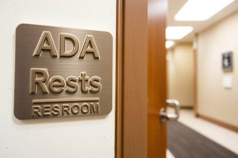
- Integrating ADA standards improve accessibility and makes wayfinding inclusive for all users.
What Is a Wayfinding Sign and How Does It Differ from Other Signs?
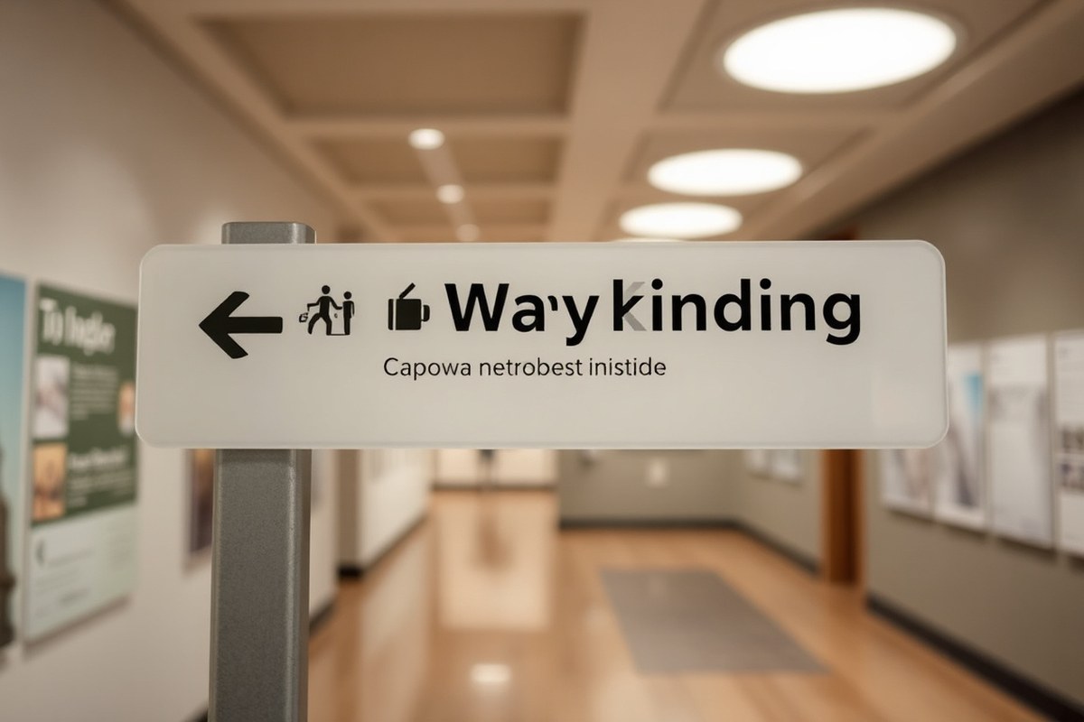
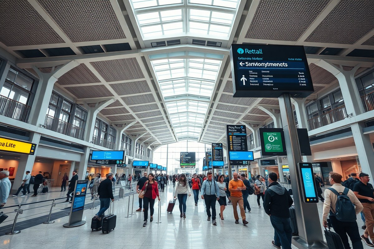
Wayfinding signs form part of a coordinated system designed to help people navigate and find their way through complex environments. Unlike regular signs that may focus solely on branding, advertising, or identification, wayfinding signage guides users from one point to another, clarifying locations and directions to reduce confusion. These signs appear in places like hospitals, airports, shopping malls, and campuses where visitors often need quick, clear guidance. A typical wayfinding sign might point to restrooms, exits, or specific departments, while others identify the user’s current location, such as a room number or map kiosk.
Wayfinding signage differs from standard signage in several important ways. The primary function of wayfinding signs is navigation and orientation within a space rather than just conveying information or promoting a product. For example, a regular sign might simply label a conference room, but a wayfinding sign could be part of a system that lets someone start at the lobby and reach that room using a set path. Wayfinding signs also tend to work together as part of a deliberate plan, with each sign complementing the next to form a logical sequence that guides users confidently and efficiently.
A wayfinding sign could take many forms, including traditional wall-mounted signs, large pylons near building entrances, graphics applied directly to walls or floors, and even digital displays offering real-time directions. This flexibility supports different contexts and environments. Indoor wayfinding signs may comply with ADA requirements, featuring tactile elements, clear fonts, and high-contrast colors, while outdoor signs must consider weather resistance and visibility from a distance. More advanced systems integrate interactive kiosks, mobile app links with QR codes, or Bluetooth tracking to provide personalized routes.
The difference between wayfinding signs and regular signs can be summarized in their objectives and design approach. Wayfinding signs focus on reducing directional inquiries and helping users navigate faster. According to research from the Society for Experiential Graphic Design, effective wayfinding systems can cut navigation time by about 35 percent and reduce directional questions by up to 60 percent in facilities like hospitals or educational campuses. In contrast, regular signage might not affect user orientation or movement directly.
To implement effective wayfinding signage, you need a complete strategy that considers the entire environment rather than placing isolated signs. This means assessing visitor flow, key decision points, and potential confusion areas. The cost of a full wayfinding system varies by scale and complexity but can range from a few thousand dollars for small facilities to tens of thousands for large campuses. When done well, wayfinding signs provide a smooth experience that users appreciate, lowering stress and improving satisfaction. Poorly planned signage, by comparison, can lead to frustration, delays, and repeated questions, defeating its purpose.
Where Are Wayfinding Signs Used? Key Environments and Applications
Wayfinding signs play a critical role in environments where people must move efficiently and confidently, especially in complex or unfamiliar spaces. Healthcare facilities use these signs extensively to guide patients and visitors through sprawling campuses with multiple buildings, departments, and emergency rooms. Clear wayfinding reduces stress and ensures timely arrival, which can impact patient outcomes. Hospitals often incorporate tactile characters and braille on signage to comply with the Americans with Disabilities Act (ADA), ensuring accessibility for all users.
Retail environments and malls rely on wayfinding signage to simplify navigation from parking lots to stores and amenities. Properly designed signs help shoppers locate entrances, restrooms, specific brands, and food courts, improving the overall customer experience and increasing sales. Digital directories and interactive maps are common in larger retail centers, providing dynamic updates for events, promotions, and store changes.
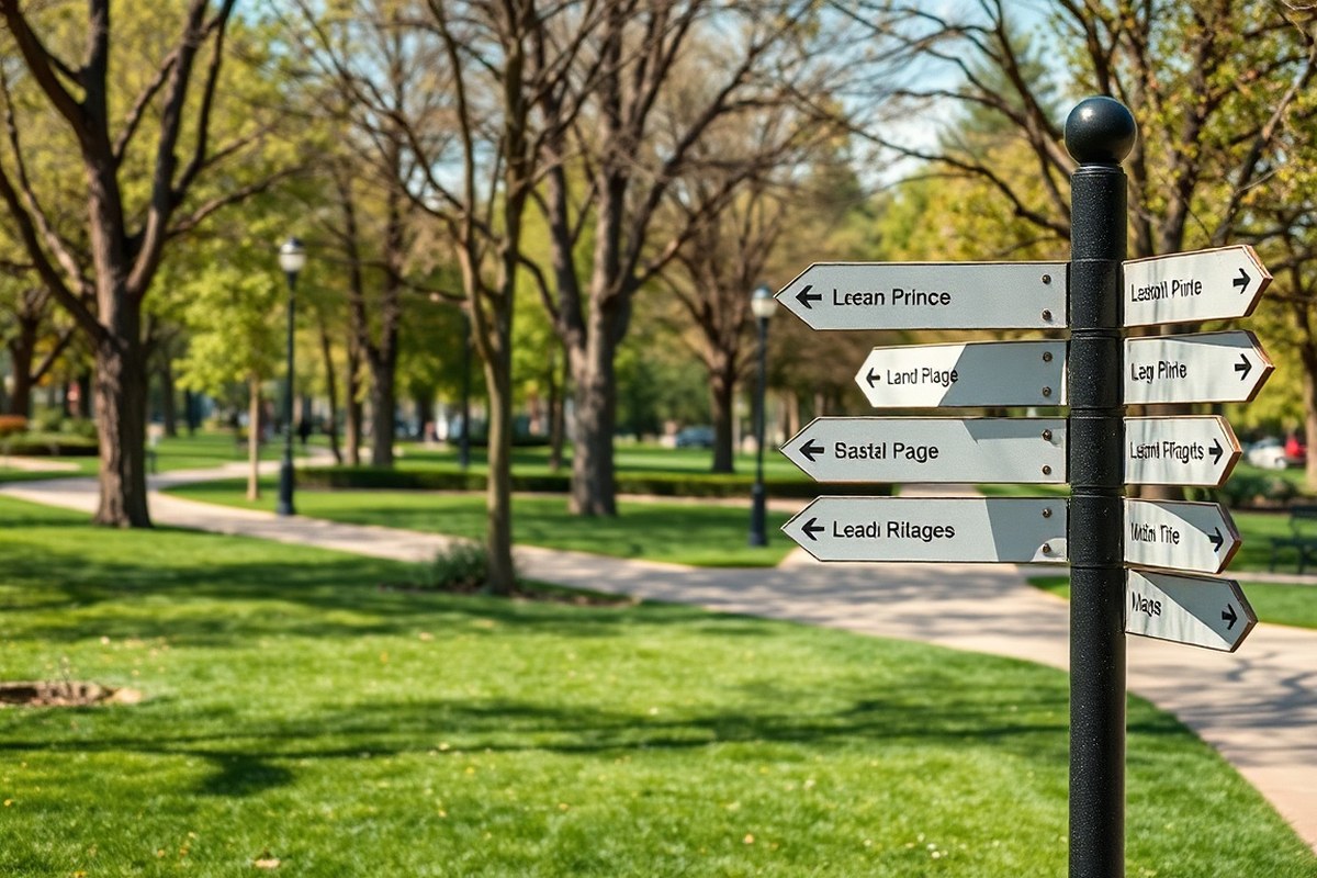
University campuses and cultural institutions face the challenge of directing diverse groups of people, including new students, visitors, and staff, across multi-building sites. Effective wayfinding systems address changing schedules and high-traffic events by blending permanent signage with digital updates or mobile wayfinding apps, helping to minimize confusion during busy periods. Public parks, botanical gardens, and transit hubs also depend on clear wayfinding to guide visitors through trails, exhibits, and transit connections efficiently. The environments below highlight typical real-world wayfinding sign applications:
- Hospitals and healthcare campuses with tactile and braille signage for accessibility
- Malls and retail spaces combining static signs with digital directories for navigation
- Universities and multi-building campuses using updated directional signs and mobile integration
- Public parks and botanical gardens featuring trail markers and interpretative signage
- City centers and transit areas applying wayfinding to assist pedestrians and commuters
- Museums and cultural venues integrating indoor maps with Bluetooth beacon navigation
Well-designed systems consider how people move, make decisions, and interact with their surroundings, improving visitor confidence and reducing stress. For example, Philadelphia’s citywide wayfinding signage project demonstrates how coordinated efforts across city streets and public spaces enable easy orientation. Similarly, healthcare institutions that invest in ultra-wideband (UWB) localization technology can offer precise indoor navigation essential for critical logistics and patient transport.
Remember, signage alone does not guarantee effective wayfinding; placement, clarity, and accessibility must align with user needs and environmental context to avoid confusion or frustration.
Common Types of Wayfinding Signs and How to Choose Them
Wayfinding signs come in several key types that work together to help people navigate spaces effectively. The main categories include directional, identification, informational, and regulatory signs. You can choose between traditional physical signs and digital options based on the environment and your specific needs, balancing factors like flexibility, maintenance, and user interaction.
Directional and Identification Signs
Directional signs provide clear instructions on movement, typically using arrows and short text to indicate routes to exits, elevators, parking, or key destinations. These signs usually sit at decision points where visitors need guidance on which way to turn. Identification signs serve to label spaces and confirm arrival, such as room numbers, department names, restrooms, or gate numbers. Together, these two types form the backbone of wayfinding by guiding and confirming a user’s path through a facility or outdoor area.
Choosing the right materials and placement depends on whether the signs are indoors or outdoors. Indoor identification signs often use lightweight materials like acrylic or PVC and have a lifespan of around 10 to 15 years. Outdoor directional and identification signs require durable materials like aluminum, which typically last 15 to 20 years and can withstand weather conditions. Visibility, lighting, and mounting height must align with user needs, ensuring signs are easy to spot and read from common viewing distances, usually between 6 to 10 feet for indoor signs.
Informational and Regulatory Signage
Informational signs provide context beyond simple navigation, such as maps, building hours, emergency procedures, or lists of available amenities. These signs help users understand their environment better and plan their routes accordingly. Regulatory signs communicate rules, safety measures, or restrictions, like “No Smoking” areas, “Authorized Personnel Only,” or handicap accessibility markers. They are essential for compliance with legal and safety standards but also play a part in guiding the visitor experience.
Informational signage is often placed in lobbies, near entrances, or at hubs where visitors pause, while regulatory signs need to be clearly visible wherever rules apply. Choosing high-contrast colors and universal symbols improves comprehension, especially in facilities with diverse or international visitors. Both informational and regulatory signs should be updated regularly to reflect policy changes or temporary conditions, with a review cycle aligned to the facility’s maintenance schedule, often annually.
Digital vs Traditional Wayfinding Signs
Digital wayfinding signs offer dynamic content and real-time updates, which can be especially useful in large complexes like hospitals or airports where frequent changes occur. These signs can display routed paths, emergency messages, or even advertisements, and often include accessibility features like audio instructions or multi-language support. However, they usually require higher upfront costs, ongoing maintenance, and hardware refresh every 5 to 7 years.
Traditional signs, made from metal, acrylic, or vinyl, provide a static, cost-effective solution with lower maintenance needs and longer lifespans. They perform well in stable environments with minimal changes and usually have a lifespan of 10 to 20 years depending on material and location. The best approach often combines both types, static signs for permanent, fundamental cues and digital signage for flexible, real-time communication.
Indoor spaces generally favor lighter materials and smaller digital displays, suitable for close viewing, while outdoor signs need weather-resistant construction and larger sizes for visibility from a distance. Installation logistics, power availability, and cost will influence your choice. For example, a museum might install digital maps near entrances and traditional signs in galleries, balancing ease of use and budget effectively.
How Wayfinding Signs Work: The Cognitive and Design Process
Wayfinding signs support navigation by guiding people through a four-stage cognitive process: orientation, route decision, navigation, and destination recognition. Orientation happens first as you assess your current location and understand the layout. Wayfinding signs help by clearly presenting your starting point and immediate surroundings, often with maps or “You Are Here” markers. Next, route decision involves choosing the correct path to your destination. Signs that show directional arrows, distances, and landmarks assist in making this choice quickly and confidently.
Once on the chosen route, navigation is the ongoing process of following the right course. Effective signs placed at key decision points reassure you that you’re on track, reducing stress and avoiding confusion. The final stage is destination recognition, where you identify the correct endpoint. Signs that clearly label rooms, exits, or points of interest confirm arrival and complete the wayfinding journey.
Cognitive mapping underpins this process. It refers to how people mentally create a map of their surroundings using visual cues and memory. Well-designed wayfinding signage strengthens this mental map by using consistent visual elements that make spaces easier to understand and remember. To support cognitive mapping, signs should employ simple, legible typography and standard symbols that users can quickly interpret. For example, using clear fonts like Helvetica or Arial sized at least 72 points for main headings improve readability from a distance, especially in large spaces like airports or hospitals.
Color plays a critical role in wayfinding by helping users distinguish different routes or zone areas. Using contrasting colors for text and background, such as white letters on a dark blue background, improves legibility in various lighting conditions. Consistent color coding across signs aids quick recognition and reduces cognitive load during navigation. However, be mindful of color blindness, designers often combine colors with symbols or shape differences to ensure accessibility for everyone.
Good wayfinding signage uses familiar, universal symbols, like a wheelchair figure for accessible routes or a knife and fork for dining areas, to communicate instantly without language barriers. Placement also matters; signs should appear at decision points such as intersections, entrances, and escalators, typically mounted between 48 and 60 inches from the floor for clear visibility. Overloading signs with too much information or cluttered visuals can overwhelm users, leading to mistakes or frustration. Aim to keep messages concise with no more than 7 words per line and 3 lines per sign to maintain quick comprehension.
Applying the four-stage model combined with design principles ensures wayfinding signs minimize confusion and make navigation more intuitive. While design quality and placement add upfront costs, the payoff comes in smoother traffic flow, less staff needed for directions, and improved user experience in complex facilities like universities or medical centers. In crowded or multi-level environments, layering these design elements and periodically updating signs based on user feedback maintains effective wayfinding over time.
Designing Effective Wayfinding Systems: Elements and Best Practices
Effective wayfinding systems rely on clear communication, consistent design, and thoughtful placement to guide users easy through complex environments. Key elements include maps, symbols, and signage that follow accessibility standards. These components work together to create a smooth experience that reduces confusion and improve safety.
Maps and Directories
Maps and directories provide users with an overview of the environment and their current location, helping them plan their route. They should be positioned at decision points where users pause and need orientation, such as building entrances or transportation hubs. The design must feature clear labels, an intuitive legend, and a “You Are Here” marker that stands out.
The materials used for maps should ensure durability and readability in varying lighting conditions. For outdoor or high-traffic areas, weather-resistant materials and anti-glare finishes help maintain clarity over time. Regular updates to reflect changes in the area’s layout or services prevent outdated information that can cause confusion.
Symbols, Icons, and Typography
Symbols and icons offer quick visual cues by representing common places or actions, like restrooms, exits, or elevators. These graphics must be universally recognizable to accommodate diverse users, avoiding culturally specific or ambiguous images. Typography should use high-contrast colors and legible fonts, sized appropriately for viewing distances, generally, letters should be at least 1 inch tall for every 10 feet of viewing distance.
Consistency across all signage supports user confidence and speed in navigation. This includes uniform color schemes, shapes, and font styles. A controlled vocabulary for place names and directional instructions minimizes confusion. The backbone of effective wayfinding is accurate naming and systematic application of these design elements across all signs and digital screens.
Accessibility and User Experience
Accessibility is a critical design principle that ensures all users, including those with disabilities, can navigate spaces independently. Signs should meet ADA (Americans with Disabilities Act) requirements such as tactile text, Braille, and appropriate mounting heights between 48 and 60 inches above the ground for wheelchair users. Contrast ratios of at least 70% between text and background improve readability, especially for people with visual impairments.
Consider how user behavior influences sign placement. Signs should be located at natural sightlines and decision points without obstructing pathways. Designs that reduce cognitive load, keeping information simple and sequential, allow users to process directions without frustration.
- Use durable, weather-resistant materials for outdoor signage
- Place directional signs at every critical decision point
- Maintain a consistent color scheme and icon set throughout
- Apply ADA guidelines for tactile and Braille elements
- Use high-contrast colors for better visibility
- Include clear “You Are Here” markers on maps
- Regularly update signs to reflect environmental changes
Strong wayfinding systems avoid overloading signs with too much information; clear, simple messages ensure users find their way quickly and confidently.
Cost Factors and Typical Pricing for Wayfinding Signage
The cost of wayfinding signage usually ranges from $300 to $600 for each installed sign. This range depends on multiple factors like sign material, size, complexity, and the environment where it will be placed. Installation needs can also drive prices up, especially if mounting requires special tools or work at heights.
Key factors impacting wayfinding sign pricing include whether the sign is static or digital, the required durability for indoor versus outdoor settings, and any artistic or branding elements. For example, a straightforward vinyl print differs considerably from a custom metal sign with backlighting. Also, temporary signs might allow for DIY installation, lowering costs, compared to permanent fixtures that often require professional handling.
| Cost Factor | Typical Range | Impact on Budget |
|---|---|---|
| Per Sign Installation | $300 – $600 | Base price per installed sign |
| Material | Vinyl to Metal | Affects durability and design complexity |
| Sign Type | Static to Digital Kiosk | Digital kiosks cost $8,000, $25,000 including install |
| Installation Complexity | Simple to High (heights, wiring) | Higher complexity increases labor costs |
| Design Customization | Basic to Branded/Artistic | Custom designs raise production costs |
| Sign Location | Indoor vs. Outdoor | Outdoor signs require tougher materials |
Consider a facility planning to install 10 new wayfinding signs inside a building at an average price of $450 per installed sign. That would total $4,500. Add a digital kiosk at the main lobby, which may cost $15,000 including installation and first-year service. The project budget would be about $19,500.
Installing signs at a height of 48 to 60 inches from the floor suits average eye levels of users standing or seated, which can affect mounting method and installation time. Complex mounting on difficult surfaces or wiring for digital signs requires professional installers, often costing more than simple wall-mounted signs.
Choosing the right combination of materials, sign types, and installation methods ensures your wayfinding system offers clear guidance while fitting your budget. Temporary signs might be more affordable but lack durability, making permanent options better for long-term investments despite the higher initial cost.
Common Mistakes in Wayfinding Signage and How to Avoid Them
Poor placement is a frequent error in wayfinding signage that can confuse users and waste your investment. Signs placed too high, too low, or out of sight from decision points fail their purpose. The fix is to install signs within a person’s natural line of sight, typically between 48 and 60 inches from the floor, and precisely at locations where people must make choices, such as hallway intersections or elevator lobbies.
Legibility often suffers when fonts are too small, cluttered, or lack sufficient contrast. Sign text should use clear, sans-serif fonts sized to allow easy reading from at least 10 feet away, with colors chosen to maximize contrast between letters and backgrounds. Ignoring accessibility guidelines, like those from the ADA, adds barriers for people with disabilities. Always include tactile elements and braille on relevant signs to comply with legal standards and ensure inclusivity.
Consistency in design elements such as color schemes, icons, and terminology is important. Mixing different styles or symbolic languages can create confusion. To avoid this, develop a unified design system for your signage and keep it consistent throughout the facility. Overloading signs with too much information also reduces effectiveness. Limit each sign’s message to the essentials needed at that point to prevent decision fatigue.
- Incorrect placement: Install signs at key decision points within a 48, 60 inch height range.
- Illegible fonts: Use sans-serif fonts sized for at least 10 feet visibility with high contrast colors.
- Inconsistent design: Stick to uniform colors, icons, and terminology across all signs.
- Overloaded signs: Keep messages concise and relevant to the immediate navigation need.
- Ignoring accessibility: Include tactile text and braille per ADA requirements.
- Lack of signage at critical junctions: Identify and cover all navigational decision points.
Hospitals, for example, can lose over $200,000 a year from patient and visitor confusion caused by poor wayfinding, showing the tangible impact of these mistakes. Budget constraints or in-house attempts often cause these pitfalls. Hiring a professional is advisable if your environment is complex, such as multi-floor buildings, large campuses, or areas serving diverse populations. Professionals bring expertise in user behavior, graphics design, and regulatory compliance. They can conduct site audits, create detailed sign placement plans, and design a cohesive system that aligns with your brand and operational needs.
Choosing a professional saves time, reduces costly revisions, and ensures your signage system truly helps users. For smaller, straightforward sites, you might handle the process with well-researched guidelines and digital tools. However, if you face language diversity, ADA compliance complexity, or multiple user groups, consult a specialized wayfinding consultant or design firm to create effective solutions tailored to your space.
Incorporating Technology: Digital, AR, and Mobile Wayfinding Tools
Wayfinding today increasingly blends traditional signage with advanced digital tools to guide users more precisely and personally. Digital signage often includes indoor kiosks that offer interactive maps and real-time updates, contrasting with static signs that rely on fixed, unchanging information. Augmenting these are mobile apps that provide personalized navigation, enabling users to receive step-by-step directions overlaid on indoor maps through features like “blue dot” positioning, which shows the exact user location inside complex venues such as shopping malls or university campuses.
Augmented reality (AR) wayfinding uses a smartphone or tablet camera view to overlay directional arrows and informational cues onto a user’s real-time surroundings. This method can improve understanding of physical spaces by providing intuitive visual markers aligned with the environment. Indoor positioning systems (IPS) use Wi-Fi, Bluetooth beacons, or other sensors to track and update user location continuously, supporting functions like live route adjustments and notifications about crowd density or temporary closures. These systems tend to demand higher setup costs and technical maintenance compared to static signs but offer significant benefits in user engagement and navigation accuracy.
| Feature | Static Wayfinding Signs | Digital and Mobile Wayfinding Tools |
|---|---|---|
| Flexibility | Fixed content; requires physical replacement or update | Dynamic content; real-time updates and personalized routing |
| Installation Cost | Lower upfront cost; minimal maintenance | Higher initial investment; ongoing software and hardware maintenance |
| User Interaction | Passive, one-way communication | Interactive; two-way communication with user |
| Accessibility | Visible to all on site but non-customizable | Customizable to user needs such as language or mobility aids |
| Navigation Accuracy | General location and direction guidance | Precise positioning with turn-by-turn directions |
Implementing a digital or AR wayfinding system requires selecting technology compatible with the facility’s infrastructure and the target audience’s needs. For example, integrating Bluetooth beacons into a large airport allows indoor positioning systems to function effectively, while an art museum may rely more on a mobile app that offers AR-improve routes and exhibit information. Development costs for specialized mobile wayfinding apps can range from $50,000 to over $150,000 depending on complexity, technical features, and custom content needs. Facilities can also partner with existing platforms like Mappedin, which provide modular digital wayfinding solutions reducing time-to-launch and upfront risk.
Costs aside, these digital tools can significantly improve wayfinding quality, reducing visitor frustration and improving safety by communicating real-time alerts, such as closed pathways or crowded zones. Good results mean users can navigate complex spaces comfortably, find points of interest quickly, and receive accessibility accommodations automatically. Poor implementation, however, can cause confusion if technology fails, data is outdated, or apps lack intuitive design.
Ensure digital wayfinding systems sync perfectly with physical signs and maps to avoid contradictory information that can confuse users navigating your space.
Maintaining Wayfinding Signage: Updates, Emergency Planning, and User Feedback
Maintaining wayfinding signage ensures it stays accurate, durable, and ready for emergencies, directly impacting operational costs and user experience. Regular updates, emergency planning, and user feedback evaluation prevent confusion and reduce costly directional inquiries, especially in complex environments like hospitals. An organized approach to signage content governance and upkeep supports smooth navigation and safety compliance.
Content Maintenance and Governance
Effective governance involves scheduling consistent reviews to update wayfinding content as facility layouts and services change. For hospitals and large venues, outdated signs increase misdirection, leading to longer visitor times, higher staff interruptions, and increased operational expenses. Setting a maintenance checklist improves accountability and prolongs sign lifespan. A practical maintenance checklist includes:
- Quarterly inspections for legibility, lighting, and physical condition
- Updating directions and departmental names within 30 days of changes
- Cleaning signs to maintain visibility and reduce wear
- Replacing damaged or faded signs promptly, within two weeks
- Verifying compliance with ADA (Americans with Disabilities Act) standards annually
- Ensuring digital and interactive signage software is current and functioning
- Documenting all maintenance actions for tracking and budgeting
These processes help avoid frequent reprints, a cost-saving measure that can be significant; for example, AR signage technology, despite high initial setup costs between $50,000 and $200,000, eliminates regular map update expenses. Good content governance also minimizes confusion, supporting faster patient or customer movement.
Emergency and Outage Preparedness
Wayfinding signage plays a important role during emergencies and facility outages by providing clear, accessible routes to safety and essential services. Signs must be designed and placed to remain visible under power loss or smoke conditions. Preparing for outages means creating signage with photoluminescent materials or backup power sources. Guidelines for emergency readiness include:
- Install glow-in-the-dark or illuminated signs along escape routes
- Ensure all emergency exits and emergency equipment (defibrillators, fire extinguishers) are clearly marked
- Review emergency signage after drills and update if routes have changed
- Maintain integrated systems that switch to battery power during outages
- Train staff on wayfinding locations and emergency route updates
Implementing these recommendations improves safety compliance and supports rapid evacuation, reducing risk and liability. Signage that fails during emergencies may compromise safety and increase operational disruption.
Measuring Effectiveness and Gathering Feedback
Measuring wayfinding success requires tracking how easily users handle the space and addressing their concerns. Common metrics include the reduction in directional inquiries, average visitor navigation time, and wayfinding error rates. For example, augmented reality systems can cut directional questions by up to 70%, directly lowering staffing costs and improving customer satisfaction.
User feedback methods should be simple and accessible. Surveys at kiosks, QR codes on signs linking to feedback forms, and direct interviews provide actionable data. A basic script for soliciting user feedback might read:
“Please help us improve navigation by answering a few quick questions about your experience finding your destination today.”
Tracking this feedback quarterly alongside operational data highlights problem areas. Revisions should be based on a combination of hard data and user insights to maximize clarity and efficiency.
Quick-Start Action Plan for Implementing Wayfinding Signage
Follow these steps to develop and install effective wayfinding signs in your facility that meet user needs and stay on budget.
- Before you start: Identify key navigation challenges by observing foot traffic and asking users where they get lost. Confirm success when clear problem spots are mapped out.
- Week 1: Choose sign types and materials suited to your environment, indoor, outdoor, or mixed, with durability and readability in mind. You’ll know you’ve succeeded when your plan matches budget and site conditions.
- Week 2: Draft preliminary sign designs including text, symbols, and colors based on cognitive best practices. Validate designs with a small group of typical users for clarity.
- Week 3: Install prototype signs at critical points for real-world testing. Success means users can navigate smoothly without additional help.
- Week 4: Collect feedback from users and staff to spot confusion or maintenance issues. Adjust signs accordingly to improve effectiveness.
- Month 2: Roll out the full wayfinding system across your site. Confirm correct installation and consistent appearance.
- Month 3 and ongoing: Schedule regular inspections and updates, especially after layout changes or renovations. Keep logs of user feedback and sign condition to guide maintenance.
Frequently Asked Questions
What Is the Main Purpose of a Wayfinding Sign?
A wayfinding sign’s main purpose is to guide people efficiently through a space. It helps reduce confusion by clearly showing routes, destinations, or locations to improve navigation in complex environments.
Can Wayfinding Signs Be Customized for Specific Facilities?
Yes, wayfinding signs can be customized to suit the unique layout and style of your facility. Custom designs ensure they fit your branding and provide clear guidance tailored to your space’s needs.
How Important Is the Placement of a Wayfinding Sign?
Placement is critical for wayfinding signs to be effective. Signs need to be located where people naturally look for direction, such as decision points or entrances, to catch their attention at the right moment.
Are Digital Wayfinding Signs More Effective Than Static Signs?
Digital signs offer flexibility with updates and interactive features, improving user experience. However, static signs remain reliable and cost-effective for areas with stable navigation needs or limited technology access.
What Materials Are Best for Durable Wayfinding Signs?
Materials like metal, acrylic, and high-quality vinyl provide durability for both indoor and outdoor signs. Picking weather-resistant materials prevents damage and maintains legibility over time in your facility.
Who Should Be Involved in Planning a Wayfinding Sign System?
Planning should involve facility managers, designers, and end users to address practical needs. Collaboration ensures signs meet real navigation challenges and comply with local regulations or accessibility standards.
Before You Go
Wayfinding signs play a key role in helping people move through complicated areas without confusion. Begin by pinpointing the specific navigation issues you face, then design and test your signs to confirm they provide straightforward guidance. Introducing a well-planned wayfinding system improve the overall experience for all visitors to your facility.