How to Letter a Chalkboard: A Complete Guide with Proven Techniques
How to letter a chalkboard starts with choosing the right tools and preparing your board properly. Begin by rubbing chalk all over a new chalkboard, then wiping it clean to condition the surface and prevent ghosting. Using simple transfer techniques and planning your layout ensures precise, attractive lettering every time.
Key Takeaways
- Condition new chalkboards by rubbing chalk all over, then wiping off before starting your lettering.
- Print your design on regular paper to transfer it easily onto your chalkboard surface.
- For large designs, use free online tools like blockposters.com to print oversized templates.
- Place your printed paper chalk-side down on the board to smoothly trace letters without stencils.
- Mix 2 to 3 lettering styles per board for visual interest without causing clutter.
- Ornate lettering with curls and shadows adds a vintage look inspired by early 20th-century signs.
How to Begin Lettering on a Chalkboard
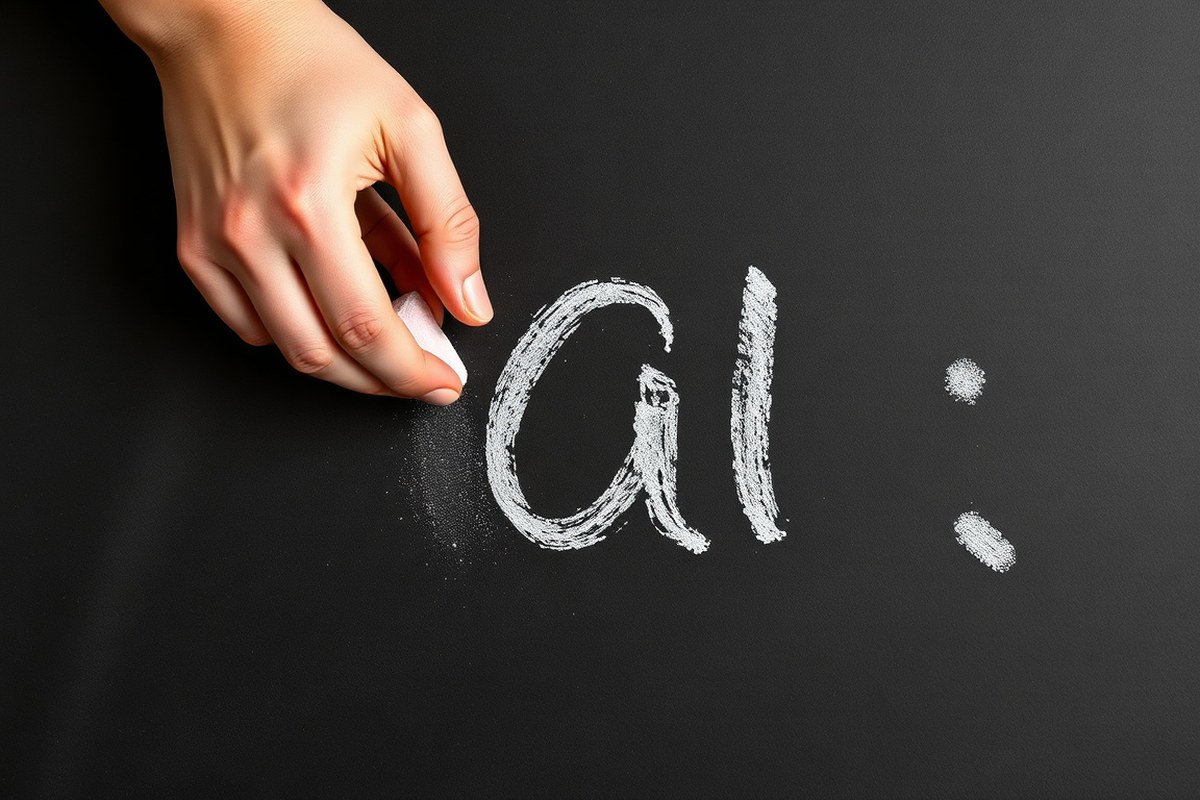
Starting your chalkboard lettering with the right preparation prevents smudging and gives your letters a crisp, clear look. New chalkboards often have a surface coating or dust that can cause uneven chalk application or ghost marks. Getting the board ready and warming up your hand with practice strokes will build your confidence and muscle memory. The process is simple, low cost, and takes just a few minutes but makes a big difference in the quality of your lettering.
Begin by treating the chalkboard surface to ensure smooth chalk glide and easy correction ability. Then, take time to practice simple lines and basic letter shapes on the board or a separate sheet of paper. This helps your hand learn the pressure and movement needed for neat chalk strokes, especially when writing vertically. Practicing also reduces shakiness and uneven downstrokes, which are common for beginners.
- Condition the board: Rub a piece of regular white chalk sideways over the entire surface until it’s covered with a thin layer of chalk dust. This “seasoning” fills in the tiny pores and prevents your artwork from sticking too firmly.
- Erase thoroughly: Use a dry cloth or chalkboard eraser to wipe off the chalk layer completely. Avoid using water at this stage as moisture can leave streaks or cause the chalk to smear.
- Check the surface: Inspect the board for any residual spots or shiny patches. If needed, repeat the conditioning and erasing process once more to create a uniform matte finish.
- Prepare your workspace: Set the chalkboard upright in a well-lit area with all your tools within reach. This positioning supports comfortable lettering and precise strokes.
- Warm up on paper: Before touching the board, sketch your lettering on paper, focusing on the style you want to use and the thickness of strokes. Practicing faux calligraphy or modern calligraphy basics this way saves time and frustration.
- Practice on the chalkboard: Use light, short strokes to draw simple lines and curves. Repeat several times to develop steady hand movements and gain control over thick and thin strokes, the key to chalkboard lettering styles.
- Test your chalk or markers: Experiment with your chosen chalk or chalk markers to see how they lay down on the board. Some chalk markers give a more opaque finish but may require a longer drying time and careful handling.
- Plan your design area: Lightly sketch your layout with a faint chalk line or use a ruler to mark margins and spacing areas. This step frames your lettering space and guides balanced letter placement.
Following these steps takes about 10 to 15 minutes and costs almost nothing beyond your initial chalkboard and chalk. Good preparation creates a smooth chalk surface, prevents chalk dust buildup, and supports consistent lettering. Skipping this can lead to blotchy letters and more erasing, which wears down the board’s finish over time. Start slow and steady; your clean surface and practiced strokes lay the foundation for beautiful chalkboard lettering.
Choosing the Right Tools for Chalkboard Lettering
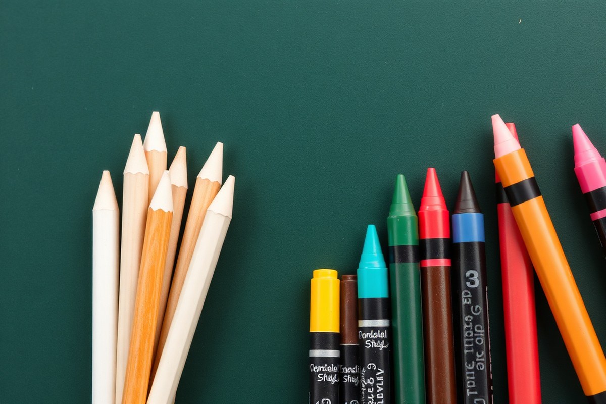
Choosing between traditional chalk and chalk markers depends on the look and longevity you want for your chalkboard lettering. Traditional chalk offers a soft, blendable finish that’s easy to adjust and erase. Chalk markers provide sharper lines and more vibrant colors but require a bit more care when erasing to avoid ghosting or damage to the board’s surface. Here’s a side-by-side comparison to help you decide which tool fits your project best:
| Feature | Traditional Chalk | Chalk Markers |
|---|---|---|
| Appearance | Matte, soft edges, slightly dusty | Bright, smooth, crisp lines |
| Ease of Use | Simple, forgiving for mistakes | Needs careful handling and drying time |
| Color Options | Limited pastel shades | Wider range of vivid colors |
| Longevity | Easily smudges, lasts a few days | Lasts longer but can ghost if wiped too soon |
| Surface Compatibility | Works on most chalkboards | Best on non-porous boards, can stain porous surfaces |
| Price Range | Usually under $5 for quality artist chalk | Typically $3-$7 per marker |
Beyond your choice of chalk or markers, several essential tools will improve your lettering’s precision and polish. Begin with a good-quality chalkboard or chalkboard paint surface made for lettering. Use a ruler or triangle to create light pencil guidelines for spacing your text evenly. A fine chalk pencil or chalk marker with a brush tip allows for varied stroke widths, creating that sought-after thick-thin contrast similar to calligraphy.
For corrections, keep a slightly damp cloth and a dry eraser handy. Always wait for marker ink to dry before removing pencil marks with a damp cloth to avoid smearing. Chalk pastels are great for blending shadows or highlights around letters but aren’t suitable for main strokes if you want sharp edges. If you plan to reuse your chalkboard regularly, keep your tools stored in a clean, dry place to prevent chalk or marker tips from drying out.
Always test chalk markers on a small section of your chalkboard first to ensure the marker erases fully without leaving ghost marks.
How to Transfer Your Design Onto a Chalkboard
Getting your design onto a chalkboard accurately helps avoid mistakes and saves time when lettering. Several methods can transfer outlines or text to chalkboards effectively, depending on your tools and the size of the project. Using transfer techniques makes it easier to replicate complex designs or fonts, producing clean, professional-looking chalkboard art.
Tracing with Chalk on Paper Back
This method involves printing or drawing your design on regular paper, then rubbing chalk over the back side before tracing. First, print or sketch your chosen text or image on the front of a standard sheet of paper. Flip the paper over and thoroughly rub white chalk all over the backside where the design lines will be traced.
Secure the paper on the chalkboard with tape on one side so it doesn’t shift. Use a pencil to trace the outlines of your design from the front, pressing firmly but carefully. The chalk powder transfers onto the chalkboard, leaving a light chalk outline underneath the paper. Remove the paper gently to reveal a faint chalk guide.
This method is affordable, requiring just chalk and paper. It works well for small to medium designs and simple lettering. However, the chalk lines can be faint or uneven if the chalk layer is thin or the paper moves during tracing. It’s best to use fresh, soft chalk and clean the board beforehand for clear transfer results.
Using Transfer Paper
Transfer paper designed for chalkboard use offers a more precise option. Place the chalkboard transfer paper between your printed design and the chalkboard surface. Tape the edges to hold everything steady. With a pencil or stylus, carefully trace the design lines on the paper’s front side.
The pressure pushes chalk or graphite from the transfer paper onto the chalkboard, creating sharper and more consistent outlines than the chalk-on-paper-back method. This is especially helpful for detailed designs or when replicating multiple copies of the same artwork.
Transfer paper costs around $5 to $10 per pack of several sheets, making it a worthwhile investment for frequent chalkboard projects. It requires extra materials but reduces smudging and improves accuracy. Use this method when you need cleaner edges or work with intricate lettering styles.
Freehand Drawing from a Digital Sketch
For simple or small designs, drawing freehand directly from a digital sketch can work if you have steady hand control. Use a tablet or phone to display your design, then lightly sketch the text or shapes onto the chalkboard with faint chalk using guidelines for spacing. Digital tools like drawing apps let you adjust your text size and style before you start.
This technique costs nothing apart from chalk, but relies more on your drawing skill and eyesight. It allows quick adjustments to spacing and proportions on the board itself. When you want a natural, hand-lettered look or are comfortable tweaking as you draw, freehand can be the fastest approach.
Keep a rag or eraser handy to fix early marks. Freehand is less precise but offers flexibility. Avoid this method for large designs or complex fonts without practice, since uneven lettering or spacing can reduce the final visual appeal.
Projector or Grid Method
Using an overhead projector provides a way to enlarge and precisely trace your design right onto the chalkboard. Print your image or text on transparency film compatible with the projector. Set up the projector so the image casts onto the chalkboard at the desired size. Then trace over the projected light lines with chalk or a pencil.
If you don’t have a projector, a grid method is an alternative. Draw a grid of equal squares over your paper design and a matching grid lightly on the chalkboard using a ruler and faint chalk marks. Transfer the design square by square, sketching smaller segments of the image inside each square. This breaks down complex shapes into manageable parts, helping replicate proportions and placement accurately.
This method is ideal if you need large-scale chalkboard signs or complex illustrations. The projector method requires access to a transparency printer and overhead projector, costing around $50 to $150 for a basic setup. The grid method only needs a ruler and patience. Both methods produce sharp, well-proportioned outlines that reduce guesswork and maintain design integrity.
Planning Your Layout and Spacing for Chalkboard Text
Start by measuring the width and height of your chalkboard to know the exact space you have for lettering and decorations. Chalkboards have a fixed size, so without careful planning, you might run out of room or end up with uneven spacing. Use a ruler or measuring tape and note these dimensions before sketching your layout. Planning helps you balance your text and art so the final design looks polished and readable from a distance.
Mark guidelines on the board lightly with a pencil that wipes off easily with chalkboard paint. Draw a baseline, an x-height line (the middle height of lowercase letters), and a cap-height line (top of uppercase letters) for each row of text. These lines keep your letters aligned, making the writing look neat and professional. Consistent letter height and spacing create a visually pleasing design that doesn’t feel crowded or sparse.
Keep letter spacing uniform by imagining equal gaps between letters rather than just eyeballing it. You can also use a small piece of cardboard or a ruler to check consistent spaces as you work. Avoid starting your text right at the very edge of the board. Leave some margin space so the final letters don’t feel squeezed in, and viewers won’t miss parts of the message. Here’s a simple checklist to plan your chalkboard layout:
- Measure the chalkboard width and height accurately
- Decide how many lines of text you need and draw pencil guidelines
- Sketch your message on paper or use a lettering generator to preview styles
- Limit yourself to 2-3 lettering styles for a balanced look
- Plan margins to keep text away from edges
- Keep spacing consistent using pencil marks or rulers as guides
- Place decorative elements thoughtfully so they don’t crowd the text
Large boards require breaking the text into sections and testing the layout before writing. Draft your message in pencil or on paper first and assess how well it fits. Very large letters may become hard to space evenly, so you might choose simpler fonts or fewer words to maintain clarity. For smaller boards, tight but even spacing and fewer design elements work best to keep the message easy to read.
Using a digital tool or printed template to test your lettering style and size can prevent frustration. Previewing your text in advance helps you adjust the design or wording so it looks balanced. Planning well takes some time but avoids having to erase and start over, saving you materials and preserving the chalkboard surface.
Essential Chalkboard Lettering Techniques and Styles
Popular chalkboard lettering styles include faux calligraphy, block letters, and cursive scripts, each offering distinct visual effects. Mastering these basic strokes helps you create signs that stand out and remain readable. Mixing two or three styles adds interest without overwhelming the design.
Faux Calligraphy Basics
Faux calligraphy mimics traditional calligraphy without special pens, using regular chalk or chalk markers. Start by writing your word in cursive with light, fluid strokes. Next, identify the downstrokes, these are the parts of each letter where your pen moves downward. Carefully thicken these downstrokes by drawing parallel lines on each side, then fill in the space between them. This makes your letters look more elegant and dynamic, similar to brush calligraphy but more approachable for beginners.
For best results, keep your initial strokes consistent in size and spacing. This technique works well on medium to large chalkboards where details show clearly. Taking your time with the thickening step ensures clean edges without smudging. Avoid over-thickening downstrokes, as it can make letters look bulky.
Block Letter Techniques
Block lettering offers bold, straightforward styles that command attention and are easy to read from a distance. These letters are usually uppercase with straight lines and sharp angles. Begin by sketching your letter shapes with light chalk, keeping them uniform in height and width. Thicken the outlines and fill in or leave hollow depending on your style preference. Adding drop shadows or highlights next to block letters creates depth and can make your text pop.
This style suits menus, event titles, or any sign where clarity matters most. It requires less precision than cursive and holds up well even with quick drawing or minor mistakes. Blocks work nicely with script fonts when mixed because they provide a solid contrast and help important words stand out. Too many block styles in one sign can look cluttered, so pick one word or phrase to emphasize this way.
Cursive and Script Lettering
Cursive and script styles convey a casual, flowing look that fits rustic or vintage-themed chalkboards. Letters connect smoothly with curved strokes and loops, emphasizing elegance or whimsy depending on the letterforms. Start by practicing common letter connections and letter spacing on scrap paper or a test board. Use light chalk lines first, correcting spacing before darkening the strokes.
This style works well for names, quotes, or decorative accents but can reduce readability if overused or written too small. Pair cursive with block or faux calligraphy lettering for balance. Avoid combining multiple script styles on the same project to prevent a busy appearance. Proper spacing and consistent slant angles make your cursive lettering more polished and easier to read.
Keep your chalkboard surface clean and dry before lettering to prevent smudging and help your lines stay sharp and crisp.
How to Fix Mistakes and Maintain Your Chalkboard Lettering
Fixing mistakes on a chalkboard depends on the type of error you’re dealing with and the tools you used. For chalk lettering, smudges happen when your hand brushes over wet chalk or if the surface is dusty. To fix smudges, lightly dampen a clean cloth or a cotton swab and gently wipe the affected area. Avoid rubbing hard, as this can erase nearby chalk as well. For chalk markers, use a damp cloth or a chalkboard cleaner made for marker ink. Keep a scrap piece of cloth handy to quickly blot any accidental smears as you work.
Spacing errors and uneven strokes are common when lettering freehand. Start by penciling in your words lightly with a chalk pencil or a soft chalk stick before committing to your final strokes. This step helps catch spelling mistakes and uneven spacing early. After sketching, step back about 3 to 6 feet from the board to review alignment and balance. Adjust any spacing issues by gently erasing and re-drawing with careful measurements. For uneven strokes, practice applying consistent pressure with your chalk or marker. You can also use tools like a ruler or a stencil for more precise lines. Use these tips to avoid common lettering mistakes and maintain a clean, clear chalkboard surface:
- Always season new chalkboard paint by rubbing the surface with the side of a chalk stick and wiping clean before first use.
- Pencil in designs before final chalk or marker application to correct spacing and spelling errors early.
- Clean smudges immediately with a slightly damp cloth or cotton swab to prevent spreading.
- Avoid resting your hand on already lettered areas to prevent accidental smearing.
- Stand back periodically to check overall spacing and alignment from a normal viewing distance.
- For chalk markers, follow product instructions for removal and avoid harsh cleaners that might damage the chalkboard.
- Allow chalkboards to dry fully before cleaning with water to prevent streaking or erosion of the lettering surface.
Maintaining your chalkboard well extends its life and keeps lettering sharp. Regularly wipe the board with a clean, damp cloth and allow it to dry. Avoid abrasive cleaners or harsh chemicals, as these can damage the chalkboard coating. If ghosting occurs, faint outlines of past designs, apply a chalkboard cleaner or occasionally reseason the surface by rubbing with chalk and wiping it off. Make sure hands and tools are clean to reduce unwanted dust and smudging while working.
Creative Effects to improve Chalkboard Lettering
To make your chalkboard lettering look polished and more eye-catching, adding shadows, outlines, and decorative flourishes gives your text depth and character. These effects turn simple words into art that stands out, balancing artistry with legibility. Learning a few step-by-step techniques will help you achieve professional results using basic chalk or chalk markers.
Creating Shadow Effects
Shadows add dimension and make your letters pop off the chalkboard. They mimic light coming from one direction, giving flat text a 3D look. Simple shadows work best for beginners and fit almost any style, from vintage to modern.
To create a shadow, pick a light source direction (top-left is common). Draw your letter strokes normally, then redraw the edges where the light wouldn’t hit. These shadow edges should be offset slightly, about 1/8 inch (3 mm) away, mimicking consistent light shading.
- Draw your letters firmly and clearly on the chalkboard.
- Choose a light direction (e.g., top-left).
- Using a softer or lighter chalk tone, draw a shadow line just outside the right or bottom edge of each letter.
- Fill in the shadow area with light shading, using either a chalk stick or a sponge for soft blending.
- Keep shadows consistent on all letters, matching the chosen light direction.
- Step back to check evenness and darkness balance.
- Erase or soften any overly harsh shadow edges with a damp cloth.
Using shadows too thickly can clutter your design. Thin, consistent shadows usually look best. Experiment on scrap boards first to find the right offset and density.
Adding Outlines and Highlights
Outlines define letters and improve readability, especially from a distance. Highlights simulate reflected light and add a polished feel. Both improve contrast and make your chalkboard lettering look intentional and neat.
To outline letters, use a chalk marker or sharpened chalk to trace the edges of each letter. For highlights, add thin white strokes or dots where light would naturally catch, like the tops or curves. These small details bring life and clarity to your work.
For a clean look, avoid outlining every letter with heavy lines. Instead, lightly trace and combine with shadows for depth. White chalk or a fine-tipped chalk pen works well for highlights because they stand out sharply on dark boards.
Using Flourishes and Frames
Flourishes are decorative swirls, curls, and lines that add personality and style to your lettering. Frames enclose your text, giving it focus and a finished look. Both elements often appear in vintage chalk art and can be simple or elaborate depending on your skill level.
Start with basic flourishes like loops on letter tails, gentle curls on caps, or small dots and stars nearby. Frames can be rectangular lines, scalloped borders, or ribbon shapes around your text. These details should complement, not overpower, your lettering.
- Sketch small curls or loops on the ends of letters that naturally taper or have space, such as ‘y’, ‘f’, ‘g’, or capital letters.
- Add short, curved lines trailing from letter strokes or corners to give movement.
- Draw simple frames by outlining the entire word or phrase with straight or curved lines, leaving room so letters don’t look crammed.
- Decorate corners or ends of frames with small flourishes like dots, stars, or floral shapes.
- Ensure flourishes are balanced and don’t interfere with key parts of letters.
- Use lighter chalk for flourishes to keep them subtle, or stronger contrast to make them a focal point.
Modern flourishes tend to be minimal and clean, fitting contemporary designs, while vintage flourishes are often ornate and sweeping. Pick a style that matches your lettering for the best effect.
Projects and Practical Uses for Chalkboard Lettering
Chalkboard lettering offers a flexible, creative way to update home decor and organize daily life. Smaller framed boards work well for displaying kitchen quotes, grocery lists, or changing seasonal messages. These projects allow you to refresh your designs to match holidays or personal milestones without needing permanent installations. You can switch out or erase your lettering quickly using a damp cloth, making chalkboards ideal for situations where you want to update content often at little to no cost.
Seasonal chalkboards can become a centerpiece for celebrations by featuring holiday greetings or themed art. Using simple fonts and decorative flourishes like swirls or borders helps your message stand out. For daily planners or menus, organize text with clear headings and consistent spacing so the information is easy to read at a glance. Precision here makes your board a functional tool rather than just decoration.
- Kitchen grocery list or meal planner updated weekly
- Seasonal greetings or holiday countdowns
- Inspirational quotes or daily affirmations in entryways
- Weekly schedule or chore charts for family areas
- Menus for home cafes or dinner parties
- Milestone announcements like birthdays or anniversaries
- Kids’ artwork or learning boards
Maintaining your chalkboard lettering means sealing finished art with a clear chalkboard spray to prevent smudging, especially if it will stay unaltered for a while. To erase and update you simply wipe the surface with a damp cloth and dry thoroughly before writing anew. Some messiness is normal, so expect occasional faint ghosting of old text. Cleaning with a mixture of half vinegar and half water every few weeks will keep your board looking fresh.
Use a soft microfiber cloth to erase instead of a regular chalkboard eraser to reduce residue and dust.
Complex or very large chalkboard projects may deserve a professional touch. Skilled chalk artists have tools and techniques to create sharp, intricate designs and can complete work more quickly. Consider hiring one for wedding signs, restaurant menus, or permanent business displays where a flawless finish matters. For home use, however, beginner and intermediate DIY chalkboard lettering is accessible and rewarding with practice and patience.
Step-by-Step Action Plan for Chalkboard Lettering
Follow these steps to create chalkboard lettering that looks neat and creative. Each step helps you build your skills and achieve a clear, attractive design.
- Before you start: Choose your chalkboard size and tools. Select chalk or chalk markers and the right eraser so you can work cleanly.
- Day 1: Sketch your lettering design on paper. Use simple shapes and spacing to plan how your text will fit the board.
- Day 2: Transfer the design onto the chalkboard using chalk transfer paper or a grid method. Check that your lines are light and easy to adjust.
- Day 3: Begin lettering with light strokes. Use basic styles like block or script letters and see that your lines are even and legible.
- Day 4: Add embellishments such as borders or shading. Review whether these improve the readability and balance of your lettering.
- Day 5: Fix any mistakes by wiping gently with a damp cloth and redrawing. Confirm your corrections blend well with the rest of the design.
- After 1 week: Seal your design with a fixative spray if needed for durability. Make sure the spray is compatible with your chalk type.
Frequently Asked Questions
What Is the Easiest Method to Trace Letters Onto a Chalkboard?
The easiest and low-cost way is tracing letters using printed paper and pencil. Print your text on paper, place it chalk-side down on the board, and trace. This method avoids freehand errors and is great for beginners.
How Can I Make My Chalkboard Lettering Look More Professional?
Focus on consistent spacing and balanced letter shapes. Plan your layout carefully to avoid running out of space. Practicing letter shapes until they feel natural makes writing on a vertical surface smoother and neater.
How Do I Prepare a Brand New Chalkboard for Lettering?
Rub chalk all over the surface and wipe it off before starting. This conditions the board and prevents ghosting from future drawings or writings.
Can I Use Printed Chalkboard Printables for My Projects?
Yes, you can print designs on regular paper and transfer them by tracing. For bigger images, free tools like blockposters.com help print larger chalkboard designs.
How Do Faux Calligraphy and Modern Calligraphy Differ in Chalkboard Lettering?
Faux calligraphy is done by thickening downstrokes after writing normal letters. Modern calligraphy builds thick and thin strokes as you write. Both styles create stylish chalk designs but require different techniques.
What Should I Do If I Make a Mistake While Lettering on a Chalkboard?
Wipe the mistake gently with a damp cloth and let it dry before fixing. Chalkboard mistakes can be erased without leaving marks if corrected quickly.
Before You Go
Lettering a chalkboard clearly and creatively takes practice but is rewarding. Start with simple designs and build your confidence using the steps above. Your next move should be to gather your materials and try a small project to find your style and technique.