How to Center Text on a Sign: 8 Proven Methods for Perfect Alignment
How to center text on a sign precisely involves balancing both mathematical and visual alignment to create an appealing design. Starting with the exact middle of your sign as a reference point helps, but adjusting slightly for optical centering improves the overall look. Align text using accurate measurements or digital tools to ensure the text sits evenly and looks balanced to the eye.
Key Takeaways
- Use the 50% mark horizontally as the base for mathematical centering of text on your sign.
- Adjust vertical centering to around 46% from the top for better optical balance on most signs.
- Highlight the text and use center alignment buttons in software like Word or Illustrator for quick centering.
- Apply CSS property
Text-align: center;for digital sign text instead of outdated<center>tags. - For fixed-width text, measure and set exact padding or margins to center within designated columns.
- Check alignment visually against the material and viewing distance since optical perception shifts based on context.
1. How to Center Text on a Sign Accurately
Centering text on a sign ensures the message looks balanced and professional, which draws attention and improves readability. Working on a physical sign or a digital layout, accurate centering requires following precise steps and using the right tools.
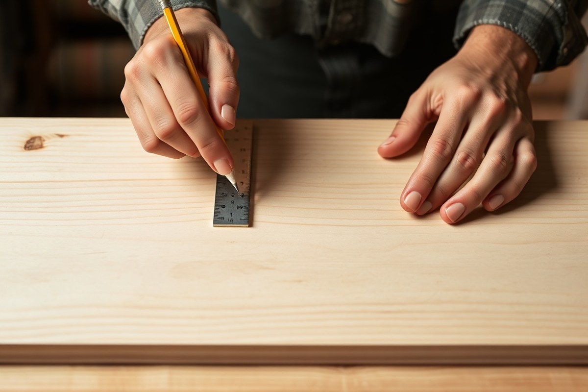
Manual centering is the foundation when working with physical signs or handcrafted designs. The key is measuring the sign’s width, calculating the text block’s width, and positioning the text so the spaces on both sides are equal. Common tools include a steel ruler or measuring tape, a pencil for marking, a laser level for straight alignment, and a square to confirm vertical positioning. For digital text, design software provides alignment features but preparing the text properly (trimming excess spaces, choosing consistent font sizes) avoids off-center results.
- Measure the total width of the sign surface. Use a steel ruler or tape measure to get an exact dimension in inches or centimeters.
- Calculate the width of the text block. Measure the longest line of text as it will determine the horizontal space needed. When working digitally, select the text and locate its bounding box in your software.
- Mark the sign’s horizontal midpoint lightly. Divide the total sign width by two and mark this center point with a pencil or chalk.
- Find the center of the text block. Halve the text width measurement to determine where the text’s midpoint falls.
- Position the text block so its center aligns with the sign’s midpoint. For physical signs, draw vertical guide lines or use a laser level to help place text evenly from the center mark.
- Adjust vertical placement as needed. Centering often focuses on the horizontal axis, but check vertical spacing for balanced appearance, typically by eyeballing or using a ruler.
- Secure or finalize the text placement. Attach vinyl letters, paint outlines, or lock in your digital layout once the position looks balanced and centered.
Manual centering usually costs only minimal supplies like a ruler and pencil, while laser levels start around $20 for basic models. Digital centering tools come standard in design software like Adobe Illustrator or free tools like Canva. Accuracy depends on precise measurements and avoiding extra spaces in your text input, which can shift the block unexpectedly. Good results show equal margins on both sides and a visually balanced sign that draws the viewer’s eye naturally to the message.
2. Understanding the Difference Between Optical and Mathematical Centering
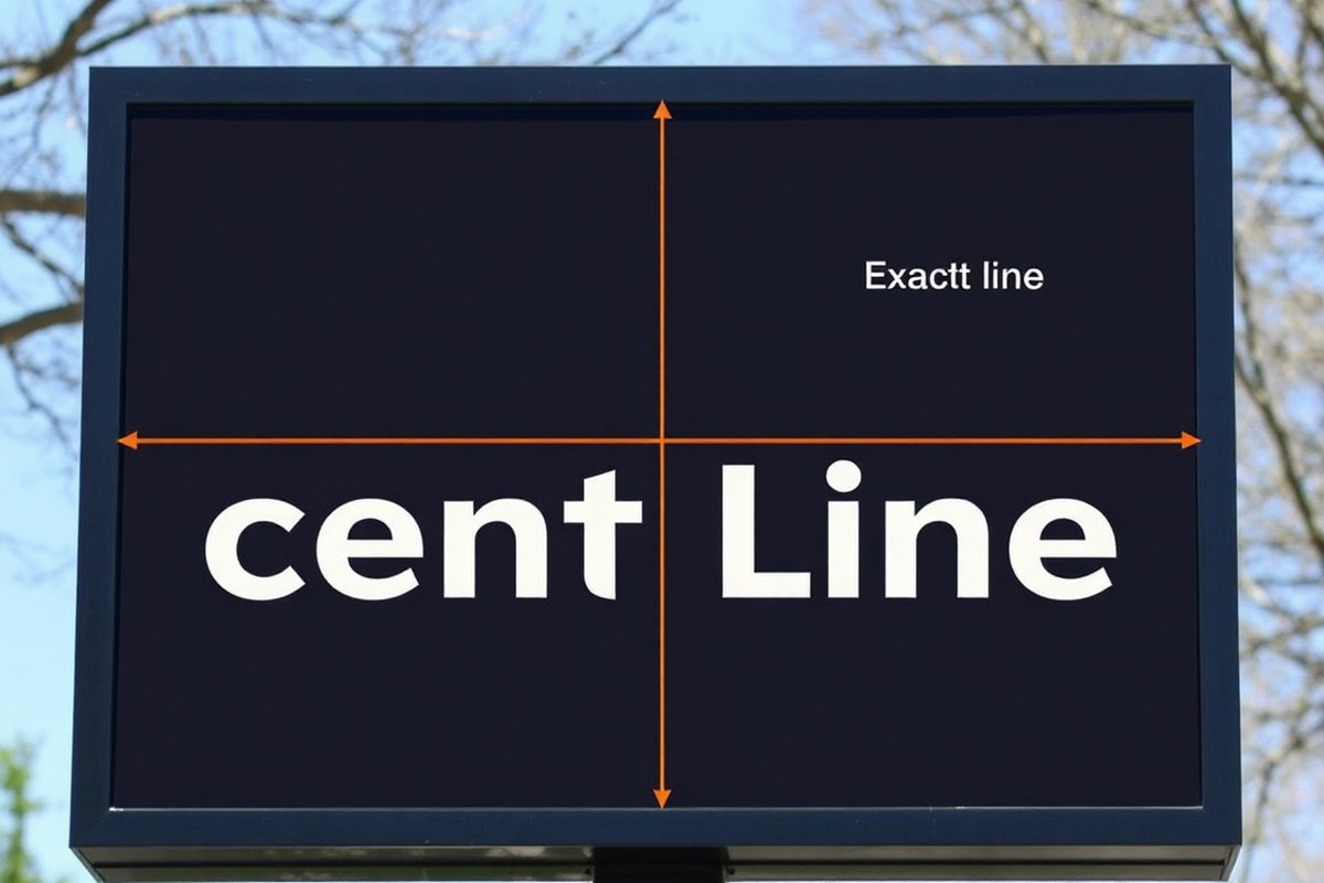
Optical centering adjusts text placement to where the eye naturally focuses, often just above the exact middle. Mathematical centering aligns text precisely at the geometric center. Use optical centering in sign design for better visual balance, and mathematical centering for technical layouts or when exact symmetry is required.
Defining Optical and Mathematical Centering
Mathematical centering positions text exactly halfway between two edges, such as left to right or top to bottom. For example, a sign 24 inches wide with a 6-inch-wide text block will place the text so 9 inches remain on each side. This creates a perfectly symmetrical arrangement.
Optical centering, by contrast, accounts for how humans perceive balance. Because the eye tends to enter a design slightly above the geometric center, around 46% down from the top instead of 50%, text placed just above true center feels more balanced and comfortable to view. This approach avoids making centered text look like it’s visually “drooping” toward the bottom.
Why Optical Centering Matters in Sign Design
Visual perception plays a big role in how your sign communicates. Optical centering helps text appear stable and engaging, even if it’s not mathematically centered. This matters most on larger signs or those with single lines of text and plenty of surrounding space.
In high-contrast settings, optical centering prevents the eye from dragging downward, which can happen with mathematical centering alone. This method also helps when text shapes are uneven, like signs with wide letters on one side, because true center may not feel balanced without adjustment.
Applying Optical Centering in Installation
To center a sign’s text optically, start by measuring the sign’s dimensions. Locate the mathematical center, then shift the text upward about 4% of the sign’s height to reach optical center. For example, on a 30-inch-tall sign, place the text approximately 1.2 inches above the halfway point.
This subtle shift doesn’t require special tools beyond a ruler or tape measure but does need careful marking before mounting. Using a laser level can help achieve straight horizontal lines parallel to the sign edges. Ensure text spacing and font size remain consistent after adjustment.
Choosing When to Use Each Method
Mathematical centering works well for technical designs requiring precise alignment, like architectural signs, regulatory markers, or multi-column text. Optical centering fits better with business signs, banners, and displays that rely on quick readability and visual appeal.
Signs with multiple text lines might combine both: use mathematical centering horizontally for even margins but adjust vertical placement with optical centering for balanced eye flow. Small signs or stickers often rely on mathematical centering since the optical difference becomes less noticeable.
Remember to test your sign placement in natural light and from typical viewing distances; optical centering adjustments can look different up close versus across a room.
3. Centering Text Digitally Using CSS and HTML for Web-Based Signs
To center text on digital signs or online banners, use CSS rather than the outdated <center> tag. Modern web design relies on the Text-align: center CSS property for horizontal alignment, which offers more control and works consistently across browsers. This approach can be applied to different text elements, enabling clean, responsive layouts for web-based signs.
Why the Tag Is Deprecated
The <center> tag was an early HTML element used to horizontally center text and other elements. However, it is now obsolete according to the HTML5 specification. The tag lacks flexibility and control, which are essential in modern, responsive design environments. Browsers still support it for legacy reasons, but relying on this tag can lead to inconsistent presentation and limits your ability to adjust alignment alongside other CSS styles.
Using CSS instead separates content structure from presentation, making it easier to manage styles across multiple pages. This separation encourages cleaner HTML code and better accessibility. For professional digital sign design, avoiding the <center> tag prevents future compatibility issues and results in more precise control over text appearance.
Using CSS Text-Align for Centering
The Text-align CSS property aligns inline content inside a block-level element. To center text horizontally, apply Text-align: center; to the container element, such as a <div>, <p>, or heading tag. This method works for single lines or paragraphs and fits well with responsive layouts, automatically adjusting to different screen sizes. For example, the following CSS styles will center all text inside a <div> with the class Banner-text:
.banner-text { text-align: center; }
Applying this CSS rule creates a straightforward, browser-compatible way to center text horizontally without extra HTML elements. It also makes updating styles easier, as you only need to change one CSS property instead of altering HTML structure.
Centering Multi-Line Text Blocks with CSS
When dealing with multiple lines of text, applying Text-align: center; will center each line within the container. This is ideal for sign content like slogans or calls to action that span several lines. To ensure consistent centering, wrap your text paragraphs or headings inside a block-level container with the centering CSS applied. To center text both horizontally and vertically, such as inside a fixed-height banner, you can use Flexbox. Adding the following CSS to the container centers the text in both directions:
.banner-container { display: flex; justify-content: center; /* horizontal */ align-items: center; /* vertical */ height: 200px; /* example height */ }
This method provides precise control over positioning inside sign areas of any size and adjusts well across devices. To center text on an HTML5 web-based sign using CSS, follow these steps:
- Create a container element such as a
<div>or<section>to hold your text. - Add a class or ID to the container for styling reference, for example,
Class="sign-text". - In your CSS file or
<style>block, write a rule for that class usingText-align: center;to horizontally center the text. - To center content vertically within a fixed-size container, apply
Display: flex;,Justify-content: center;, andAlign-items: center;to the container’s CSS. - Apply any additional styling like font size, color, or padding to optimize readability on the sign.
- Insert your text inside the container element in the HTML.
- Test the sign display on various screen sizes and adjust container width or padding as necessary to maintain visual balance.
4. Centering Text in Design Software Like Word, Photoshop, and Illustrator
Centering text accurately in design software ensures your sign looks professional and balanced. Each tool offers built-in alignment options that make the process straightforward, whether you are working with single-line headlines or multi-line body text. Applying the right settings and managing your text layers properly prevents common alignment errors and improves the visual appeal of your sign.
Centering Text in Microsoft Word
Microsoft Word provides simple options for centering text within your document or text box, making it a convenient choice for basic sign layouts. Using the Home tab’s alignment buttons, you can quickly switch between left, right, center, or justified text alignment. When working with multi-line text, selecting the entire paragraph before choosing center alignment ensures all lines align evenly along the vertical center axis.
To center text vertically inside a text box, use the Format Shape pane and adjust the text box’s internal margin or vertical alignment settings to middle. This prevents the text from sitting too high or low in the box, which is useful in signs with set dimensions. Handling different fonts and sizes requires testing the visual balance; slightly increasing line spacing may help maintain clarity for larger signs.
- Launch Word and open your sign document or create a new one.
- Select the text or text box to center.
- Go to the Home tab on the ribbon if not already active.
- Click the Center alignment button, which looks like centered lines.
- For vertical centering inside a text box, right-click the box and choose “Format Shape.”
- Open “Text Options” and then “Text Box” to set “Vertical alignment” to “Middle.”
- Adjust font size or line spacing if multi-line text looks uneven.
Using Alignment Tools in Adobe Photoshop
Photoshop offers precise control over text placement with its alignment tools and layers. Use the Move Tool combined with alignment options in the top toolbar to center text relative to the entire canvas or a selected layer group. For multi-line text, adjusting paragraph alignment within the Character or Paragraph panel centers each line, while layer alignment can position the entire text block.
Managing layers is critical in Photoshop. Keep sign text on its own text layer so you can edit and align it independently. Adding guides or grids helps snap your text into the perfect center. Remember to rasterize text only after final alignment; this way you can adjust easily without losing quality.
- Open Photoshop and your sign file or create a new canvas.
- Select the Text Tool (T) and enter your sign text.
- Choose the Move Tool (V) and select the text layer in the Layers panel.
- Use the alignment buttons in the top options bar to center the text horizontally and vertically relative to the canvas or selection.
- Open the Paragraph panel (Window > Paragraph) and set text alignment to centered for multi-line text.
- Turn on rulers and guides (View > Rulers and View > New Guide) to position text precisely.
- Keep the text editable on its own layer until final adjustments are complete.
Centering Text Objects in Illustrator
Adobe Illustrator’s alignment panel provides powerful tools for centering entire text objects or individual text frames for signs. Selecting your text object and the artboard or another object lets you use “Horizontal Align Center” and “Vertical Align Center” commands to position text exactly in the middle. Illustrator handles multi-line text within paragraph or area type frames, making vertical and horizontal centering straightforward.
Layer organization can simplify the process. Group all sign text layers so you can align multiple elements at once. Using outlines on text may help visualize spacing but keep editable type until the design is finalized. Varying font sizes or weights may require manual nudging after automatic alignment to achieve optical balance.
- Open your sign file in Illustrator or create a new document.
- Select the Type Tool (T) and create your text content.
- Click to select the text object or text frame you want to center.
- Open the Align panel (Window > Align).
- To center on the artboard, click the Align To dropdown and select “Align to Artboard.”
- Click the Horizontal Align Center and Vertical Align Center buttons.
- Group multiple text objects if needed to align them together.
- Adjust spacing or position manually for different font sizes or styles if necessary.
5. Using Manual Measurements and Padding for Fixed-Width Text Centering
Fixed-width centering means placing your text evenly within a set number of characters, such as a 40-character-wide sign panel or an 80-character terminal line. This method requires calculating the total width, measuring the text length, then adding padding, usually spaces, on the left side to shift the text into the visual center. Manual measurements and padding are helpful when you don’t have software tools or when working on signs with fixed character widths, like LED displays or engraved plates.
Start by choosing the total width your text must fit inside. Next, measure the exact length of the string you want to center. Subtract your text length from the total width to find how many padding characters you’ll add. If padding is an odd number, place the extra space on the left side to keep the text visually balanced. You can use plain spaces or other characters, like dots or dashes, depending on the sign’s style and legibility needs. Here are the steps to manually center text within a fixed width using padding:
- Determine the total fixed width. For example, a 40-character-wide sign board or LED display panel.
- Count the length of the text. For instance, the phrase “Welcome” has 7 characters.
- Calculate total padding. Subtract text length from the fixed width: 40 – 7 = 33 spaces of padding needed.
- Divide the padding for the left side. Use floor division for left padding: 33 ÷ 2 = 16 spaces on the left.
- Add left padding to the text. Insert 16 spaces before “Welcome.”
- For uneven padding, accept the slight right-offset. The right side will have one space more (17 spaces), keeping the total width fixed.
- Choose padding characters thoughtfully. Spaces keep text clean; dots or dashes can add style but reduce readability on small signs.
- Test your centering visually. Step back and adjust padding if the text looks off-center due to font irregularities or sign material.
For example, centering “Welcome” in 40 characters looks like this, with “_” representing spaces:
________________Welcome_________________
(16 spaces on the left, 17 on the right, total 40 characters)
Manual padding is error-prone; always double-check your total character count and preview the sign in the actual display environment before finalizing.
6. Common Mistakes to Avoid When Centering Text on Signs
Text on a sign can look off-center even when it’s mathematically centered. This often happens because of uneven character widths in proportional fonts or inconsistent spacing. For example, wide letters like “W” can create an imbalance if you rely only on character count. Visual misalignment becomes more noticeable in simple signs where symmetry matters.
Common centering errors include ignoring optical centering, uneven padding, and poor font choices. Optical centering means adjusting the text layout based on how the eye perceives space, not just the exact geometric center. Failing to do this causes signs to appear lopsided or cramped on one side. Manual centering tools that use fixed character counts won’t fix this problem if you apply them without considering letter shapes and spacing.
- Using equal character spacing without adjusting for letter width
- Centering text visually by eye rather than with a ruler or digital grid
- Ignoring the influence of font style and size on perceived balance
- Failing to add padding or symbols to fill empty space around text
- Relying only on software’s default centering, which may be mathematically precise but visually off
To fix spacing issues, review your sign layout under natural lighting and from about 5 feet away, the typical viewing distance. If one side seems heavier, add thin padding characters such as spaces or small symbols like dots (.) or asterisks (*) to the lighter side. These act as visual buffers and create balance. The choice depends on your sign’s style, dots work well for leader lines, while dashes (-) suit borders.
Layout mistakes should be corrected by measuring both the total width of the sign text and the space on either side. Use a tape measure or a digital ruler tool if working on design software. Adjust by shifting the text slightly left or right, or by tweaking letter spacing if your software allows. Prevent errors by always checking both optical and mathematical centering before producing the sign.
Fonts also affect centering. Sans-serif fonts with uniform character widths are easier to center accurately than decorative or script fonts with varied widths. When using proportional fonts, add custom symbols or padding alongside the text for visual balance. For digital signs, use CSS letter-spacing properties carefully to avoid disrupting optical balance.
7. When and Why to Use Professional Sign Makers for Text Centering
Hiring a professional sign maker is essential when your sign demands precision beyond the capabilities of basic DIY tools or software. Situations involving complex fonts, uneven letter shapes, or non-standard materials often require expert intervention to ensure truly balanced text. For example, signs intended for high-visibility locations, outdoor use with variable lighting, or brand-critical signage benefit from the accuracy and refined eye that professionals provide. Their expertise prevents subtle off-centering that can diminish the sign’s visual appeal and readability.
Professional sign makers have specialized equipment and experience that help them achieve perfect centering reliably. They use tools that calculate exact left and right padding for each line, accounting for optical illusions caused by font weight and letter shapes. This reduces common mistakes like starting text too close to the center or right edge, which leads to the text appearing lopsided. Beyond measurements, pros understand how materials like acrylic, metal, or wood affect text placement and adjust accordingly. Their handling includes precise cutting, mounting, and finishing that fixed-width or digital methods can’t replicate alone.
Choosing the right professional service starts with assessing your project’s complexity and scale. Small, temporary signs may not justify the cost of hiring a specialist, which can range from $100 to several hundred dollars depending on size and materials. For permanent or branding-critical signs, investing in a reputable maker ensures a polished, consistent look. Look for providers with experience in your sign type and materials. Confirm they use reliable layout software and hardware, offer proofs or samples, and have positive reviews about accuracy and finish quality.
Before hiring, ask for a sample proof that demonstrates their centering method, including how they handle optical illusions or uneven character widths. Compare this to a DIY attempt using design software to see the difference in balance. A simple checklist for selecting a sign maker includes verifying their portfolio, understanding their measurement approaches, and confirming turnaround time and price transparency. Professionals often offer advice on how your chosen font, size, and sign material interact to affect visual centering, improvements tough to manage without their know-how.
DIY attempts might suffice for informal projects or temporary signs but often fall short when precision and durability count. Off-center text can undermine a professional image, especially in retail or business signage where first impressions are critical. Professionals minimize rework and material waste by getting the layout right the first time. Their involvement becomes even more valuable when designing signs with variable line lengths or mixed font styles, tasks that challenge common text-centering rules and tools.
8. How Font, Size, and Sign Material Affect Text Centering
Font style plays a significant role in how text appears centered on a sign. Fonts with uneven character widths or decorative features can create an optical illusion where the text looks off-center, despite precise mathematical alignment. For example, serif fonts often have varying stroke widths and small serifs that extend beyond the main letter shapes, making the text block visually asymmetrical. Sans serif fonts tend to have cleaner, more uniform shapes, which generally makes it easier to center text accurately.
Size is another key factor affecting centering. Larger text naturally demands more space and can reveal slight imbalances in alignment. Small text may seem easier to center, but small misalignments become harder to detect with the naked eye. Also, larger sizes can cause uneven spacing between letters to become more noticeable, which shifts the optical center. Adjusting letter spacing or kerning manually becomes important at bigger sizes.
The material or surface on which the sign is made influences how the text is perceived and thus how you approach centering. Reflective or textured surfaces, like metal or wood, can distort shadows and highlights, altering how your eyes judge the text position. Vinyl signs on smooth surfaces typically offer more consistent visual balance. Materials that absorb or scatter light unevenly may require shifting the text slightly off strict center to achieve a balanced look. The table below compares common font types and their typical centering challenges:
| Font Type | Centering Challenge | Best Use Case |
|---|---|---|
| Serif (e.g., Times New Roman) | Uneven stroke widths and serifs create optical imbalance | Formal signs with moderate text size; manual optical adjustment needed |
| Sans Serif (e.g., Arial) | Generally uniform, easier mathematical centering | Most sign types; works well for digital and print |
| Script or Decorative | Irregular letterforms cause visual offsets | Short headlines; requires optical centering tweaks |
| Monospace (e.g., Courier) | Equal character width; easier alignment but can look mechanical | Technical or digital-themed signs; works well for digital layouts |
Adjusting your centering for text size means closely inspecting how letters space apart at the chosen font size. For big bold text, scale test prints or on-screen previews to check if the alignment feels centered visually. For very small sizes, rely more on precise mathematical centering because minor optical shifts matter less.
For material-based adjustments, closely examine the surface under typical lighting before finalising text placement. For example, wood signage can have knots or uneven paint that visually shift the apparent text position. Moving the text a fraction toward the visually lighter side balances the sign. For reflective metal, avoid exact machine-perfect centering without visual checks, because glare can trick the eye.
Tip: Always step back and view the sign in its natural lighting conditions before confirming the text center, especially on textured or reflective materials.
Step-by-Step Action Plan to Center Text on Your Sign
Follow this plan to center text accurately on any sign, whether physical or digital. Use these steps to check your work at each stage and make adjustments as needed.
- Before you start: Choose your font and size based on your sign’s material and viewing distance. Confirm your design software or tools support precise alignment.
- Day 1: Create a draft layout using your preferred design software or manual measurements. Check that the text box or padding is symmetrical.
- Day 2: Apply optical centering adjustments by eye or with guides if your text is asymmetrical. Print or preview to ensure balance.
- Day 3: If digital, use CSS text-align:center or program alignment tools carefully. For physical signs, mark centerlines with tape or chalk before applying the text.
- Day 4: Place your text in position and measure margins and spacing to confirm equal distance on both sides.
- Day 5: Review your sign in natural light and intended viewing conditions. Adjust font size or placement slightly if the text appears visually off-center.
- After 1 week: For complex or large signs, consider a professional sign maker’s help to verify centering accuracy or handle installation.
Frequently Asked Questions
How Do I Center Multiline Text on a Sign Evenly?
Center multiline text by aligning each line so the midpoint of the entire text block is centered horizontally. Use equal spacing or padding on each line to ensure visual balance and consistent alignment across lines.
Can I Center Text on a Curved Sign?
Yes, but you’ll need to adjust letter spacing and follow the curve manually or use design software that supports text on a path. This keeps the text centered visually along the curve’s arc.
What’s a Quick Way to Center Text Without Measuring?
Use design tools’ built-in center alignment options, like the “center” button in most editors, to auto-align text without manual measurements.
How Does Line Height Affect Text Centering?
Line height changes vertical spacing, which can make centered text look off if inconsistent. Keep line height uniform for a balanced appearance.
Can I Center Text on a Transparent Sign?
Yes, centering works the same regardless of material. Focus on visual balance and readability against the background or transparency.
What Font Styles Are Hardest to Center?
Decorative or asymmetrical fonts are harder to center optically since their shapes vary. Adjust spacing manually for best results.
Wrapping Up
Centering text correctly involves balancing mathematical accuracy with visual appeal to create a polished look. Start by trusting both measurements and your eyes during the process. Try applying these techniques on a small project to build your confidence before tackling larger or more permanent signs.