How to Choose Fonts for Signs: A Complete Guide with Pro Tips
How to choose fonts for signs starts with prioritizing readability and legibility at the intended viewing distance. Select fonts with clean, simple letterforms, avoiding scripts or overly decorative styles when the sign must be read quickly or from far away. First, determine your viewing distance to size letters correctly, generally following one inch of letter height per 10 feet of distance.
Key Takeaways
- Use sans-serif fonts like DIN or Helvetica for clear, quick readability on most signs.
- Ensure positive contrast with light letters on dark backgrounds to boost legibility by nearly 30% at night.
- Apply a minimum font size of 120% for multi-line signs to maintain clarity across lines.
- Avoid script fonts for signs read from more than 15 feet, as they reduce quick comprehension.
- Follow the rule of one inch of letter height per 10 feet of typical viewing distance for sizing.
- Adjust letter spacing generously to improve visibility, especially for outdoor signage in varied lighting.
What Makes a Font Effective for Signage?
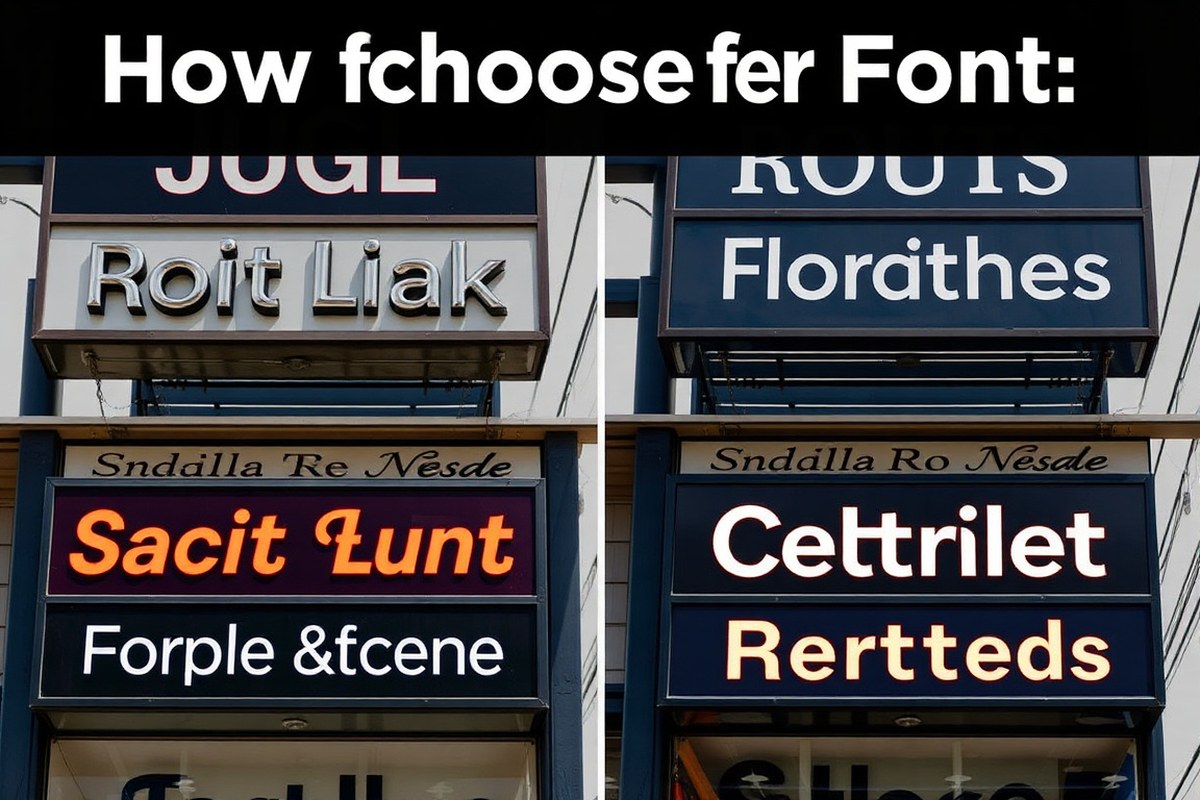
Effective fonts for signage focus first on legibility and readability, which means people can quickly understand them even from a distance or a glance. The core features that make fonts work well on signs include clean letterforms, sufficient stroke thickness, and proper spacing between characters. These elements help to prevent confusion and reduce eye strain, ensuring the message is clear and easy to read.
Stroke weight plays a major role in font visibility. Thick, clear strokes stand out better against various backgrounds and lighting conditions, making fonts like Helvetica and Impact commonly used for signs. Thin or delicate strokes often blur or fade, especially on outdoor signs exposed to sunlight and weather. Aim for medium to bold stroke weights depending on the size of the sign and viewing distance.
Letterform simplicity also matters. Fonts with straightforward shapes and minimal decorative details reduce visual clutter. Sans-serif fonts, which lack the small line extensions at the ends of characters, perform better for signs because their simple shapes maintain clarity at various sizes. Geometric sans-serif fonts like Futura and Montserrat provide a modern, clean appearance without compromising legibility. Avoid overly ornate or script fonts, which can be difficult to read quickly, especially from afar.
Spacing between letters affects how well each character stands out. Fonts designed for signage usually include generous letter spacing to prevent letters from blending into one another. Overcrowding text or using tight kerning can make even a clean font hard to read. Check how the font looks at your intended sign size and adjust letter spacing for balance and ease of reading.
Consistency in stroke width and proportion aids legibility too. Fonts with balanced, even strokes avoid drawing attention to one part of a letter more than another, which can slow reading speed. For example, a balanced font like Frutiger ensures each letter is clearly distinguishable without extra effort.
Choosing fonts with minimal variation in stroke contrast also helps maintain readability in different lighting or at different viewing angles. High contrast serif fonts look elegant but often lose clarity on large signs viewed from a distance. These are better reserved for smaller indoor plaques than large outdoor banners.
Good signage fonts also perform well across different colors and backgrounds. A simple, clean font combined with sufficient stroke weight and space ensures visibility even when placed over complex or colorful images. You can test font effectiveness by viewing a printed sample from your approximate sign viewing distance and checking for clarity without needing to focus hard.
Using fonts with these key features means your signs will communicate their message clearly, fast, and with little effort from viewers. That clarity saves time for your customers and helps your business make a strong, professional impression.
How to Match Fonts to Viewing Distance and Size Requirements
Matching font size to viewing distance is key for sign legibility. The main rule is to use 1 inch of letter height for every 10 feet of expected reading distance. This ensures people can read the sign quickly and easily from where they stand.
Standard Letter Size Guidelines
Standard practice for indoor and outdoor signs follows the 10-foot-per-inch rule: one inch of letter height covers approximately 10 feet of readable distance. For example, a sign viewed from 50 feet should have letters about 5 inches tall. This rule accommodates average eyesight and typical lighting conditions.
Letter spacing and color contrast also matter. Open letters with generous spacing and high contrast between text and background increase legibility. Avoid overly condensed fonts or tightly spaced words, as they reduce clarity at a distance.
Calculating Letter Height for Distance
Calculating the right letter height starts with determining the farthest viewing distance. Multiply that distance in feet by 0.1 to get the minimum letter height in inches. Then, adjust based on location, lighting, and font style.
For example, a sign viewed from 50 feet requires 50 x 0.1 = 5 inches letter height. If the viewing conditions are poor or the font is decorative, increase size by 10, 20% to maintain readability. Testing a mock-up at full scale helps confirm these calculations.
Adjustments for Multi-Line and Complex Signs
Multi-line signs need line spacing (leading) set at no less than 120% of the font size to avoid cramped text. For instance, 5-inch letters require at least 6 inches between lines to keep words distinct and readable. Maintain about 40% text coverage on the sign face, leaving 60% whitespace as margins to prevent crowding. For multi-line layouts, create a checklist before production:
- Determine maximum viewing distance and calculate minimum letter height using the 1 inch per 10 feet rule.
- Choose a clear, highly legible font designed for signage.
- Set letter spacing 5-10% wider than normal desktop defaults for large signs.
- Use line height at least 120% of letter height to separate lines.
- Check color contrast between text and background to maximize visibility.
- Ensure text occupies roughly 40% of the sign area, with 60% as whitespace.
- Print or simulate the sign at full scale for a visual check in expected lighting.
- Adjust size or spacing if any text seems difficult to read at the required distance.
Tip: Avoid script or decorative fonts for signs expected to be read from long distances, since their complex shapes reduce legibility even when sized correctly.
Choosing the Right Font Style: Sans-Serif, Serif, and Decorative
Choosing the right font style affects how easily people read your signs and the tone your message sends. Sans-serif fonts excel at clear communication, especially for outdoor or quick-read signs. Serif fonts suit formal or elegant signs where a classic look is desired. Decorative fonts can add personality but should be used sparingly and only when readability is not the top priority.
Sans-Serif Fonts for Maximum Clarity
Sans-serif fonts are the go-to choice for signs that demand high legibility. Their clean lines and simple shapes make letters easier to recognize from a distance or at a glance. This style avoids the small strokes or “serifs” at letter ends, preventing clutter and confusion, which matters most in busy environments, such as street signs or storefront signs.
Many regulations prefer or require sans-serif fonts for functional signage to maximize readability. Bold sans-serif fonts with minimal ornamentation stand out against backgrounds, especially outdoors. These fonts work well on wayfinding signs, directional signage, and any display read quickly or at high speed.
Serif Fonts for Formal and Elegant Signs
Serif fonts feature small decorative strokes at the ends of each letter, lending a traditional and refined appearance. They work best for interior signage, like restaurant menus, luxury boutiques, formal plaques, or house signs where viewers have more time to read. These fonts convey a sense of trust, sophistication, and class.
Despite being less legible than sans-serif fonts over long distances or at speed, serif fonts are quite effective for signs designed to attract closer attention. Use serif fonts in sizes large enough to maintain clarity, typically above 18 points, and in well-lit indoor spaces where fine details are visible.
Examples of effective serif fonts in signage include classic roman styles that create a timeless feel. Avoid using them for any outdoor or quick-read situations to prevent misinterpretation.
Decorative Fonts: When and How to Use
Decorative or script fonts offer a unique style but often sacrifice readability, especially from a distance or on quick-glance signs. Highly stylized fonts like Curlz MT or Jokerman lose clarity when viewed from afar or in motion, making them inappropriate for standard or safety signage.
Use decorative fonts only for artistic posters, event invitations, or branding elements where design impact is more important than quick legibility. When used, keep text size large, limit the number of words, and place these fonts where viewers have time to appreciate the style.
Avoid script and ornamental fonts for outdoor signs or any situation requiring fast comprehension, such as traffic signs or emergency exits. These fonts can confuse viewers and reduce sign effectiveness. Below is a comparison of serif, sans-serif, and script fonts highlighting their legibility and appropriate sign types:
| Font Style | Legibility | Common Use Cases | Pros | Cons |
|---|---|---|---|---|
| Sans-Serif | High (especially at distance) | Street signs, storefronts, wayfinding, outdoor signs | Clear, simple, meets regulations for functional signs | Less formal appearance |
| Serif | Moderate (best up close and indoors) | Formal plaques, luxury boutiques, restaurant menus, house signs | Elegant, classic, builds trust and sophistication | Less readable from far or at speed |
| Decorative/Script | Low (especially from distance or moving viewer) | Artistic posters, event signage, branding accents | Unique style, draws attention, adds personality | Poor readability, not compliant with many standards for safety or functional signs |
Choosing between serif, sans-serif, and decorative fonts depends on your sign’s purpose and viewing context. Prioritize sans-serif for clear communication in demanding conditions. Opt for serif fonts to convey elegance in slower-reading situations. Reserve decorative fonts for special cases that allow viewers time to engage with style over speed.
Which Fonts Work Best for Outdoor vs Indoor Signs?
Outdoor signs demand fonts that remain clear and legible from considerable distances and under shifting weather and lighting conditions. Bold-weight sans-serif fonts with open letterforms and generous spacing work best. These characteristics help letters stay distinct when viewed in bright sunlight, rain, or at night with reflective materials. Fonts like Clearview, designed for road signs, excel outdoors because they reduce visual strain by improving readability in low light and poor weather. Helvetica Bold, Arial Black, and Montserrat Bold are also strong choices for outdoor signage due to their clean shapes and thick strokes. Keep messages concise, as these fonts perform best with short text to maintain impact and legibility.
Indoor signage benefits from greater flexibility since lighting is controlled and viewing distances are shorter. Serif fonts such as Garamond create a sophisticated look where viewers have more time to absorb the information. For clearer readability inside, medium to bold weights are preferred, as lighter weights tend to disappear or blur from a typical reading distance. Sans-serif options like Helvetica and Arial are popular indoors for retail or office signs because of their clarity and familiarity. Indoor fonts can include more style variations and finer spacing, which might get lost or muddled outdoors under harsh conditions.
Font weight plays a key role in adapting signs to their environment. Outdoor signs need medium to extra bold fonts so letters maintain form against natural elements and distance. Indoor signs can use medium weights with tighter letter spacing since there is less competing glare and more controlled lighting. Wide letter spacing outdoors prevents letters from blending together under reflective surfaces or at night. High contrast between font color and background is essential both inside and out, but outdoor signs require materials and colors that withstand UV exposure and fading.
To optimize fonts for weather and lighting effects outdoors, choose those with durable strokes and consider reflective coatings or illuminated backing to extend visibility after dark. Signs viewed in shaded or partially lit outdoor spaces may need even bolder fonts or brighter colors than fully sunlit spots. Indoors, softer ambient lighting means you can opt for fonts with slimmer strokes and more decorative details without sacrificing legibility. Matching the font style to your brand’s message and environment ensures your signs not only attract attention but also convey information clearly and professionally.
How to Use Contrast and Color to improve Font Visibility
Color contrast is a key factor in font visibility on signs. Higher contrast between the text and its background makes words easier to read, especially from a distance or in poor lighting conditions. Without enough contrast, even the best fonts can become nearly invisible, which defeats the purpose of the sign entirely.
Contrast comes in two main types: positive and negative. Positive contrast uses dark text on a light background, while negative contrast features light text on a dark background. For daytime viewing, positive contrast often works best because natural light helps brighten the background. Conversely, negative contrast tends to be more effective at night or in low-light environments since illuminated light text on a dark background can stand out more sharply.
Choosing colors that complement your font starts with maximizing the difference in brightness (luminance) accessible to the eye. For example, black text on a white or pale yellow background offers very high contrast, easily readable from far away. Poor choices like medium gray text on a light gray background or blue text on a green background create low contrast and strain readers’ eyes. You want a contrast ratio of at least 70% brightness difference for most signs. Follow these best practices to improve font visibility through color and contrast:
- Use bold or heavy font weights to increase edge definition against the background.
- Pick complementary colors that are opposite in color wheel placement when color vision deficiency is not a concern (e.g., dark blue text on a bright orange background).
- Test your sign design in natural and artificial lighting before finalizing colors.
- Reserve all caps for headlines to improve legibility but avoid using them for long sentences.
- Keep backgrounds simple and free from patterns to prevent interference with letterforms.
- Consider reflective or illuminated backgrounds for night visibility with negative contrast text in light colors.
- Consult local guidelines or standard signage color charts to ensure your design meets visibility requirements.
Always verify that your text-to-background contrast passes accessibility and legibility tests under the actual lighting conditions where the sign will be installed.
Deciding between light text on a dark background or the reverse depends on where and when people will view your sign most. Dark text on a light surface usually fares better outdoors during the day because it works with natural sunlight. For indoor signs near entrance lighting or in places open at night, light-colored text on a dark backdrop is often more readable. Many brands use one or the other consistently across all signage to maintain a cohesive look while optimizing clarity.
Using a color contrast checker tool during your design process helps ensure that your font choice complements the background. This simple step can save money and frustration later by avoiding signs that do not stand out or that require frequent replacement. Signs with strong color contrast create a professional appearance, promote quick information absorption, and support your overall branding and marketing goals.
Avoiding Common Font Mistakes and How to Fix Them
Many signs lose their impact because of common font selection errors that reduce readability and clarity. Overly decorative fonts, fonts that are too small, and poor spacing between letters and words are typical mistakes that spoil effective communication. These errors can make your signage hard to read from the intended viewing distance, causing potential customers to overlook your message.
Decorative fonts like script or handwritten styles often look nice up close but become illegible at distance, especially on outdoor or roadside signs. Such fonts fail to maintain clarity on LED or digital displays where letter shapes must remain consistent across sizes. Small font sizes also limit visibility and can violate guidelines like the ADA, which requires legible signage with clear, simple fonts and adequate contrast.
Poor spacing, too tight or too loose, between letters (kerning) and words affects reading speed and comprehension. Crowded letters may blend into each other, while excessive gaps break word recognition. Font styles with fine details or thin strokes can disappear against bright or illuminated backgrounds, further harming readability. Use the following checklist to evaluate and correct common font mistakes on signs:
- Avoid decorative, script, or handwritten fonts for important text needing quick recognition.
- Ensure font size matches viewing distance, generally, 1 inch of letter height for every 10 feet of viewing distance.
- Use sans-serif fonts for most outdoor and LED signs to improve legibility.
- Maintain consistent and adequate spacing between letters; adjust kerning manually if possible.
- Choose fonts with simple, clear shapes and medium weight strokes for better visibility.
- Avoid thin or highly detailed fonts that lose definition on illuminated or reflective surfaces.
To fix spacing errors, increase or decrease letter spacing incrementally and view your sign at a realistic distance or scale mock-up. For size issues, resize text according to the recommended ratio, 1 inch of letter height per every 10 feet viewers will stand away. When style is the issue, switch to a clean, sans-serif font like Helvetica or Arial for outdoor signage, or select classic fonts like Garamond only for applications needing a historical or formal look. Testing your updated design in natural light and various viewing distances before fabrication helps ensure the font choice supports quick, easy reading.
Improvements result in signs that customers notice and understand faster, maximizing your branding impact. Signs with fixed font mistakes demonstrate uniform letter shapes, well-balanced spacing, and sizes tailored precisely to their environment. Signs failing these corrections typically confuse or lose viewers, weakening your message and wasting your sign budget.
Best Free and Paid Fonts for Different Signage Needs
Selecting the right font depends largely on your budget, the type of sign, and where the sign will be displayed. Free fonts like Open Sans, Mukta, and Source Sans 3 offer excellent legibility with open apertures and tall x-heights, making them ideal for interior signage, wayfinding, directories, and small business signs when you want to avoid licensing fees. For more specialized needs, paid fonts such as ITC Franklin Gothic or DIN 1451 provide superior style and are often used for technical or ADA-compliant signage, offering professional reliability and refined details that free versions may lack.
Sans-serif fonts dominate effective sign design because of their clarity and readability. Fonts like Helvetica, Arial, and Futura are classic choices, especially for outdoor and identification signs meeting ADA standards. Script fonts and overly decorative choices tend to fail on legibility, so focus on clean, straightforward designs for customer-facing or safety-critical signage. Consider your brand personality as well; for example, Bebas Neue and Montserrat provide a modern look that suits trendy retail or event signage.
| Name | Style | Free/Paid | Best Use Case | Pros | Cons | Font Licensing Tips |
|---|---|---|---|---|---|---|
| Open Sans | Humanist Sans-Serif | Free (Google Fonts) | Interior signs, directories, small business signage | High legibility, open apertures, no cost | Less distinctive for branding | Open license allows commercial use; verify embedding rights for sign production |
| Source Sans 3 | Humanist Sans-Serif | Free (Adobe Open License) | Interior wayfinding, budget sign systems | Tall x-height, open forms, accessible design compliant | May lack uniqueness for brand identity | Check Adobe’s license for commercial signage distribution |
| DIN 1451 | SANS-Serif (Engineering Standard) | Paid | Road signs, technical signage | Highly legible, crisp, functional | Less suitable for branding or decorative purposes | Purchase a commercial license; ensure use covers digital and physical signage |
| ITC Franklin Gothic | SANS-Serif | Paid | Professional sign design, ADA compliant signage | Complete font family, strong legibility | Cost ranges from $30, $100 per weight | Obtain full font license for multiple users and commercial reproduction |
| Montserrat | SANS-Serif | Free (Google Fonts) | Modern storefront signs, event posters | Popular, clean modern look, good for branding | Less readable at very small sizes | Open license for commercial use; verify compatibility with your sign production software |
| Bebas Neue | SANS-Serif (Display) | Free (Google Fonts) | Headline signage, storefronts, promotional signs | Strong impact, easy to read at large sizes | Not suitable for body text or small prints | Free for commercial use but confirm before mass production |
Fonts like Open Sans and Source Sans 3 provide accessible and license-friendly options for budget-conscious projects where legibility is key. Paid fonts such as ITC Franklin Gothic or DIN 1451 add polish and precision, preferred when signage requires strict compliance or brand consistency. Confirm the font license carefully to ensure you can legally reproduce the font in physical or digital signs, avoiding unauthorized use. This often means purchasing a commercial license covering the specific sign production techniques and distribution.
Choosing the right font involves balancing cost with visual impact and functionality. For example, a small café might use Open Sans or Sign Ron for a hand-painted look, while a corporate office should invest in ADA-compliant fonts like Helvetica or Franklin Gothic to meet accessibility standards and maintain professionalism. Consider the viewing distance, environment, and brand identity in your final selection to deliver clear, effective communication through your signage.
How to Match Fonts to Your Brand and Sign Type
Choosing fonts that align with your brand and the purpose of your sign ensures your message resonates clearly with your audience. Font styles communicate more than words alone; they reflect your business personality and guide customer expectations. Carefully matching font choices with brand identity and sign function helps create a coherent visual impression that supports your goals.
Fonts for Professional and Corporate Brands
For professional or corporate brands, fonts should project clarity, trustworthiness, and a polished appearance. Helvetica is a common choice because its clean lines and neutrality don’t distract from the message, supporting an image of reliability and efficiency. Classic serif fonts like Times New Roman or Garamond suit formal plaques, office signage, and upscale restaurant signs, where elegance and tradition matter.
Use a single, straightforward font to maintain professionalism and avoid confusing viewers. Such fonts help visitors quickly identify and trust your business without distraction, especially in legal, financial, or medical industries where serious tone is key. Pairing fonts that are too decorative or casual with these brands can create a mismatch, reducing credibility.
Fonts for Casual and Retail Businesses
Casual brands, such as cafes, boutiques, or creative studios, benefit from fonts that express friendliness or innovation. Fonts with playful curves or unique letter shapes add personality and create a welcoming atmosphere. For example, signage for hipster shops might use stylish, modern fonts that are eye-catching but still legible. Bold, chunky fonts work well for sportswear and streetwear brands, commanding attention and reflecting energy.
Matching your font style to customer expectations here is important. A casual business should avoid overly formal fonts that alienate its target audience. Instead, pick fonts that balance readability with your brand’s character, whether it’s quirky, trendy, or relaxed. Promotional signs often benefit from this approach, using more expressive fonts to draw interest but keeping text easy to scan quickly.
Fonts Suited to Wayfinding and Directional Signs
Wayfinding and directional signage require fonts that prioritize readability at various distances and speeds of sight. Sans-serif fonts like Helvetica and other geometric styles work best because they minimize clutter and maximize clarity. The purpose of these signs is to guide, so font simplicity directly impacts how swiftly viewers can read and comprehend the information.
For these functional signs, avoid decorative fonts that slow recognition or cause confusion. The font choice should match the context without conflicting with the overall brand style. For example, a modern office complex might use a clean sans-serif font for directional signs that complements its corporate branding, while a retail mall might use a more playful sans-serif font for an inviting feel.
Use one font consistently across all signage to reinforce brand identity and avoid visual clutter that confuses or deters customers.
Step-by-Step Action Plan for Choosing the Right Font for Your Signs
Follow these steps to pick fonts that boost visibility and align with your brand identity across all your signage.
- Before You Start: Identify where each sign will be placed (indoor or outdoor) and measure typical viewing distances. This sets the stage for selecting font styles and sizes that work.
- Day 1: Choose a font style based on the sign’s purpose, opt for sans-serif fonts for clear outdoor signs and serif or decorative fonts for indoor or decorative signs. Test readability from your measured distances.
- Day 2: Select font weight and size that maintain legibility at the target viewing distance. Print samples or create mock-ups to verify clarity.
- Day 3: Pick high-contrast color combinations between font and background. Use bright or neutral colors based on environment lighting and brand colors.
- Day 4: Check for any common font mistakes like overusing decorative fonts or tight spacing, then adjust kerning and letter spacing accordingly.
- Day 5: Align your font choice with your brand style guide or logo fonts to maintain consistency in customer perception.
- Day 6: Review your sign designs in various lighting conditions, both digital and physical samples, to confirm your fonts remain legible and on-message.
- After Installation: Solicit feedback from employees or customers about the sign’s readability and style and make tweaks if necessary during your next update cycle.
Frequently Asked Questions
What Font Weight Should I Use for Small Signs to Ensure Readability?
Use a medium to bold font weight for small signs to keep letters clear. Thin fonts can blur at small sizes, so choose weights that maintain stroke thickness for legibility.
Can I Use Script Fonts Effectively on Outdoor Signs?
Script fonts generally are not ideal for outdoor signs due to low legibility at a distance. They work better on indoor decorative signs where viewers can read closely.
How Do I Test Font Readability Before Finalizing a Sign Design?
Print a sample at actual size and view it from the typical reading distance. This helps confirm if the font is clear enough and the spacing feels balanced.
Are Mixed Font Types Recommended on a Single Sign?
Limit signs to two complementary fonts maximum to avoid clutter. Mixing serif and sans serif can work if styled carefully for a clean, professional look.
Does Letter Spacing Affect How Quickly People Read a Sign?
Yes, proper letter spacing (tracking) improves readability by preventing crowding or gaps. Adjust spacing to suit the font style and sign size for best results.
How Important Is Font Consistency Across Multiple Signs for a Business?
Consistent fonts reinforce brand identity and improve customer recognition. Use the same font family on all business signs for a unified, professional appearance.
Key Points to Remember
Choosing fonts carefully impacts how well your signs communicate and reflect your brand. Focus on visibility, style, and context to make smart font decisions that attract and inform customers. Start by reviewing your current signage and testing font readability at key viewing spots today.