How to Make a Warning Sign: Simple Steps, Templates, and Printing Tips
Knowing how to make a warning sign is essential for alerting people about hazards and keeping them safe. Start by choosing a clear, simple message paired with an easily recognizable warning symbol. Using templates and clear design principles helps ensure your sign quickly communicates the necessary caution.
Key Takeaways
- Pick a standard size like 8.5 × 11 inches to ensure the sign is readable from a distance.
- Select one of the 11 common warning sign templates based on the hazard level, such as Warning or Danger.
- Use no more than six lines of text for a clear, concise message on your warning sign.
- Choose warning icons from a set of over 45 symbols to visually reinforce your message.
- Use free online templates to speed up sign creation and guarantee professional design compliance.
- Print signs on durable materials like vinyl or weather-resistant plastic for outdoor use.
What Is a Warning Sign and Why Is It Important?

A warning sign provides a clear visual alert about possible dangers or unsafe conditions nearby. It aims to deliver straightforward instructions or advisories so people can identify risks and act to prevent harm or property damage. These signs often feature prominent headings, contrasting colors, and basic symbols to guarantee the information stands out and is grasped rapidly from a distance, commonly starting at dimensions like 8.5 × 11 inches or more.
Organizations use warning signs primarily to reduce the chance of harm in environments where hazards are present. Common users include safety officers, construction companies, facility managers, and regulatory bodies overseeing workplace safety. These signs are essential in areas like construction sites, parking lots, manufacturing facilities, chemical storage rooms, and any setting where risk factors such as moving vehicles, slippery floors, chemical exposure, or restricted access exist. Warning signs serve as clear, immediate signals that help prevent mistakes and guide behavior, which ultimately reduces liability and contributes to compliance with safety regulations such as OSHA.
The main goal of a warning sign is to inform people about a hazard and advise them how to avoid danger. This communication is critical because it guides workers, visitors, and the public to recognize risks before coming into contact with them. For example, a “Beware of Moving Vehicles” sign at a warehouse entrance warns pedestrians to stay alert and maintain a safe distance from forklifts and trucks. By clearly explaining hazards and safety measures, these signs promote awareness and encourage safer decision-making.
Creating a warning sign starts with choosing the correct type of message from standardized templates such as Warning, Caution, Danger, or Notice. These templates include space for a brief, six-line warning message paired with an appropriate symbol selected from a library of over 45 icons. Using professionally designed templates ensures consistency and clarity, helping maintain compliance with legal and safety standards. The cost of producing these signs varies depending on size, material, and printing method, but digital templates available online often provide a free starting point for small businesses and facility managers looking to create effective safety communications with minimal expense.
Different environments may require specific warning details or symbol variations depending on the nature and severity of the hazard. For instance, a construction site might need a “Restricted Area” warning with a high-visibility background, while a chemical storage room requires clear hazard pictograms and durability against corrosive substances. In any case, the best results come from making the sign easy to read, quickly understood, and strategically placed at points where people need the warning the most. Poorly designed or misplaced warning signs risk being ignored, increasing the chance of accidents or compliance failures.
What Essential Elements Must a Warning Sign Include?
Every effective warning sign must include several essential elements to capture attention quickly and communicate hazards clearly. Start with a bold headline that uses a word like WARNING or CAUTION. These words immediately signal the level of risk involved. The headline should be in uppercase letters, large enough to be seen from several feet away, typically at least 1 inch in height for standard workplace signs.
Next, add a clear symbol or pictogram that visually represents the danger. Using internationally recognized symbols helps overcome language barriers and speeds recognition. For example, a flame icon signals fire hazards, while a skull and crossbones warns of toxic substances. Place the symbol prominently near the headline to guide quick comprehension.
Instructional or explanatory text is the third critical component. This text explains the hazard and details the actions needed to stay safe, using simple, direct language. Keep messages short, ideally no more than 6 lines, and avoid technical jargon. Use bullet points or numbered lists for steps if necessary. Clarity ensures workers immediately understand the risk and response.
To improve visibility and compliance, include a border outline around the sign, typically in black. Color coding is important: warning signs usually have a yellow background with black text and symbols, aligning with OSHA and ANSI standards. This contrast improves legibility in varied lighting conditions.
- Bold headline in uppercase (e.g., WARNING, CAUTION)
- Recognizable safety symbol relevant to the hazard
- Concise message with clear instructions, no more than 6 lines
- High-contrast colors (yellow background, black text/symbols)
- Border outline around the sign to frame the message
- Durable materials and size appropriate to the viewing distance
A practical example of a headline and message for a chemical hazard could read: WARNING: HAZARDOUS CHEMICALS followed by a skull and crossbones symbol and the text Wear protective gloves and eyewear. Avoid inhaling fumes. This direct format gets the message across instantly and clearly.
Use short, punchy sentences and avoid redundancy. Test your draft sign by asking someone unfamiliar with the environment if they grasp the message quickly. Adjust wording or symbols based on their feedback. This approach helps prevent misunderstandings that could lead to accidents.
Ensure you follow local regulations and standards for your signs to avoid legal issues and maintain workplace safety.
How to Design a Warning Sign for Clarity and Compliance
Designing a warning sign that is both clear and compliant begins with understanding the core principles of visibility, symbol choice, and layout. Following a structured process ensures your sign communicates effectively and meets safety standards, reducing risk and liability.
Choosing Colors and Contrast for Visibility
Effective warning signs use high-contrast colors to grab attention quickly. Commonly, safety yellow or orange backgrounds with black text and symbols deliver the best visibility. These colors are recognized by OSHA and ANSI standards for hazard warning signs. Avoid using colors that blend with the surrounding environment or that do not stand out against the sign’s placement.
For text, use bold sans-serif fonts like Helvetica, Arial, or Futura in all caps to maximize readability from a distance. Fonts should be large enough to read at the expected viewing distance; typically, one inch of letter height corresponds to about 10 feet of visibility.
Selecting Symbols Based on Hazard Severity
Symbols clarify the type and severity of hazards without relying solely on text, which helps overcome language barriers. Use standardized pictograms as defined by OSHA or ANSI, such as an exclamation mark for general warnings or a skull and crossbones for toxic hazards.
Match the symbol to the level of hazard: moderate risks might use triangular warning symbols, while more severe hazards require a red danger header with a specific icon. Do not create custom symbols unless approved by regulatory guidelines, as this can cause confusion.
Layout Tips to Improve Readability
Arrange your sign’s elements with clear hierarchy: place the hazard symbol at the top or left, followed by a strong header word like “WARNING” or “DANGER,” then concise, simple text below. Use bullet points or short phrases rather than long sentences to speed comprehension.
Leave enough white space around text and symbols to prevent clutter. Avoid mixing too many colors or fonts that distract or confuse. Align text to the left for easier scanning, and make sure the sign is balanced visually to appear professional and trustworthy. Follow these steps to design your warning sign effectively:
- Identify the hazard severity to determine required sign type and symbols.
- Choose the primary background color based on OSHA colors: yellow for caution, orange for warning, red for danger.
- Select high-contrast font color (usually black) and a clear sans-serif font.
- Pick standardized pictograms that correspond to your hazard type and severity.
- Create a clear header with capitalized words like “WARNING” or “DANGER” for immediate recognition.
- Add concise text describing the hazard and necessary action or restriction.
- Adjust layout ensuring visibility from expected distances and avoid clutter.
- Review for compliance with OSHA or ANSI standards, and revise any ambiguous elements.
What Sizes and Formats Are Standard for Warning Signs?
Choosing the right size for a warning sign ensures it grabs attention from a safe distance and remains legible under expected viewing conditions. Indoor warning signs typically measure between 7 by 10 inches and 10 by 14 inches. These sizes are effective for hallways, equipment labels, and rooms where viewers are close, usually within 10 feet. Outdoor signs require larger dimensions, often starting at 12 by 18 inches to 18 by 24 inches or more, to remain visible and readable from farther distances such as parking lots, loading docks, or large industrial sites.
Sign size has a direct impact on placement. Smaller signs work best near the hazard or at eye level where people will naturally look within a few feet. Larger signs suit open spaces where viewers see them from 25 feet or farther. If you place a small sign too far from the hazard, it loses effectiveness because people cannot read the warning in time. On the other hand, oversized signs can be intrusive or costly in tight spaces and might not comply with facility standards.
File format choice matters significantly to keep text and graphics crisp when printing at various sizes. Vector formats like SVG, EPS, or PDF are best because they scale without losing quality. Raster images like JPEG or PNG may be fine for small or medium signs but can pixelate if printed too large. For example, if your sign is 7 by 10 inches, a high-resolution PNG at 300 dpi works well. For 18 by 24 inches or larger, choose a vector format or a very high-resolution file (at least 600 dpi).
The table below summarizes typical warning sign sizes, recommended viewing distances, and matching file format suggestions. It includes common usage scenarios to help pick the best option for your facility.
| Sign Size | Recommended Viewing Distance | Typical Use | Suggested File Format |
|---|---|---|---|
| 7 × 10 inches | 5, 10 feet | Indoor rooms, equipment labels | High-res PNG (300 dpi) or PDF |
| 10 × 14 inches | 10, 15 feet | Indoor corridors, small machinery | Vector (SVG, EPS, PDF) |
| 12 × 18 inches | 15, 25 feet | Outdoor areas, warning fences | Vector (SVG, EPS, PDF) |
| 18 × 24 inches | 25, 40 feet | Large outdoor spaces, parking lots | Vector (SVG, EPS, PDF) |
| 24 × 36 inches | 40+ feet | Warehouse entrances, construction sites | Vector (SVG, EPS, PDF) |
Choosing the right size and file format reduces printing errors and improves safety by making warnings clear and timely. Using scalable file formats like SVG or PDF helps you adjust sign dimensions easily without losing quality. For smaller signs, standard printers and sheet labels work well and keep costs low. Larger prints may need professional printing services, which offer materials suitable for harsh environments and long-term use.
How to Create a Warning Sign Using Free Online Templates and Tools
You can create a professional warning sign without special design software by using free online templates and sign-making tools. These resources let you customize text, colors, and symbols quickly, then save your designs for future use. Several websites offer downloadable templates that meet common safety sign standards.
Finding Reliable Free Sign Templates
Start by searching for free warning sign templates on trusted websites geared toward business or facility safety. Popular sources include Avery, which offers templates compatible with their printable labels, and sites like Canva or Creative Safety Supply that have free sign designs you can customize online. Look for templates with clear layouts featuring commonly required warning colors such as yellow or red backgrounds and black text or symbols.
Free templates from established vendors reduce the risk of missing essential design elements, like readable fonts or standard safety icons. You can download these templates in formats like PDF, JPG, or editable files for most online editors.
Editing Messages and Selecting Icons
Customizing your warning sign involves changing the default text and selecting appropriate symbols that match your specific hazard. Online tools let you click on text areas to type your message. Use concise, direct wording to maximize clarity. Many platforms also provide an icon library, where you can add universally recognized safety symbols like exclamation marks or electrical hazard images.
To maintain compliance, keep font styles simple and ensure high contrast between text and background. Avoid overcrowding the sign with too much information. Adjust font size so the sign is easy to read from a typical viewing distance, which may be between 5 and 10 feet for facility warning signs.
- Choose your template and open it in the online editor.
- Click on the text sections and type your custom warning message.
- Browse the icon library and drag relevant hazard symbols onto the sign.
- Adjust font size, color, and positioning to make the sign legible and visually balanced.
- Preview your design to check for spelling errors and clarity.
Choose symbols that are widely recognized to avoid misinterpretation and ensure your sign meets potential workplace safety requirements.
Saving and Exporting Your Custom Sign
Most free online sign makers allow you to save your work by creating a user account. For example, registering with Avery lets you store your designs, so you can edit or reorder prints without starting over. Saving your templates protects your investment of time and simplifies future updates when hazards change.
Export options usually include PDF for professional printing or image files like PNG or JPG for digital use. Check the resolution settings to ensure your sign prints clearly, typically 300 dpi or higher is sufficient for most signs.
- Create a free account on the sign-making platform to enable saving.
- Save your current design with a descriptive name related to its location or hazard.
- Download the sign in the format best suited for your printing method.
- Keep backups of your files on your computer or cloud storage.
- Reuse saved designs by opening them later to make minor adjustments if needed.
Which Printing Methods and Materials Work Best for Warning Signs?
Choosing the right materials and printing methods for warning signs depends on factors like durability, cost, and where you’ll use them. Outdoor warning signs need materials that resist weather, UV rays, and wear. Common materials include metal, vinyl, and plastic, each with different strengths for safety signage.
Metal signs, often made of aluminum, are very durable and weather-resistant. They can last 7 to 10 years outdoors without fading or cracking. Aluminum is rustproof and ideal for industrial or harsh environments but tends to be more expensive upfront, typically $25 to $50 for a standard 12×18 inch sign. Printing on metal usually involves screen printing or digital UV printing, offering sharp, long-lasting images and colors.
Vinyl signs are a cost-effective option for temporary or semi-permanent use. They cost about $10 to $30 for similar sizes and work well for short-term warnings or areas with less harsh exposure. Vinyl performs well when printed using solvent or eco-solvent printers, which create waterproof and UV-resistant signs. These signs generally last 2 to 5 years outside but can tear or fade in extreme conditions.
Plastic signs, such as those made from polyethylene or PVC, balance cost and durability. They typically last 3 to 7 years outdoors. Plastic is lighter than metal and can be more affordable, around $15 to $40 per sign. They often use screen printing or digital print methods. Plastic can crack in freezing temperatures or warp in heat, so consider climate when choosing this option.
Printing signs at home is possible using inkjet or laser printers on adhesive vinyl sheets or printable plastic films. This approach suits indoor or short-term signs since home printers can’t apply UV protection or industrial-strength inks. Professional printers offer more durable printing techniques, like lamination and UV curing, which extend sign life and weather resistance. Here is a comparison table to help decide based on your facility’s needs:
| Material | Durability (Outdoor) | Typical Cost per 12×18 Inch Sign | Best Printing Methods | Pros | Cons |
|---|---|---|---|---|---|
| Aluminum (Metal) | 7-10 years | $25-$50 | Screen printing, UV digital printing | Very durable, rustproof, professional look | Higher cost, heavier, requires professional printing |
| Vinyl | 2-5 years | $10-$30 | Solvent, eco-solvent printing | Low cost, flexible, waterproof | Less durable, prone to tearing and fading |
| Plastic (PVC, Polyethylene) | 3-7 years | $15-$40 | Screen printing, digital printing | Moderate cost, lightweight, stable color | Can crack or warp in extreme temperatures |
| Home-Printed Vinyl | Indoor/short-term | $5-$15 (materials) | Inkjet or laser printing on printable vinyl sheets | Very low cost, quick production | Low durability, no industrial UV protection |
Maintenance also influences sign longevity. Regular cleaning with mild soap reduces dirt buildup that accelerates wear. For metal and plastic signs, inspect for fading or damage every 6 to 12 months. Vinyl signs might need replacement sooner in direct sunlight areas. Adding clear protective laminates or UV coatings during printing can help extend life but increases cost.
A professional printing service typically offers better weatherproofing, consistent colours, and longer durability versus printing signs at home. Use home printing mainly for indoor-only or temporary warnings. For critical safety signage outdoors, invest in durable materials like aluminum or thick plastic with proven printing methods.
What Are the Different Severity Levels in Warning Signs?
Warning signs are classified into different severity levels, commonly Danger, Warning, and Caution, to communicate the risk and urgency of a hazard. Choosing the right level depends on how serious the potential injury or damage could be. The severity level affects the wording and design, ensuring people understand the risk clearly and respond appropriately.
Warning vs. Danger: Definitions and Uses
Danger signs indicate the highest level of risk and are used when immediate hazards present a high probability of death or serious injury. These signs typically feature a red header labeled “DANGER” along with strong, direct language. For example, “DANGER: High Voltage, Risk of Electrocution” warns workers to stay away from electrical equipment that can cause fatal shocks. Use Danger signs only for hazards that require immediate attention and strict compliance to avoid severe consequences.
Warning signs communicate a moderate risk level that could result in serious injury but not usually death. These signs have an orange header with the word “WARNING.” Phrasing generally includes clear, firm instructions like “WARNING: Flammable Materials, No Open Flames.” They fit situations where hazards exist but the risk is somewhat less immediate or life-threatening than those tagged with Danger signs. Choosing Warning over Danger helps prevent desensitization from overuse of the highest-level signs.
Caution Signs and Common Scenarios
Caution signs address lower-risk hazards that might cause minor or moderate injuries, like slips, cuts, or bruises. These signs have a yellow header marked “CAUTION.” Their messages balance firmness with clarity, such as “CAUTION: Wet Floor” or “CAUTION: Low Overhead Clearance.” Caution signs suit environments where hazards are less severe but still deserving attention to avoid accidents.
The decision to use Caution signs often depends on frequency and likelihood of injury and the hazard’s nature. For example, in warehouses, a caution sign for “Caution: Forklift Operating” alerts personnel to stay alert without overstating danger. Use caution signs where injuries are possible but unlikely to be fatal or cause permanent disabilities. The tone remains instructive rather than alarming to encourage safe behavior without panic.
Examples of Severity-Based Messages
Matching the message’s tone and detail to severity improves compliance and reduces confusion. Danger messages should be concise, commanding attention immediately. An example: “DANGER: Confined Space, Authorized Personnel Only.” This signals an urgent, restricted area requiring protective measures.
Warning signs need to balance urgency with information. An instance is: “WARNING: Chemical Hazard, Wear Protective Gear.” It informs workers of potential danger while instructing specific precautions. The wording is less alarmist but clear.
Caution sign wording usually suggests precaution rather than prohibition. For example, “CAUTION: Slippery Surface, Walk Carefully” advises awareness and gradual action. Using polite but firm language fits lower-risk hazards where the goal is reducing accidents through attentiveness.
To decide the proper severity level, assess the hazard’s potential outcome, likelihood, and the environment. Serious injury or death calls for Danger. Moderate injury but serious enough for special handling uses Warning, and minor injuries or irritations typically require Caution. Selecting the correct severity prevents unnecessary alarm or complacency, making signs effective safety tools.
How to Print and Install Your Completed Warning Sign Safely
Printing your warning sign correctly and installing it in the right spot ensures it catches attention and keeps people safe. Use a high-resolution file (at least 300 dpi) when printing either at home or through a commercial service. For home printing, use heavy-duty cardstock or weather-resistant printable vinyl sheets to resist outdoor conditions. Commercial printers typically use durable materials like aluminum or thick plastic with reflective coatings suitable for long-term outdoor use.
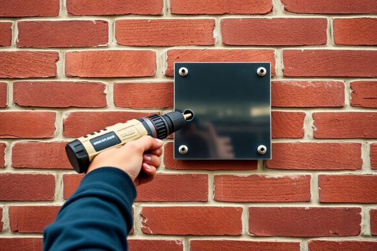
Before installation, gather the essential tools: a drill or screwdriver, screws or bolts compatible with your mounting surface, a level, a measuring tape, and anchors if mounting on drywall or masonry. Location matters for visibility and compliance. Generally, place signs between 5 and 7 feet above ground level, centered at eye level, and near the potential hazard or entry points where people will notice them quickly. Outdoor signs should resist sun exposure and weather, so consider mounting under eaves or using UV-resistant materials. Follow this checklist and steps to print, prepare, and install your warning sign safely:
- Check the design file resolution: Confirm the design is at least 300 dpi to avoid blurry prints and set the size according to the location’s standard dimensions.
- Select proper printing material: For indoor signs, use heavy cardstock or durable plastic; for outdoor, choose weatherproof vinyl or metal with reflective surfaces.
- Print a test copy: Print a draft on regular paper to check colors, text legibility, and size placement before the final print.
- Cut and prepare the sign: Trim edges neatly, add any protective laminating film if print durability is a concern, especially in harsh environments.
- Mark the installation spots: Use a measuring tape and level to position where the sign will be most visible, typically 5 to 7 feet off the ground near the hazard or access point.
- Drill pilot holes or use anchors: For masonry or drywall, install wall anchors before securing the sign; for wood or metal, pilot holes prevent splitting.
- Attach the sign securely: Use screws or bolts matching the mounting surface; ensure the sign is flush and level to avoid damage and improve readability.
- Inspect the installation: Verify the sign is firmly in place and visible from typical approach paths; adjust if any glare or obstruction occurs.
Make sure to wear safety goggles when drilling and use a sturdy ladder to reach placement heights safely.
Step-by-Step Action Plan for Creating Your Warning Sign
Use this plan to make your first effective warning sign that meets safety standards and clearly communicates hazards.
- Before you start: Identify the specific hazard and required warning level to determine sign content and severity. Confirm compliance needs with OSHA or local regulations.
- Day 1: Choose your warning sign template from a reputable free online tool. Select a design with clear symbols and required text fields.
- Day 2: Customize the sign using the tool. Include the hazard symbol, signal word (e.g., WARNING), concise hazard description, and necessary instructions. Ensure text is readable from the expected viewing distance.
- Day 3: Select appropriate size and format based on installation location and visibility requirements. Check that the sign meets minimum size standards for legibility.
- Day 4: Choose durable printing material such as weather-resistant vinyl or aluminum for longevity in your environment.
- Day 5: Print a test copy to check colors, text clarity, and symbol accuracy. Adjust as needed before final printing.
- Day 6: Print the final sign using your chosen method. Inspect for any flaws or fading before installation.
- Day 7: Install the warning sign at the hazard site at eye level and secure it firmly. Confirm it is easily visible and unobstructed from common lines of sight.
Frequently Asked Questions
How Do I Choose the Right Symbol for a Warning Sign?
Pick a symbol that clearly represents the specific hazard. Use high-contrast, simple icons for immediate recognition by all viewers.
Can I Customize Warning Sign Templates for My Specific Facility Needs?
Yes, most templates are editable so you can add your message and select from over 45 icons. Customizing increases relevance and compliance.
What Colors Should I Use to Make a Warning Sign Effective?
Use high-visibility colors like yellow, orange, or red with contrasting text to grab attention and communicate risk levels.
How Often Should I Update or Replace Warning Signs?
Replace signs whenever they show wear or if hazards change. Clear, current signs maintain safety compliance and effectiveness.
Can I Create a Warning Sign Without Graphic Design Experience?
Yes, online tools with free templates make it easy to create professional-looking signs without design skills.
What’s the Best Location for Installing a Warning Sign?
Place signs where hazards are visible and at eye level. Consider traffic flow and lighting to ensure maximum visibility.
Final Thoughts
Creating a compliant and clear warning sign protects people and helps your facility meet safety requirements. The key is matching the sign’s message and format to your specific hazard. Start by defining the risk and use online tools to ensure your sign is both visible and correct. Take action now by selecting a template and drafting your first warning sign tailored to your workspace.