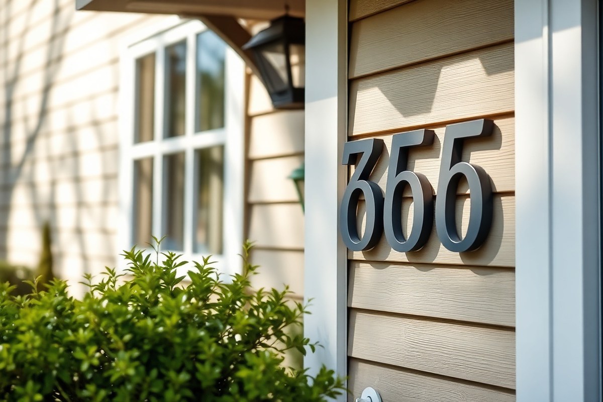
How Big Should House Numbers Be: A Complete Guide to Perfect Size and Visibility
How big should house numbers be depends mostly on how far your home is from the street. Generally, numbers should be at least 4 to 6 inches tall for easy visibility. Larger sizes are best for homes set back more than 70 feet, ensuring visitors and emergency responders can see them clearly. Start by measuring the distance from the street to where you’ll place your numbers; this distance guides the minimum size for readability.
Key Takeaways
- Choose 4-inch numbers for houses located up to 50 feet from the street to ensure they are easy to see.
- Increase house number size by 1 inch for roughly every extra 10 feet of setback beyond 50 feet.
- Place numbers at eye level, about 4 to 5 feet above ground, to optimize viewing angles.
- Choose contrasting colors between numbers and backgrounds to improve legibility from a distance.
- Check local codes, as some require a minimum number height or illumination at night.
- For multi-story or multi-unit buildings, numbers should be at least 6 inches tall for quicker identification.
How Big Should House Numbers Be for Maximum Visibility?
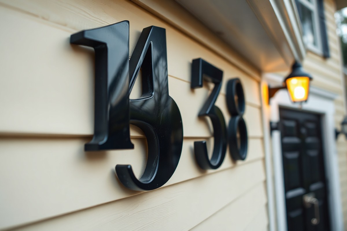
The best height for house numbers depends mainly on how far your home sits from the street. Use this guideline: take the distance from the street in feet and divide by 10 to find the minimum height in inches for your house numbers. For instance, a house 50 feet away from the street should have numbers at least 5 inches tall. This size helps visitors, delivery drivers, and emergency responders spot your home more easily.
This calculation aligns with many fire codes and local standards, which often require numbers to be at least 4 inches tall on single-family homes. However, when the setback exceeds about 70 feet, your numbers should increase to 5 or 6 inches or more to maintain legibility. For instance, a house 100 feet away from the road should have numbers at least 10 inches tall according to this rule. Numbers smaller than this can become difficult to read from the street, especially under low light or adverse weather conditions.
Most residential properties with standard front yard setbacks between 30 and 70 feet can use numbers around 4 to 6 inches tall. This size range balances visibility and aesthetic fit on typical home facades. Numbers under 3 inches usually won’t be easily visible beyond 30 feet, while numbers larger than 8 inches are generally reserved for properties with long driveways or commercial buildings where the viewing distance is significantly greater.
It’s also important to consider the stroke width of the numbers, which should be at least half an inch to support clear readability alongside the height. Contrast with the background color and placement at eye level, usually between 4 and 5 feet above ground, further improve visibility. Using this setback-to-height rule helps you pick a size that meets both these visibility needs and local requirements.
Applying the formula to your property is straightforward: measure the distance from the street to the front door or mailbox, divide that number by 10, then round up to the nearest whole inch. This result gives a reliable minimum height for your house numbers. Choosing a size larger than the minimum is fine and often better for visibility, but excessive size may overpower the design of your home’s exterior.
What Local Codes and Fire Regulations Say About Number Size

Most local building and fire codes require house numbers to be at least 3 to 6 inches tall, depending on the region and property type. Illumination and visibility rules also play a role, especially in states like Massachusetts where illuminated numbers are mandatory. To comply, you need to check your city or county regulations, measure the setback from the road, and choose numbers that meet both height and stroke width standards.
Minimum Size Requirements by Region
The International Building Code sets a baseline minimum height of 4 inches for single-family residential numbers, with a stroke width of at least 0.5 inch. Chicago’s municipal code, for example, requires house numbers on residences to be no less than 3 inches tall, but stores and commercial buildings must have numbers at least 6 inches high. Massachusetts demands a minimum of 4-inch tall numbers, plus the added rule that numbers be illuminated at night.
Macon County, Illinois allows numbers as small as 3 inches, but many states follow the 4-inch minimum rule from the International Building Code. Some fire codes use setback-based sizing: homes within 50 feet of the road can use 4-inch numbers, while those further back need larger sizes, often reaching 8 to 10 inches for long driveways. Multi-family buildings typically require at least 6-inch numbers for unit identification, while commercial properties usually must have numbers 8 inches or taller.
Illumination and Night Visibility Rules
Illuminated or reflective house numbers are mandatory in some localities, mainly to boost visibility during night hours or low-light conditions. Massachusetts specifically requires illumination for residential numbers to ensure emergency responders can easily identify homes after dark. In other areas, illumination is recommended but not legally required.
Reflective numbers or backlit designs satisfy most night-visibility standards. If your area has no clear rule on illumination, installing a small exterior light specifically focused on your house numbers can prevent fines and improve safety. Check your local fire department or building code website for specific guidance on illumination requirements.
How to Verify Your Compliance
Start by searching your city or county codes using terms like “[your city] house number ordinance” or “[your city] address number requirements.” The official municipal or county website often provides downloadable PDFs or online resources with detailed rules. Be sure to measure both the height and stroke width of your numbers, then compare these to the minimums set in your local regulations.
A useful approach is to apply the 1-inch-per-10-feet rule for legibility. Measure the distance between your house number and the street, then choose number height accordingly, ensuring it never falls below your local code minimum. Contact your local fire marshal or building department directly if the code language is unclear or if your property has unusual conditions such as a long driveway.
Consequences of Non-Compliance
Failing to meet local house number codes can lead to penalties ranging from fines to orders to replace your numbers. More importantly, poorly sized or non-illuminated numbers can delay emergency services, putting your safety at risk. Some fire departments may require a second address marker at the driveway entrance if your home is set back too far or numbers are unreadable from the street.
Meeting and exceeding local minimums ensures your property is properly identified in emergencies and helps avoid inspections or code violation notices. Compliance may also impact insurance claims if your home cannot be promptly located due to inadequate numbering.
Confirm minimum size and illumination rules with your local fire department early to avoid costly replacements later.
How Viewing Distance Directly Influences Ideal Number Size
Choosing the right size for house numbers depends heavily on how far your home is from the street. Numbers that are too small become difficult to read from the road, while those that are properly sized improve visibility and safety, especially for visitors and emergency responders. The Los Angeles Fire Department uses a simple formula to calculate the ideal height of house numbers based on the distance, or setback, from the street: Height in inches = (distance in feet ÷ 10) + 2.
For example, if your house is 30 feet from the street, the calculation is (30 ÷ 10) + 2 = 5 inches tall. At 150 feet, it becomes (150 ÷ 10) + 2 = 17 inches. This shows how setback distance directly increases the necessary size of your house numbers. Smaller numbers, such as 4 or 5 inches, work well for close set distances up to 50 feet, but you need larger numbers when the house sits farther back.
The table below summarizes recommended number heights based on various setback distances, reflecting common local guidelines and the LAFD formula approach. This table can serve as a quick reference when selecting your numbers.
| Distance from Road (feet) | Recommended Number Height (inches) |
|---|---|
| Up to 50 feet | 4 inches |
| 51 to 100 feet | 6 inches |
| 101 to 150 feet | 8 inches |
| 151 to 200 feet | 10 inches |
| 201 to 300 feet | 12 inches |
| More than 300 feet | 18 inches |
To apply the formula on your own, start by measuring the setback from the street curb or edge of the road to your house entrance or mailbox. Divide this distance by 10, then add 2 inches to the result. This calculation helps ensure your house numbers remain readable from the street. For example, a 100-foot setback results in (100 ÷ 10) + 2 = 12 inches, which is generally larger than the sizes suggested for shorter distances.
Setbacks beyond 100 feet call for significantly taller numbers. At distances over 150 feet, 8 to 12 inch high digits are more visible, with numbers increasing up to 18 inches or more for extreme setbacks over 300 feet. These larger sizes compensate for the longer viewing distance and reduce the chance of misreading your address.
Ignoring these guidelines may lead to numbers too small to be seen clearly, especially under low-light or poor contrast conditions. This can cause delays for deliveries, visitors, or emergency responders trying to find your home. Spending a few extra dollars on larger numbers based on your home’s setback avoids frustration and improve safety.
How Font, Stroke, and Color Contrast Affect Readability
Bold fonts, thick strokes, and high color contrast play as important a role as size in making house numbers easy to read. Proper font choice and stroke width improve legibility, while contrasting colors ensure numbers stand out under various lighting conditions. These factors combined extend how far away your house numbers can be seen.
Which Fonts Improve Number Legibility
Choose fonts designed for clarity and simplicity. Sans-serif fonts like Arial, Helvetica, and Futura provide clean, modern shapes with minimal decoration. These fonts avoid extra curves or flourishes that can blur at a distance. For a classic look, fonts like Franklin Gothic or Gotham bold offer thick strokes and good spacing that help distinguish characters clearly.
Avoid script or highly stylized fonts. Thin or fancy fonts reduce readability, particularly from the street. Look for fonts labeled “bold” or “extra bold” to ensure sufficient thickness.
Recommended Stroke Width for Visibility
Stroke width impacts how clearly each number stands out. Aim for stroke widths that occupy about 15% to 20% of the total numeral height. For example, if your house numbers are 4 inches tall, the stroke width should be roughly 0.6 to 0.8 inches wide. Thicker strokes reduce blurring from distance and bad lighting.
Numbers with strokes thinner than 10% of their height tend to fade into the background or become unreadable in dim conditions. Very thick strokes over 25% can appear blocky and reduce character recognition, so balance is key.
Choosing High Contrast Color Combinations
Contrast between your house numbers and the mounting surface is important. Dark numbers on a light background or light numbers on a dark surface create the sharpest visibility. For instance, white numbers on dark navy, black numbers on cream, or bright yellow numbers on dark green all maximize contrast.
Consider your house paint color when selecting number colors. Your medium brown siding pairs well with cream or white numbers, which stand out clearly. On light gray or beige siding, solid black or deep blue provides good contrast. Avoid colors too close to your siding’s hue or that blend in under poor lighting.
Can Contrast Compensate for Smaller Numbers?
High contrast can somewhat extend the readable distance of house numbers, allowing you to use slightly smaller numbers without sacrificing visibility. For example, a 3-inch number in bright white against a black background might be as legible from 20 feet as a 4-inch size with low contrast. However, contrast does not fully replace size.
When numbers are too small, even the highest contrast fonts become difficult to discern from the street. Use contrast to optimize visibility but follow minimum size guidelines based on your viewing distance for best results.
- Select sans-serif fonts like Arial, Helvetica, or Futura bold for clear shapes
- Use stroke widths around 15-20% of the number’s height for balanced boldness
- Match number color to contrast sharply against your house siding (light on dark or dark on light)
- Avoid thin, script, or highly stylized fonts for street-facing numbers
- Use color combinations tested outdoors, ensuring visibility under varying lighting
- Combine size and contrast, use larger sizes when mounting further from street or behind landscaping
- Consider reflective or illuminated numbers if visibility at night is needed
Troubleshooting Poor Readability
Low contrast between numbers and siding often looks good but reduces legibility. Your medium-toned house paint will cause numbers of a similar color to blend in and become hard to see from a distance. Fix this by applying numbers in a contrasting color panel or mounting plate.
Thin fonts or numbers with uneven stroke widths can look decorative but create shadows or unclear edges when sunlight hits them. Choose bold, uniform stroke widths to ensure numbers stay crisp in sunlight and shade.
Where and How to Mount House Numbers for Best Visibility
Mount house numbers at a height between 4 and 6 feet above the ground for ideal visibility from the street. Positioning them around eye level makes them easier to spot for drivers and pedestrians. Mounting numbers too low or too high can reduce their effectiveness, especially when viewed from the curb.
Placing numbers on the facade near or above the front door is the most common and effective choice. This area often has architectural features like trim or a porch light that naturally draw attention to the numbers. Align numbers vertically or horizontally with these features to maintain a balanced look and avoid visual clutter. For smaller homes, keep numbers proportional to the entryway size to maintain aesthetic harmony.
Numbers mounted on mailboxes or gates can work well but often face space constraints limiting their size to about 4 inches (100 mm). Mailbox numbers usually require reflective materials or additional lighting to remain visible at night. Gate numbers offer a unique placement but may need to be larger or paired with lighting due to their distance from the street and potential visual obstructions.
Proper lighting is essential for nighttime visibility. External light sources like porch lights or dedicated fixture-mounted spotlights directly above or below the numbers greatly improve legibility after dark. Alternatively, backlit or LED-integrated numbers provide consistent illumination without extra fixtures. Reflective paint or materials also help but rely on vehicle headlights or street lighting, which can be uneven or insufficient.
- Mount numbers 4 to 6 feet above ground for optimal street visibility
- Place numbers near or above the front door for best architectural integration
- Limit mailbox numbers to about 4 inches due to space constraints
- Use external porch lights or spotlights on numbers for night visibility
- Consider backlit or LED house numbers for consistent illumination
- Ensure numbers contrast with the background for day and night clarity
- For gates, combine size and lighting to overcome distance and obstructions
Size and placement decisions are linked; larger numbers demand more space and different mounting methods. For example, oversized numbers placed too high might be harder to read at night if lighting isn’t adequate. Balance between size, location, and lighting ensures maximum effectiveness.
Keep screws and mounting hardware secure to prevent numbers from loosening or falling, especially in exposed outdoor locations.
How to Accurately Measure and Visualize Number Size Before Buying
Measuring the space intended for house numbers and visualizing their size helps ensure the numbers fit well and remain clearly visible. Using simple tools and a few practical techniques lets you preview how different sizes will look before purchasing. Taking these steps avoids costly mistakes and helps pick numbers that complement your door or facade perfectly.
Measuring Available Space on Different Surfaces
Start by measuring the height and width of the area where you plan to mount the house numbers. For example, if placing numbers on a front door or surrounding facade, note the clear, unobstructed space around the intended spot. A typical front door frame measures about 36 inches wide by 80 inches tall, but the available mounting space is often much smaller. Measuring this space defines the maximum number size that will fit comfortably without looking cramped.
Use a tape measure or ruler, hold it straight against the surface, and record both height and width in inches. For garage doors or walls, measure similarly and consider whether numbers will be centered or offset. Keep local rules in mind, as minimum sizes may vary. Knowing the precise area helps avoid ordering numbers too large or too small for the space.
- Find a tape measure or ruler that clearly shows inches.
- Identify the exact spot intended for mounting numbers (e.g., door, sidelight, garage wall).
- Measure the width of the free space horizontally, noting the smallest width if areas are irregular.
- Measure the height of the free space vertically starting from the lowest mount allowed.
- Record both measurements clearly on a piece of paper.
- Repeat measurements in case of uneven surfaces or angled installations.
Creating Paper or Cardboard Number Templates
Cutting paper or cardboard templates to the size of prospective house numbers offers a tactile way to test fit and visual balance. This method shows how different sizes and fonts will look on your actual surface without buying anything first. It’s also easy and inexpensive, requiring only materials you likely have on hand.
To make templates, draw rectangles on paper matching the height and approximate width of the numbers you want. Then cut out these shapes and attach them to your surface with painter’s tape. Step back to view the layout from different angles and distances. Adjust the size or spacing as needed before buying actual numbers.
- Gather paper or lightweight cardboard, scissors, pencil, and painter’s tape.
- Consult the number size options you’re considering (e.g., 4 to 8 inches tall).
- Draw rectangles on paper matching height and estimated width of those numbers.
- Cut out the rectangles carefully along the lines.
- Tape the cutouts individually or spaced as numbers will appear.
- Check how the size looks at eye level and from the approximate viewing distance.
- Adjust size or spacing and repeat as necessary for best visual balance.
Using Digital Tools to Preview Number Sizes
Several smartphone apps and augmented reality (AR) tools let you overlay virtual house numbers on your door or wall. Using these applications provides a quick way to simulate different sizes, fonts, and placements without any physical setup. Most AR apps are free or cost a few dollars and do not require special equipment.
After downloading an AR app that supports size simulation, open the app and point your phone camera at the intended mounting area. Select house numbers from the app’s catalog, then adjust the size and style to see how it fits. This method is especially useful for irregular surfaces or multi-unit buildings where precise placement matters.
Digital previews reduce guesswork, allowing realistic visualization under varying light and viewpoint conditions. Keep in mind, lighting and screen size may slightly affect perception, so combine this with physical templates for the most accurate result.
- Search your app store for “augmented reality house number planner” or similar terms.
- Download and install a well-reviewed app that allows size customization.
- Open the app and grant necessary camera permissions.
- Aim your phone at your door or wall where numbers would go.
- Choose the house number style or font you like within the app.
- Adjust the size until it fits well within your previously measured space.
- Walk away and view from various distances to confirm visibility.
- Use screenshots or photos to share with vendors or family for feedback.
Typical Size Differences for Residential, Commercial, and Multi-Unit Buildings
House number sizes vary significantly between residential, commercial, and multi-unit buildings due to differences in visibility needs, setback distances, and safety regulations. Commercial properties often require larger numbers because emergency responders must quickly locate a building from greater distances and at higher traffic speeds. Residential properties usually have shorter setbacks, allowing for smaller numbers while maintaining visibility.
Multi-unit or apartment buildings face challenges with space limitations and the need to differentiate between units clearly. Numbers here tend to be smaller than commercial ones but need to remain legible at hallway or driveway distances. Often, a combination of building numbers and unit identifiers is necessary for clarity. Using a consistent size hierarchy helps: larger numbers for the building, smaller but clear numbers or letters for individual units.
| Building Type | Typical Number Size (inches) | Setback Distance (feet) | Notes |
|---|---|---|---|
| Residential | 4, 6 | 10, 40 | Smaller sizes work when setback is short; standard two- or three-digit format. |
| Commercial | 8, 18 | Within 40 to 80+ | Fire codes demand 8-inch minimum near street, increasing with setback; larger buildings need bigger digits. |
| Multi-Unit Residential | 3, 6 (unit); 6, 8 (building) | Varies | Building numbers often larger for visibility; unit numbers smaller due to limited space and close viewing distance. |
| Rural or Expansive Properties | 10+ | Variable (often 50+) | Larger sizes help visibility on fast roads and large walls. |
For multi-unit properties, label the main building number prominently at entrances using digits 6 to 8 inches tall. Individual unit numbers can be smaller, typically 3 to 6 inches, displayed on doors or mailboxes. Use contrasting colors and simple fonts for clarity. Avoid crowding numbers together; separate unit identifiers with spacing or prefixes like “A” or “#” to prevent confusion. This approach balances visibility with limited space and complies with typical fire safety standards.
Choosing too small numbers for commercial buildings risks delayed emergency response, while overly large residential numbers can be costly and visually overwhelming. Assess your property’s setback, sight lines, and local regulations before deciding. Commercial properties near busy roads generally require numbers at least 8 inches high, while residential homes with closer street access can use 4- to 6-inch digits effectively. Multi-unit complexes benefit from hierarchical numbering, making it easier for visitors and responders alike to navigate.
Common House Number Size Mistakes and How to Fix Them
Choosing the wrong size for house numbers causes major issues, especially during emergencies. Numbers that are too small become invisible from the street or driveway, delaying emergency responders. On the other hand, numbers that are excessively large can overwhelm your home’s façade and disrupt curb appeal, sometimes violating local aesthetic guidelines.
Another frequent mistake is poor contrast. Numbers that blend with the background or have insufficient illumination hinder readability, particularly at night. Placement errors also obstruct visibility; mounting numbers too high or too low, or placing them where landscaping or architectural features block sight lines, reduces their effectiveness. Here are common size and placement mistakes along with direct fixes that improve visibility and ensure compliance:
- Using numbers smaller than 4 inches in height; increase to at least 6 inches for clear distance visibility.
- Failing to check local code minimum sizes; always verify and meet or exceed these standards.
- Mounting numbers without contrasting colors; add paint or background panels for strong contrast.
- Installing numbers on uneven or textured surfaces that impede legibility; choose smoother mounting locations or use raised numbers.
- Positioning numbers where plants or ornaments block sight lines; trim or relocate obstructions.
- Ignoring lighting needs; install external lighting or choose reflective materials to ensure night visibility.
Retrofitting numbers often requires removing old fixtures and repainting or prepping the surface, which can cost between $20 to $100 depending on materials. Professional installation might add $50 to $150 but guarantees secure mounting. The best results show numbers that are easy to read from typical passersby or emergency vehicles, ensuring identification within a few seconds.
Make sure your house numbers are visible from the street day and night, contrast and proper illumination are as important as size.
Choosing the correct size paired with clear contrast and strategic placement prevents emergency delays and improve your home’s overall presentation. A balance between functionality and curb appeal makes this small investment valuable and practical. For multi-unit buildings or homes with specific architecture, consider customizing size and style to harmonize with surroundings while maintaining visibility standards.
Step-by-Step Action Plan for Choosing and Installing House Numbers
Use this plan to select house numbers that are easy to see, code-compliant, and fit your home’s style. Follow the steps in order to avoid common issues and ensure a smooth installation.
- Before you start: Check your local building and fire codes for house number requirements. Confirm size, placement, and contrast rules to avoid fines or safety issues.
- Day 1: Measure the typical viewing distance from your street or driveway to your house to determine the minimum height for your numbers. Numbers generally should be at least 4 to 6 inches tall for 20 to 30 feet viewing distances.
- Day 2: Choose a font with clear strokes and high contrast colors against your wall or mounting surface. Test visibility by printing mock-ups and viewing them at the actual distance.
- Day 3: Decide on the best mounting location, such as near the front door or mailbox, at eye level and in unobstructed sight lines. Use clean, flat surfaces for easy attachment.
- Day 4: Purchase house numbers in the confirmed size and style. Ensure materials are weather-resistant for your climate.
- Day 5: Install the numbers using appropriate fasteners or adhesive. Double-check alignment and secure attachment.
- After installation: Observe the numbers at different times of day and under various lighting. Adjust lighting or re-mount if visibility is poor.
- Within one month: Confirm that your numbers meet local regulations by requesting a simple inspection or reviewing official guidelines again.
Frequently Asked Questions
What Size House Numbers Work Best for Homes on Lengthy Driveways?
For homes with long driveways, house numbers should be larger, around 10 to 12 inches, to ensure visibility from the street. Bigger numbers help emergency services and visitors find your home without difficulty.
Are Illuminated House Numbers More Effective for Visibility?
Yes, illuminated house numbers are easier to see at night or in poor weather. Installing backlit or reflective numbers improves visibility significantly.
Can House Number Size Impact Property Resale Value?
Yes, clearly visible house numbers can improve curb appeal and help potential buyers locate your home easily. This small upgrade may boost your property’s attractiveness.
Do Vinyl House Numbers Require Specific Sizing for Durability?
Vinyl house numbers don’t need to be a certain size for durability, but larger sizes improve visibility. Choosing weather-resistant vinyl ensures longevity regardless of size.
How Does the Font Style of House Numbers Affect Size Choice?
Fonts with thin strokes may need to be larger for readability compared to bold or block fonts. Picking a clear, simple font allows slightly smaller sizes while remaining legible.
What Are the Consequences of Using House Numbers That Are Too Small?
Small house numbers can delay emergency response and confuse visitors. This oversight often leads to missed deliveries and poor visibility from the street.
Before You Go
Choosing house numbers that are easy to read and meet local codes ensures emergency responders can find your home quickly, improving safety. Start by checking your local rules and measuring the viewing distance today. This simple step helps you pick the right size and style for clear visibility and lasting curb appeal.