Dimensional Letter Sign Ideas: Creative Designs, Materials & Installation Tips
Dimensional letter sign ideas can transform any business facade or interior wall into a powerful brand statement. Using three-dimensional, individually cut letters raised from the surface creates eye-catching depth and professionalism. Start by selecting materials that fit the sign’s location and purpose to ensure durability and visual impact.
Key Takeaways
- Choose acrylic letters for sleek indoor signs and metal letters for long-lasting outdoor use.
- Opt for raised mounting on spacers to add shadow effects and improve readability.
- Consider letter thickness between 1 and 3 inches depending on viewing distance and installation height.
- Use backlighting or halo lighting to make dimensional letters stand out after dark.
- Plan at least 3 to 4 weeks for custom dimensional letter sign production and shipping.
- Install with double-sided tape and silicone for secure mounting; removal typically requires a solvent soak.
What Are Dimensional Letter Signs and Their Benefits

Dimensional letter signs are three-dimensional letters individually cut from materials such as acrylic, metal, or wood, designed to stand out from a surface. Unlike flat signs, which display graphics and text on a single plane, dimensional letters have depth and thickness, often mounted with spacers to create a floating or shadow effect. This physical depth adds texture and eye-catching detail that flat signs cannot achieve, making dimensional letter signs especially effective for storefronts, corporate lobbies, and monument signs.
The key difference lies in visual impact. Dimensional signs use shadows and lighting to produce a sense of volume, improving brand visibility from multiple angles. This approach makes the text and logo unmistakable even from a distance or in varying light conditions. By choosing dimensional letters, you give your signage a tactile quality that communicates professionalism and attention to detail, proving valuable in competitive retail or office environments.
Brands benefit from dimensional letters as they establish a clear focal point, grabbing the attention of passersby quickly. For example, metal dimensional letters like those made from aluminum or brass offer a classic, polished look while providing durability against weather if placed outdoors. Acrylic letters, often preferred for indoor use, allow for smooth finishes and can be custom painted or backlit for additional flair. Each material choice affects cost, with acrylic generally being more affordable and metal providing longer-lasting appeal. The decision depends on the sign’s location, expected wear, and desired finish.
The installation of dimensional letters involves mounting each letter separately rather than affixing a flat board sign. Typically, letters are raised on spacers between ¼ inch to 1 inch from the wall to produce depth and shadowing. This requires precise measurement and anchoring to ensure alignment and stability, often a task best handled by professionals. Well-installed dimensional signage remains visually striking over time and requires minimal maintenance.
Visual effects created by dimensional letters include subtle shadows that shift with the light and highlights that draw the eye to important name or message elements. When combined with lighting options such as LED halo illumination or front lighting, the 3D effect becomes even more pronounced. This method is especially useful for evening visibility and improving brand presence around the clock. Choosing dimensional signs means committing to a signage style that improve brand identity through physical form and light interaction.
Creative Dimensional Letter Sign Ideas for Indoor and Outdoor Use
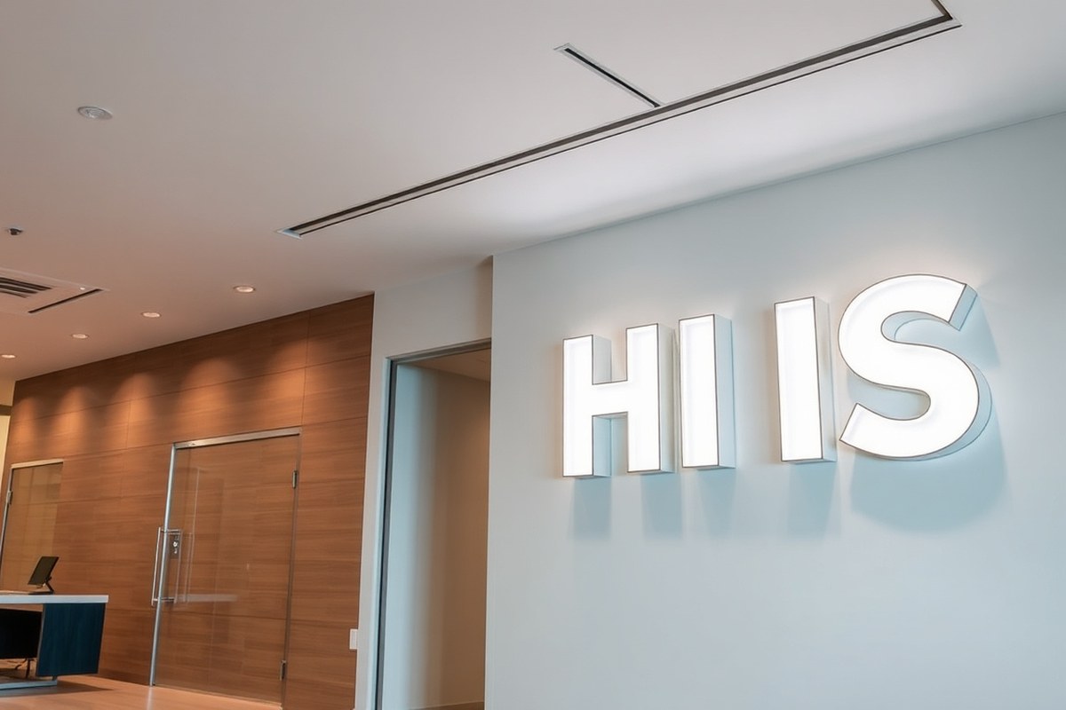
Creative dimensional letter signs can transform your business space both indoors and outdoors by using varied styles, materials, and lighting options. The right combination highlights your brand, adds visual interest, and improves visibility. You can customize these signs with logos, floating effects, and backlighting to make an impact that suits your environment and budget.
Combining Materials and Colors
Indoors, lightweight yet durable materials like foam or PVC offer cost-effective options that allow vibrant colors and smooth finishes. For outdoor signs, choose weather resistant materials such as aluminum, stainless steel, or UV-protected acrylic to withstand sun, rain, and temperature changes. Mixing materials can help emphasize different parts of your sign, for example, a stainless steel logo paired with acrylic letters can create contrast and depth.
Consider combining bold colors with metallic finishes for indoors to complement modern or classic interiors. Outdoors, use colors chosen for high visibility and UV stability to maintain vibrancy. Custom finishes, like brushed or polished metals, add sophistication and reflect your brand’s style successfully.
- Foam or PVC for affordable indoor signs
- Aluminum, stainless steel, or UV acrylic for durable outdoor signs
- Mix materials for contrasting texture and depth
- Choose colors with UV resistance for extended outdoor life
- Use metallic finishes for elegance and brand consistency
Lighting Techniques to Improve 3D Effects
Backlighting dimensional letters traces their edges with light, creating a halo or floating effect that improves readability especially in low light. Front lighting with LED spotlights can emphasize texture and polished surfaces while reducing shadows. Combining front and backlighting may provide a dynamic three-dimensional look that changes with the time of day.
For indoor signage, LED or fiber optic lighting can offer sharp, energy-efficient illumination without heat buildup. Outdoor lighting must be weatherproof and rated for exterior use, with timed controls or photocells to illuminate only when needed. Properly placed lighting can extend the visibility of your sign beyond business hours, increasing return on investment.
Use lighting options designed for your specific material to avoid damage or uneven illumination that diminishes your sign’s impact.
Incorporating Logos and Custom Shapes
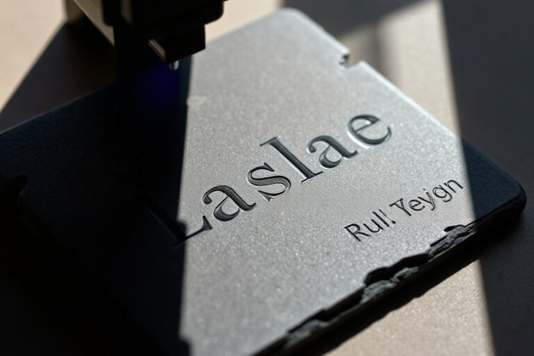
You can integrate logos or graphics into dimensional letter signs by converting them into three-dimensional shapes that match your brand’s visual identity. Custom CNC cutting or laser engraving techniques allow for precise replication of logos on various materials, maintaining detail even at smaller scales.
Custom shapes work well for both indoor displays, such as lobby signs, and outdoor uses on walls or monument signage. They reinforce brand recognition because they stand out more than flat graphics. Turning a logo into dimensional elements requires accurate digital files and close collaboration with your sign fabricator.
Mounting Styles for Floating Appearance
Creating floating dimensional letter signs involves mounting letters slightly away from the wall using standoffs or spacers. This technique casts natural shadows and gives the sign a three-dimensional depth that stands out visually. Common spacing ranges from 0.5 inches to 1.5 inches depending on lighting and sign size.
Flush mounting places letters directly on the surface for a clean, modern look but reduces shadow play. For outdoor signs on rough or uneven walls, floating mounting compensates for imperfections and makes cleaning easier. You can also use hidden mounting systems that conceal fasteners, improving the floating effect.
Choosing the Right Materials for Dimensional Letter Signs
Selecting the right materials for dimensional letter signs depends on where you plan to install them, how long they need to last, and your budget. For outdoor use, aluminum and acrylic are top choices due to their durability and appealing finishes. Aluminum holds up well against weather, resists corrosion, and can be powder-coated for a sleek look. Acrylic offers bright, clean colors and stands up to sunlight without fading quickly. Both materials can handle temperature changes common in most climates.
Indoor signs don’t require as much weather resistance, so materials like PVC or high-density foam can work well. These options are often more affordable and lighter to mount, ideal for office lobbies or retail spaces. Keep in mind the environment, high humidity or direct sunlight indoors may still call for more resilient materials such as acrylic.
The budget can vary widely depending on material choice, thickness, and finish. Aluminum typically costs more upfront but can lower maintenance costs over time. PVC and foam are cheaper but less durable outside. Prices often range from around $20 to $50 per letter for basic materials, though custom finishes or larger sizes increase costs.
| Material | Durability | Appearance | Suitable Environment | Typical Cost per Letter* |
|---|---|---|---|---|
| Aluminum | High; weather-resistant, rust-proof with coating | Modern, metallic finish; powder-coated available | Outdoor and indoor, including harsh climates | $30-$50 |
| Acrylic | Medium-high; UV resistant, handles sunlight | Bright, glossy, multiple colors | Outdoor and indoor, less impact resistant | $25-$45 |
| PVC | Medium; better indoors, sensitive to sun | Matte or gloss; flat colors | Indoor use recommended | $15-$30 |
| High-Density Foam | Low-medium; not suited for wet weather | Can be painted; lightweight-look | Indoor only, dry conditions | $15-$25 |
*Prices vary based on letter size, thickness, and finish options. Consider the typical climate where the sign will live. Coastal and humid regions need corrosion-resistant materials like aluminum. In shady indoor spots, lighter and cost-effective foam or PVC can work without losing visual impact. Always ask your signage provider about layout templates and material samples before ordering. This helps avoid surprises and ensures your dimensional letters add presence without blending into the background.
How to Choose Letter Thickness and Mounting Heights
Choosing the right thickness and mounting height for dimensional letter signs directly influences their visibility and the message your brand conveys. The most common thicknesses are ¼ inch, ½ inch, and 1 inch. Thinner letters suit tight indoor spaces or subtle branding, while thicker letters create a bolder visual presence, especially outdoors or on large walls. Mounting letters raised from the surface adds depth, further improving visibility and style. Typical mounting distances range from flush to 1 inch or more, depending on the lighting and background material.
Thickness affects how much shadow the letters cast, which boosts readability and catches the eye from a distance. For smaller signs or delicate fonts, ¼ inch is often enough. Half-inch thick letters offer a solid balance for most indoor spaces and daylight-exterior signs. One-inch thick letters stand out sharply in large, open areas or on monument signs where visibility from far away matters most.
Mounting letters off the surface uses spacers or studs to lift them typically between ½ inch and 1 inch. This technique creates shadows and a layered look that improve 3D effect, drawing attention without overwhelming the wall. On rough or uneven textures like brick, greater separation can improve legibility by blocking background patterns. Smooth surfaces allow for less distance, maintaining a sleek appearance.
Brands focused on modern, minimalist style often choose thinner letters and closer mounting to maintain clean lines. Bold, impactful brands aiming for high visibility pick thicker letters with higher mounts to create strong shadows and pronounced depth. Lighting choices like backlighting pair well with raised letters to maximize nighttime clarity. Follow these steps to select the right thickness and mounting height for your dimensional letters:
- Assess your location and viewing distance. Measure how far viewers will stand or drive by the sign to determine necessary visual impact.
- Choose letter thickness based on size and style. Select ¼ inch for small, elegant lettering; ½ inch for medium-sized, versatile use; or 1 inch for bold, large-scale signs.
- Select a mounting offset. Use spacer mounts or studs to raise letters between ½ inch and 1 inch for improve depth and shadow effect.
- Consider the wall surface. Use larger mounts on textured surfaces like brick for readability; closer mounting on smooth drywall suits modern aesthetics.
- Decide on lighting integration, if any. Raised letters work better with backlit or halo lighting to create contrast in low light.
- Confirm the mounting method and weight limits. Make sure your surface can support the thickness and spacer system chosen without damage.
- Finalize design samples. Review mockups or prototypes to check visibility and style before production.
- Plan installation details. Communicate thickness and mounting specs clearly to installers for accurate alignment and secure attachment.
Lighting Options to Maximize Dimensional Letter Impact
Lighting improve dimensional letter signs by improving visibility, emphasizing three-dimensional shapes, and creating brand impact day and night. Choosing between halo backlighting, front illumination, and integrated LEDs depends on your environment, budget, and design goals. Properly applied lighting not only highlights letter edges and depth but also ensures your sign stands out in low-light conditions.
Halo Backlighting Techniques
Halo backlighting involves mounting lights behind the letters, casting a soft glow on the wall or surface behind the sign. This method accentuates the depth of the dimensional letters while producing a subtle, elegant outline that can visually separate the sign from its background. It works well for both indoor areas like reception desks and outdoor facades, especially where a dramatic effect is desired without direct glare.
To install halo backlighting, use LED modules or strips positioned in a channel or raceway mounted behind the letters. Maintain a gap of about 1 to 3 inches between the letter back and the surface to allow light to spread evenly. Use diffusers or frosted backing to avoid hotspots. Materials like acrylic or metal with an opaque finish usually serve as the letter backplate for ideal light diffusion.
Costs vary by size and complexity, typically ranging from $200 to $700 per letter, mostly for fixtures and labor. Electrical access must be planned to keep wiring hidden. Results look best on matte or lightly textured surfaces that catch and soften the glow. Avoid highly reflective or glossy backgrounds that cause distracting light bursts or uneven halos.
Front and Edge Lighting Options
Front lighting uses bulbs or LEDs shining directly on the front face of the letters. This method increases sign visibility and color vibrancy in daylight and darkness. It can be done with fixture-mounted spotlights or built-in front LEDs recessed into the letter faces, providing an even wash of light that draws attention to branding details.
Edge lighting illuminates letter outlines using LEDs embedded in the letter edges, typically with acrylic or translucent material. This method produces a distinctive lit border without lighting the entire face, emphasizing the dimensional form and color contrast. It’s effective indoors and outdoors, adding modern aesthetics especially to logos or minimalist designs.
Front and edge lighting require careful design to prevent glare or uneven brightness. Outdoor fixtures should have weatherproof housings with IP65 rating or higher. Energy consumption depends on LED type and power but generally stays under 50 watts per letter for efficient setups. Night-time visibility improves dramatically, reducing challenges from shadows, fog, or streetlights.
LED Integration and Controls
Integrated LEDs built into dimensional letters combine illumination and structure in one unit. These systems often incorporate low-voltage, energy-efficient LEDs that fit behind face panels or inside hollow letters. Integration creates consistent light distribution and reduces installation complexity, as wiring and control can be centralized.
Controls such as dimmers, timers, or smart lighting systems allow customization of brightness and scheduling. This helps save energy by limiting illumination to business hours or peak foot traffic times. Intelligent controls also enable color changes or dynamic effects, helping brands refresh their appearance without manual updates.
The initial investment for integrated LEDs tends to be higher than external lighting, starting around $500 per letter including electronics and labor, but this often pays off with lower energy and maintenance costs. Use LED brands rated for at least 50,000 hours of operation and ensure heat dissipation through aluminum backplates or heat sinks to prolong lifespan.
Maintenance Tips for Lit Signs
Routine cleaning keeps lighting components bright and prevents dirt buildup from reducing luminescence. Use soft cloths dampened with mild soap and water; avoid harsh chemicals that damage finishes or LED coatings. Inspect wiring and fixtures annually to detect wear or corrosion, especially in outdoor installations exposed to moisture and temperature cycles.
Replace LED modules in matched sets to maintain uniform brightness and color. Monitor dimmer controls and timers for proper function, recalibrating as needed. Keep ventilation clear around integrated LED housing to avoid overheating, which can shorten component life and cause flickering.
Regular maintenance every 6 to 12 months extends sign life and can prevent costly repairs due to moisture or electrical faults.
Planning Your Dimensional Letter Sign Project Timeline
The total time from designing dimensional letter signage to installation usually ranges from 3 to 8 weeks. This depends on the complexity of the design, materials chosen, approval speed, and the manufacturing process at the sign shop. Some shops can expedite production in 1 to 3 weeks for a rush fee, depending on their current schedule and your installation deadline. Your project will typically follow these steps:
- Design Phase: Initial discussions to select fonts, materials, lighting, and size, while making sure the design matches your brand standards. This phase can take 1 to 2 weeks, especially if you require multiple design revisions or if your brand guidelines are particularly detailed.
- Approval: Getting approvals from your internal team or building management. This can take 1 to 2 weeks and may require adjustments to your design for code compliance or visibility.
- Production: Once approved, production begins. Time here varies by material and design complexity, simple designs in acrylic or PVC may take 1 to 2 weeks, while metal or illuminated signs can take 3 to 6 weeks. Rush options may reduce this to 1 to 3 weeks.
- Installation: Scheduling installation with a professional ensures correct mounting and safety. Installation usually takes 1 to 2 days but requires coordination with your business hours to prevent disruptions. Early mornings, evenings, or weekends are common to avoid customer interference.
Planning ahead and allowing at least 6 weeks for typical projects helps prevent delays. Communicating your installation date when requesting quotes makes it easier for the fabricator to offer rush options or adjust their schedule. For example, a simple non-illuminated sign may be completed within 3 weeks total if approvals move quickly and the fabricator can prioritize your order.
| Project Stage | Typical Duration | Rush Option |
|---|---|---|
| Design | 1, 2 weeks | Can be shortened with quick decisions |
| Approval | 1, 2 weeks | Depends on approvers’ availability |
| Production | 1, 6 weeks | 1, 3 weeks (based on complexity) |
| Installation | 1, 2 days | Typically same timeframe; scheduling matters |
Coordinating installation with your business operations minimizes downtime and inconvenience. Booking installers during off-hours can reduce disruption but may increase cost. Providing detailed site access instructions and ensuring an approved mounting surface are important for smooth installation. Delays often happen due to late approvals, changes in design after production starts, or unforeseen site conditions.
Installation Methods and Maintenance for Dimensional Letters
Dimensional letters can be installed in various ways depending on the desired visual effect and the surface type. Common mounting methods include flush mounting with adhesive for a sleek, wall-hugging look or spacer-raised mounting to create depth through shadow and separation from the wall. Installation difficulty varies from simple DIY projects to those requiring professional tools and precision. Maintaining these signs involves regular cleaning and occasional touch-ups, while removal should be done carefully to avoid damage.
Flush vs Raised Mounting Approaches
Flush mounting involves attaching dimensional letters directly against the wall surface using strong double-sided tape combined with silicone. This method creates a clean, modern appearance with the letters sitting tight to the background. It is ideal for smooth, clean walls and indoor environments. Raised mounting, on the other hand, uses spacers, typically 1/2 inch pegs, that lift the letters off the wall, creating a floating effect that casts shadows and adds dimension. This approach works well with both indoor and outdoor signs and can improve visibility in varying light conditions.
Flush mounting tends to be quicker to install and can be suitable for DIY enthusiasts who have a steady hand and basic tools. Raised mounting usually requires precise drilling and alignment to ensure even spacing and secure anchoring, so many businesses prefer professional installers for this method. Raised letters also provide better airflow behind the sign, reducing moisture buildup, which is beneficial in humid or outdoor locations.
Adhesives, Screws, and Anchors Explained
Dimensional letters are commonly secured by mechanical fixings or adhesives, sometimes combining both for extra durability. Adhesive mounting mainly uses industrial-strength double-sided tape paired with silicone sealant, offering a clean look without visible hardware. This method is best for lightweight letters and smooth surfaces. Mechanical mounting typically involves screws driven through the letters into wall anchors, especially necessary for heavier signs or exterior applications exposed to wind or weather.
Wall anchors come in various types such as plastic expansion anchors, metal toggle bolts, or sleeve anchors, chosen based on wall material, from drywall to masonry. Accuracy in marking holes and drilling depth is key to keep letters level and secure. Many installations use the following steps:
- Measure and mark exact letter positions on the wall
- Drill pilot holes for anchors if using screws
- Apply double-sided tape and/or silicone sealant
- Set spacers if opting for raised mounting
- Attach letters firmly and hold for adhesive curing time
Costs vary; adhesive kits may run $20 to $50 depending on size, while installing anchors and screws can add to labor costs if professionals are hired. Choosing between adhesives and mechanical fixings depends on letter weight, location, and longevity requirements.
Cleaning and Protective Coatings
Maintaining dimensional letters extends their lifespan and preserves appearance. Routine cleaning involves wiping letters with a soft cloth dampened with mild soap and water to remove dust and dirt. Avoid harsh chemicals or abrasive tools that might scratch finishes or strip protective coatings. Outdoor signs benefit from protective clear coatings or sealants that guard against UV rays, moisture, and environmental pollutants.
Determine your cleaning schedule based on location and weather exposure: indoor signs may need cleaning once every few months, while exterior signs might require monthly attention. In coastal or industrial areas, more frequent cleaning and inspections are recommended due to corrosive elements.
Removal and Refurbishment Tips
Removing dimensional letters without damage requires patience and appropriate tools. Letters mounted with double-sided tape and silicone take approximately 30 minutes plus a 10-minute solvent soak to release adhesive bonds safely. Use a plastic scraper to gently pry letters loose once the solvent has softened the adhesive.
Mechanical fixings necessitate unscrewing the fasteners carefully to avoid wall damage. After removal, clean residual adhesive or sealant from the wall and letter surfaces to prepare for reinstallation or refinishing.
For refurbishment, inspect the letters for chipped paint, corrosion, or loose hardware. Touch up paint as needed using appropriate formulations matching the original finish. Replace any damaged anchors or spacers to restore secure mounting. Proper removal and maintenance help preserve investment in your dimensional signage and keep your branding sharp.
How Dimensional Letters Reflect Brand Identity Effectively
Choosing the right font for dimensional letter signs starts with understanding your brand’s personality. Sans-serif fonts with clean lines often project professionalism and reliability, making them ideal for law firms, financial institutions, and corporate offices. On the other hand, script or custom fonts with unique shapes can express creativity and friendliness, which suits retail boutiques, art galleries, or creative agencies. Your dimensional letter fonts should align with your existing brand materials to maintain consistency and avoid confusion.
Color plays a critical role in reflecting brand identity through dimensional letters. Use your core brand colors, especially those customers already associate with your business, to reinforce recognition. Contrast your letters sharply against the background so they stand out even from a distance. For example, if your brand’s primary color is a dark navy blue, consider white or metallic silver dimensional letters on a matte navy panel for maximum clarity. Consistent color use across all signage helps customers immediately identify your brand without effort.
Dimensional letters can go beyond just acronyms or company names by incorporating mission statements or logos subtly into the design. This can be done by adding smaller, secondary dimensional elements next to or underneath the main letters, maintaining readability while adding depth to the storytelling. For instance, a healthcare provider might feature a simple cross or heart symbol as part of its signage to reinforce care and trust. However, be mindful of size, long mission statements might not suit outdoor signage placed at a distance, so prioritize brevity and clarity.
Placement and size are essential for balancing visibility with brand messaging. Letters should be large enough to be legible from the typical viewing distance. For outdoor signs, letters generally range from 12 to 36 inches tall depending on the location, larger sizes suit highway-facing signage, while smaller sizes fit entrance walls. Indoor signs can be more modest, ranging between 6 and 12 inches tall. Placement also matters for context; signs near entrances or key decision points get the most attention and should use bold fonts and striking colors to reinforce brand identity effectively.
Maintaining brand consistency across all your dimensional letter signs means using the same style, color palette, and materials that reflect your brand guidelines. This may involve selecting the same metal finish, such as brushed aluminum or matte black, and matching font weights and spacing across all signage. Working with a graphic design professional can ensure your dimensional letters are both visually consistent and optimized for their specific environment. Avoid mixing styles or colors that deviate from your established brand identity, as this dilutes recognition and can confuse customers.
Ensure your dimensional letters contrast sufficiently with their background for clear visibility; poor contrast reduces legibility and weakens your brand’s impact.
Your First Steps: A Quick-Start Plan for Dimensional Letter Signs
Follow these steps to move confidently from planning to installing your dimensional letter sign and ensure it serves your brand well.
- Before you start: Define your branding goals and decide where the sign will be placed. Success looks like a clear brief that matches your business identity and site constraints.
- Week 1: Choose materials and lighting based on location, budget, and durability needs. Confirm your choice by reviewing samples or manufacturer specs.
- Week 2: Determine letter thickness and mounting height to balance visibility and aesthetic appeal. Check this by mockups or digital previews at the actual installation site.
- Week 3: Select installation method suitable for your wall type and sign weight. Ensure installer qualification or vendor guarantees before proceeding.
- Week 4: Schedule the fabrication and delivery, allowing buffer days for delays. Keep production updates on track by regular check-ins with the supplier.
- Installation day: Supervise the placement to confirm alignment, lighting, and secure mounting. Measure visibility and stability on-site as verification.
- After 2 weeks: Perform maintenance check to clean and tighten fittings as needed. Check that the sign looks and functions as expected under daily conditions.
Frequently Asked Questions
What Are Some Creative Dimensional Letter Sign Ideas for Storefronts?
Use a mix of metal and acrylic letters with backlighting to create a striking storefront display that draws attention day and night. Consider custom fonts reflecting your brand style for a unique look.
Can Dimensional Letters Be Customized for Different Indoor Environments?
Yes, dimensional letters can be tailored in material, size, and finish for indoor settings like corporate lobbies or retail spaces to match the interior design. Use lightweight materials to ease installation on various surfaces.
What Is the Best Way to Maintain Outdoor Dimensional Letter Signs?
Regular cleaning with mild soap and water and inspecting mounts and lighting ensures outdoor signs stay vibrant and secure over time. Avoid harsh chemicals which can damage finishes.
How Do Lighting Options Affect the Visibility of Dimensional Letter Signs?
Proper lighting, such as halo backlighting or front illumination, improve the 3D effect and readability of dimensional letters during all hours. Lighting choice depends on sign location and brand aesthetics.
Can Dimensional Letter Signs Be Integrated with Logos or Symbols?
Dimensional letters can be combined with branded logos or symbols to create cohesive signage that strengthens brand identity and recognition. Ensure materials and lighting styles are consistent across elements.
What Design Factors Help Dimensional Letter Signs Stand Out in Busy Areas?
Using bold fonts, contrasting colors, and adequate letter depth boosts visibility in crowded spaces. Adding lighting and spacing letters for a floating effect further improve impact and legibility.
Wrapping Up
Dimensional letter signs give businesses a sharp, professional look that reinforces your brand identity and grabs attention. Taking measured steps to plan materials, installation, and upkeep will maximize your sign’s impact for years. Start by defining your brand message and location clearly, that foundation drives every choice you make.