Best Font for House Numbers: Clear Styles, Sizes & Matching Tips
Selecting the ideal font for house numbers involves picking styles that stand out clearly and boost your home’s appearance. Fonts that are straightforward and bold, with adequate thickness and size, help people read the numbers easily from a distance. Numbers at least 4 inches tall with strokes around 0.5 inches wide generally provide clear visibility for most residences.
Key Takeaways
- Use fonts with clean lines and minimal decoration for maximum legibility from a distance.
- House numbers 4 to 6 inches tall work well for most residences, adjusted for viewing distance.
- Choose a stroke thickness of at least 0.5 inches to maintain clarity at the required size.
- Bolder fonts pair better with larger number sizes to keep proportions balanced and readable.
- Check local fire codes and HOA rules to ensure font style and size comply with regulations.
- Aluminum house numbers offer longer durability compared to acrylic, lasting up to 15 years.
What Are the Most Readable Fonts for House Numbers?
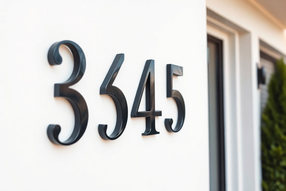
The best font styles for house numbers prioritize clear visibility and legibility from a distance and under varied lighting. Sans-serif fonts with bold, geometric shapes often offer superior readability outdoors because their clean lines reduce visual clutter. Serif fonts, featuring small decorative strokes, suit traditional or classic homes but should be subtle and bold enough to remain clear when viewed from the street or in low light.
Readability depends on how well each digit stands out and avoids confusion with similar numbers like 6 and 8 or 1 and 7. High contrast between numbers and background also plays a key role. Positioning near an exterior light helps maintain visibility after dark. Proper font choice combined with strategic placement improve curb appeal and supports safety by helping emergency responders locate the house faster. Below is a comparison of popular fonts for house numbers, rated on readability and typical use settings:
| Font | Style Type | Readability Rating* | Best Use |
|---|---|---|---|
| Arial Black | Sans-serif, Bold | 9/10 | Modern homes, high-contrast settings |
| Jersey M54 | Slab Serif, Bold | 8/10 | Bold, contemporary signage, artistic designs |
| Times New Roman (Bold) | Serif | 7/10 | Classic homes, traditional neighborhoods |
| Futura | Sans-serif, Geometric | 8/10 | Modern architecture, clean minimalist looks |
| Verdana | Sans-serif, Wide | 9/10 | Highly legible at a distance, mixed style homes |
*Readability ratings are based on clarity from typical street distances (20 to 40 feet) and in dim lighting. For house numbers visible in the daylight and at night, choose bold fonts with distinguishing features. For instance, Jersey M54’s slab serifs emphasize the vertical strokes of each digit, helping separate similar numbers visually. Sans-serif options like Verdana and Arial Black excel on modern homes by maintaining straight, uniform strokes that remain sharp in fading light. They are usually paired with simple backgrounds and lighting designed to highlight the numbers.
When selecting a serif font for a classic look, opt for versions with slightly thicker strokes to avoid reduced legibility. It’s common to blend serif with sans-serif styles for updated appeal without sacrificing visibility. A bright, contrasting background behind your numbers improve recognition distance, especially if local codes allow lighted or reflective plaque installations.
How to Choose House Number Size and Thickness for Visibility
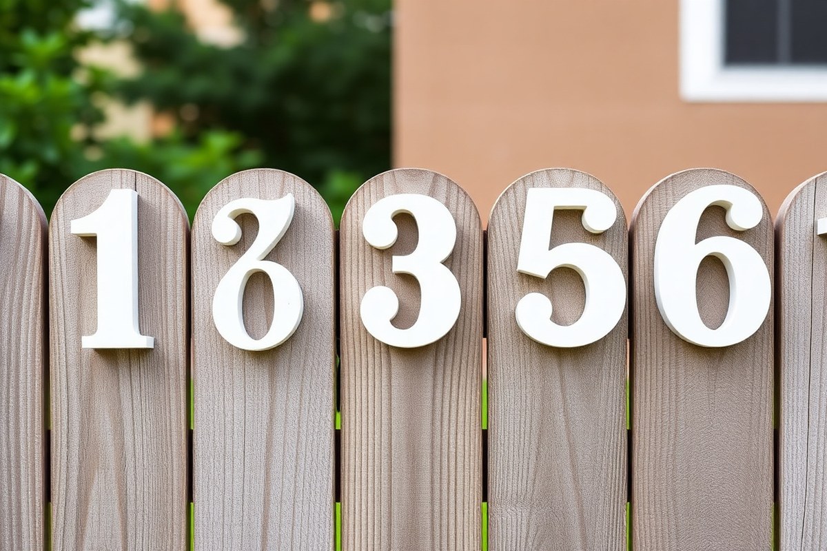
Ideal house number size depends mostly on how far the house is set back from the street. Typically, numbers should be at least 4 inches tall for most homes, with stroke thickness around 0.5 inches or more to ensure clear visibility. Proper spacing between digits also plays a role, usually 10% to 35% of the number height, so the numbers register distinctly from a distance.
Determining Number Height Based on Distance
The recommended height of house numbers scales with the distance between your home and the street or sidewalk. For homes set back up to 20 feet, numbers 4 inches tall generally offer good legibility. When the setback extends to 50 feet or more, size should increase to 6 inches or taller.
Emergency responders need to spot address numbers quickly, especially under low light or from slow-moving vehicles. A larger number height matches the natural decline in detail recognition over greater distances. Over-sizing numbers on closely set homes can look cluttered, so aim for proportional sizing to your home’s setting.
Choosing Stroke Width for Clear Visibility
Stroke width, the thickness of each part of the number, impacts how sharply the digits stand out against the background. Codes often mandate a minimum stroke width of 0.5 inches in correspondence with character height. Numbers sized 4 inches tall should have stroke widths ranging from 0.5 to 0.75 inches to maintain clarity.
Thicker strokes minimize the chance of the numbers blending into shadows or material texture. Thin strokes may appear delicate but become indistinct at a distance or in dim environments. The balance between stroke width and aperture size (the open spaces within digits like 8 or 0) affects readability. Wider apertures with moderate stroke thickness are easier to distinguish on the street.
Spacing: Separating Digits for Maximum Impact
Proper spacing between digits, often called kerning or character spacing, prevents numbers from blurring into one shape. For house numbers, spacing should be between 10% and 35% of the digit height. That translates to 0.4 to 1.4 inches of space between digits when numbers are 4 inches tall.
Too tight spacing merges digits visually, reducing legibility. Overly wide spacing can disconnect numbers, making it harder to read the address quickly. Adjust spacing to complement your font’s style and stroke width. Some fonts naturally include good spacing while others may require manual adjustment during installation.
Visibility Distance and Size Reference Chart
| Setback Distance | Recommended Number Height | Recommended Stroke Width | Recommended Spacing |
|---|---|---|---|
| 0 – 20 ft | 4 inches | 0.5 – 0.75 inches | 0.4 – 1.4 inches (10-35% of height) |
| 20 – 50 ft | 5 – 6 inches | 0.6 – 0.9 inches | 0.5 – 2.1 inches |
| 50+ ft | 6 – 8 inches | 0.75 – 1.25 inches | 0.6 – 2.8 inches |
This size chart helps you quickly match number dimensions to your house’s placement. Remember that environmental factors like lighting and colors used on the background affect how boldly your numbers stand out.
Key Factors for Installation and Maintenance
Numbers must be mounted in line of sight, free from plant overgrowth or shadows. Matte finishes reduce glare and improve night visibility, especially when paired with reflective or contrasting backgrounds. Here are essential points to check before buying and installing your house numbers:
- Confirm local fire and building codes for minimum size and stroke width.
- Check your HOA’s architectural guidelines for size restrictions or style requirements.
- Choose number materials that contrast sharply with the mounting surface.
- Plan for even lighting or add external lighting if needed for night visibility.
- Maintain your numbers by cleaning and repainting when faded.
- Measure setback distance accurately for correct sizing decisions.
- Account for font style’s character thickness and spacing needs.
Balancing these factors ensures your numbers remain clear and effective over time.
Signs with too thin strokes or too close digit spacing often cause confusion and delay in emergency response, never guess at these dimensions without measuring your home’s setback.
Top Font Styles: Modern, Classic, and Retro Choices
Choosing the right font style for your house numbers depends on your home’s architecture and the look you want. Modern homes often benefit from clean, geometric sans-serif fonts that emphasize simplicity. Traditional houses pair well with classic serif fonts that convey history and permanence. For vintage or mid-century properties, retro fonts inspired by Art Deco or handcrafted designs highlight character and charm.
Modern Sans-Serif Fonts
Modern sans-serif fonts are popular for contemporary and minimalist homes due to their clean lines and geometric forms. Fonts like MRK Maston Pro embody this style, blending vintage influences with modern readability. Its slightly condensed letterforms offer a sleek appearance that fits well with metal house numbers made from aluminum or stainless steel, which preserve sharp stroke details over time. Geometric sans-serif fonts inspired by Bauhaus principles are trending, providing high legibility and a refined urban look.
When installing house numbers using these fonts, consider finishes like brushed or matte metals. These finishes complement the minimalist style and reduce glare, improving visibility under various lighting conditions. Licensing for fonts like MRK Maston Pro typically involves purchasing a commercial license, with costs ranging from $30 to $100 depending on the vendor and usage rights. Using licensed fonts ensures a professional and legally compliant installation.
Classic Serif Fonts
Serif fonts remain the choice for traditional homes, especially those with historic or Craftsman-style architecture. The slight stroke variations and serifs echo the home’s architectural details, improving a sense of permanence. Fonts rooted in classic book typography work particularly well, offering elegant and legible numerals that withstand stylistic trends. Select fonts with slightly condensed shapes to balance a traditional feel with modern clarity.
For traditional homes, pairing serif fonts with matte brass or bronze finishes amplifies the timeless quality, as metal reflects the home’s historic charm. Costs for classic serif fonts vary widely, but many high-quality serif fonts suitable for house numbers are available for $20 to $50 with commercial licenses. Avoid overly decorative serifs that sacrifice readability at a distance or in low light.
Retro and Vintage Numerals
Retro fonts suit vintage, mid-century modern, and bungalows that reference early 20th-century styles. Inspired by Art Deco design and handcrafted typography, these fonts balance decorative flair with readability. Fonts with open forms and rounded corners work well for mid-century modern homes, reflecting the era’s architectural aesthetic without sacrificing legibility from the street.
MRK Maston Pro also fits retro and vintage styles due to its unique blend of modern sans-serif with nostalgic influences. For authentic vintage looks, consider fonts that evoke hand-painted or sign lettering styles, which bring personality to your house numbers. License fees and availability for retro fonts can vary; many vintage-inspired fonts are also available through made-to-order processes when working with specialty suppliers, allowing customization to match your home’s curb appeal.
How Home Architecture Influences Font Choice
Matching your house number font to your home’s architecture creates a cohesive look that improve curb appeal and supports clear readability. Selecting a font that echoes your exterior style can highlight your home’s character or offer a clean contrast when done well. Successful font choices depend on recognizing your home’s design period and choosing typefaces with complementary shapes and tones.
Fonts for Traditional and Historic Homes
Historic and traditional homes benefit from fonts that carry a sense of heritage and craftsmanship. Serif fonts or scripts with classical detailing work well because they reflect the ornamental features often found on older houses. Fonts with flourishes or subtle curves match well with Victorian, Colonial, Georgian, or Craftsman-style homes, reinforcing their timeless aesthetic.
Look for fonts that maintain legibility from a distance while adding a touch of sophistication. Bold, serif typefaces with consistent stroke widths complement wood or stone exteriors while lending an air of permanence. Avoid overly modern or minimalist fonts here, as they can clash with intricate architectural details.
Fonts for Modern and Minimalist Designs
Homes designed with contemporary, Mid-Century Modern, or minimalistic styles shine with sans-serif fonts that emphasize clean lines and geometric precision. Fonts like Futura or the “So-Cal” style from Modern House Numbers embody this look by combining simplicity with architectural balance. Their straightforward shapes don’t compete with the home’s structure but improve the streamlined aesthetic.
Using bold strokes in your numbers increases visibility while maintaining a neat appearance. These modern fonts pair well with materials such as metal or glass, typical in modern homes. Selecting a font by considering the home’s scale, colour palette, and materials ensures the house numbers feel like a natural part of the exterior.
Mixing and Matching Fonts and Materials
Choosing house number fonts requires considering more than style alone. The material and finish of the numbers influence how a font looks and lasts outdoors. Combining fonts with suitable materials helps maintain overall harmony and ensures durability against weather and sun exposure. Here is a checklist to guide your architectural style matching:
- Identify your home’s architectural style and key exterior features.
- Choose a font style reflecting the home’s era, serif for traditional, sans-serif for modern.
- Match font weight to material thickness to preserve clarity and durability.
- Pick complementary finishes such as brushed metal for minimalist homes or painted wood for historic ones.
- Test font visibility under various lighting conditions before installation.
- Check local regulations on font size and placement to meet code requirements.
To successfully maintain curb appeal, pay attention to proportion between number size and façade space. Avoid overcrowding or placing numbers too far apart. Regular maintenance of finish and cleaning also preserves the flawless integration of font and material over time. Installing house numbers that respect these architectural and material considerations reflects well on your property’s aesthetic and value.
Materials and Finishes: What Works Best with House Number Fonts
Choosing the right material and finish for your house numbers directly influences how your font style looks, how long it lasts, and how easily it can be read. Metal, acrylic, and wood are the most common options, each pairing better with different font styles and finishes. For example, brushed aluminum suits modern, sans-serif fonts and adds sleek contrast without glare. Wood works well with classic and rustic fonts, naturally complementing warm, textured styles. Acrylic is ideal for bold, thick fonts and can be paired with glossy or matte finishes depending on your desired visibility and exterior palette. Below is a comparison table to help match materials and finishes with font styles while considering durability and maintenance:
| Material | Best Font Style | Finish Options | Durability & Lifespan | Pros | Cons | Maintenance |
|---|---|---|---|---|---|---|
| Aluminum | Modern, Sans-serif | Brushed, Matte | 10-20 years; resists rust | Lightweight, long-lasting, low glare with matte | May scratch; brushed option can dull bright colors | Occasional cleaning, avoid abrasive scrubbing |
| Acrylic | Bold, Thick, Display fonts | Glossy, Matte | 5-15 years; UV may fade colors | Vivid colors, smooth edges, easy to cut | Prone to scratches; less weather-resistant than metal | Clean with mild soap; protect from direct sun |
| Wood | Classic, Rustic, Script | Stained, Painted, Matte | 3-10 years; subject to rot if unsealed | Warm appearance, customizable, eco-friendly | Requires sealing; vulnerable to weather and pests | Periodic sealing, touch-up paint; sheltered placements last longer |
Finish choice dramatically affects how well your house numbers can be read, especially from a distance. Brushed finishes reduce glare, making numbers visible under bright sunlight, while matte finishes soften reflections and can improve contrast when matched with your home’s exterior palette. Glossy acrylic finishes offer sharp visibility but might reflect too much light, reducing legibility in direct sun.
Test your selected font and finish combination in the actual lighting conditions of your home’s exterior to ensure your house numbers remain clear throughout the day.
Longevity depends on both the material and finish. Brushed aluminum holds up well in varied climates, meaning you typically need to replace numbers every 10 to 20 years. Acrylic fades faster under UV exposure and lasts around 5 to 15 years unless regularly maintained. Wood requires more upkeep and sealing with a protective finish to last beyond 3 to 10 years. These differences can influence your choice based on how much time and effort you want to spend on maintenance.
To get the best results, pick a material that complements your font style and think about the finish impact on night and day visibility. For instance, a classic serif font in stained wood conveys warmth and tradition but demands sealing for added lifespan. On the other hand, a brushed aluminum sans serif font offers a minimalist look with strong legibility and minimal upkeep.
Local Codes and Regulations for House Number Fonts and Sizes
Municipalities and fire codes often specify the height, stroke width, and positioning of house numbers to keep them clearly visible for emergency personnel. According to the 2024 International Fire Code (IFC), address numbers must be at least 4 inches high with a stroke thickness of at least 0.5 inches. These measurements improve readability from the street, especially in dim lighting. Local rules frequently adopt or exceed these standards to address specific community requirements.
Besides the IFC, cities may have their own variations. The Los Angeles Fire Department adjusts number size depending on how far the house is set back from the road. Montgomery County in Maryland requires 5-inch tall numbers for new residential addresses. Homeowner associations also frequently dictate font style, size, and mounting location to preserve neighborhood consistency. Before choosing your font or size, verify the exact parameters required by both your local fire department and HOA guidelines if applicable.
To check if your house numbers comply, start by measuring your current characters’ height and stroke thickness. Compare these against your city’s fire code and HOA architectural guidelines, which are usually available on municipal or HOA websites. Call your local fire marshal’s office or building department to confirm if any permits are required for altering or installing house numbers. Some jurisdictions might ask for a permit to ensure your numbers meet visibility standards designed to aid emergency services.
Noncompliant house numbers should be replaced to avoid potential issues with emergency access or real estate processes. Noncompliant numbers may lead to citations, required replacements at your cost, or slower response times by first responders. Proper placement matters too; characters should be mounted in a well-lit location visible from the street, typically near the front door or driveway entrance, depending on local rules. Here’s a checklist to follow: measure your numbers’ height and stroke width; review your city’s fire code and HOA rules for minimum size, stroke weight, contrast, and placement; call local authorities to clarify rules and permit requirements; if a permit is needed, submit an application with your planned house number style and installation details; install numbers that meet or exceed code.
Costs vary, generally between $20 and $100 for new numbers depending on material and style, plus permit fees if applicable. Permit approval times range from a few days to a few weeks. Proper adherence not only avoids fines but improve safety and curb appeal. Avoid using decorative, thin, or ornate fonts that may violate stroke width minimums, as they can impair readability.
Customizing Fonts for Unique House Numbers and Curb Appeal
Homeowners can definitely request personalized or unique fonts to make their house numbers stand out. Custom fonts allow you to control the style and personality of your address, tying the numbers directly to your home’s overall design. For example, you might choose a font with bold, modern numbers for a contemporary look or a handcrafted cursive style for a more charming, traditional feel. Working with a font designer lets you specify the shape, thickness, and spacing of each digit to suit your taste and ensure legibility.
Customization options include altering existing font styles, selecting full-character typefaces that balance readability and style, or commissioning a completely new design. Fonts like Lato and Montserrat offer well-designed number characters that fit many exterior looks without sacrificing clarity. If you prefer, you can also blend fonts by using a number-focused font unique to your house numbers while keeping a complementary font for other signage. A key tip is to prioritize high contrast, dark numbers on light backgrounds or the reverse, to maintain visibility at varying distances and lighting conditions.
When working with font designers, provide clear guidelines about your preferences for size, thickness, and style. A practical approach is to request bold versions of your chosen font at around 6 inches tall or larger to maintain proportion and visibility. Ask for digital mock-ups or printed proofs to see how the numbers perform in your chosen setting before committing. Keep in mind that overly decorative or intricate fonts may reduce legibility, especially from the street, so balance creativity with clear readability.
Custom fonts can significantly boost curb appeal by making your home’s address more memorable and reflecting your personal style. For instance, a home with mid-century architecture might opt for geometric, streamlined numbers that echo that era’s design ethos. On the other hand, a cottage-style house could benefit from fonts with soft curves and elegant details. Custom styles not only improve aesthetics but also make your house easier to locate, which helps visitors, delivery services, and emergency responders.
Costs for custom font design vary widely, typically starting around $100 and increasing depending on the complexity and exclusivity of the font. Alternatively, many font foundries offer customizable options for a fixed price, which might be more affordable and quicker. Taking the time to select or design a custom font pays off by creating a coherent visual identity for your home. To avoid potential issues, ensure the font is tested outdoors in different lighting and from various angles. Avoid fonts with very thin strokes or confusing numbers, which can become illegible when viewed from a distance or in poor weather.
Common Font Selection Mistakes and How to Avoid Them
Poor font choices often result from confusing style, insufficient spacing, and low contrast between the numbers and their background. Fonts with elaborate serifs or thin strokes reduce legibility, especially at a distance. Avoid fonts that look decorative or script-like since they complicate quick recognition. Clear, bold fonts with open shapes make house numbers easier to read.
Kerning, or the spacing between characters, plays a key role in how clearly your numbers stand out. For example, the digit ‘1’ uses less visual space than ‘8’. If you space all numbers evenly by width or center, the lineup looks unbalanced and harder to scan, which can slow delivery workers or visitors. Proper kerning adjusts spacing proportionally to each digit’s shape.
Test your chosen font at the actual installation size by printing samples and viewing from typical street distances before buying or installing numbers.
Before installation, check for these common font issues and correct them:
- Using overly thin strokes, switch to a bold or semi-bold version to improve visibility.
- Poor spacing or kerning, manually adjust spacing in design software or request kerning from your sign maker.
- Fonts with confusing letterforms (like script or overly stylized numbers), choose simple, open designs.
- Insufficient contrast with the mounting surface, add contrasting backing or paint numbers in a standout color.
- Overly close numbers that blend together, add extra space to keep each digit distinct.
Here’s a basic kerning and contrast improvement checklist you can follow:
- Measure character spacing using a ruler or software grid, aim for consistent optical spacing over mechanical equal gaps.
- Print a sample of your numbers at full size and view from 20 to 40 feet to simulate curb appeal.
- Adjust kerning pair by pair, especially around narrow digits like 1, 4, and round digits like 0, 6, 8.
- Use high-contrast colors, dark numbers on a light background or vice versa.
- Consult your local regulations if applicable, as some require specific fonts and spacing standards.
For instance, compare the numbers ‘1 8 3’ in a standard font with automatic spacing versus adjusted kerning. Automatic spacing makes the ‘1’ appear detached and the ‘8’ overly tight to the ‘3’. After manual kerning, the numbers balance visually and read more smoothly from a distance.
Fixing these issues early keeps you from costly replacements or rewrites. Customizing your font’s spacing can be done in common graphics programs like Adobe Illustrator or free tools like Inkscape. Many sign fabricators offer kerning adjustment services for a reasonable fee, typically $20 to $50, depending on complexity and volume.
Step-by-Step Action Plan for Choosing the Best House Number Font
Follow these steps to select a font that stands out, complies with local rules, and fits your home’s style.
- Day 1: Check local regulations on house number size and placement. Knowing this ensures your numbers won’t need replacing later.
- Day 2: Measure visible areas where you plan to place the numbers. Make sure the size matches recommended visibility distances.
- Day 3: Choose a font style, modern, classic, or retro, that complements your home’s architecture. Preview it on a sample panel to see the effect.
- Day 4: Select thickness and material based on your font choice and outdoor conditions. Confirm it resists weather and maintains legibility day and night.
- Day 5: Order custom numbers if desired to add personality and curb appeal. Ask for proofs to verify font clarity and compliance before production.
- Day 6: Install the numbers in the planned spot using recommended hardware for stability and visibility. Test readability from the street during day and night.
- Day 7: Gather feedback from visitors or neighbors about visibility and style. Adjust lighting or placement if needed for better impact.
Frequently Asked Questions
What Font Improves House Number Visibility in Emergencies?
The City of Mobile, Alabama reports that choosing fonts with clear lines, bold contrasts, and straightforward designs can help first responders find your home up to 60% faster. Sans-serif fonts work best for easy reading from afar.
Can Changing Font Style Increase My Home’s Curb Appeal?
Yes, choosing a font that complements your home’s architectural style improve curb appeal. Matching fonts like Palm Springs or SoHo with modern designs can add a cohesive, attractive look.
How Do I Pick a Font That Stands Out on My Street?
Select a font that contrasts with your home’s exterior color and neighborhood style. Bold, sans-serif fonts often stand out on busy streets while blending with contemporary designs.
Are There Fonts Better Suited for House Numbers on Wood Versus Metal?
Fonts with clean, straight lines work better on wood for easier carving, while metal suits both sharp and curved fonts. Choose styles that align with your material’s durability and finish.
How Important Is Spacing Between Numbers in Font Choice?
Proper spacing improves readability from the street and prevents numbers from blending together. Keep consistent spacing tailored to your font’s style for clear distinction.
Do Different Neighborhoods Favor Different House Number Fonts?
Neighborhoods with historic homes often prefer classic serif fonts, while newer developments lean toward modern sans-serif styles. Picking a font that respects local style improve community appeal.
Final Thoughts
Choosing the right house number font improves your home’s curb appeal while making sure visitors and emergency responders can find you easily. Focus on readability, code compliance, and style to get the best results. Start by reviewing your local size requirements today to narrow down your font and material options.