Wayfinding Sign Ideas: Creative Tips and Practical Guide for Effective Navigation
Wayfinding sign ideas solve the challenge of helping people navigate spaces clearly and efficiently. The most effective signs combine creative design with practical features to guide users quickly to their destinations. Start by choosing signage that balances visibility, consistency, and accessibility for the best results.
Key Takeaways
- Use large, bold fonts and high-contrast colors to improve sign readability from a distance.
- Integrate brand colors and logos into signage design to reinforce identity and build trust.
- Incorporate tactile elements like raised lettering to meet ADA standards and assist visually impaired users.
- Include clear, concise room names or numbers such as “Room 305” for specific location identification.
- Consider durable materials like printed graphics on glass for longevity and style.
- Employ landmark-based signs, such as 3D letterforms or sculptural pieces, to create memorable navigation points.
Creative and Functional Wayfinding Sign Ideas for Any Space
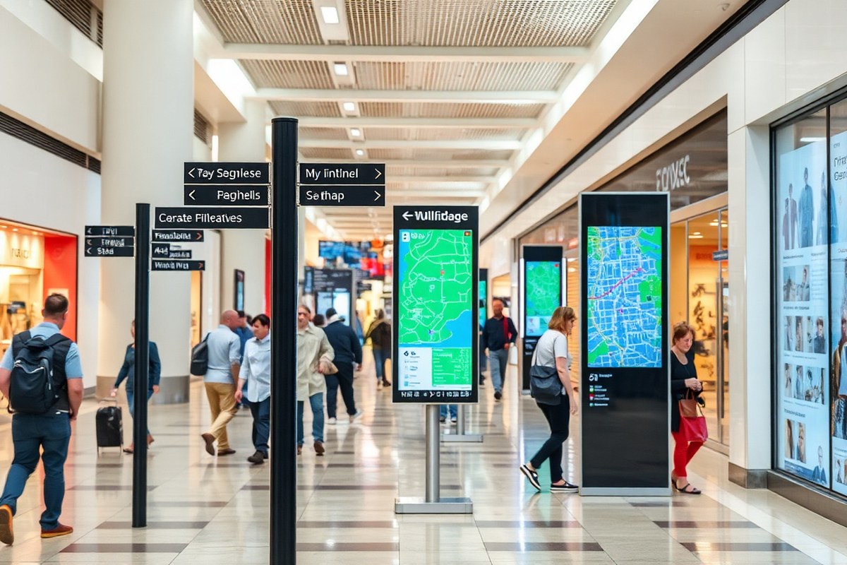
Effective wayfinding signs balance clarity with creativity to guide people smooth through any facility. Functional elements like clear typography, high contrast, and intuitive icons ensure quick comprehension. Combining these features with artistic or decorative touches helps your signs stand out without sacrificing their primary role of communication. You can customize signs for seasonal themes, special events, or branding updates by swapping out panels, incorporating digital displays, or applying vinyl overlays that are easy and cost-effective to update. Consider these 10 varied wayfinding sign ideas with examples and benefits tailored to facility managers, designers, and architects:
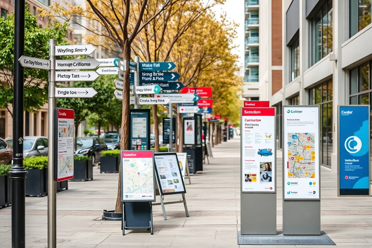
- Waymarking posts: Ideal for large outdoor walking paths, these durable posts use simple directional arrows and consistent branding. They cost around $150-$300 each and require minimal maintenance.
- Pylon signs: Tall and visible from a distance, pylons work well for outdoor complex entrances. Use bold colors and creative shapes to grab attention while maintaining clear messaging.
- Directory boards: Placed in lobbies or common areas, directories list departments or tenants with floor maps. Digital versions allow easy real-time updates for events or construction.
- Room and door signs: Critical for office interiors, these can combine Braille and tactile lettering for accessibility, following ADA standards at an average cost of $50-$100 per sign.
- Branded wall graphics: Large-scale wall signs with artwork or logos serve as landmarks and reinforce brand identity, helping visitors orient themselves.
- Hanging signs: Suspended from ceilings, these save valuable floor space and offer directional cues in corridors or open areas without visual clutter.
- Interactive digital kiosks: Best for large or complex venues, kiosks provide maps and event info that users can customize. Initial costs range from $3,000 to $7,000 plus software fees.
- Temporary banner stands: Use for seasonal promotions or events, offering flexible installation and removal. Printed fabric banners run $200-$400 and can feature vibrant, eye-catching graphics.
- Landmark-based installations: Sculptural or oversized elements near intersections or entrances help visitors orient themselves intuitively, ideal for campuses or parks.
- Vinyl overlay decals: Applied to existing signage or walls, decals allow easy seasonal updates or highlight specific areas without replacing entire signs.
Combining these ideas allows you to tailor your wayfinding system to different environments and user needs. Interior signs can incorporate more artistic elements because they don’t face weather exposure, so designers often include creative shapes or materials indoors. Meanwhile, outdoor signs prioritize visibility, weather resistance, and durability. Regularly updating seasonal and event signage keeps your space engaging and current, reducing visitor confusion and improving their overall experience.
Types of Wayfinding Signs and Their Roles Explained

Wayfinding signs come in four main types that work together to help people navigate spaces efficiently: directional, identification, informational, and regulatory. Each type has a distinct role in guiding users, whether in a small business or a large complex. Directional signs use arrows and simple instructions to lead visitors to specific locations. Identification signs mark rooms, departments, or landmarks within a space. Informational signs provide broader context, such as maps or building layouts, to orient users. Regulatory signs set rules or restrictions, such as no-entry zones, to keep visitors safe and maintain order.
Large complexes often need a complete wayfinding system combining all four types because visitors must navigate multiple floors and departments. Small businesses may only require identification and directional signs due to simpler layouts but can benefit from clear, branded designs that reinforce their identity. The table below clarifies the key characteristics, common uses, and user goals for each wayfinding sign type:
| Sign Type | Description | Common Locations | User Goal |
|---|---|---|---|
| Directional | Signs with arrows or paths directing users to destinations | Hallways, corridors, large stores, campuses | Find a specific place quickly |
| Identification | Signs labeling rooms or areas, like room number or department names | Offices, entrances, departments, restrooms | Recognize and confirm current location |
| Informational | Displays with maps, directories, or general building info | Entryways, lobbies, large public buildings | Understand overall layout and plan routes |
| Regulatory | Signs communicating rules, warnings, or restrictions | Restricted areas, exits, emergency routes | Follow safety rules and avoid prohibited zones |
Creating an effective wayfinding system starts with assessing your space’s complexity. For large retail stores, freestanding directional and informational signs across floors help customers navigate departments more easily. Identification signs in lobbies or on office doors guide visitors within specific areas. Regulatory signs protect safety by outlining restricted zones or emergency exits. Small businesses can prioritize clear identification and directional signs near entrances and key areas to reduce confusion.
Include “You Are Here” markers on informational maps near main entrances to give users immediate context and improve confidence handle the space.
Durability plays a critical role in wayfinding sign effectiveness. Using long-lasting materials and high-contrast graphics ensures signs remain readable in busy environments. Directional signs should be large enough for quick glances, generally a minimum of 18 inches wide, to serve their guiding role. Identification signs typically measure around 8 by 10 inches for visibility at doors. Informational maps and directories require larger formats, often 24 by 36 inches or bigger, to display details clearly. Regulatory signs must follow local codes and use standardized symbols for universal understanding.
Integrating Branding and Design Consistency in Wayfinding Signs
Incorporating brand elements into wayfinding signs involves blending visual identity with functional clarity. To maintain usability, your design should embed brand colors, fonts, and logos without overwhelming the sign’s primary purpose: guiding users effectively. Strategic application of these elements ensures that signage supports your brand while providing a consistent and easy-to-follow navigation experience.
Choosing Brand-Appropriate Colors and Fonts
Selecting colors and fonts that reflect your brand identity is essential, but these choices must also improve readability and visibility. Use your brand’s primary colors for key navigational elements like arrows and headings, and reserve secondary or accent colors for background or decorative areas. Fonts should match your brand’s style yet remain legible from common viewing distances, generally 6 to 12 feet for indoor signage and up to 50 feet for outdoor signs.
For example, a facility using a bold sans-serif font like Helvetica or Futura in black or dark blue improve clarity, especially when paired with high-contrast backgrounds in the brand palette. Avoid overly decorative fonts that can confuse or slow down interpretation. Restrict font usage to one or two families to preserve visual harmony and ease of reading.
Consistency Across Sign Types and Locations
Brand consistency means applying the same design principles throughout all wayfinding sign types, directional, informational, regulatory, across every location in your facility. When colors, fonts, terminologies, and layout structures remain uniform, visitors quickly learn how to interpret signs without pause or confusion. This reduces frustration and improves overall navigation efficiency. A checklist for brand alignment in wayfinding design helps maintain this consistency:
- Use a fixed palette of brand colors, specifying Pantone or CMYK codes for accuracy
- Apply consistent font families, sizes, and weights across all signs
- Follow a standard layout template with dedicated areas for titles, directions, and logos
- Ensure terminology and iconography match brand tone and language style
- Maintain uniform materials and finishes to complement the brand’s look
This checklist guides designers and fabricators, minimizing costly reworks and ensuring the signage system feels cohesive.
Using Logos and Imagery Effectively
Logos signal your brand identity immediately but can clutter a sign if used excessively or placed improperly. Use logos sparingly on wayfinding signs, positioning them in corners or headers rather than centering them. This allows the navigational information to remain the focus. For example, a university campus may feature its crest on signposts but avoid large logos on directional arrows or room identifier plaques.
Imagery should support navigation without distracting. Simple, brand-consistent icons or symbols can reinforce instructions while adding visual interest. Choose clean, high-contrast versions of logos and symbols adapted for signage, ensuring they retain clarity in low light or from distance.
Balancing Aesthetics with Legibility
The challenge lies in integrating decorative brand elements alongside practical readability. Overly artistic or busy designs can reduce the speed at which someone reads and comprehends wayfinding signs. Prioritize high-contrast color combinations and sufficient letter spacing. For instance, use white or light-colored text on a solid brand-color background for maximum legibility.
Creative elements can coexist with clarity when applied in moderation and tested in real-world lighting and viewing conditions. Professional lighting design supports visibility day or night, further helping branded signage remain effective. Avoid gloss or reflective surfaces that distort letters or graphics under direct light sources.
Signs designed with this balance help users receive instant guidance while immersing them in an environment that feels intentional and branded. Poorly balanced signs lead to confusion, delayed navigation, and weakened brand perception.
Materials, Durability, and Style Choices for Long-Lasting Wayfinding Signs
Choosing the right materials and finishes for wayfinding signs is key to balancing durability, environmental fit, and style. Outdoor signs face challenges like sun exposure, moisture, temperature swings, and public interaction, requiring materials with weather resistance and longevity. Indoor signs, by contrast, can focus more on aesthetics and brand integration since they avoid harsh elements but still need durability for high-traffic areas.
Wood is an excellent choice for outdoor settings like parks and conservatories because it complements natural surroundings while offering a sturdy, traditional style. Metal, such as aluminum or stainless steel, provides high durability and a modern look suited for urban or transit hub environments. Acrylic and PVC signs tend to work better indoors due to their versatility in shapes, finishes, and cost-effectiveness, though they wear down faster outdoors. Glass or etched panels add sophistication indoors but risk damage if used outside. Below is a comparison table of common materials for wayfinding signs, highlighting pros, cons, and best use cases:
| Material | Pros | Cons | Best Use Cases |
|---|---|---|---|
| Wood | Blends with natural environments, durable with treatment, warm aesthetic | Requires regular maintenance, can rot or warp in extreme moisture | Outdoor parks, trails, conservatories |
| Aluminum | Lightweight, corrosion-resistant, clean look, long-lasting | Can dent, limited color options without coating | Outdoor urban and transit signage, municipalities |
| Stainless Steel | Highly durable, modern and sleek, weather-resistant | Higher cost, heavier, potential glare issues | Outdoor institutional, corporate campuses |
| Acrylic | Cost-effective, versatile in shape/color, smooth finish | Prone to scratching and yellowing outdoors | Indoor directional, lobby, retail signage |
| PVC (Foam Board) | Lightweight, inexpensive, easy to fabricate | Not weatherproof, degrades under UV light | Temporary or indoor wayfinding |
| Glass/Etched Panels | Elegant look, durable indoors, easy to clean | Fragile, heavy, expensive, not suitable outdoors | Indoor executive offices, galleries, museums |
Start selecting sign materials based on the environment and desired style. For outdoor use, prioritize materials like treated wood or metals that handle weather and vandalism. Indoor signs allow more design flexibility with materials such as acrylic or glass, focusing on brand consistency and aesthetics. Maintenance schedules differ greatly: wood signs may need annual sealing, while metal signs require minimal upkeep beyond cleaning.
Consider the cost range often spanning from $50 for simple acrylic indoor signs to $500 or more for custom metal or wood outdoor signs. Factoring in the lifespan means upfront investment in durable materials usually pays off compared to frequent replacements.
Accessibility and Inclusive Features Every Wayfinding Sign Needs
Wayfinding signs must include accessibility features that enable all users, including people with visual or physical impairments, to navigate spaces safely and independently. The Americans with Disabilities Act (ADA) sets specific standards for these signs in the U.S., requiring Braille and tactile text on signs that identify permanent rooms such as restrooms, exits, and office numbers. The tactile letters should be uppercase, raised at least 1/32 inch, with Grade 2 Braille directly below the corresponding text.
High contrast between text and background is essential to improve legibility for users with low vision. The ADA recommends at least a 70% contrast ratio, which can often be achieved with dark text on a light background or vice versa. Small type sizes and decorative fonts reduce readability, so use sans-serif fonts in a minimum 5/8 inch height for tactile characters. Place signs at strategic locations, like every major decision point or hallway intersection, so users receive guidance before making a turn.
- Include raised tactile text and Grade 2 Braille on permanent room identification signs.
- Ensure high color contrast, at least 70%, between text and background for readability.
- Use uppercase, sans-serif fonts with a minimum character height of 5/8 inch for tactile letters.
- Mount signs between 48 and 60 inches from the floor centerline for comfortable reach.
- Locate signs on the latch side of doors to be found easily by all users.
- Reserve tactile and Braille features for room identification signs, as directional and temporary signs are typically exempt.
- Maintain consistent placement throughout the facility to reduce confusion.
Color contrast can be tested using online tools or software to ensure compliance before installation. Mounting height matters; placing signs too high or low can make tactile features inaccessible. The cost of adding Braille and tactile letters varies with materials and size but typically increases sign expenses by about 10-20%. Results of good accessibility design include fewer navigation errors, reduced assistance calls, and positive user feedback from visitors with disabilities.
Do not rely solely on color or symbols; incorporate tactile elements and Braille to meet legal requirements and serve all users effectively.
Failing to meet these accessibility standards risks excluding users and can lead to legal penalties. Accessibility features also improve the overall user experience by making navigation intuitive and stress-free for everyone. For outdoor or complex environments such as campuses and stadiums, detailed signs with crisp, bright maps complement tactile signage to guide visitors effectively.
How to Plan and Implement an Effective Wayfinding System
Planning an effective wayfinding system requires a clear, structured approach that begins with understanding user needs and finishes with thorough testing and review. Each phase must build on the last, ensuring the signage guides users confidently and efficiently. Below is a stepwise checklist to help you develop and implement a cohesive wayfinding signage system.
- Assess user behavior and analyze site layout to identify critical decision points.
- Select appropriate sign types and create design concepts reflecting user needs and visual hierarchy.
- Choose durable materials and consider technology options for legibility and maintenance.
- Engage stakeholders including facility managers, designers, and end-users for input and approval.
- Plan installation logistics, ensuring signage placement aligns with natural pauses and navigation decisions.
- Install signs with attention to height, visibility, and compliance with accessibility standards.
- Test signage with representative users, gathering feedback on clarity and ease of navigation.
- Review results, make necessary adjustments, and establish a maintenance plan for ongoing effectiveness.
Assessing User Needs and Site Layout
Start by observing how people currently move through the space and where they hesitate or get confused. Pinpointing these critical decision points helps you understand where wayfinding signs will have the greatest impact.
Next, examine the site layout in detail, including entrances, exits, key destinations, and natural pause areas. This spatial understanding lets you create a signage plan that aligns with user flow patterns. Early assessments should involve mapping routes and noting sightlines to avoid sign obstruction or confusion.
Choosing Sign Types and Designs
Select sign types that best match different navigation needs, including directional, identification, regulatory, and informational signs. Designs must prioritize readability with clear visual hierarchy, larger fonts and high-contrast colors for key messages, smaller text for details.
Graphic consistency matters for user confidence. Use consistent typography, symbols, and color schemes to create a cohesive experience. Plan design concepts with feedback loops to test clarity before final production.
Deciding on Materials and Technology
Materials must withstand environmental conditions and maintain legibility over time. Consider options like aluminum, acrylic, or high-impact plastics, depending on indoor or outdoor use. UV-resistant coatings and anti-graffiti laminates can extend sign life, especially in high-traffic areas.
In some spaces, integrating digital technology such as interactive kiosks or electronic displays may improve navigation but involves higher upfront costs and maintenance. Choose these options only if they clearly improve user experience and fit the facility’s operational constraints.
Collaborating with Stakeholders
Engage all relevant parties early in the process, including facility managers, architects, designers, and actual users. Their input ensures the system meets practical needs and matches the facility’s branding and regulatory requirements.
Regular meetings and presentations of design concepts help secure approvals and identify potential challenges before implementation. A collaborative approach minimizes costly revisions and promotes buy-in across departments.
Installation and Post-Implementation Review
During installation, carefully place signs at locations identified in planning steps, typically where users naturally stop or must quickly decide a route. Mount signs at an accessible height, generally between 48 and 60 inches from the floor, ensuring visibility for all users, including those with disabilities.
Once installed, conduct on-site testing by observing user interactions and gathering feedback. Identify any points of confusion or missed signs. Adjust placements or designs as needed to improve effectiveness. Establish a maintenance schedule to keep signage clean, illuminated if required, and updated for any changes in the space.
Creative Landmark-Based and Interactive Wayfinding Concepts
Landmark-based wayfinding uses distinctive visual cues or physical features as navigation points, while interactive digital elements offer dynamic, real-time guidance and engagement. Combining these approaches improve user experience by making navigation easier and more memorable. You can apply landmark visuals for intuitive orientation and use digital kiosks or mobile apps to provide detailed, interactive directions.
Landmark-Based Wayfinding Explained
Landmark-based wayfinding involves integrating noticeable visual features, such as sculptures, large graphics, architectural details, or unique objects, within a space to help users orient themselves. In large venues like exhibit halls or civic centers, a few strong landmarks can simplify complex layouts, reducing visitor confusion. This method use the natural human tendency to remember distinctive points rather than abstract maps or signs.
For example, SCHEELS, a sports superstore, pairs huge aquariums and even a Ferris wheel with traditional signage to create memorable focal points. Those landmarks become navigation anchors, helping visitors remember their location and find destinations more easily. These visual anchors can be permanent architectural elements or custom features like 3D lettering or oversized graphics integrated into the environment.
Interactive Digital Kiosks and Mobile Integration
Interactive digital wayfinding options include touch-screen kiosks, app-based navigation tools, and LED display boards that offer real-time, customizable guidance. Digital kiosks can present maps, directions, event schedules, or even tailored routes based on visitor preferences. Mobile integration with GPS or indoor positioning systems can take this further by delivering turn-by-turn directions right to a user’s smartphone.
Implementing such technology requires investment in hardware, software, and ongoing maintenance. Costs vary widely depending on scale; a kiosk unit might cost $3,000 to $10,000, excluding installation and content management. However, digital wayfinding can reduce staff demands and provide accessibility features like audio guidance or multilingual support, improving inclusiveness.
Floor and Wall Graphics as Guides
Graphics applied directly to floors and walls create continuous visual pathways that guide visitors without overwhelming the space with standalone signs. Painted floor graphics at Westerdals, one of the top creative schools, demonstrate how floor visuals can both serve functional navigation and complement interior aesthetics. Wall graphics can include arrows, maps, or thematic designs that reinforce the space’s identity while pointing the way.
These graphics work well in environments where subtle direction cues are needed, such as office buildings or hospitals, without disrupting sightlines or architectural features. Applying durable vinyl or paint ensures longevity in high-traffic areas, while regular cleaning and monitoring preserve clarity. Combined with landmarks or digital tools, these elements create layered, intuitive wayfinding.
Pros and Cons of Creative Approaches
Choosing between landmark-based and interactive digital wayfinding depends on your space, budget, and visitor needs. A creative mix often yields the best results.
- Landmark-Based Wayfinding Pros: Intuitive, memorable, low maintenance, integrates with architecture
- Landmark-Based Wayfinding Cons: Limited detail, static, requires physical space for landmarks
- Digital Wayfinding Pros: Real-time updates, customizable, includes accessibility features
- Digital Wayfinding Cons: Higher upfront and ongoing costs, possible technical failures
- Floor and Wall Graphics Pros: Visually subtle, flexible placement, cost-effective
- Floor and Wall Graphics Cons: Can wear quickly, less visible in cluttered environments
For venues with large open areas or complex layouts, landmark-based cues reduce disorientation by providing easy visual anchors. Interactive digital solutions shine in dynamic environments where information changes frequently, such as malls or hospitals with shifting events and departments. Floor and wall graphics complement both strategies, adding layered guidance that feels organic to the space.
Common Wayfinding Mistakes and How to Fix Them
The most common wayfinding mistakes involve poor design, unclear information, bad placement, and accessibility issues. Each of these disrupts the visitor experience and can cause confusion or frustration. For example, overcrowded signs with too much text slow down navigation, while signs placed too high or hidden behind obstacles go unnoticed. Fixing these errors improves visitor flow and reduces stress. Here are eight frequent wayfinding errors with clear fixes:
- Overloading signs with information: Simplify content by prioritizing essential directions and using icons. Limit text to 5, 7 words per line. This encourages quick reading and decision-making.
- Poor placement of signs: Position signs at eye level, near decision points like intersections or entrances. Avoid locations blocked by plants or furniture. Test sightlines in all lighting conditions.
- Inconsistent visual style: Maintain uniform colors, fonts, and symbol styles to strengthen brand identity and help visitors trust the signage system.
- Ignoring accessibility standards: Include braille, tactile elements, high-contrast colors, and larger fonts. Check compliance with ADA guidelines to serve all users effectively.
- Lack of a clear hierarchy: Use size, color, and placement to differentiate primary routes from secondary information, so visitors quickly recognize which signs to follow first.
- Using confusing or unfamiliar terminology: Use simple, commonly understood language. Avoid jargon or abbreviations, especially in multi-use or public spaces.
- Failing to update signage after changes: Regularly audit the area and update signs promptly when routes or destinations change. An outdated sign can lead to dead ends and frustration.
- Skipping professional input on complex projects: Larger or complicated sites benefit from wayfinding consultants, who audit navigation needs, develop coherent strategies, and reduce costly mistakes during installation.
For complex or large facilities like airports, universities, or sports arenas, hiring a professional wayfinding design service can save time, effort, and money. These experts work closely with your team, ensuring signs guide users logically while aligning with your brand. A professional audit usually costs several thousand dollars but pays off by preventing confusion and visitor complaints that damage reputation.
Test your signs in real-world conditions before final installation to catch visibility or comprehension issues early.
Addressing these mistakes requires planning, user testing, and collaboration among stakeholders. Proper wayfinding design respects users’ diverse needs and improves the overall experience, making your facility easier to navigate for everyone.
Your Wayfinding Sign System: A Practical Launch Plan
Start organizing your wayfinding sign project with clear, manageable steps. Track your progress by checking if each phase meets your usability and design goals.
- Week 1: Assess Your Space, Walk through your facility noting key decision points and common navigation challenges; verify by confirming frequent visitor feedback or congestion spots.
- Week 2: Define Objectives and User Needs, List what you want your signs to achieve and identify diverse user groups; success means you have clear goals aligned with accessibility standards.
- Week 3: Develop a Design Concept, Choose styles and branding elements that reflect your organization and fit the environment; approval from your design or marketing team shows you’re ready.
- Week 4: Select Materials and Manufacturers, Pick durable, maintenance-appropriate materials and a reliable supplier; confirm by obtaining samples that meet your specifications.
- Week 5: Prototype and Test, Install signs in a pilot area or use mockups with target users; success is positive user feedback and clear, quick wayfinding during tests.
- Week 6: Full Installation, Roll out the signs throughout the property according to the plan; verify by random checks making sure all signs are installed and stable.
- Week 8: Evaluate and Adjust, Monitor the system’s effectiveness over multiple weeks; measure whether visitor wayfinding problems have decreased and adjust signs as needed.
Frequently Asked Questions
What Are Some Budget-Friendly Wayfinding Sign Ideas for Small Businesses?
Using durable printed graphics on glass and simple totem signs offers a cost-effective way to guide visitors. These options balance visual appeal with durability without requiring a large investment in custom fabrication.
How Can Technology improve Traditional Wayfinding Sign Ideas?
Incorporating QR codes or NFC tags can link users to digital maps or real-time updates. This approach adds interactivity without replacing physical signage, keeping guidance accessible for all users.
What Role Does Color Coding Play in Effective Wayfinding Signage?
Color coding simplifies navigation by grouping destinations or routes visually. Consistency in color helps users quickly interpret signs, especially in complex spaces like hospitals or campuses.
Can Wayfinding Signs Be Customized for Seasonal or Event-Based Changes?
Yes, modular sign components or changeable inserts allow updates for events or seasons. This flexibility keeps signage relevant without needing complete replacement, saving time and cost.
How Do You Measure the Success of Wayfinding Sign Ideas Once Implemented?
Observing user flow and feedback confirms if signs reduce confusion and delays. Periodic reviews help identify when signs need updating or repositioning for optimal effectiveness.
What Considerations Are Unique to Outdoor Wayfinding Sign Ideas?
Weather-resistant materials and visibility under varying light conditions are essential outdoors. Signs must withstand elements while remaining readable, which differs from indoor design priorities.
Before You Go
A practical wayfinding sign system improves how people navigate your space, reducing confusion and supporting your facility’s brand. Start by pinpointing critical navigation points and addressing those first. This initial focus lets you make the biggest impact on visitor experience right away.