Sign Design Tips: 11 Expert Strategies That Improve Visibility & Impact
Effective sign design tips focus on clarity, simplicity, and bold visual cues to capture attention quickly. Using clear fonts, contrasting colors, and concise messaging helps your sign stand out and communicate fast. Start by defining your sign’s purpose and main message to guide all other design choices.
Key Takeaways
- Limit text to no more than three lines with five words each to keep your message easy and fast to read.
- Choose fonts that are clean and highly legible from a distance, avoiding overly decorative styles.
- Use high-contrast color combinations like dark text on a light background for better visibility.
- Position your main message near the optical center, about 46% down from the top, for natural eye focus.
- Include relevant graphics that support the message, but avoid clutter to maintain clarity.
- Select a sign shape that fits its placement and complements your branding for stronger impact.
1. What Makes a Sign Design Effective and Attention-Grabbing?
Effective sign design depends on clarity, simplicity, and visibility to attract customers and communicate your message instantly. A successful sign must deliver its message with the least amount of text, so focus on what matters most. Less is more when it comes to wording. Avoid filling your sign with too much information, because people generally have only a few seconds to read it.
Clear readability is essential for effective signage. Choose bold, sizable fonts that remain visible from afar. Increasing the size of the sign helps keep your message strong without cluttering the layout. Use all caps sparingly, mainly for brief headlines or key phrases, and mix with regular case to keep the text approachable. Maintain proper spacing between letters to ensure the message stays easy to understand.
Colors should contrast sharply to boost visibility. Bright and bold colors grab attention, especially outdoors, but make sure they also support your brand identity. Using white space effectively separates text and graphics, making the sign easier to read quickly. White space is not wasted space; it helps direct the viewer’s eye to your essential message.
Graphics and images add visual interest but should never overpower the central message. Choose simple, high-contrast visuals that improve rather than distract. The material and texture can influence how your sign is perceived; for example, glossy materials stand out in the sun but may create glare, while matte finishes reduce reflection but might look dull if not well lit.
Location and positioning are also part of effective design. Place the sign where customers naturally look or where it’s hard to miss. A well-designed sign hidden behind obstacles won’t serve its purpose, no matter how good it looks. Consider environmental factors such as lighting, weather, and sightlines when selecting placement.
In different situations, these principles may vary. For example, a storefront sign needs to be visible from a distance and thus requires larger fonts and bolder colors. An indoor directional sign can have slightly smaller text but should still maintain high contrast. Event signs may incorporate temporary materials that allow for quick setup and removal but need to be readable from multiple angles.
Costs depend on the materials, size, and complexity of your design. A standard aluminum sign with vinyl lettering might cost a few hundred dollars, while custom shapes, lighting, or digital displays can increase costs significantly. Investing in a well-designed sign often pays off through increased customer traffic and brand recognition, while poor design risks wasted money on a sign that customers overlook or can’t read.
To create an effective sign, start with a clear goal and prioritize simplicity. Use bold colors and fonts designed for distance reading. Include enough white space to separate elements and place the sign where it naturally draws attention. Regularly check your designs for clutter, legibility, and relevance to ensure they deliver the results you need.
2. How to Define Your Sign’s Purpose and Main Message
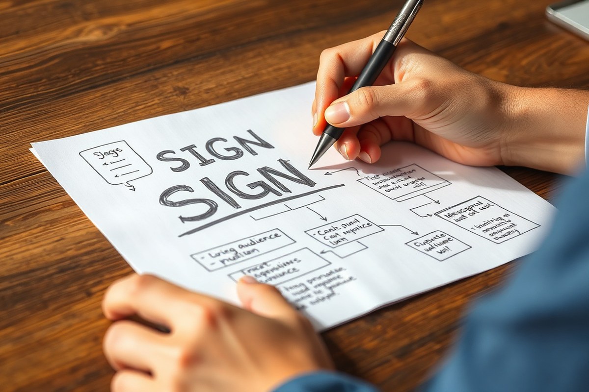
Defining your sign’s purpose starts with knowing what you want it to achieve. Trying to attract new customers, announce a promotion, or boost brand recognition? Clarifying this goal helps you focus on the most important message. For example, if your purpose is to drive immediate sales, your sign should highlight a key offer or call to action. When building brand awareness, your logo and tagline should stand out instead.
Once you pick the main goal, narrow down your message to one clear statement. A sign should communicate quickly and without confusion, since viewers often only have 2 to 3 seconds to read it, especially from a moving vehicle. This means you need to limit text to just a few words or a short phrase. Avoid overcrowding your sign with too many details; this reduces readability and weakens your impact.
Follow this script to craft your main message: First, state what your business is or offers in a few words. Next, include a benefit or reason to engage, like “Fresh coffee open early” or “Free estimates today.” Finally, add a simple call to action if appropriate, such as “Visit now” or “Call for a quote.” This formula keeps your text concise and focused on your sign’s purpose without extra filler.
Testing your message is key. Start by sketching your concept, then show it to colleagues or potential customers for feedback. Adjust wording based on what they understand quickly. Preview your design on screen and stand back a few feet to simulate viewing distance. This step helps you spot text that is too small or cluttered before printing. Remember, good signage often uses no more than two font styles to make reading easy.
The placement of your sign can also influence how well your message stands out. A sign mounted on a wall with contrasting background colors, like light text on dark bricks, increases visibility and makes your message easier to read at a glance. Knowing how your sign’s environment affects perception allows you to tailor your wording and design accordingly.
Cost-wise, focusing your sign’s content reduces production expenses since simpler designs may require less material and labor, especially for illuminated or custom-shaped signs. Clear and concise messaging improves the return on this investment by hitting your marketing goal your first time.
Overcrowding your sign with too many words makes it difficult to read from a distance, so keep your message short and clear.
3. Choosing Fonts and Letter Sizes for Maximum Readability
Selecting the right fonts and sizing letters correctly ensures your sign’s message is clear and readable from the distance your audience will view it. Choose simple, easy-to-read typefaces and size letters based on the typical viewing distance to avoid overwhelming or confusing readers. Testing your design in context helps you confirm that the text performs as expected.
Best Font Styles for Outdoor Signage
Simple and clear fonts outperform decorative or script fonts in outdoor signage. Sans-serif typefaces like Helvetica, Arial, or Futura offer clean lines and better visibility at a distance. These fonts reduce visual noise and improve legibility, especially when drivers or pedestrians see the sign briefly.
Avoid highly stylized fonts, thin strokes, or tight letter spacing. Fonts that mimic handwriting or use intricate details decrease readability. Choose fonts with consistent stroke widths and straightforward letterforms. The goal is to minimize the effort it takes for the viewer to identify each character.
Font Size Guidelines by Viewing Distance
Letter size should always be based on the distance from which viewers will read the sign. The most effective approach is to decide your primary viewing distance first, then calculate letter height to match. A simple rule of thumb is that for every 10 feet of distance, the letter height should be approximately 1 inch. Below is a helpful table showing recommended letter heights for various viewing distances, which aligns with common signage standards and clarity expectations.
| Viewing Distance (feet) | Minimum Letter Height (inches) | Recommended Letter Height for Easy Readability (inches) |
|---|---|---|
| 20 | 2 | 4 |
| 50 | 5 | 9 |
| 100 | 10 | 19 |
| 198 (car at 45 MPH, 3 sec glance) | 19 | 30+ |
This sizing approach prioritizes quick readability without overwhelming the sign layout. Larger letters might be impractical in tight spaces, but too small letters reduce visibility and effectiveness. Always size letters first, then scale your sign to fit those dimensions.
Common Font Mistakes and Fixes
Choosing fonts that are too decorative or using font sizes too small for the intended distance are the two leading errors. Text that blends into the background or uses low-contrast colors also hinders readability, but font choice and size are the foundation.
Fix these issues by swapping out complex fonts for clean, sans-serif alternatives and applying the size guidelines above. Avoid tight letter spacing, all caps in lengthy text, or mixing many fonts on one sign. Test your design in actual viewing conditions to catch any issues before final production.
4. Effective Color Combinations That Boost Visibility and Brand Recall
Choosing the right color combinations is essential to making your sign visible and memorable. High contrast between the background and text boosts readability, especially in variable lighting conditions or from a distance. For example, white text on a dark blue background creates a clear and professional look, while black text on a yellow background draws attention quickly. These contrasts help viewers process your message faster and recall your brand more easily.
Beyond contrast, consistent use of your brand colors across signage reinforces identity. Align your sign colors with your logos, fonts, and other brand elements. This integration enables people to recognize your brand at a glance, whether they see your awning, storefront, or digital ads. A harmonious color scheme that matches your overall identity will feel both contemporary and timeless, which can improve customer trust and engagement.
The environment where your sign will be placed also affects color choices. For outdoor signs in bright sunlight, opt for color contrasts that resist glare, such as dark lettering on a light background or vice versa. At night or in shaded areas, lighter text on a dark background often improves visibility. Matching your sign colors to the surroundings while maintaining legibility can prevent your sign from blending in or competing with other visual elements nearby.
Below is a comparison of effective color combinations commonly tested for readability at a distance. Each pair balances contrast and brand-friendliness to suit different environments and lighting conditions.
| Text Color | Background Color | Visibility | Typical Use |
|---|---|---|---|
| White | Dark Blue | High | Corporate, professional signs |
| Black | Yellow | Very High | Warning, outdoor, high visibility |
| Dark Green | Light Beige | Moderate to High | Natural, environmental, subtle branding |
| Red | White | High | Retail, alert, promotional signs |
| Yellow | Black | Very High | Nighttime visibility, caution signs |
| Black | White | High | All-purpose, classic, easy to read |
Using your brand colors consistently helps customers connect your signs with your business at multiple touchpoints. Avoid unusual or low-contrast combinations that reduce legibility or clash with your environment. For example, neon text on a bright background can confuse viewers or cause eye strain. Invest time in testing your sign colors under the actual conditions where they will be seen to confirm they work well together.
Applying these principles takes some effort but requires no extraordinary costs beyond selecting appropriate materials and inks from your sign maker. Signs with well-chosen colors not only grab attention but also support brand recall and guide potential customers toward action, improving the overall effectiveness of your marketing.
5. Using Graphics and Images to improve Sign Impact
Graphics and images can significantly increase a sign’s impact by attracting attention and improving message retention. Visuals add an extra layer of clarity to your sign by supporting the text and making the entire message easier to understand at a glance. According to the Pennsylvania College of Optometry, adding a graphic or an extra color can improve reader retention by up to 78%. That makes clear why choosing the right images matters just as much as your words and colors.
Choose graphics that directly relate to your sign’s purpose to avoid confusing viewers. For example, a coffee shop sign might use a sharp, high-resolution image of a steaming cup or coffee beans, reinforcing the main product. Avoid using unrelated or overly complex images that can distract from your message. Keep visuals simple and focused to maximize clarity and speed of recognition.
Make sure the graphics are high-resolution and crisp. Blurry or pixelated images can hurt your sign’s professionalism and reduce its visual appeal. For outdoor signs or larger formats, source images with at least 300 dpi resolution at the final print size. This might cost more upfront if purchasing stock photos or hiring a photographer, but the payoff is a sharp, eye-catching sign.
Placement is key. Position images near the main message to draw the eye to your key information, but avoid overcrowding. For storefront signs, place a single graphic to the left or right of the headline or use a background image that doesn’t compete with the text. In directional or informational signs, small icons can help quickly communicate concepts without adding bulk.
Different situations call for different approaches. A retail store targeting casual foot traffic benefits from colorful, inviting images with clear product cues. B2B businesses might prefer cleaner, more minimalist graphics to maintain professionalism. Seasonal promotions can incorporate thematic images, like pumpkins for fall sales, but swap them out quickly to avoid outdated visuals.
Good results show signs that catch the eye within three seconds and communicate their message clearly enough to be understood from a distance. Overuse of graphics or irrelevant imagery can confuse or slow down comprehension, reducing the sign’s effectiveness and possibly sending the wrong message about your brand.
Practical tip: Test your sign’s graphics by viewing the design from the typical customer’s distance; an image that looks clear up close may lose impact when seen from far away.
6. How to Structure Your Sign Layout for Clarity and Speedy Reading
Keep text on a sign short and focused to ensure fast comprehension. Limit lines to three or fewer and keep each line under eight words. Readers scan signs quickly, often in under three seconds, so cutting extra words boosts impact and clarity. Overcrowding text makes your message harder to read and less likely to be noticed.
Use a simple, clean layout with clear visual hierarchy. Place the main message at the top or center and use larger font sizes for key words to emphasize them. Align text elements consistently, either left-aligned or centered, to guide the eye smoothly across the sign. Adequate spacing between lines (leading) and between letters (kerning) improves readability and prevents the sign from feeling cramped.
- Limit sign text to 15-20 words total.
- Use 2-3 short lines, each with fewer than 8 words.
- Emphasize main message with larger font size (at least 1.5x subtext).
- Use consistent text alignment: left or center aligned.
- Increase line spacing by 120-150% of font size for easy scanning.
- Adjust kerning to avoid crowded or overly spaced letters.
- Separate important elements with enough white space to reduce clutter.
Short lines improve legibility because the eye can capture the whole phrase in one glance. When readers do not have to move their eyes too much, they read faster, sometimes up to 26% faster with well-structured layouts. Avoid all caps for long texts since they slow reading speed, but for very short, impactful words or acronyms, all caps may work.
Consider the viewing distance when arranging your layout. Closer viewing allows for slightly smaller fonts and tighter line spacing. For signs viewed from a distance (20 feet or more), increase font size significantly and add more white space. Traffic or wayfinding signs often benefit from simple, bold text and very few words to communicate directions instantly. Here’s a solid script to structure your sign layout:
Headline (main message): One clear sentence, 5-8 words, top-centered, largest font. Supporting line: One short phrase or secondary info, 4-7 words, below headline, medium font. Call to action or contact: A phone number, website, or action phrase, smallest font, placed at bottom.
Following these rules helps your sign deliver information quickly and clearly, preventing common mistakes like overwhelming the reader with too much text or poorly spaced layout. The effort to plan your layout this way usually takes less than an hour and requires no special tools beyond a standard design program. Results include greater message retention and higher likelihood of passing pedestrians acting on your sign’s message.
7. Choosing the Right Sign Shape for Your Location and Message
Choosing the right sign shape depends on the location, space available, and the message you want to convey. Rectangular signs are the most common and versatile. They work well for storefronts and directional signs, providing a clean layout that suits text-heavy messages. Rectangles optimize space, letting you fit longer names or detailed information clearly.
Square signs are compact, ideal for limited spaces such as posts, kiosks, or interior walls. Their balanced shape draws attention to simple, bold messages like logos or icons rather than lengthy text. Circle or oval signs add a softer, friendly feel and can differentiate your business, especially in retail or service entrances. These shapes stand out more than rectangles but limit the amount of text you can use effectively.
Directional signs often use arrow shapes, which clearly indicate movement or pathways. Using an arrow shape can increase comprehension and speed up decision-making for customers at intersections or within complex environments like shopping centers. Curved signs and custom shapes can creatively support your brand identity but often require careful design to ensure readability and fit within the environment.
Shape impacts visibility by influencing how the eye scans the sign and the space available for key elements. For example, a tall narrow rectangle suits pylons near roadways where vertical space is plentiful, while a wide horizontal rectangle fits above doorways or windows. In crowded storefronts, circular or oval signs can help a business stand out from typical rectangular signs nearby. Here is a comparison of common sign shapes and their uses to help you decide based on your specific location and message goals:
| Sign Shape | Recommended Use | Visibility Benefits | Message Type |
|---|---|---|---|
| Rectangle | Storefronts, directional signs, storefront windows | Maximizes space, easy to read linearly | Longer text, detailed info, business name |
| Square | Post signs, kiosks, interior branding | Compact, balanced for icons and short text | Logos, short slogans |
| Circle/Oval | Retail entrances, distinct brand marks | Stands out, softer aesthetic | Short brand names, symbols |
| Arrow | Wayfinding, parking, directional signaling | Immediate directional clarity | Directional words, short commands |
| Custom/Curvy | Brand identity, standout signage | Unique, draws attention but lower readability | Creative logos, limited text |
Exact measurements depend on your location’s distance from viewers. For signs viewed from 20 to 50 feet, letters should be at least 6 inches tall to maintain readability. This height often suits rectangular or square signs. Curvy or custom shapes may require larger sizes to keep text legible, potentially increasing costs.
Tradeoffs include balancing space with readability. Too much text on a circular sign can make it cluttered. Using rectangular shapes with more area supports longer messages but fits less well in tight or angled spaces. Consider the environment’s shape restrictions and customer sightlines to pick the shape that delivers your message clearly without overwhelming the viewer.
8. The Role of the Optical Center and Negative Space in Sign Design
The optical center and negative space play key roles in creating visually balanced signs that quickly grab attention and aid legibility. Placing key elements near the optical center and using negative space properly makes your sign feel organized and easy to read at a glance.
Defining the Optical Center
The optical center is where the eye naturally lands when viewing a design. Unlike the exact mathematical center, which sits at 50% down the page, the optical center typically falls slightly above it, around 46% from the top. This subtle difference accounts for how people visually scan signs more comfortably when important elements are a bit higher than center. Positioning your most important message or graphic at this optical center aligns with natural eye movement, increasing the chance people will notice and remember it fast.
This concept matters because placing content precisely at the middle can feel off-balance. For example, a business name positioned exactly at the 50% vertical mark may require extra visual weight to feel centered, while placing it closer to the optical center creates a more comfortable and inviting layout without added effort.
Adjusting Design for Optical Balance
To adjust your sign for optical balance, start by measuring down 46% from the top edge to mark the optical center. Arrange your headline, logo, or critical graphics around this point rather than at the exact center. When your sign is wider, balance heavier elements by offsetting lighter content or empty space to prevent lopsided designs.
Should your sign need a border, use it to frame the reading area so the eye naturally moves inward toward the optical center. Borders help contain the viewer’s focus and reduce distractions. Signs with multiple message areas should still maintain overall balance by aligning main points near the optical center and spacing supporting details around them.
Place your most important text or image near 46% vertical height rather than rigidly centering it to create a comfortable viewing experience.
Negative Space Techniques for Clarity
Negative space, or empty areas without text or images, prevents clutter and guides the eye through your sign smoothly. Use negative space to separate headline, body copy, and graphics. This separation boosts legibility, especially from a distance, where crowded elements blend together and lose impact.
Effective use of negative space can mean adding 10% to 20% more blank area than you think you need. For example, around a 24-inch-wide sign, leaving at least 2 inches of margin or padding around content supports reading speed and reduces eye strain. Keep in mind that negative space isn’t wasted space; it is part of your design that frames and highlights the important parts.
Situations with limited sign size require prioritizing white space more carefully. Tighter spaces demand fewer words and more focus on key elements placed near the optical center. When making directional or informational signs, increasing negative space around arrows, symbols, or numbers improves immediate comprehension.
9. Materials, Texture, and Placement: Making Your Sign Durable and Visible
Your choice of materials directly impacts how long your sign lasts and how well it catches attention. For outdoor signs, durable materials like aluminum or weather-resistant acrylic resist fading and warping in sun, rain, or snow. Aluminum typically costs between $10 and $20 per square foot and can last up to 10 years with minimal maintenance. For indoor signs, lighter materials like foam board or PVC work well and cost less, usually around $3 to $7 per square foot, but they don’t hold up to moisture or heavy wear. Textured surfaces can make your sign stand out by adding depth and tactile interest, but avoid overly rough textures that might obscure your message or create glare under lighting.
Placement plays a major role in your sign’s visibility and lifespan. Position your sign at eye level or slightly above for easy reading. For pedestrian traffic, 5 to 7 feet above the ground is ideal, while roadside signs benefit from higher placement to be seen from a distance and by drivers. Shade protects your sign from UV damage, extending its durability. Avoid placing signs where trees or buildings cast heavy shadows that reduce readability, or where dirt and water splash often, which increases maintenance needs.
Consider your sign’s viewing distance and angle. For a storefront sign, place it perpendicular to the sidewalk so pedestrians can see it clearly from both directions. For signs aimed at drivers, mount them so the face is parallel to the road with an unobstructed line of sight from at least 100 feet away. This ensures the message is readable within the typical decision time drivers have.
Here’s a checklist to ensure durability and visibility: verify your chosen material matches the weather exposure; use UV-treated inks or finishes for outdoor colors; aim for placement with direct but not harsh sunlight; mount at heights suited to your main audience; keep the sign free from obstructions; and select textures that improve rather than distract from the message. Regularly inspect your sign for signs of wear, such as fading or peeling, to schedule timely repairs.
For signs exposed to harsh environments, like salty coastal air or heavy industrial pollution, consider higher-grade materials such as marine-grade aluminum or laminated protective coatings. These can cost about 20 to 40% more but prevent frequent replacements. Indoor signs in high-traffic areas may need impact-resistant acrylic to avoid scratches and dents. Textures like matte finishes reduce glare from indoor lighting, improving legibility.
Strategic placement and material choice not only improve your sign’s appearance but also reduce long-term costs by minimizing replacements and upkeep. Thoughtful texture selection adds a subtle but effective design layer, while proper mounting height and orientation make sure your message isn’t missed by your target audience. Matching these factors to your specific location and audience will help your sign maintain its impact throughout its intended lifespan.
10. Common Sign Design Mistakes and How to Fix Them
Cluttered signs confuse viewers and reduce message impact. Signs overloaded with text or graphics make it hard for people to quickly grasp important information. Fix this by prioritizing only one main message and supporting details. Use bullet points or short phrases and remove anything unnecessary.
Poor contrast between text and background lowers sign readability, especially from a distance or in bright light. Avoid light text on light backgrounds or dark text on dark backgrounds. Use high-contrast color pairs like black on white or white on blue. Check your sign under different lighting conditions before finalizing your design.
- Limit text to 5 to 7 words for the main message
- Choose contrasting colors using a tool or color wheel
- Use a minimum font size of 1 inch tall for signs viewed from 10 feet away
- Stick to one or two easy-to-read fonts, avoid overly decorative styles
- Space letters adequately to prevent crowding and improve clarity
- Remove or simplify background images to keep text legible
- Check text alignment and centering visually, not just mathematically
Using the wrong font size is a frequent issue that causes poor readability. A simple rule is if your sign will be viewed from 10 feet, letters should be at least 1 inch tall. For longer distances, increase font size by 1 inch for every additional 10 feet. For example, a sign meant to be read from 30 feet needs 3-inch letters. Small fonts may save space but frustrate viewers, hurting your sign’s purpose.
Mathematical centering of text on a sign or wall can sometimes make the content appear lower than expected. Try raising text about 10% above the vertical center line for better visual balance. This subtle adjustment creates a stronger focal point and improve the sign’s appeal.
Confusing messaging often results from not defining your sign’s main purpose clearly. Start by writing your key message and asking if each word supports it. Cut any words or elements that don’t contribute directly. Replace jargon or elaborate phrases with simple, direct language that your audience understands easily.
11. Testing Your Sign Design and Knowing When to Hire a Professional
Testing your sign design before finalizing ensures it communicates clearly and attracts attention as intended. You can assess readability and impact by viewing the design in conditions similar to where the sign will be placed. Hiring a professional designer makes sense when your project involves complex branding, unusual placement, or demands high visibility and durability that you can count on.
Testing Sign Visibility in Real Environments
Check how your sign looks from typical viewer distances and lighting conditions at the installation site. Different weather or lighting can change how your colors and fonts appear. Testing helps you catch problems like hard-to-read text or distracting glare before production and installation.
Start by printing a life-size version of your design on paper or a lightweight board. Place it where the final sign will hang, then observe it during various times of the day. This will reveal if fonts are legible from the needed distance and whether colors stand out against the background.
- Print your design full size using accurate colors and materials whenever possible.
- Install the sample in the intended location or simulate this environment.
- View it from multiple angles and typical distances, including the farthest expected viewer point.
- Assess readability in both bright sunlight and low-light conditions if possible.
- Note any elements that lose visibility, such as small text or low-contrast colors.
- Compare how the sign stands out from nearby objects or competing signs.
- Make adjustments to fonts, colors, or layout based on your observations.
Gathering and Incorporating Feedback
Multiple opinions improve design quality. Run your draft sign by people who match your target audience and those unfamiliar with your business. Ask for feedback on clarity, appeal, and overall impact. Honest comments reveal what resonates and what causes confusion.
Use guided questions to get focused responses about size, font readability, color attractiveness, and message clarity. Implement changes based on consistent feedback trends. This iterative approach reduces the risk of costly design errors during production and installation.
Make sure your feedback group includes viewers of different ages and vision capabilities to catch diverse readability issues.
Criteria for Hiring Professional Designers
Consider hiring a professional when your sign must comply with local regulations, represent a complex brand identity, or require specialized installation. Professional sign designers bring expertise in typography, color theory, material durability, and site-specific considerations.
Professionals can also manage the entire process, from design through creation and installation, saving you time and avoiding costly mistakes. The Sign Pack, for example, offers access to over 100 graphic designers skilled in signage for small businesses. You may want to hire a pro if your estimated sign budget exceeds a few hundred dollars or your project has unusual technical demands. Use this decision rule to guide you:
- Gauge your design skills versus the project complexity.
- Assess whether your sign needs to meet regulatory or brand standards.
- Consider your budget for design, production, and installation.
- Decide if professional experience would reduce risk or increase impact.
- Any answers leaning toward complexity or strict requirements suggest consulting a professional.
Step-by-Step Action Plan for Designing Effective Signs
Follow these steps to create signs that grab attention and drive customer action successfully.
- Before you start: Define your sign’s purpose and main message clearly. Make sure the message fits your brand and target audience.
- Day 1: Choose fonts and letter sizes that ensure readability from your sign’s typical viewing distance. Check with a test at that distance.
- Day 2: Select color combinations that maximize contrast and align with your brand colors. Confirm visibility by viewing your design under different lighting.
- Day 3: Add graphics or images that support your message without cluttering. Ask others if the visual elements make the message clearer.
- Day 4: Arrange your layout using the optical center and leave enough negative space to guide quick reading. Test readability within 5 seconds.
- Day 5: Pick a sign shape and size appropriate to your location and message complexity. Check that the sign fits the physical space and stands out.
- Day 6: Choose durable materials and place your sign where it’s easily visible and protected from elements. Inspect it from the typical customer’s view.
- Day 7: Review your design to avoid common mistakes like overcrowding or poor contrast. Run the design by someone unfamiliar with your project for feedback.
Frequently Asked Questions
What Is the Most Common Mistake in Sign Wording?
The most common mistake is using bad wording that confuses the message. Clear and concise text helps ensure your sign quickly communicates its purpose.
How Does Sign Placement Affect Design Effectiveness?
Sign placement is almost as important as design for visibility. Even the best design won’t be noticed if the sign is hidden or poorly located.
Why Is White Space Important in Sign Design?
White space prevents clutter and improves readability. Using space strategically helps the key message stand out and makes the sign easier to scan quickly.
How Can Materials Reflect My Brand on a Sign?
Materials like metal, wood, or acrylic tell a story about your brand’s personality. Choosing the right texture and finish aligns your sign’s look with your business ethos.
What Role Does the Optical Center Play in Design Layout?
Positioning elements at the optical center balances the sign visually and draws attention. This small adjustment can make your design more appealing and easier to read.
Can a Small Design Tweak Improve a Sign’s Impact?
Small tweaks in color contrast, font size, or layout can greatly improve readability and appeal, making your sign more effective without a full redesign.
Final Thoughts
Effective sign design combines clarity, consistency, and strategic placement to attract and inform your target audience. Focus on creating a message that reads quickly and looks professional to increase customer engagement. Your next step should be drafting a simple sign prototype and testing it in the actual location to see how well it catches attention and conveys your message.