How to Space Letters on a Sign: Expert Tips for Clear, Readable Signs
Correctly spacing letters on a sign ensures your message is easy and fast to read. A good guideline is to have 1 inch of letter height for every 10 feet between the viewer and the sign. First, determine how far away the audience will be, then space the letters to balance readability and appearance.
Key Takeaways
- Measure the viewing distance first to determine your minimum letter height using 1 inch per 10 feet as a baseline.
- Keep letter spacing around 8% of the letter width for most sans serif fonts to maintain legibility at a distance.
- Maintain white space equal to 60% of the sign area, letting your lettering occupy about 40% for balanced visibility.
- Use proper kerning to adjust space between individual letters, increasing spacing for smaller fonts below 13 pixels.
- Apply larger spacing between words than between letters to improve readability without crowding.
- Account for material shifts in wood or metal, allowing slight spacing adjustments to accommodate expansion or shrinkage.
How to Space Letters on a Sign for Maximum Readability
Spacing letters on a sign effectively requires a balance between readability and visual appeal. The best approach combines consistent letter spacing with ample white space around the text. Research from the Sign Research Foundation shows that optimal spacing can improve comprehension by as much as 25% at a distance of 100 feet. To achieve this, your sign’s copy should occupy roughly 40% of the total area, leaving 60% as white space that frames and highlights the message.
White space plays a critical role. A practical rule is to maintain at least a 2-inch margin around the edges of the sign. For example, on a 10-inch by 20-inch sign, you would allocate about 6 inches by 16 inches for letter placement after applying this margin. This buffer prevents the letters from feeling cramped and improve legibility by providing visual breathing room.
The space between letters depends largely on their height and the overall sign size. Larger letters demand wider spacing to avoid crowding and to maintain clarity from farther distances. The industry standard suggests a letter height of 1 inch for every 10 feet of expected viewing distance, which influences the recommended letter spacing. For instance, 3-inch tall letters meant to be read from 30 feet should have proportionally more space between them than letters designed for close-up reading.
Letter spacing, or kerning, ensures that the gaps between individual letters appear visually even. Uneven spacing can cause letters to cluster or drift apart, disrupting readability and making the sign appear unprofessional. The goal is to adjust space so that pairs of letters, like “FA” or “LA,” don’t leave awkward gaps due to their shapes. This usually involves a combination of manual kerning and reference to font standards, especially when working with vinyl lettering or custom-cut signs.
Balancing readability with aesthetics means avoiding overly tight or loose letter spacing. Tight spacing may cause letters to merge visually, while too much space could make words harder to recognize quickly. The sweet spot varies with font style and size but generally aligns with increasing letter spacing slightly as letter size decreases, especially when font sizes drop below 13 points for digital proofs or vinyl templates.
In practice, test your sign design by stepping back to its typical viewing distance and verify that letters have enough clearance without excessive gaps. Avoid exceeding letter heights recommended for your distance, as that can force spacing choices that reduce overall quality. Following these principles results in signs that effectively communicate your message with professionalism and clarity.
How Viewing Distance Determines Letter Size and Spacing
The size of letters on a sign and the spacing between them depend on how far away people will be standing or driving when they read it. Typically, letters should be 1 inch tall for every 10 feet between the sign and the viewer. This sizing keeps your message easy to read from a distance. Signs meant to be seen from very far, like highway or building signs, require larger letters.
Spacing between letters, known as tracking, usually increases with letter size. For most channel letter signs, aim for letter spacing to be between 10% and 15% of the letter height. Capital letters are blockier and can look crowded if spacing is too tight, so adjusting tracking as letters grow helps keep the text easy to read. Below is a table showing recommended minimum letter heights based on viewing distance for common signage applications:
| Viewing Distance | Minimum Letter Height | Common Applications |
|---|---|---|
| 10 feet | 1 inch | Window decals, door signs |
| 50 feet | 5 inches | Storefront signage, A-frames |
| 100 feet | 10 inches | Building identification |
| 200 feet | 20 inches | Highway signs, monument signs |
This table helps you decide what letter height to use by measuring how far your typical viewer will be. Remember, the minimum letter height listed is the smallest size that still offers legibility at that distance. For best visibility, consider going above the minimum if space and budget allow.
Spaces between letters should grow proportionally as letters get larger to avoid cramping. For example, if you use 6-inch tall letters, spacing around 0.6 to 0.9 inches usually works well. Use a flat percentage of the letter height (10%-15%) as your spacing guideline, but always preview your design to see how the font and case affect spacing needs.
Practical tip: When you submit your sign design, specify letter spacing as a percentage of letter height or request the fabricator use about 12% if you’re unsure, and ask for a proof before final production.
Understanding Kerning, Tracking, and Word Spacing Differences
Kerning adjusts the space between specific pairs of letters to create a visually balanced appearance. For instance, the space between “A” and “V” in a sign often needs tightening since their shapes naturally create a larger gap than other pairs. Tracking, on the other hand, changes the spacing evenly across an entire word or sentence. This uniform adjustment can make text look more open and readable or more compact depending on whether you increase or decrease the tracking. While kerning is all about the fine-tuning of individual letter pairs, tracking provides consistent spacing that affects the overall text block’s rhythm.
Word spacing refers to the gap between separate words rather than individual letters. It plays an important role in sign legibility because too little space makes words run together, while too much spacing breaks reading flow. In signage, word spacing typically should be set wider than letter spacing, around 20% to 30% more than the default, to ensure clarity. For example, on a large storefront sign, maintaining consistent word spacing helps viewers quickly separate words even from a distance, improving readability.
Letter spacing should adjust depending on each letter pair since their shapes influence perceived distance. Applying the same spacing to all pairs can cause uneven gaps. Review the space between each pair and tweak it visually as needed. This careful process is essential especially for large signs where spacing errors become obvious, such as turning “WELCOME” into “W E L C O M E” if the letters are too far apart. For example, adjusting kerning by 1/8 inch on artwork might translate to a 1.25-inch change on a 10-foot-high outdoor sign. Using manual or software kerning tools helps improve your sign’s appearance and legibility.
To space letters effectively on a sign, start by setting your base tracking, for example, a slightly expanded setting around +10% can prevent letters from appearing crowded. Next, check word spacing, ensuring gaps between words are larger than between letters, preferably by about 20% to 30%. Then examine each pair of letters for kerning adjustments, tightening or loosening spacing to make the letter shapes look balanced and readable. Consistent spacing is particularly important when using changeable letter systems like letterboards, where uneven gaps can distract or confuse viewers. Remember, the larger the sign or letters, the more noticeable poor kerning and word spacing become, so take the time to get these details right. Proper kerning and tracking avoid both overcrowding and disjointed text, resulting in a sign that’s easy to read and attractive from various viewing distances.
Calculating Letter and Word Spacing Based on Sign Size
Calculate letter size and spacing carefully by first measuring your sign’s total dimensions and set margins, then determine the minimum letter height needed based on viewing distance. Next, use spacing ratios to evenly distribute letters and words within the available space, adjusting as needed for the chosen font style and sign shape. This method ensures your text fits well, looks balanced, and stays legible.
Measure Total Sign Dimensions and Margins
Start by measuring the entire width and height of your sign. Then decide how much empty space to leave around the text, this margin keeps your message from looking crowded and improves legibility. A common rule is to reserve 10% to 20% of the sign’s overall width and height for margins, depending on the sign’s size and location.
Margins vary by design but usually range from 1 to 3 inches on indoor signs, and 3 to 6 inches or more on outdoor signs exposed to longer viewing distances. Leaving equal margins on all sides creates a balanced layout and frames the text well.
Calculate Minimum Letter Height for Distance
Letter height should suit the viewing distance to keep your sign clear. A standard guideline is 1 inch of letter height for every 10 feet the viewer is from the sign. For example, text meant to be read from 50 feet away needs to be at least 5 inches tall. Steps to determine letter height include:
- Measure or estimate the average viewing distance in feet.
- Divide the distance by 10 to get minimum letter height in inches.
- Increasing letter height improves visibility and strengthens branding when space on your sign permits.
- Confirm this height fits within the sign’s vertical space minus margins.
Determine Spacing Ratios for Letters and Words
After deciding letter height, calculate spacing to evenly fill the horizontal space. Kerning between letters typically ranges from 5% to 15% of the letter width, which prevents crowding or excessive gaps. Word spacing should be scaled proportionally, roughly 50% to 100% wider than letter spacing, especially important if using all-capital letters. To fit text within your sign:
- Subtract twice the margin from the total sign width to find usable text width.
- Estimate the average letter width based on your font and letter height.
- Multiply letter width by the number of letters, then add total inter-letter and inter-word spaces.
- Adjust kerning and word spacing percentages iteratively until text length fits within usable width.
Adjust Spacing for Font Style and Sign Shape
Fonts with wide or complex letters, like script or decorative styles, need more spacing to remain legible. Narrow or sans-serif fonts allow tighter spacing. The architecture of your sign, such as curved or angled surfaces, requires spacing tweaks to prevent overlapping or distortion.
For example, on channel letters with thick stroke widths, increase letter spacing up to 15% of letter width. On rectangular signs with simple fonts, 5% spacing might suffice. Test spacing by printing samples scaled to sign size or use design software tools.
Letter Spacing Guidelines for Different Materials and Environments
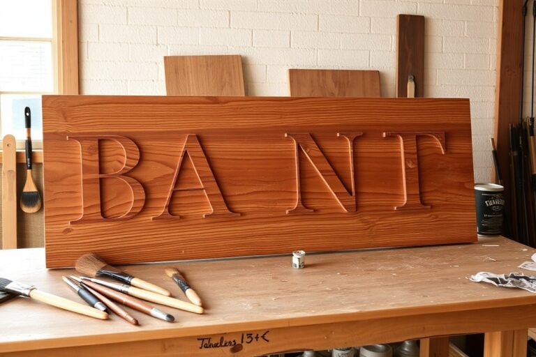
Materials like wood, metal, and vinyl affect letter spacing because each expands and contracts differently under temperature and humidity changes. Wood signs, for instance, absorb moisture and swell when humidity rises, which can tighten letter spacing and distort kerning. Summer humidity levels of around 18% may cause wooden letters to expand by about 1/16 inch, enough to crush the space between letters if not accounted for. To prevent this, increase letter spacing on wood signs by approximately 10 to 15% when laying out your design. This extra room allows wood to expand without making letters appear cramped or overlapping.
Metal signs respond less to humidity changes but still expand slightly with temperature shifts, so spacing should be more conservative. On metal signs with a 12-inch letter height, maintain letter spacing between 1.2 to 1.8 inches, sticking toward the lower end of that range for typical outdoor environments. If your metal sign includes back-lit halo letters, increase spacing 15 to 18% to avoid shadow bleed and ensure clear letter definition. Metal retains shape well, so large spacing changes are less critical compared to wood, but even small miscalculations can make text appear scattered across the raceway rather than integrated.
Vinyl and other synthetic materials tend to be more stable, expanding less in humidity but potentially shrinking slightly in cold. For vinyl-faced signs, spacing adjustments are often minor, but tracking should still allow for small material shifts to prevent buckling or peeling. Using flexible adhesives and high-quality vinyl reduces the need for major letter spacing changes. Always check manufacturer recommendations since some vinyls tolerate tight spacing better than others.
Spacing adjustments also serve as a safeguard against material expansion issues during installation. Adding 10 to 15% more space than your ideal kerning allows for changes without costly redo work; over 35% of sign redos stem from spacing errors according to a 2026 Woodworkers Guild survey. Doing this upfront can save hundreds of dollars and dozens of hours, no sign maker wants to waste $300 in cedar or $800 on a front-lit letter due to tight, unworkable spacing. Always consider the local climate and material behavior before finalizing letter spacing to avoid these costly mistakes.
Allow extra spacing on wood signs to accommodate expansion, tight spacing on a humid day can become impossible to read when the wood swells.
Best Practices for Spacing Letters on All-Capital and Punctuation-Heavy Signs
Spacing letters on signs with all-capital text and punctuation-heavy designs requires special attention to kerning and spacing. Capital letters often sit too close together, making the sign look cramped or uneven. Adjusting spacing for punctuation and numbers ensures clear readability and a polished, professional look.
Identify Problematic Letter Pairs in Uppercase Text
Capital letters tend to create tight spacing, especially between certain pairs like “AV,” “VA,” “TO,” and “LA.” These pairs often look unbalanced because of their shapes and fixed widths. Numbers next to letters can cause similar issues, depending on their form and width.
Begin by reviewing the sign layout closely for tight-fitting pairs. Signs with all caps generally show more spacing issues than mixed-case because uppercase letters have less natural variation in shape and height. Identifying pairs where letters almost touch or create distracting gaps is the first step toward balanced spacing.
Adjust Space Around Punctuation Marks Appropriately
Punctuation marks demand distinct spacing rules compared to letters. Items like periods, commas, apostrophes, and colons need slightly more space on both sides to avoid clustering. For example, a period following a capital letter should have about 15% more space to prevent it from seeming cramped.
Numbers combined with punctuation often need extra care. A phone number on a sign, for instance, should have enough space between digits and dashes or parentheses to remain legible from a distance. Adjust punctuation spacing manually or use kerning tools designed for signage.
Apply Recommended Spacing Increases for All Caps
Generally, add about 10 to 15 percent more space between uppercase letters compared to mixed-case text. This compensates for the naturally tighter fit of capital letters. Erring on the larger side usually improves clarity and aesthetics, especially on signs viewed from several feet away.
Smaller lettering sizes, such as on upscale retail or historic district signs, sometimes require less additional spacing. Those situations call for a softer touch to avoid too much negative space, which can look sparse or weak. Use visual tests at the actual display size to confirm. Follow these steps to space letters effectively on all-capital and punctuation-heavy signs:
- Review the entire text layout to spot tight or uneven letter pairs, focusing on common problematic pairs like “AV” and “TO.”
- Inspect all punctuation marks in the text, noting where commas, periods, and colons appear, especially next to letters and numbers.
- Use software kerning tools or manual spacing adjustments to increase space around identified letter pairs and punctuation marks as needed.
- Add 10, 15% more space between all-uppercase letters compared to normal mixed-case spacing.
- Check spacing at full scale or printed proof, viewing from the intended distance to confirm visual balance.
- Reduce spacing slightly if the design calls for smaller, elegant lettering styles but keep clarity a priority.
- Test spacing with actual sign materials and lighting conditions, as reflections can affect letter clarity.
- Consult professional signage designers or typographers when working on high-stakes or complex sign projects for best results.
Common Letter Spacing Mistakes and How to Fix Them
Common mistakes in letter spacing often hurt the professional look and legibility of your sign. One typical error is setting letters too close together, especially with large letters. This crowding makes words blur and forces viewers to pause, decreasing sign readability. On the flip side, letters spaced too far apart break the word flow, causing confusion and a disjointed appearance. Uneven spacing, where some letters cluster tightly while others have wide gaps, signals careless design and lowers trust in your brand.
Correcting these spacing issues starts with identifying the problem. If letters are too tight, increase the space between them by adjusting tracking or kerning controls in your design software. Signs made from vinyl or painted letters might allow some correction by carefully repositioning decals or repainting in the early stages. For channel or dimensional letters, spacing changes after production can be costly and time-consuming, often requiring full removal and reinstallation. Prevention through precise design and proofs helps avoid expensive fixes. Here is a checklist to identify and fix common letter spacing mistakes on your sign:
- Check for overly small letters that get lost from a distance; increase size to improve visibility.
- Look for letters too close together, especially on large text; add 1/8 inch to 1/4 inch space between characters for clarity.
- Ensure spacing consistency across all characters to maintain a polished, intentional look.
- Test your design by viewing at the expected distance to confirm readability and spacing balance.
- For materials like vinyl or paint, confirm adhesion and drying times before making adjustments to avoid damage.
- Avoid mixing fonts or weights that demand different spacing unless carefully kerned.
The impact of poor letter spacing extends beyond aesthetics. Signs with bad spacing can frustrate potential customers, making your message harder to understand or causing it to be overlooked. This reflects on the business as inattentive and unprofessional. A well-spaced sign conveys quality and reliability, attracting customers by making the message clear at a glance.
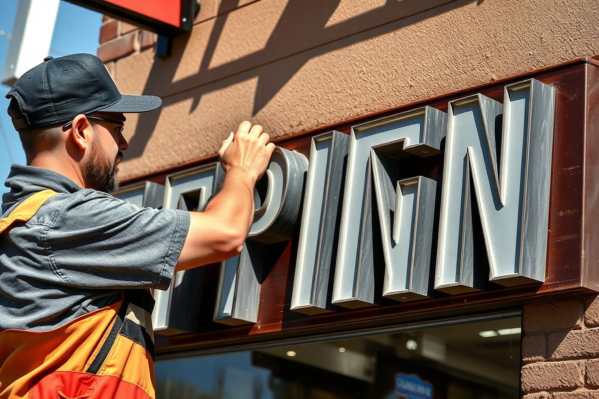
For signs already produced, minor spacing corrections may be possible on flexible materials by removing and repositioning individual letters, provided you do so gently and within cautious timelines to avoid adhesive failure or damage. For permanent signage like metal channel letters, spacing adjustments require re-fabrication or complete replacement, which can cost hundreds to thousands of dollars. Always review spacing details before final production to save time and expense.
Visual and Measurement Techniques to Verify Spacing on Your Sign
Checking and confirming the spacing of letters on your sign before installation ensures clarity and aesthetic appeal. Using simple tools like rulers and spacing gauges, combined with on-site visual inspections, you can detect inconsistencies early and make necessary corrections. These methods save time and prevent costly rework by ensuring the sign looks balanced and readable at the intended viewing distance.
Use Ruler and Spacing Gauges to Measure Gaps
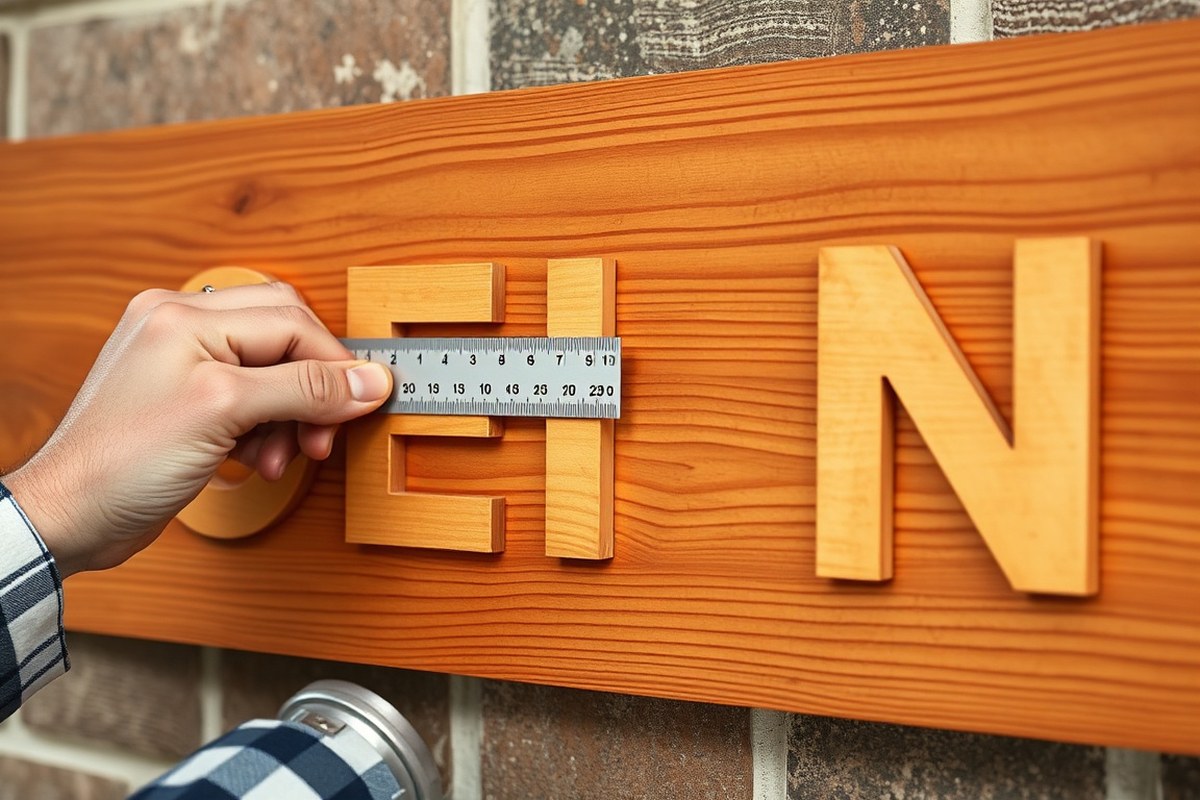
Accurate letter spacing depends on precise measurements between each character. Professional sign makers often use metal rulers and letter spacing gauges designed to hold consistent gaps. These tools help maintain uniformity, especially on larger signs or when working with all-capital letters.
Spacing gauges are inexpensive, sometimes priced between $10 and $30, and are adjustable to suit different letter sizes. Use one to set the space between letters evenly by aligning it at the midpoint of letter heights for better accuracy.
Step Back and View Sign from Recommended Distance
Visual checks at the sign’s intended viewing distance reveal whether the spacing allows for easy reading. A common practice is to step back about 20 feet or more, depending on the sign’s size and location, to assess overall legibility. For roadside or building signs, digital tools help determine the ideal letter size and spacing through online calculators related to viewing distance. Signs that look well spaced up close can appear crowded or too loose from afar, so this distance check helps confirm the sign meets readability standards for your audience.
Adjust Spacing Based on Visual Balance and Legibility
Spacing adjustments rely on a blend of measurement and judgment. Letters should have visually equal space rather than strictly equal numeric gaps, since shapes affect perception. For example, round letters like “O” may require slightly more room than narrow letters like “I.”
Iterate by sketching letters onto the sign surface with a pencil and ruler, then step back again. Repeat this process until the text appears balanced and legible without awkward gaps or crowding.
- Trace each letter lightly with a pencil onto the sign base, using a ruler for alignment.
- Measure the gaps with a spacing gauge or ruler at the midpoint of letters.
- Step 20 feet back and examine the overall visual balance and readability.
- Adjust the spacing by erasing and retracing letters if needed.
- Repeat the measurement and viewing steps until satisfied.
Mark Guidelines to Ensure Consistent Spacing During Installation
Before permanently affixing letters, draw faint guidelines on the sign surface to keep spacing accurate. Use a pencil and straightedge to mark baselines and vertical boxes where each letter will sit. These act as a template during installation and help prevent uneven spacing caused by placement errors. Templates can also be made from cardboard or plastic sheets with cutouts matching the letter size to quickly position letters with consistent gaps.
Double-check all pencil marks before installing permanent materials to avoid mistakes that are difficult to correct later.
Step-by-Step Action Plan for Perfect Letter Spacing on Your Sign
Follow these steps to achieve clear, professional-looking letter spacing that boosts your sign’s readability.
- Before you start: Determine your sign’s viewing distance and size to calculate the minimum letter height and spacing needed. Check if your material and environment will affect spacing choices.
- Day 1: Establish the base letter size using viewing distance guidelines, typically 1 inch in height for every 10 feet away. Make sure your spacing calculator or tool matches this measurement.
- Day 2: Apply consistent tracking across all text, adjusting based on whether the sign uses all capitals or punctuation, as these often need tighter or looser spacing. Preview your layout digitally or printed scale to confirm flow.
- Day 3: Adjust kerning for specific letter pairs that look too close or far apart manually, especially on words with tight or wide letter shapes. Take measurements and compare visually to a spacing template.
- Day 4: Measure word spacing between each word, keeping it proportional to letter size and style. Test viewing at the intended distance or photograph and zoom to inspect spacing consistency.
- Week 1: Use a spacing gauge or create a stencil based on your measurements to verify spacing during fabrication. Ensure environmental factors like light or mounting surface do not distort perception.
- Week 2: Test readability by showing mockups or samples to potential viewers. Adjust spacing if letters appear crowded or too spread out under real conditions.
Frequently Asked Questions
How Do I Decide the Space Between Letters Based on Letter Height?
The space between letters typically equals half the letter height. For example, if your letters are 4 inches tall, aim for about 2 inches of spacing to keep the text readable and balanced on the sign.
Can Spacing Between Letters Affect How People Perceive My Sign’s Message?
Yes, improper spacing can confuse viewers or make the sign look cluttered. Proper spacing ensures each letter stands out, improving readability and delivering a clear message to your audience.
Is It Okay to Manually Space Letters Without Design Software?
Yes, but use a ruler or spacing tool for accuracy. Always check your spacing in person to avoid uneven gaps that design software would automatically correct.
What Role Does Word Spacing Play Compared to Letter Spacing on Signs?
Word spacing controls the gap between words, often twice the letter spacing. Balancing both ensures the sign’s message flows smoothly and is easy to read from a distance.
How Should I Adjust Letter Spacing for Long Words on a Narrow Sign?
Reduce letter spacing slightly to fit long words but keep it readable. Avoid cramming letters too close to prevent blurring or confusion from a distance.
Why Do Signs with All Capital Letters Need Special Spacing Considerations?
All caps usually need more letter spacing to prevent letters from merging visually. This extra space helps maintain clarity and prevents the sign from looking too crowded.
Key Points to Remember
Proper letter spacing combines precise measurement with visual checks tailored to your sign’s size, location, and materials. Begin by carefully choosing letter sizes suited to your viewing distance, then apply measured tracking, kerning, and word spacing adjustments. Use physical or digital tools to confirm your choices, and test in real-world conditions. Start spacing your next sign with these steps to ensure professional appearance and maximum readability.