Ada Sign Requirements: Complete Guide to Design and Installation Rules
ADA sign rules require signs to feature tactile letters and Braille for easy reading by everyone. Install these signs between 48 and 60 inches above the floor finish, usually placed on the door’s latch side. Correct height placement and character design ensure the signs meet accessibility standards and support inclusive navigation.
Key Takeaways
- Tactile characters must be sized so each letter’s width is 55% to 110% of its height for readability.
- Install Braille in Grade 2 format below tactile text on signs identifying rooms and features.
- A clear floor area measuring 18 by 18 inches must be kept directly in front of the sign, allowing easy access and use by individuals with disabilities.
- Use light-on-dark or dark-on-light color combinations providing at least 70% contrast for visual clarity.
- Mount ADA bathroom signs on the latch side wall with text and Braille between 48 and 60 inches above floor.
- Confirm state-specific rules, such as in California, where Braille cells must be 48 inches from the floor, not just text.
Core ADA Sign Requirements for Accessibility Compliance
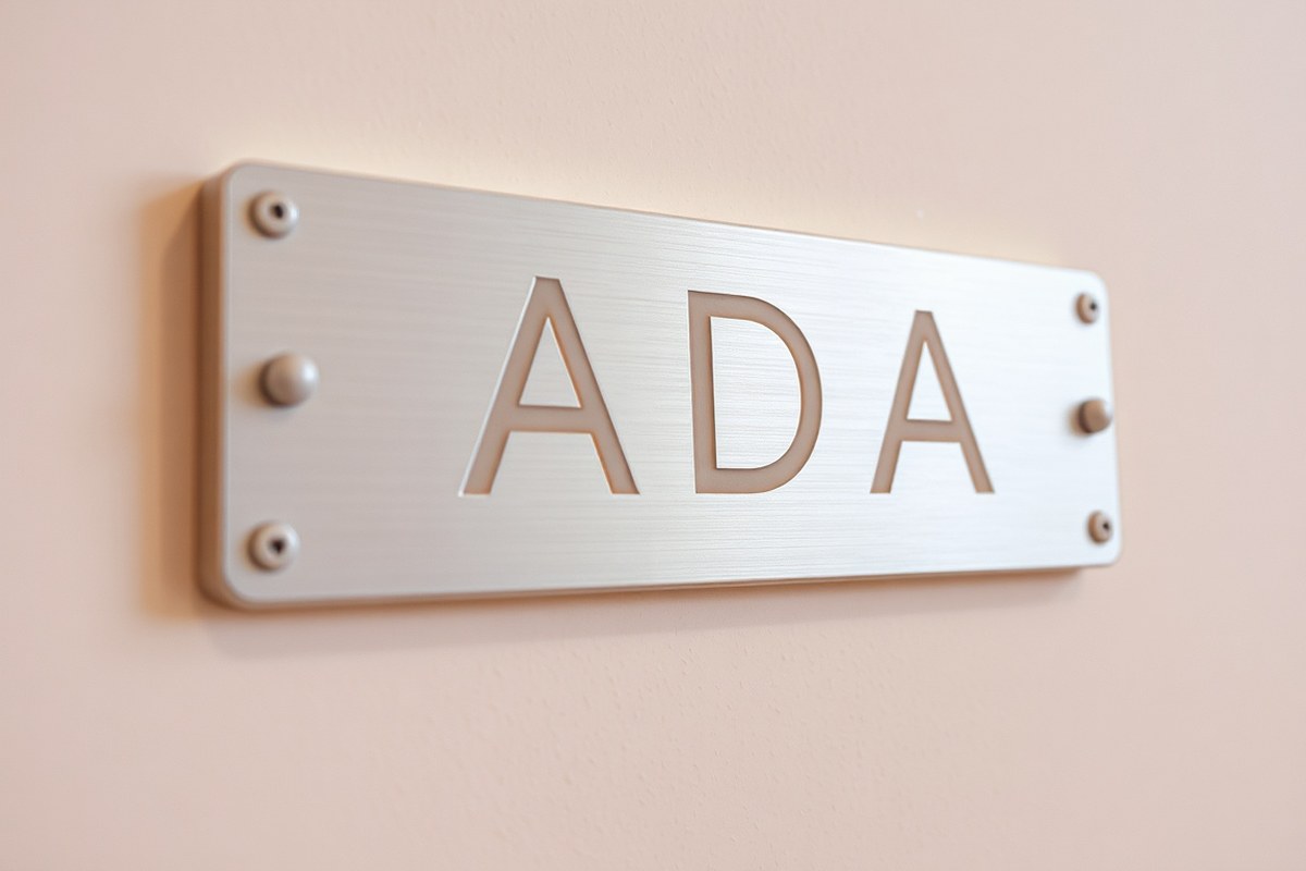
Permanent room identification signs must include tactile raised characters and Grade 2 Braille to meet ADA requirements. This combination ensures accessibility for people who are blind or visually impaired by allowing them to read the sign through touch. Signs cannot rely solely on visual characters; the law mandates these tactile elements for identifying rooms or spaces such as offices, restrooms, and stairwells.
Not all signs require Braille and tactile text. Informational and directional signs, for example, do not need raised or Braille characters. Pictograms, including the International Symbol of Accessibility (ISA), are mandatory when they provide clear information about permanent rooms or spaces. However, pictograms on directional signs and those that offer general information are not required to have tactile text below them. When pictograms do appear on room identification signs, tactile text and Braille must be placed immediately beneath the pictogram field.
The ADA sets clear mounting height rules to ensure signs are reachable and usable. Tactile and Braille elements must be mounted between 48 and 60 inches from the finished floor to the centerline of the tactile characters. Bathroom signs, typically placed on the latch side of doors, follow this mounting range. For directional signs, visual characters must be located at least 40 inches above the floor, but tactile features are not required on these signs. Exceptions exist for specialized signs like hoistway floor levels, where raised characters can be larger and mounted outside these standard height ranges.
Essential ADA sign elements include raised characters at least 1/2 inch high when paired with compliant visual characters, and Grade 2 Braille that matches the text visually. Characters must be uppercase, sans serif, and in a tactile format easily distinguishable by touch. The pictogram field on room identification signs must be at least 6 inches high when pictograms are used. Color contrast and finish requirements apply primarily to visual elements but tactile characters are exempt from these rules when visual and tactile text appear separately.
Missing tactile elements is a frequent violation causing noncompliance. Signs without raised letters or Braille fail basic ADA standards, leading to accessibility barriers and potential legal consequences. Accurate placement, correct character size, and inclusion of Braille together produce effective results. Signs that fit well within the height range, use proper tactile fonts, and clearly place pictograms ensure that everyone, regardless of physical ability, can identify and navigate a building confidently.
Design Specifications for Characters, Braille, and Symbols
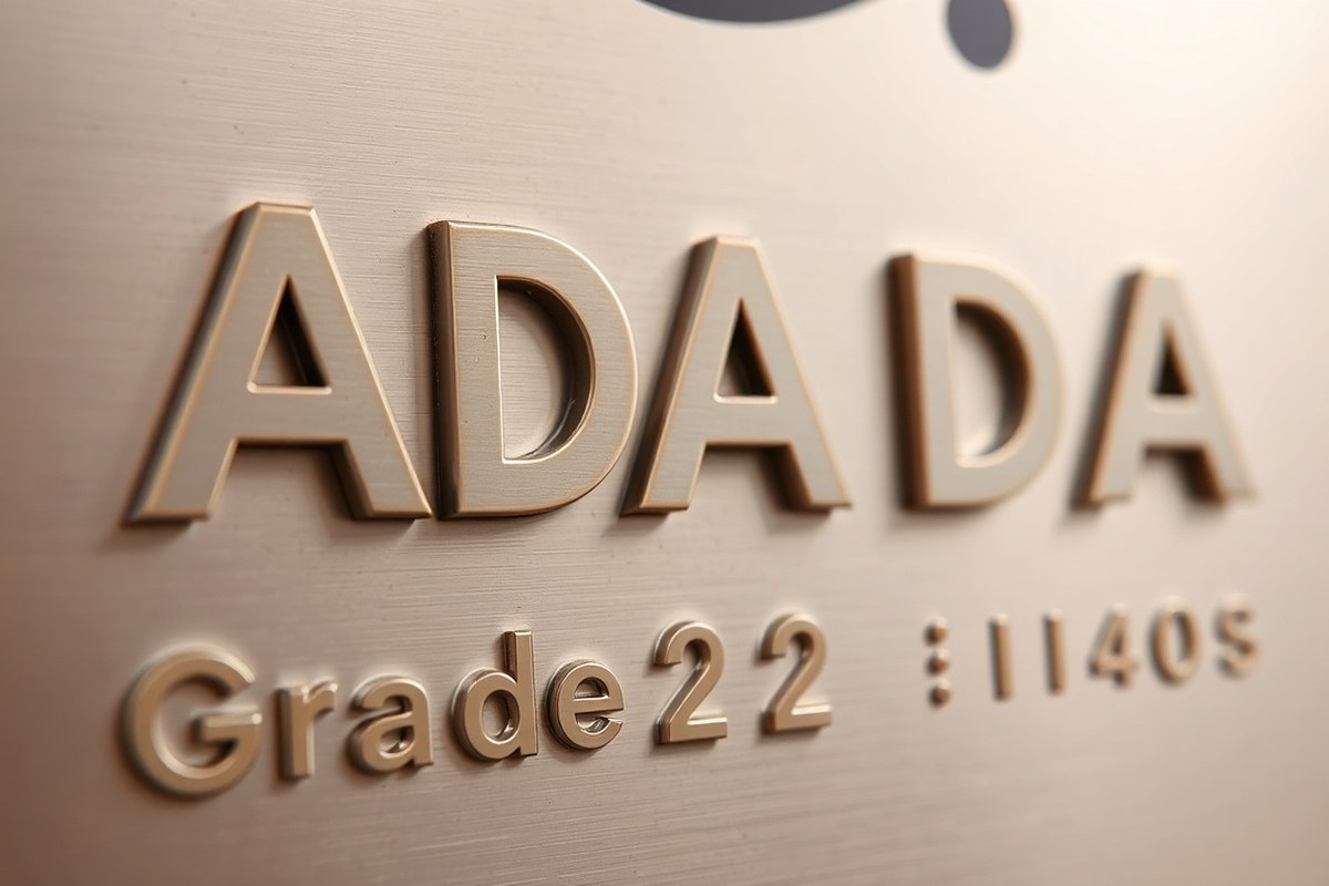
Your ADA signs must use a sans serif font that ensures clear readability and tactile access, such as Helvetica, Arial, or a similar simple, non-decorative style. The characters’ height should range from 5/8 inch to 2 inches, depending on the viewing distance and the specific sign type, as specified in § 703.2.5 of the ADA Standards. Keep characters proportionate with widths between 55% and 110% of their height (§ 703.2.4), preserving natural letter shapes and avoiding distortion. Stroke thickness must not exceed 15% of the character height (§ 703.2.6) to keep letters legible and prevent overly thick, confusing shapes, which hinder both visual and tactile readers. Minimum spacing between characters should be at least 1/8 inch (§ 703.2.7) to eliminate crowding, with line spacing set between 35% and 70% of the character height to maintain clarity in multi-line text.
Raised characters must be medium or bold in weight to ensure adequate tactile feedback for users, balancing stroke thickness rules without making the letters too thin or bulky. Capitals are generally required for tactile letters because they are easier to identify by touch, although the font should still be simple and uniform. Braille on ADA signs uses Grade 2 format, which involves contractions and abbreviations to create more compact and readable content; Grade 1 Braille is not acceptable for public signage. The Braille dots must be accurately spaced and sized according to ADA regulations, typically with dot spacing of about 0.1 inch center to center and a dot height that allows reliable tactile recognition without snagging or wearing down too easily.
These tactile and Braille elements apply mostly to identification signs, such as room numbers and restroom signs, while informational or directional signs might not require Braille. The Braille is placed directly below the associated raised text and must be on the same sign face to facilitate reading. Only the International Symbol of Accessibility (ISA) is permitted for accessibility symbols on ADA-required signs; non-ISA symbols generally do not comply with ADA standards and should be avoided to maintain regulatory clarity and universal recognition.
Precise application of these design elements ensures signs are usable for diverse disabilities, meeting federal mandates while avoiding common pitfalls like overly ornamental fonts, improper stroke widths, or insufficient spacing that can obscure meaning. An effective ADA sign is straightforward in layout with tactile features that reliably convey information via both sight and touch.
Maintain stroke thickness under 15% of character height and ensure Braille dots are raised adequately to preserve tactile readability over time.
Proper ADA Sign Mounting Height and Placement Rules
Install ADA signs on the wall beside the door handle, typically positioned 48 to 60 inches above the finished floor. Ensure an unobstructed 18-inch by 18-inch floor space centered on the tactile characters for accessibility. If no wall space exists on the handle side, mount the sign on the nearest adjacent wall. These guidelines assist individuals with blindness or low vision in locating and reading the signs effectively.
Standard Mounting Height Range
ADA signs must have tactile characters mounted at a height between 48 inches and 60 inches above the finished floor, measured from the baseline of the tactile characters. This height range ensures that individuals using wheelchairs or those standing can comfortably reach and read the signs. All rooms or permanent spaces requiring identification, including restrooms, offices, and conference rooms, should have signs installed within this range to maintain consistency and predictability.
Restroom signs belong on the wall next to the door latch side, a location familiar to both sighted and visually impaired individuals. Placing these signs outside this range or directly on the door may create confusion and obstruct safe approach and reading. Positioning signs inside the door swing can limit access and cause difficulty.
Clear Floor Space Requirements
Clear floor space is critical to ensure ADA signs are accessible to individuals using wheelchairs, canes, or other mobility aids. An unobstructed space at least 18 inches by 18 inches must be centered on the tactile characters of the sign, allowing users proper approach distance for tactile reading.
This clear floor space must be located beyond the door swing, so the sign remains accessible when the door is open or closed. Protrusions like base moldings may offset this space slightly, but significant obstructions are not allowed as they interfere with access. Maintaining this floor space helps guarantee the sign can be reached easily and read by touch.
Alternate Mounting Locations Guidance
When sign mounting at the latch side of the door is impossible due to lack of wall space, or if the door swings into a narrow corridor or recess, ADA guidelines allow placement on the nearest adjacent wall. The goal remains to locate the sign where it is most accessible and visible.
Mounting the sign on the door should be a last resort, used only when no suitable wall space is available. Signs placed on doors can be harder to find and might pose hazards in emergency situations. The alternative wall selected must still accommodate the required clear floor space and maintain the standard mounting height range for tactile characters.
Signs should never be placed within the door swing path or anywhere restricting safe and comfortable approach. Constant adherence to clear floor space and reachable height ensures compliance and user safety. Follow these mounting steps for ADA signs to meet requirements:
- Identify the latch side of the door and measure the height from the finished floor to place tactile characters between 48 and 60 inches.
- Locate a wall space adjacent to the latch side wide enough to accommodate an 18-inch by 18-inch clear floor space centered on the tactile characters.
- Ensure no elements protrude into the clear floor space that could hinder tactile reading or approach.
- When no space is available on the latch side wall, choose the closest adjacent wall that supports the required mounting height and clear floor space.
- Verify the sign will not be installed within the door swing to avoid obstructing access.
- Install the sign securely using durable materials, making certain tactile characters and Braille are properly aligned and legible.
- Confirm the area in front of the sign remains free of obstructions that could block access over time.
Types of ADA Signs and Their Specific Requirements
ADA signs fall into distinct categories, each with specific legal and design requirements to ensure accessibility for people with disabilities. Identification, directional, emergency, and informational signs differ mainly in tactile features, Braille, mounting, and visual contrast standards. Knowing these differences helps comply with the 2010 ADA standards and local codes.
Identification Signs
Identification signs label permanent rooms, spaces, or offices and require tactile characters and Grade 2 Braille. The Braille must be located directly below the raised text, helping those who are blind or have low vision to navigate independently. These signs must meet specific mounting heights, often between 48 and 60 inches to the baseline of Braille cells, with some local variations such as California’s fixed 48-inch minimum.
Effective design uses bold color contrasts and matte surfaces to improve legibility. Raised tactile features need to stand out a minimum of 1/32 inch from the surface, with letter heights ranging from 5/8 inch up to 2 inches. Identification signs follow the most stringent ADA signage standards, as they are critical for navigation at entry points.
Directional and Informational Signs
Directional signs provide wayfinding assistance within a building or campus, pointing the way to exits, rooms, or facilities. Informational signs offer general notices or instructions about policies or accessibility features. Unlike identification signs, most directional and informational signs are exempt from tactile or Braille requirements unless located at a doorway.
These signs still need to meet visual standards such as contrast, font size, and non-glare backgrounds. For transit and parking areas, accessible parking signs and transit markers must comply with tactile requirements if they identify specific accessible services or locations, such as designated wheelchair spaces or station entrances. While tactile features often are unnecessary for general informational signage, signs that help locate accessible routes or accessible transit entrances must include them.
Emergency and Egress Signs
Emergency signs, such as exit signs or fire safety markers, are critical for safety. The ADA and related building codes require these to have visual clarity, with high contrast and illumination for low-light conditions. However, most emergency and egress signs do not require Braille or tactile characters unless they also serve as identification signs, like labeling an exit doorway.
Signs that mark accessible egress routes or emergency evacuation features for those with disabilities may need to include tactile elements and comply with mounting height requirements. Audible or “talking” sign systems are often used in transit facilities to supplement visual signs and make emergency information accessible to people with vision impairments. The following table summarizes differences in ADA sign types, highlighting tactile, Braille, mounting, and use case requirements as defined in federal ADA Standards and local variations:
| Sign Type | Requires Tactile Characters | Requires Grade 2 Braille | Typical Mounting Height | Visual Contrast & Finish | Examples |
|---|---|---|---|---|---|
| Identification | Yes | Yes | 48, 60 inches to baseline of Braille cells (varies by state) | High contrast, non-glare | Room numbers, office names, restrooms |
| Directional | No, unless at doorways | No, unless at doorways | Varies; no strict ADA tactile height if not at doorway | High contrast, legible font | Floor directories, arrows, accessible route signs |
| Informational | No, generally exempt | No | No specific ADA tactile requirement | High contrast recommended | Policy, hours of operation, public notices |
| Emergency / Egress | Only if also an identification sign | Only if also an identification sign | Varies; typically mounted for maximum visibility | Must be illuminated or highly visible | Exit signs, fire extinguisher locations |
| Accessible Parking / Transit | Yes for identifying accessible spaces or entrances | Yes if at transit station entrances | 48, 60 inches ADA standard, state-dependent | High contrast and reflective where outdoors | Accessible parking spots, transit station entrances |
Properly categorizing signs and applying the correct tactile and Braille requirements prevents costly legal issues and creates a usable environment for all users. Remember to check state and local codes for variations like specific mounting height and multilingual signage in diverse communities.
Contrast, Color, and Finish Requirements for ADA Signs
ADA sign requirements call for strong color contrast between the characters and their background to ensure readability for people with low vision. While there is no fixed minimum contrast ratio mandated, aiming for 70% or higher contrast is recommended to meet the standards effectively. Contrast can be gauged by comparing light reflectance values of the colors; the larger the difference, the easier the sign is to read.
Color combinations that provide good contrast typically involve either light characters on dark backgrounds or dark characters on light backgrounds. Examples include white on black, black on white, yellow on dark blue, and white on blue. These combinations work well visually and comply with ADA guidelines. Keep in mind that the finish of the sign must be matte or eggshell to avoid glare, which can interfere with readability in different lighting conditions.
- White characters on dark blue or black backgrounds
- Black characters on white or light yellow backgrounds
- Yellow characters on dark blue backgrounds
- Dark green on light yellow or white
- Light gray on dark gray with sufficient contrast
To calculate or verify contrast, measure the light reflectance value (LRV) of each color. Subtract the lower LRV from the higher one and divide by the higher LRV to find the contrast percentage. For example, if the background has an LRV of 20% and the characters have an LRV of 80%, the contrast is (80 – 20) / 80 = 75%, which is acceptable. This method helps verify if custom colors meet the contrast requirements.
Non-glare finishes are critical because reflective surfaces can cause light to bounce unpredictably, making signs difficult to read from certain angles or under bright lighting. Matte or eggshell textured finishes diffuse reflections, maintaining consistent visibility. These finishes are required for raised characters, pictograms, and visual text but do not apply to braille.
Always verify both color contrast and finish before installing signs; poor contrast or glossy finishes can create compliance issues and frustrate users with low vision.
Using these specifications helps ensure signs stay readable and accessible under different lighting conditions, such as fluorescent lights and direct sunlight. Plan ahead by adopting updated guidelines advising a minimum of 65% contrast based on light reflectance levels to meet anticipated standards for 2025.
Materials, Durability, and Installation Best Practices
Selecting materials that meet ADA compliance while offering durability is essential for long-lasting signage. Acrylic, metal, and high-grade plastics are commonly recommended due to their resistance to wear, impact, and environmental factors. These materials maintain tactile and visual features over time without warping or fading. Avoid materials prone to cracking or peeling because they can compromise readability and tactile feedback important for accessibility.
Proper installation plays a significant role in preserving the integrity of ADA signs. Mount the sign with the center line at 54 inches above the floor to ensure a consistent sight line and simplify installation. Position signs approximately 8 to 12 inches from the door edge or aim for about 9 inches from the frame when centering tactile text, which supports predictability for users. Use drill guides and level tools during installation to maintain straight alignment. Anchoring hardware should be stainless steel or corrosion-resistant to prevent loosening caused by environmental exposure or vandalism. For areas prone to impact or tampering, consider mounting signs within protective frames or using tamper-proof screws to extend lifespan.
Finishing options improve signs’ tactile qualities and visual clarity. Matte finishes reduce glare and improve readability particularly under artificial lighting. For tactile text and Braille, applying a clear protective coating preserves raised surfaces from abrasion while maintaining contrast. Laminates designed for outdoor use can guard against UV damage and moisture without altering tactile elements, which is critical in both interior and exterior environments. Maintenance protocols should include gentle cleaning with non-abrasive solutions at least semi-annually to remove dust and grime that can obscure tactile or visual features.
The cost of ADA-compliant materials varies depending on size, finish, and fabrication complexity. Metal signs typically run higher in price but deliver the most strong durability, lasting 10 or more years with minimal upkeep. Acrylic and plastics offer lower upfront costs but may require replacement every 5 to 7 years in high-traffic or outdoor settings. Using standardized mounting heights and consistent positioning reduces labor time and potential rework, lowering overall installation expenses.
Signs installed without adherence to these practices often face premature damage such as peeling, fading, or detachment from walls. Uneven mounting heights or misaligned placement can confuse users and negate accessibility goals. For environments exposed to temperature fluctuations or moisture, selecting corrosion-resistant materials and sealants prevents deterioration. Adopting these material and installation techniques ensures your ADA signage remains functional, compliant, and easy to use for years.
Common ADA Sign Implementation Mistakes and Fixes
A frequent problem in ADA sign compliance is mounting signs outside the required height range. Tactile characters must be placed between 48 and 60 inches from the finished floor to ensure reachability and comfort. Installing signs too low or too high can cause violations and hinder accessibility. To fix this, measure from the floor to the tactile elements and adjust the mounting bracket or fasteners so the centerline of tactile text falls within this range.
Inadequate tactile depth or spacing is another common error. Raised characters should have a minimum height of 1/32 inch for tactile readability, with line spacing between 135% and 170% of the character height. Braille dots need proper spacing and must be placed at least 3/8 inch away from raised text, edges, and decorative elements. Fixing tactile issues requires reprinting or replacing signs that do not meet these dimensions, as incorrect depth and spacing reduce legibility for users who rely on touch.
Missing Braille or poorly embossed Braille is a violation if required Braille is omitted or too flat to read by touch. Braille should have domed dots spaced correctly according to the ADA standard. When signs lack readable Braille, replacing the sign with one that complies is necessary. Avoid attempts to manually emboss Braille on existing signs, as this usually does not meet standards.
Placing signs in the wrong spots often leads to compliance issues. Room or feature labels must be installed on the wall next to the door’s latch side at a uniform height. Signs positioned on an incorrect wall or too distant from the door may cause misunderstanding. Fix this by moving the sign to the correct location or adding another sign where required.
- Check mounting height with a tape measure; adjust to fall between 48 and 60 inches from the floor.
- Verify tactile character height is at least 1/32 inch and line spacing is 135%, 170% of character height.
- Ensure Braille dots are domed, spaced properly, and at least 3/8 inch from other elements.
- Confirm Braille is present on all signs required by ADA for that area or room type.
- Locate signs on the latch side of doors, mounted where users can easily find them when approaching.
Correcting these mistakes often requires re-measuring existing signs and locations, purchasing compliant signs from certified manufacturers, and reinstalling them accurately. Costs vary depending on sign size, materials, and labor, but addressing these mistakes reduces the risk of non-compliance fines and improves accessibility. Good results show users easily locating and reading signs, including tactile features, with no physical strain or guesswork involved.
Navigating ADA Updates and State-Level Variations
The 2025 ADA signage updates introduce refinements to character spacing, tactile letter height, and updated symbols to improve readability and consistency. States can enforce additional or stricter rules alongside these federal guidelines, making it essential to check local codes carefully. Confirming compliance means following the federal baseline while adapting to jurisdiction-specific requirements such as California’s improve standards on signage materials and mounting.
2025 ADA Signage Updates Overview
The core ADA standards for signage, last widely updated in 2010, will see targeted changes coming into effect in 2025. These include adjustments to the minimum and maximum tactile character heights, improved spacing between Braille dots, and standardized use of certain international symbols for accessibility (ISA). Enforcement will focus on ensuring these specifications are met precisely, especially in new construction and altered facilities. The Department of Justice Civil Rights Division will continue inspections and may issue penalties for noncompliance.
These updates aim to improve clarity, making signs easier to read and navigate for people with disabilities. Facilities undergoing renovations or new builds after 2025 must integrate these changes during the design phase to avoid costly retrofits. The timeline requires full compliance by the end of the 2025 calendar year, with a phased approach allowing some flexibility for projects already underway.
Examples of State-Specific Rules
Some states impose requirements beyond the federal ADA baseline, often related to material durability, color contrast ratios, and installation height tolerances. California has some of the strictest signage codes, including specifications on non-glare finishes and exact mounting locations tied directly to local building codes. These additions reflect a commitment to improve accessibility that surpasses minimum federal standards.
Other jurisdictions may mandate additional language requirements on signs or require the use of particular symbol versions that comply with local demographics. The federal ADA standards allow states and cities to adopt these additional rules, provided they still use the Interactive Symbol of Accessibility where required. This layering of rules means that meeting federal standards might not be enough to ensure full compliance in all places.
Best Practices to Stay Ahead of Code
Validate your project’s jurisdiction and confirm applicable local codes early in the planning process. Start by reviewing the current federal ADA standards and consult your city or state’s building department or accessibility office for supplementary requirements. Many jurisdictions publish their code updates online, often including guidance documents or checklists specific to signage compliance.
Document all signage specifications with detailed references to both federal and local rules. For multiple location projects, create a directory that outlines each jurisdiction’s unique signage needs, including updated deadlines and enforcement practices. Regular training of design and construction teams on emerging changes can prevent costly corrections and maintain visual consistency across properties.
Always cross-check the signage standards with the latest local building codes before manufacturing or installation to avoid costly rework or fines.
Your First 7 Days: A Quick-Start Action Plan for ADA Sign Compliance
Follow these steps to ensure your facility’s ADA signs meet current accessibility standards and avoid costly errors.
- Day 1: Conduct a thorough site survey. Confirm all doorways, restrooms, and key areas requiring signage are identified on your layout.
- Day 2: Review your design specs. Check that characters, braille, and symbols meet federal ADA contrast, size, and material standards.
- Day 3: Choose durable materials suitable for your environment that comply with ADA guidelines to ensure longevity and legibility.
- Day 4: Plan mounting heights and locations precisely to meet ADA placement rules, including tactile and visual accessibility.
- Week 1: Coordinate with a licensed contractor experienced in ADA installations to verify technical compliance during installation.
- After installation: Perform a final inspection using a detailed ADA checklist or have an ADA compliance officer review the signs on site.
- Within 7 days: Address any deficiencies immediately; adjust mounting, replace signs, or modify design elements to meet standards.
Frequently Asked Questions
What Are the Penalties for Not Complying with ADA Sign Requirements?
Penalties can include fines and legal action for non-compliance. Businesses should correct deficiencies promptly to avoid enforcement issues and maintain accessibility.
How Often Should ADA Signs Be Inspected or Replaced?
Inspect ADA signs annually and replace damaged or illegible signs immediately to maintain compliance and usability. Regular checks help prevent access barriers.
Can Digital Displays Be Used as ADA-compliant Signs?
Digital signs must meet tactile and braille requirements to be ADA-compliant. Touchscreen or visual-only digital signs typically don’t fulfill all ADA sign criteria.
Are Temporary ADA Signs Required During Construction or Renovations?
Temporary ADA signs are required if construction impacts accessibility routes or signage. They must meet ADA standards to ensure continuous access.
Do ADA Sign Requirements Apply to Outdoor Signs?
ADA guidelines apply to exterior signs that identify or direct users to accessible features. Outdoor signs must also consider durability and visibility under various conditions.
Can Decorative Fonts Be Used for ADA-compliant Signage?
Decorative fonts are not allowed; characters must be simple and legible to meet ADA standards. Use clear, sans-serif fonts for tactile readability.
Wrapping Up
Prioritizing correct ADA sign design and placement protects you from accessibility violations and improve usability for all visitors. Your next step should be to secure an ADA compliance expert or review local state requirements to tailor your signage plan. Taking action early minimizes costly rework and ensures your facility supports equal access effectively and legally.


