How to Make a Chalkboard Sign Look Professional: 8 Expert Tips That Work
How to make a chalkboard sign look professional starts with clean, crisp lettering and a well-prepared surface. Consistent design, balanced layouts, and the right materials create eye-catching results that appear polished and intentional. Begin by prepping your chalkboard surface properly to ensure chalk or markers adhere smoothly and last longer.
Key Takeaways
- Clean and prime your chalkboard surface with a light chalk rub or primer spray before drawing.
- Choose high-quality chalk or liquid chalk markers for sharp lines and vivid colors.
- Plan your layout with grids or guidelines to maintain symmetry and spacing.
- Use contrasting colors and bold fonts to increase readability and impact.
- Incorporate simple decorative elements like borders or icons for a polished look.
- Apply chalk highlights and shadows to add depth and a 3D effect to your art.
1. Key Elements That Make Chalkboard Signs Look Professional
A professional-looking chalkboard sign combines clear readability, balanced layout, neat lettering, and a polished finish. Clarity is essential because your message needs to be instantly understood, especially if the sign is distant or viewed briefly. Use large, bold letters for key words or titles, generally at least 2 to 3 inches tall, depending on the size of your board. Smaller text, such as details or prices, should stay legible at about 1 inch tall with enough spacing between lines so the words don’t blur together. Avoid overcrowding the board to maintain focus and flow.
Layout plays a important role. Start by dividing the chalkboard into sections or zones, ensuring each part has enough room. Leave margins at the edges, about one inch, to prevent the design from feeling squeezed. Align text to guide the reader’s eyes naturally, often centering headings and left-aligning informational content. Incorporate simple visual elements like lines or small icons to separate sections without cluttering. Proper spacing improves readability and makes the sign appear thoughtfully designed.
Lettering quality directly influences the perceived professionalism of your sign. Use consistent chalk or chalk marker strokes in your lettering, aiming for smooth, even lines with no smudges or flicks. Thick and thin contrasts in your letters can make the text more attractive and easier to read; for example, thicker downstrokes and thinner upstrokes imitate hand-lettering styles popular on professional signs. Practicing letters on paper or a scrap board can improve steadiness before committing to your final piece. Costs vary depending on chalk supplies, with quality markers starting around $5 to $10 each, which often offer better control and durability than traditional chalk.
A clean finish is the last important step. Once your chalkboard design is complete, erase any underlying pencil sketches carefully with a soft eraser to keep only the chalk or marker design visible. This cleanup sharpens edges and eliminates distractions. If using a non-porous chalkboard, allow the artwork to dry fully, at least a few minutes for liquid chalk markers. Sealing your sign with a compatible spray fixative (available at craft stores for about $8 to $15) can protect against smudging when the sign is displayed outdoors or in high traffic areas. A wooden frame or sturdy easel can further improve the overall professionalism by providing structure and stability, keeping your sign neat and inviting.
Signs with simple clear fonts, minimal yet meaningful decorations, and no excessive information hold attention better than overly busy designs. For example, a birthday party welcome sign might use bright colors and playful lettering but keep the message brief to sustain focus. For business menus or event instructions, prioritize legibility and organization over artistic flair. Well-executed balance between style and clarity will make your chalkboard sign not only professional in appearance but effective as a communication tool.
2. How to Properly Prepare and Prime Your Chalkboard Surface
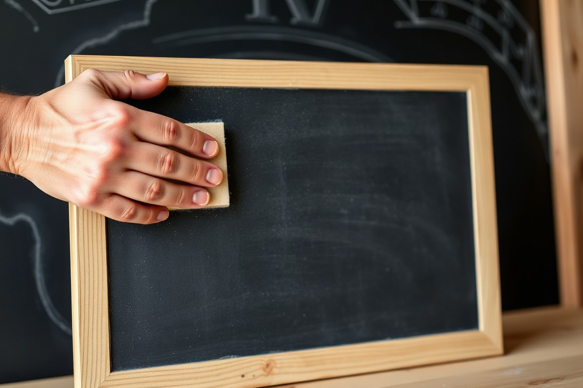
Properly preparing and priming your chalkboard surface creates a smooth, clean base that helps chalk or markers stick better and last longer. This involves cleaning off old residue, lightly sanding to smooth out rough spots, and applying a quality chalkboard paint or primer. These steps prevent chalk from smudging or soaking unevenly, resulting in clear, professional lettering every time.
Cleaning Your Chalkboard Surface
Start by removing all old chalk dust and marks to avoid interference with new artwork. First, gently tap the chalkboard to loosen dry dust. Then, wipe the surface with a damp cloth or sponge, using plain water or a mild soap solution. Make sure to remove stubborn marks by scrubbing lightly without damaging the board’s finish. After wiping, dry the surface completely with a lint-free cloth.
For chalkboards with permanent marker stains, note that these are difficult to remove entirely. Repeat gentle cleaning or consider repainting to ensure a smooth, stain-free base. Avoid harsh chemicals that could harm the chalkboard surface.
Sanding for a Smooth Finish
Sanding helps create an ideal surface for chalk or chalk markers to adhere evenly. Use fine-grit sandpaper (around 220 grit) to lightly sand the entire chalkboard. Focus on any bumpy or rough areas, sanding just enough to smooth out imperfections without removing too much of the existing finish. After sanding, wipe away all dust with a damp cloth. Without this step, chalk marks may appear uneven or blotchy. If you are working with a new wooden board or a surface without previous chalkboard paint, sanding raw wood smooth before priming is especially important.
Choosing the Right Chalkboard Paint or Primer
Select a high-quality chalkboard paint designed for the surface you have. Most DIY chalkboard projects use water-based acrylic chalkboard paint available in spray cans or cans for brushing. These products cost about $10 to $25 per quart and cure fully within 24 to 72 hours depending on brand and conditions.
For fresh surfaces or repaired chalkboards, applying a primer suited to your base material (wood, metal, glass) ensures better paint adhesion. Use a smooth, even coat of primer first, let it dry completely, then apply two thin coats of chalkboard paint, sanding lightly between coats if recommended by the manufacturer.
Seasoning Your Chalkboard for Best Chalk Adherence
Seasoning your chalkboard creates a textured surface that holds chalk better and reduces ghosting from previous chalk marks. Take a piece of chalk, turn it on its side, and rub it evenly over the entire chalkboard surface, covering all corners and edges. Then wipe off the excess with a dry cloth or chalkboard eraser. This step prevents the first chalk writings from sticking permanently.
Checklist for Preparing Your Chalkboard Surface
Use this checklist to ensure your chalkboard is fully ready before starting your design:
- Tap chalkboard gently to remove loose dust
- Wipe surface with a damp cloth, removing stubborn marks
- Allow surface to dry completely
- Lightly sand uneven or rough areas with 220 grit sandpaper
- Wipe away sanding dust thoroughly
- Apply appropriate primer if surface is raw or repaired
- Paint two thin coats of quality chalkboard paint, drying and sanding as recommended
- Season surface by rubbing chalk evenly, then erase excess chalk
Following these steps takes time, expect one to three days depending on drying and curing times. Proper preparation prevents chalk from smudging or fading prematurely.
Practical Tip: Wait at least 24 hours after painting before applying chalk, allowing the paint to cure fully. Using chalk too soon can damage the surface and cause poor adherence.
3. Best Chalk and Marker Types for Professional Chalkboard Art
Choosing the right chalk or marker is key to making your chalkboard sign look professional. Traditional chalk offers a classic, textured look but tends to smudge easily and requires more frequent cleaning or fixing. Chalk markers provide bold, bright lines that hold up better to handling and offer greater control for detailed art or lettering. Specialty markers, like liquid chalk pens, deliver the cleanest, sharpest lines but may not suit signs where a traditional chalk texture or smudging is desired.
Chalk markers stand out for their superior visibility and vibrant colors, making them a strong choice for event signs or business promos that need to catch the eye. However, they often cost more upfront, expect to pay around $10 to $15 per marker, and they dry quickly, which means you need to work confidently and avoid going over areas repeatedly to prevent streaking. Traditional chalk packs usually cost $3 to $5 for a dozen sticks and work great if you want to create a 3D illusion or add highlights. For example, using white chalk to highlight edges can improve depth on your signs.
| Type | Advantages | Disadvantages | Best Uses | Cost Range (Approx.) |
|---|---|---|---|---|
| Traditional Chalk | Textured look, easy blending, inexpensive | Smudges easily, less vibrant, requires skill to control | Hand-drawn art, 3D effects, quick edits | $3 – $5 per dozen sticks |
| Chalk Markers | Bright, bold colors, precise lines, less smudging | More expensive, quick drying, streaks if overworked | Event signs, detailed lettering, long-lasting signs | $10 – $15 per marker |
| Liquid Chalk Pens (Specialty Markers) | Cleanest lines, vibrant and vivid shades | Less textured, may not emulate chalk fading, harder to erase | Permanent designs, professional business signage | $8 – $20 per pen |
Practice is essential regardless of which medium you choose. Many artists first sketch designs with pencil or traditional chalk to finalize spacing and layout, then trace the image using chalk markers for sharpness and contrast. This approach offers flexibility while maintaining a professional appearance. Be prepared for marker colors to appear different on your chalkboard than in packaging, testing colors on the actual surface before committing helps avoid surprises.
Combining chalk and chalk markers in one project can also be effective. For example, an outline in chalk markers can provide crisp borders, while traditional chalk adds shading or texture inside letters. This combination improve the sign’s visual interest and polished look without losing the handcrafted charm. Keep a damp cloth on hand to quickly fix mistakes before the markers dry. Following these steps ensures your chalkboard art balances vibrancy, detail, and the iconic chalkboard feel.
4. Planning Your Chalkboard Layout for Maximum Impact
A well-planned chalkboard layout ensures your message is clear, eye-catching, and easy to read from a distance. Choosing the right size, spacing, and design balance can help your sign look professional and attract attention. Organizing information in order of importance guides viewers through your content smoothly.
Choosing the Right Board Size
The size of your chalkboard sign depends largely on where it will be displayed and how far away the viewers will be. For sidewalk signs like A-frame boards, common dimensions are 24 by 36 inches or larger, which offers enough space to create readable text and visuals without overwhelming passersby. A smaller indoor chalkboard might be 12 by 18 inches, fitting on counters or walls where people are closer.
Choosing a board that is too small limits your ability to include clear, spaced text. A board that’s too large might dominate the space or be difficult to carry and install. Keep in mind that large signs require larger lettering for readability, which means more space per word and possibly fewer words overall.
Setting Spacing and Letter Size
Proper spacing and letter size are critical to legibility. Letters should be at least 1 inch tall for signs meant to be read from 3 to 8 feet away. For every additional 10 feet of viewing distance, increase letter height by about 1 inch. For example, if your sign should be readable from 20 feet away, letters should be roughly 3 inches tall.
Leave enough space between lines (line spacing) and words to avoid clutter. A good rule is to have line spacing equal to about 120 percent of your letter height. Proper spacing not only improves clarity but also makes your sign look more polished.
Creating a Hierarchy of Information
Organizing information into a visual hierarchy guides readers through your message effectively. Start with the most important information at the top or center, using the largest lettering. Secondary details can be smaller and placed below or on the sides. This approach allows readers to quickly grasp focus points like your product name, special offers, or hours.
Use different sizes or boldness of fonts to separate headers from body text. For example, if your main item title is 3 inches tall, use 1.5 to 2 inches for descriptions or prices. This guides the eye naturally through the design and reduces confusion.
Balancing Text and Decorative Elements
Decorative elements like borders, small graphics, or flourishes add personality but should not overwhelm the text. Use stencils or simple chalk drawings sparingly around the edges or corners to frame your message and draw attention. Too many images or decorations can distract from the information and reduce readability.
Keep the layout clean by allocating about 70, 80 percent of the space for text and 20, 30 percent for graphics. This proportion strikes a good balance, making the sign visually appealing yet clear. Test your design at full size on paper before transferring to the board to avoid overcrowding.
- Sketch your sign layout on paper to visualize text and graphics placement.
- Choose a board size that fits your display space and viewing distance.
- Select letter heights based on how far viewers will be standing; larger for distant viewing.
- Determine line and word spacing to prevent overcrowding and improve readability.
- Arrange information with the most important details in larger, bolder lettering.
- Add decorative elements strategically, keeping them subtle and focused on framing.
- Review your full-scale sketch, adjusting spacing and hierarchy for balance.
- Transfer your design to the chalkboard when satisfied with the overall layout.
5. Lettering Styles and Techniques That improve Professionalism
Choosing the right lettering style immediately lifts the professionalism of your chalkboard sign. Styles like serif, sans-serif, cursive, and block letters each create a distinct look that suits different purposes. For example, bold block letters work well for clear menus or directional signs, while elegant cursive fits event invitations or boutique store promos. Consistency is key, pick one or two fonts that complement your message and theme to keep your sign looking polished rather than cluttered.
Practicing your lettering before applying it directly to the chalkboard helps steady your hand and sharpen your technique. Sketch letters repeatedly on paper or use water-soluble pencils on the chalkboard surface. These pencils won’t be as vivid as chalk but are easy to erase, making them perfect for practice sessions. Setting aside 15 to 30 minutes daily will improve control and muscle memory. Steady, slow strokes create cleaner lines, reducing smudging and uneven edges.
In cases where freehand lettering feels challenging, stencils and templates are practical tools that maintain a professional look without extensive skill. Using plastic or cardboard stencils sized appropriately for your sign keeps letters uniform and helps with spacing. Templates also save time if you’re producing multiple signs with the same message or font. This technique suits business signs where clarity and brand consistency are priorities.
Readability is a top priority for any chalkboard lettering. Use ample spacing between letters and lines, and avoid overly intricate fonts on smaller boards where details blur. For larger signs, consider mixing font weights, combining bold headlines with lighter subtext, for easier scanning. High contrast between chalk color and board background further improve legibility, so white or bright chalk markers on blackboards often work best.
Practicing techniques such as drawing light guidelines with a ruler and chalk or water-soluble pencil helps maintain straight, evenly spaced text. Letter height around 1 to 2 inches balances visibility at a distance with detail. Avoid pressing too hard to prevent chalk buildup and smudges. Many chalkboard artists start by penciling their design, then trace over it with chalk or markers for clean results.
Gaining control over your chalkboard lettering also involves managing the surface. If you notice the chalk doesn’t adhere well or the board appears shiny and less porous over time, re-seasoning the surface restores chalk grip. This involves rubbing the entire board with a piece of chalk laid flat, then erasing it lightly.
Use ruler-drawn guidelines in chalk or water-soluble pencil before lettering to keep your text straight and evenly spaced for a neat and professional finish.
6. Effective Ways to Transfer Your Design Onto a Chalkboard
Accurately transferring your design onto a chalkboard helps keep your sign neat and professional-looking. Various methods like freehand drawing, using grids, carbon transfer paper, and stencils each have their strengths. Choosing the right technique depends on your comfort level, the design complexity, and how precise you want the final work to be.
Freehand Sketching and Grid Method
Freehand sketching is the simplest way to start your design directly on the chalkboard but requires steady hand skills. The grid method adds structure by dividing your design and chalkboard into matching squares, helping you replicate proportions precisely. It’s ideal for medium complexity compositions or if you want a hands-on process without extra tools.
For the grid method, lightly draw a grid over your paper design and then replicate a matching grid on the chalkboard. Transfer each square’s contents one at a time, ensuring your lines and letters remain proportional.
Using Carbon or Transfer Paper
Carbon or graphite transfer paper leaves faint pencil outlines on the chalkboard when you trace over your original design placed on top of the paper. This method suits detailed or intricate designs, letting you perfect the artwork on paper first. Transfer paper ranges from $5 to $15 per pack and can be found online or at craft stores.
- Print or draw your design on plain paper at actual or reduced size.
- Place carbon transfer paper face down onto the chalkboard.
- Position your design paper on top, aligning carefully.
- Use a pencil or stylus to firmly trace the outlines of the design.
- Remove both papers to reveal a faint outline of the design on the chalkboard.
- Fill in the outline with chalk or chalk markers.
This method reduces guesswork but requires careful alignment. Misalignment during tracing can cause uneven lines. Using a clipboard or flat board underneath helps keep the papers steady.
Applying Stencils and Templates
Stencils come in handy when repeating letters or shapes, providing clean and uniform edges. They work best for lettering styles or simple graphics. Templates can be traced multiple times and easily repositioned. Commercial stencils cost anywhere from $5 to $30 depending on size and complexity; you can also make your own by cutting designs out of sturdy plastic or cardboard.
Before using stencils, ensure the chalkboard surface is smooth to avoid chalk bleeding. Secure the stencil firmly with tape or hold it in place while tracing. Stencils speed up work but limit artistic freedom, so use them when consistency is more important than freehand creativity.
Tips for Tracing and Retaining Accuracy
Tracing accuracy improves by working in a well-lit area and using a ruler to measure key points. Always test your transfer method on a small chalkboard area first to check if lines show up clearly. When using carbon paper, tracing with moderate pressure ensures the outline is visible but doesn’t damage the chalkboard. Clean the board lightly before starting to remove any dust or chalk residue that can blur lines.
When working freehand or with grids, step back regularly to view the whole design. This helps catch proportion errors early. For stencils, clean edges with a damp cloth or chalk marker touch-up kit to sharpen outlines.
7. Finishing, Fixing Mistakes, and Sealing Your Chalkboard Sign
Fixing mistakes on your chalkboard sign without damaging your work involves gentle and precise cleaning. Use a damp cloth or a chalkboard eraser to wipe away errors immediately. For stubborn marks, dampen a cotton swab for targeted rubbing. Avoid scrubbing too hard, which can scratch the chalkboard surface or remove surrounding artwork. Allow the board to dry fully before continuing your design to prevent chalk from smudging.
Once your artwork is complete, removing any visible chalk guidelines is essential to achieve a sharp, professional look. Use a lightly dampened cloth to carefully erase these marks. Avoid over-wetting, as excess moisture can cause chalk to run. Clean in smooth, gentle strokes aligned with the grain of the board if it has one. This preserves the boldness of your finished lettering and graphics.
Sealing a chalkboard sign can protect and extend the life of your design, especially if you want it to last in a busy event or retail setting. Use a clear matte or satin fixative spray designed for chalkboards. This spray creates a thin protective layer that prevents smudging and fading while maintaining the board’s appearance. Test the fixative on a small section or practice board first to ensure it does not alter the colors or shine.
The sealing process usually takes 15 to 30 minutes for the spray to dry completely and should be done in a well-ventilated area. Avoid applying the sealant indoors in confined spaces to minimize inhaling fumes. Skip sealing if you plan to update your sign frequently, as fixatives can make future erasing difficult.
- Use a damp cloth or chalkboard eraser to gently remove mistakes immediately.
- Dab small corrections with a damp cotton swab for precision.
- Erase guidelines with a lightly dampened cloth using gentle, smooth strokes.
- Let the board dry fully between erasing and redesigning to avoid smudges.
- Apply a clear chalkboard fixative spray to seal and protect finished designs.
- Wait 15 to 30 minutes for the sealant to dry in a ventilated space.
- Do not seal signs that will be updated often to maintain erasability.
By following these steps carefully, your chalkboard sign will maintain a crisp and tidy appearance while reducing the risk of accidental smears. Protecting your work with a fixative helps preserve intricate details, making your sign eye-catching throughout its display period. Proper care during finishing and sealing ensures your chalkboard projects look polished and professional each time.
8. Tips for Display, Maintenance, and Lighting to Keep Signs Professional
Position your chalkboard sign where it naturally catches the eye without glare or shadows obscuring the text. Signs near entrances, walkways, or places with high foot traffic increase visibility and perceived professionalism. Angle the sign slightly toward the average line of sight, about 15 to 30 degrees, to reduce reflections from overhead lights or sunlight. Avoid placing it directly under bright light or where sunlight hits it at a harsh angle; this can wash out colors and make chalk hard to read.
Choosing the right lighting improve legibility and draws attention to your design. Matte chalkboards work best under soft, diffused light that prevents shiny spots. LED string lights or clip-on lamps with adjustable arms can deliver focused illumination without overheating or smudging the chalk. In outdoor settings, warm white bulbs around 2700K to 3000K create a cozy look that invites customers to take a closer look. For indoor signs, natural lighting during daytime is ideal but supplement it with indirect light to maintain clarity as daylight fades.
To keep your sign looking crisp, clean it gently with a dry microfiber cloth after each use to remove dust and loose chalk particles. Avoid harsh sprays unless specifically made for chalkboards; water or mild soapy solutions applied sparingly are safer. Store your chalkboard in a dry, shaded spot to prevent warping or deterioration, especially for wood-framed boards. Covering the chalkboard with a breathable fabric when not in use protects it from dust and damage, preserving the surface for repeated reworking. Chalk itself should be kept sealed in a dry container to avoid crumbling and loss of vibrancy.
For quick touch-ups, use a damp cloth lightly applied and wiped off immediately to erase stubborn marks without smearing. Allow the board to dry completely before drawing again. Over time, chalk residue can build up and dull the surface; a gentle cleaning product specifically designed for chalkboards can restore this, but test it on a small area first. Avoid soaking or scrubbing too hard, as this may degrade the board’s finish and affect how new chalk adheres.
Store chalk in a dry place and always cover your chalkboard sign when it’s not in use to prevent dust buildup and premature wear.
Different environments require small adjustments. For outdoor events, place signs on sturdy stands or weighted bases to prevent tipping in wind, and choose chalk markers that resist smudging if moisture or humidity is a concern. Indoors, location near entrances and seating areas maximizes exposure. Experiment with portable clip lights that can be repositioned easily to adapt to changing lighting conditions throughout the day or evening.
Step-by-Step Action Plan for Professional Chalkboard Signs
Follow these clear steps to create or upgrade your chalkboard sign so it stands out with a polished, professional look.
- Before You Start: Clean and prime your chalkboard surface using chalk or chalkboard primer. It’s ready when the primer layers are smooth and fully dry with no streaks.
- Day 1: Sketch your layout on paper using gridlines. Confirm spacing and style balance before transferring it to your board.
- Day 2: Transfer your design with tracing or chalk transfer paper. Check your outlines are clear and centered on the board.
- Day 3: Use high-quality chalk markers or chalk for lettering. Letters should be consistent and sharp with clear edges.
- Day 4: Fix any smudges or errors with a damp cotton swab or eraser. The board surface should look clean with crisp lettering.
- Day 5: Seal your work with a non-gloss spray fixative made for chalkboards. Let it dry fully to prevent smudging over time.
- After 1 Week: Place your sign under soft lighting that avoids glare. The sign should be easy to read and visually striking in its setting.
Frequently Asked Questions
What’s the Best Way to Make a Small Chalkboard Sign Appear Professional?
Use a clean frame and neat lettering to create a polished look that fits the size. Small chalkboard signs benefit from simple, clear designs to maintain legibility and visual impact.
Can I Use a Wooden Frame to Improve My Chalkboard Sign’s Look?
Yes, a wooden frame adds a polished and sturdy appearance that boosts professionalism. It also protects edges and can complement the style of your sign’s design.
How Can an Easel Improve the Presentation of My Chalkboard Sign?
An easel improve your chalkboard sign, making it more visible and giving it a professional display. It’s especially useful for event signage or retail where eye-level visibility matters.
What’s a Quick Way to Fix Smudges Without Ruining My Chalkboard Design?
Use a damp cloth carefully only on the affected area to avoid erasing your entire design. Spot cleaning keeps the rest of your sign intact and the fix less noticeable.
Is It Better to Buy a Ready-Made Chalkboard Sign or Make One from Scratch?
Ready-made signs save time and can look polished, but custom signs allow full design control. Choose based on your timeframe, budget, and the uniqueness you want in your sign.
How Important Is Lighting for Maintaining a Professional Look on a Chalkboard Sign?
Proper lighting highlights your sign’s design and increases readability in various environments. Natural or warm LED light reduces glare and improves visibility without washing out colors.
Wrapping Up
Creating a professional chalkboard sign is about clear planning and attention to detail from surface preparation through finishing. Take the next step by selecting your ideal lettering style and practicing it on scrap board sections. Consistent practice will sharpen your technique and boost your confidence before your next project.