Types of Indoor Signs: A Complete Guide to Choosing the Best for Your Business
Types of indoor signs vary widely, including directory signs, wayfinding signs, lobby signs, and safety signs. Each serves a specific function, from guiding visitors to reinforcing your brand. Start by identifying the main purpose your signs need to fulfill to choose the right type effectively.
Key Takeaways
- Directory signs help visitors navigate complex spaces efficiently and reduce staff interruptions.
- Lobby signs create a strong first impression by showcasing your brand identity clearly.
- Wayfinding signs improve customer experience by guiding people through your facility with minimal confusion.
- Safety and compliance signs ensure your business meets legal requirements and promotes a safe environment.
- Custom signs can match your interior design but typically cost more than basic stock signs.
- Ensure letter size matches viewing distance; use 1 inch of height for every 10 feet for readability.
Types of Indoor Signs and Their Primary Functions
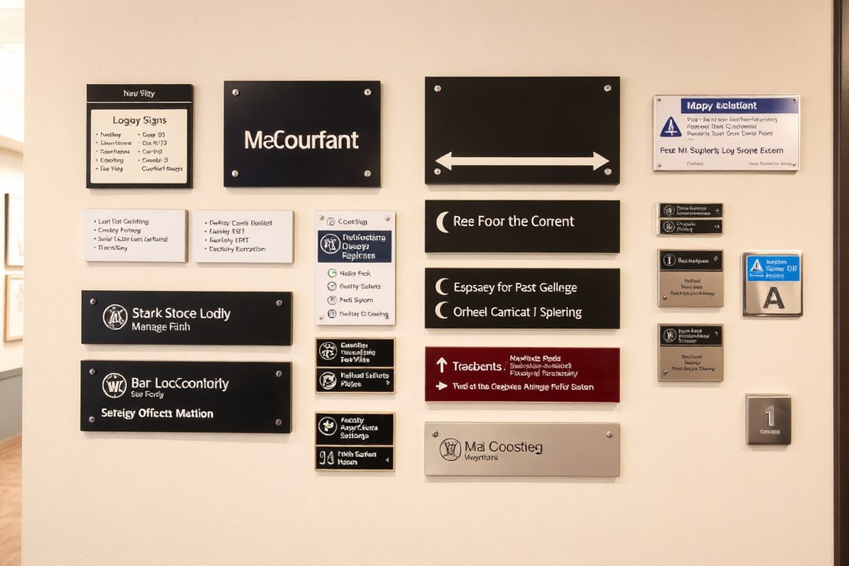
Indoor signs serve different purposes depending on where you place them in your business space. Their main function is to provide information, help with navigation, and reinforce your brand identity. Choosing the right type of sign for each location can improve customer experience and create a professional atmosphere.
Lobby signs are typically the first thing customers and visitors see. They focus on branding and making a positive first impression. These signs often display your company name or logo. They should be high-quality and well-lit, placed at entrances or reception areas to welcome people effectively.
Wayfinding signs help people move through your business easily. These include directional arrows, floor directories, and location markers, which are most useful in hallways and intersections. Clear, simple graphics and consistent design make wayfinding signs effective, reducing confusion and saving time.
- Lobby/Reception Signs: Brand introduction, placed at entrances
- Wayfinding Signs: Directional guidance in hallways and intersections
- Conference Room Signs: Room identification and meeting schedules on doors
- Wall Graphics: Visual elements that reflect company culture, applied to office walls and common areas
- Dimensional/Acrylic Signs: Professional branding accents in lobbies and key corridors
- ADA Signs: Accessibility signs with tactile and braille features, required by law in public areas
- Safety Signs: Indications of hazards or emergency instructions throughout the facility
Conference room signs identify specific rooms and can include reservation information to avoid scheduling conflicts. These signs are usually smaller and placed directly on or next to the door. Wall graphics serve to boost the interior environment by showcasing company values or inspirational messages, often covering large wall spaces for visual impact.
ADA (Americans with Disabilities Act) signs make your business accessible to everyone. These include signs with raised letters, braille, and high-contrast colors, found in restrooms, exits, and other required locations. They are mandatory for compliance and contribute to a respectful environment for all visitors.
Dimensional or acrylic signs add a polished, three-dimensional effect. They work well where you want to highlight branding or create a sophisticated look, typically in lobbies or main corridors. Proper installation and lighting improve their visual appeal, but they usually cost more, with prices ranging from $300 to over $1,000 for large panels.
Materials Used for Indoor Signs: Pros and Cons Compared
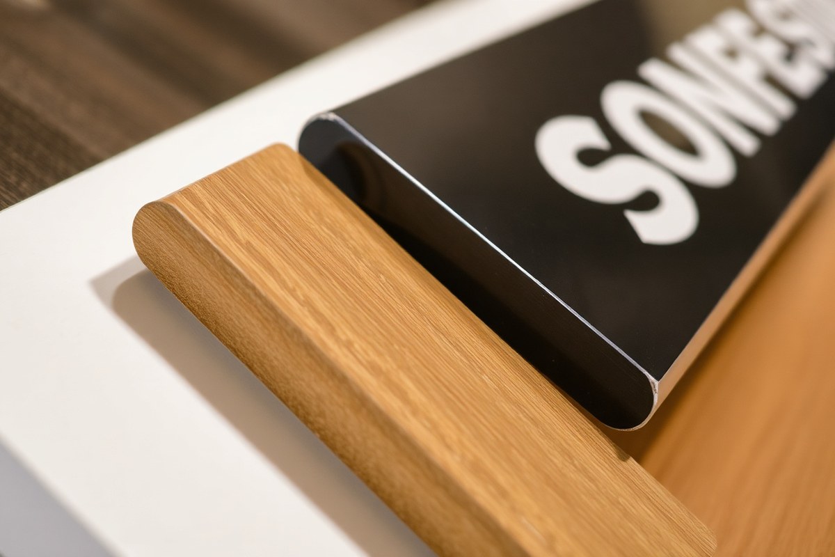
Indoor signs come in a variety of materials, each offering distinct benefits in terms of durability, cost, and appearance. Selecting the right material depends on your budget, how long you want the sign to last, and the style that fits your space. Understanding these factors helps you choose signs that support your brand while meeting practical needs.
Acrylic Signs: Sleek and Modern
Acrylic signs are valued for their glossy, glass-like appearance that adds a professional and contemporary look to offices and reception areas. This material is highly durable and resistant to moisture, making it a solid choice for long-lasting indoor signage. However, acrylic signs come with a higher price tag compared to some other materials, reflecting their premium finish and durability.
They work well for dimensional letters, logo signs, and wall-mounted displays where a polished, upscale look is desired. Acrylic can be laser cut into precise shapes and combined with lighting elements like LEDs to improve visibility and impact.
Metal Signs: Durable and Prestigious
Metal signs, including aluminum, provide some of the highest durability available for indoor use. They resist wear and tear for years and convey a sense of prestige and quality. This makes metal a preferred choice in corporate environments, lobbies, and high-traffic areas where signs must endure constant contact or occasional bumps.
Though metal signs are usually more expensive than vinyl or fabric, their longevity can justify the investment. Metals handle temperature fluctuations inside buildings without warping or fading, maintaining the sign’s professional appearance over time.
Vinyl and Foam Core Options
Vinyl signs are versatile and offer medium durability at a moderate cost. You’ll find vinyl used in wall graphics, window decals, and temporary signage where ease of installation and removal matters. Vinyl works well indoors since it resists moisture but may not hold up well when exposed to harsh lighting or frequent abrasion.
Foam core, a lightweight and affordable option, is ideal for short-term signs such as event promotions or directional signage inside offices. It lacks resistance to moisture and impacts but allows for quick, cost-effective solutions when durability is less critical.
PVC and Fabric Signage
PVC, a rigid plastic, is popular for menu boards, directories, and signs needing a smooth professional look without the expense of acrylic or metal. It offers medium durability and an attractive finish at a relatively reasonable cost. PVC signs handle indoor humidity well but can scratch more easily than metal.
Fabric signs are low-cost and lightweight, often used for banners or temporary decorations. Their appearance is softer and less formal, and they generally wear out faster, especially if placed in frequently handled areas or near vents that cause fluttering.
Material Durability and Cost Comparison
Choosing the best material requires balancing initial cost, expected lifespan, and aesthetic preferences. Below is a comparison table highlighting key factors for common indoor signage materials. This can help identify the best fit based on your specific needs.
| Material | Durability | Cost | Suitability |
|---|---|---|---|
| Vinyl | High | Medium | Indoor/Outdoor |
| Aluminum | High | High | Indoor/Outdoor |
| Wood | Medium | Medium | Indoor |
| Fabric | Low | Low | Indoor |
| Acrylic | High | High | Indoor |
This table illustrates how vinyl and aluminum provide durable options suitable for various locations, including indoor and outdoor environments. Wood and fabric tend to be less durable but offer unique aesthetics or budget advantages for mainly indoor use. Acrylic combines high durability with a premium look but at a higher cost. Understanding these trade-offs helps you decide which materials align with your branding and functional requirements.
When choosing indoor sign materials, consider environmental factors like humidity and handling frequency to avoid premature wear or damage, especially with softer options like fabric or foam core.
How to Choose the Right Indoor Sign for Your Business
Selecting the right indoor sign requires balancing your business goals with the environment it will serve. Focus on the sign’s purpose, location, your budget, compliance with regulations, and how well the sign complements your existing interior design. This approach helps ensure your signage supports both customer experience and your brand effectively.
Assessing Sign Purpose: Branding vs Navigation
Clarify what you want each indoor sign to achieve. Branding signs, such as logo displays and wall graphics, reinforce your identity and set the tone for your space. Navigation signs guide visitors through your building, helping them find departments, rooms, or exits quickly and safely.
Branding signs typically benefit from bold visuals and strategic placement in high-impact areas like entryways or lobbies. Navigational signs require clarity and legibility, usually placed at decision points and corridors. For example, a custom logo sign at the reception improve your brand, while directional signs help customers and employees move efficiently.
Evaluating Business Environment and Foot Traffic
Consider where each sign will be installed and the kind of foot traffic your location experiences. Busy retail spaces or medical offices usually need clear, durable signs that can withstand frequent contact and provide quick information. In quieter office settings, you might prioritize style and cohesive visuals over durability.
Signs in high-traffic areas should feature larger fonts and high-contrast colors for easy readability from a distance. Also, think about the sightlines, will the sign be viewed from a straight angle or at a corner, requiring specific shapes like blade signs? These choices affect visibility and effectiveness.
- Identify key decision points where visitors need guidance
- Estimate foot traffic volume and common paths
- Select materials that hold up to environmental conditions like humidity or cleaning
- Match sign size to viewing distance, larger spaces generally require larger signs
- Consider lighting and shadows that might affect visibility
These evaluation steps help you match sign types to your space, improving both customer satisfaction and operational flow.
Budget Considerations and Long-Term Value
Indoor signs vary widely in cost, from simple vinyl decals costing under $50 to custom backlit acrylic signs that can run $500 to $2,000 or more. Establish your budget early to focus on options offering the best value. Remember that high-quality materials and professional installation may cost more upfront but reduce maintenance and replacement expenses.
Long-term value is also about choosing signs that remain relevant as your business evolves. Modular or updateable signs can reduce expenses from redesigns or rebranding. Factor in installation costs, typically $100 to $300 per sign depending on complexity, and the expected lifespan, materials like metal and acrylic last 10 years or more indoors.
Compliance Needs and ADA Requirements
Many indoor signs must follow the Americans with Disabilities Act (ADA) standards, particularly in public spaces and commercial buildings. These rules specify sign height, font size, Braille inclusion, mounting location, and contrast to ensure accessibility for people with disabilities. Consulting local code requirements helps avoid costly rework and fines.
Signs such as room identification, directional signage, and facility notices often fall under ADA rules. Working with sign professionals experienced in these regulations guarantees that your signs meet legal criteria. For instance, ADA-compliant signs typically use sans-serif fonts sized at 5/8 inch to 2 inches and proper mounting heights between 48 and 60 inches above the floor.
Coordinating Signage with Interior Design
Effective indoor signage supports your brand while blending smooth with your interior design. Choose colors, fonts, and materials that complement your walls, flooring, and furniture without clashing or overpowering the space. For example, wood or metal signs suit traditional offices, while sleek acrylic or illuminated signs might suit tech environments.
Consistency across all signage creates a unified impression. Select a signage style that matches your logo and corporate colors, and keep text formatting standardized throughout. This coordination improve brand recognition and leaves a professional impression on visitors and staff alike.
ADA Indoor Signs: Compliance Requirements and Best Practices
ADA indoor signs are designed to meet accessibility standards that ensure people with disabilities can navigate buildings safely and independently. These signs must feature raised tactile letters, Grade 2 Braille, high contrast between text and background, and a non-glare finish. Precise installation following specific height and placement rules is essential for compliance.
Mounting Height and Location Guidelines
Signs that identify permanent rooms or functions must be installed at a height where both sighted and visually impaired individuals can easily read them. The bottom of the tactile characters should be at least 48 inches from the floor and the top no higher than 60 inches. Signs should be mounted on the wall adjacent to the latch side of the door whenever possible, so they are easy to locate when entering or exiting the room.
When mounting signs, avoid areas with obstacles such as corners, uneven walls, or where lighting creates glare. Proper placement will help ensure compliance and usability for all visitors.
Tactile and Braille Sign Specifications
Raised lettering on ADA signs must have a height between 5/8 inch to 2 inches to be readable by touch. The tactile letters should be sans serif or simple serif fonts, uppercase, and raised at least 1/32 inch. Grade 2 Braille, which uses contractions for space efficiency, must be placed directly below the tactile text with proper spacing to differentiate characters clearly.
The sign surface should be firm and smooth to allow easy finger movement. Materials commonly used include acrylic, aluminum, and high-impact plastics. Following these specifications ensures the sign meets legal requirements and provides practical use for those relying on touch to read signs.
Contrast and Font Requirements
High contrast between characters and background is important to assist people with low vision. Generally, the contrast ratio should be at least 70% between the text and the background color. Matte, non-glare finishes prevent reflection, which can make reading difficult under various lighting conditions.
Fonts must be simple, such as Helvetica or Arial, to improve legibility. Avoid decorative or script fonts that reduce readability. Mixing uppercase tactile letters with lowercase print is typically not allowed, as tactile readability requires consistent uppercase characters.
Common ADA Sign Types
Signs required to comply with ADA standards include room identification signs, directional signs, restroom signs, elevator signs, and exit signs. Room identification signs must always include tactile text and Braille, while directional signs may vary based on placement and purpose but commonly follow similar guidelines.
Emergency signs, such as exits, should be highly visible and include raised characters and Braille where appropriate. Conference rooms, offices, and other permanent spaces also require ADA-compliant signs to meet accessibility standards.
Inspection and Maintenance Tips
Routine inspection ensures signs remain readable and firmly attached. Check tactile characters for damage or wear and verify that Braille dots are intact. Fading or discoloration can reduce contrast and make signs harder to read, so replacing signs every few years might be necessary depending on exposure and material quality.
Maintaining clean surfaces and fixing loose mounting hardware improves longevity. Inspect signs annually or when facility changes occur to maintain compliance and functionality for all users. Follow these steps for effective ADA sign installation in your facility:
- Survey the site to determine required sign locations based on building layout and ADA guidelines.
- Select materials and sign sizes that meet tactile and visual requirements.
- Confirm high contrast color combinations suited to your interior lighting.
- Prepare the wall surface ensuring it is smooth, flat, and free from obstructions.
- Measure and mark mounting height with the bottom of tactile characters between 48 and 60 inches from the floor.
- Attach signs securely using appropriate fasteners and brackets designed for your wall type.
- Test tactile letters and Braille readability to confirm compliance.
- Document installation and schedule periodic inspections for maintenance.
Designing Indoor Signs for Maximum Visibility and Impact
Designing indoor signs for maximum visibility starts with letter size, color contrast, lighting, and strategic placement. Letter size governs how far away a sign can be read. A good rule of thumb is that each inch of letter height provides readability from about 10 feet away. For example, if you want customers to read a directional sign from 30 feet, letters should be at least 3 inches tall. Larger letters suit large, open spaces like shopping malls or office lobbies, while smaller sizes work for close-up areas like reception desks.
Color contrast is important to legibility. Choose a high-contrast pairing such as dark text on a light background or vice versa. Avoid colors that clash or blend into the environment, such as red and green or blue and black, especially for important messages. Sticking to your brand’s color palette helps maintain coherence but make sure there’s enough contrast for quick reading.
Lighting dramatically affects sign visibility. Signs directly under bright, even lighting are easiest to read. Avoid placing signs where shadows, glare, or reflections obscure text or graphics. Backlit or internally lit signs improve legibility in dim corridors or entryways, though they increase cost by $100 to $300 or more per sign compared to unlit ones. Consider the sign’s location and ambient light before selecting illumination.
Placement also dictates effectiveness. Position directional signs at eye-level (about 57 to 60 inches from the floor) in high-traffic areas to catch attention without obstructing movement. Branding or promotional signs can go slightly higher or on open wall spaces. Align signs so they’re perpendicular to common lines of sight to maximize readability. At busy intersections and elevator areas, multiple signs with consistent design reinforce messages and guide visitors clearly.
Check a new sign’s readability from various distances and angles before installation to ensure the letter size, contrast, and lighting work together effectively.
Font choice and layout matter as well. Select simple sans-serif fonts that remain clear when scaled. Avoid overly decorative or condensed fonts that reduce legibility. Keep text minimal and large enough to scan quickly, about three to five words per line and no more than seven lines. Incorporate your logo and brand colors, but ensure they don’t overpower the functional text. This approach boosts brand recognition while maintaining clarity.
The cost of a well-designed indoor sign depends on size, materials, and features like lighting. Basic vinyl signs with large letters and good contrast can start around $150 to $300, while custom signs with special lighting and materials often range from $400 to over $1,000 per unit. Investing upfront in clear design reduces the risk of confusing visitors or requiring costly replacements later.
Adapting signage design to your business environment ensures maximum visibility and impact. Open-plan offices might benefit from suspended signs with large, illuminated letters. Retail stores may prefer window clings with bold colors and direct lighting near entrances. By tailoring letter size, contrast, lighting, and placement to specific situations, your indoor signs will serve both functional and branding goals effectively.
Common Mistakes with Indoor Signs and How to Avoid Them
Choosing the wrong placement for indoor signs is a common error that can confuse visitors and reduce the sign’s effectiveness. Signs placed too high or too low might be missed by eye level viewers, while those too close to busy areas can get lost in visual clutter. To avoid this, position your signs where they naturally catch attention, typically between 48 and 60 inches from the floor, considering average eye height. Proper lighting also matters; signs should be well lit without glare to ensure clear readability.
Legibility issues happen when fonts are overly ornate, too small, or lack enough contrast from their background. Simple, sans-serif fonts like Arial or Helvetica work best for signs, with letters at least 1 inch tall per 10 feet of viewing distance. High contrast combinations such as black on white or white on dark blue make text easier to read from afar and under different lighting. Avoid colors that clash with or blend into the surrounding décor, since they hinder visibility. Partnering with a professional printer helps maintain accurate colors and uniform branding.
Failing to comply with ADA (Americans with Disabilities Act) standards is a significant issue that can lead to legal trouble and accessibility barriers. ADA indoor signs require specific features like tactile text, Braille, and mounting heights ranging from 48 to 60 inches above the finished floor to enable use by people with disabilities. Fixing ADA non-compliance involves verifying current sign specs against ADA guidelines and consulting with certified sign fabricators experienced in ADA requirements. Swapping out non-compliant signs with proper materials, fonts, and formats usually takes just a few weeks and can prevent costly fines and improve your business’s inclusivity reputation.
- Place signs at eye level, between 48 and 60 inches from the floor
- Use simple, readable fonts with sufficient letter height for viewing distance
- Ensure high contrast between text and background colors
- Avoid placing signs where heavy foot traffic or furniture block sightlines
- Consult ADA guidelines early and use certified fabricators for compliance
- Regularly review signage visibility and condition to catch outdated or damaged signs
Addressing these common indoor signage mistakes takes careful planning and, often, input from signage professionals. Expect some upfront costs for redesign or replacement, typically ranging from $100 to several hundred dollars per sign, depending on size and specifications. However, well-placed, legible, and ADA-compliant signs improve wayfinding, reduce visitor frustration, and project a professional image for your business. Ignoring these details can lead to missed customers, complaints, and potential legal issues.
Temporary Indoor Signs: Uses and Best Practices
Temporary indoor signs serve as short-term visual communication tools designed for specific occasions like events, meetings, or seasonal promotions within indoor spaces. They are particularly useful when you need to provide clear directions, highlight special offerings, or communicate timely information without investing in permanent fixtures. For example, during a convention or trade show, these signs help attendees find meeting rooms or exhibit areas easily, improving flow and reducing confusion.
Using temporary signage effectively depends on matching the sign’s design and placement to the intended purpose and duration. Choose affordable, lightweight materials such as foam board, corrugated plastic, or vinyl banners that are easy to install and remove. For events lasting a day or two, foam board signs with easel stands or adhesive-backed vinyl decals on walls or windows can work well. Seasonal promotions might require signs that last several weeks, so sturdier vinyl banners or laminated posters are better suited to withstand handling and indoor conditions.
Design temporary signs with clear, bold lettering and contrasting colors to maximize visibility from a distance. Include concise messaging, such as “Conference Room B This Way” or “Spring Sale – Up to 50% Off,” so viewers immediately understand the purpose. Incorporating brand colors and logos maintains your identity while addressing the specific event or promotion. Lighting in indoor spaces varies, so check your location for shadows or glare that could reduce sign readability, adjusting placement or brightness accordingly.
Installing temporary signs should involve minimal tools and effort. Use reusable mounting options like removable adhesive strips, command hooks, or portable sign holders to avoid damage to walls or furniture. For standing signs, ensure stability to prevent tipping, especially in high-traffic areas. Plan ahead and test installation during lower-traffic hours to avoid disruption. Removing temporary signs promptly after the event prevents clutter and maintains a professional environment.
Costs for temporary indoor signs vary but typically range from $20 to $100 per sign, depending on size, materials, and printing quality. Renting signage for a one-time event may be a cost-effective alternative if you lack storage or frequent use. Keep design files for reuse or quick updates for recurring events. Poorly designed or placed temporary signs can confuse visitors and diminish the impact of your communication, so clarity and strategic positioning are key.
For example, when hosting a company-wide meeting in a large office, place temporary directional signs at elevator lobbies, near restrooms, and along key hallways with straightforward labels like “Meeting Here” and a directional arrow. For a seasonal retail promotion, locate temporary signs near entrances, checkout counters, and in high-traffic aisles to catch customers’ attention and drive engagement. Following these best practices helps ensure temporary indoor signs fulfill their role without causing clutter or confusion.
Cost Factors and Installation Timeline for Indoor Signs
Indoor signs’ costs vary widely depending on the type, size, and materials you choose. Wall signs made from acrylic or metal generally fall into a different price range than vinyl decals or fabric banners. Besides materials, factors like detailed custom graphics, lighting options, and complexity of installation play significant roles in the overall price.
Installation costs depend largely on the sign’s size, weight, mounting surface, and whether professional installers are required. Easy-to-mount vinyl decals typically require minimal time and labor, while large dimensional letters or illuminated signs demand more preparation, manpower, and sometimes electrical work. Most indoor sign installations complete within a few hours to a few days, depending on scope and complexity.
| Sign Type | Material | Typical Cost Range | Installation Time Frame |
|---|---|---|---|
| Vinyl Wall Decals | Vinyl | $10, $200 per sign | 1, 2 hours |
| Dimensional Letter Signs | Acrylic, PVC, or Metal | $200, $1,000+ | 2, 6 hours |
| Illuminated Signs | LED with Acrylic or Metal | $500, $3,000+ | 1, 3 days |
| Fabric Banners | Polyester or Canvas | $50, $500 | 1, 2 hours |
| Directional or Informational Wall Signs | Aluminum, Acrylic, or PVC | $100, $600+ | 2, 4 hours |
Material choice affects durability and maintenance, impacting long-term value. Acrylic provides a sleek look and high durability but usually costs more and takes longer to fabricate. Lower-cost materials like vinyl are quick to produce and install but may need replacing sooner in high-traffic areas. Size matters, too, larger signs need heavier mounts and careful alignment, increasing installation time and cost.
Always verify mounting surface condition before installation to avoid unexpected delays or additional preparation costs.
Beyond fabrication and material costs, custom design details such as multicolor graphics or logos increase manufacturing time and price. Electrical access and power requirements extend the timeline for illuminated signs. Planning for realistic installation windows and budgeting for materials and labor upfront helps you avoid surprises and ensures your indoor signage is installed efficiently.
Your First Steps to Effective Indoor Signage
Get your indoor signs working for your business with these practical steps. Follow this plan to select, design, and install signs that meet your needs and comply with regulations.
- Before you start: Assess your space and pinpoint where signs are needed for navigation, branding, and compliance. Confirm that these areas meet ADA requirements.
- Within 1 week: Choose sign materials based on durability and budget, considering options like acrylic for visual impact or vinyl for flexibility. Check for any maintenance concerns.
- Week 2: Work with a designer or use design software to create signs with clear fonts and adequate contrast. Test visibility from typical viewing distances.
- Week 3: Submit your designs for review to ensure ADA compliance and brand consistency. Adjust designs based on feedback to avoid common mistakes.
- Week 4: Schedule professional installation, confirming that mounting heights and locations follow ADA rules and maximize visibility.
- After installation: Monitor customer feedback and staff input to identify any confusion or visibility issues. Plan for temporary signs during special events or changes.
Frequently Asked Questions
What Are the Main Categories of Indoor Signs for Businesses?
The main categories include directional, informational, identification, and promotional signs. Each serves different purposes, like guiding customers, providing information, or reinforcing branding within your space.
Can I Use Indoor Signs to Improve Office Navigation?
Yes, directional indoor signs help visitors find rooms and departments easily. Clear navigation signs reduce confusion and improve the overall experience in office or retail settings.
What Materials Are Best for Long-Lasting Indoor Signs?
Acrylic, metal, and high-quality vinyl offer durability and a professional look. Choose materials based on the environment, budget, and how often you might update signs.
How Do Temporary Indoor Signs Serve Business Needs?
Temporary signs are ideal for promotions, events, or changes in your facility. They are cost-effective and easy to replace, making them suitable for short-term use.
Are ADA-compliant Signs Required Indoors?
Yes, ADA signs with tactile features are required in many public and commercial buildings. They ensure accessibility for people with disabilities and are necessary to meet legal standards.
What Design Features Make Indoor Signs More Visible?
High contrast colors, readable fonts, and proper lighting increase readability. Position signs at eye level and avoid clutter for the best impact.
Final Thoughts
Choosing the right indoor signs blends practical needs with clear design and compliance. Start with a detailed assessment of your space and requirements, then move methodically through design and installation. A focused, step-by-step approach ensures your signs support your brand and guide visitors effectively. Begin today by mapping out key areas in your facility that need signage and verify their ADA requirements first.