Osha Safety Sign Colors Explained with Detailed Codes and Compliance Tips
Using the correct OSHA safety sign colors is essential for clear hazard communication and regulatory compliance. OSHA mandates specific color codes under 29 CFR 1910.144 to identify physical hazards, improving workplace safety by making dangers easily recognizable. Starting with OSHA’s color guidelines ensures you meet legal requirements and improve hazard awareness effectively.
Key Takeaways
- OSHA requires safety color codes defined in 29 CFR 1910.144 to mark physical hazards clearly.
- All OSHA safety signs must use colors and formats per 1910.145 to meet legal minimums.
- Signal words on signs must be readable from at least 5 feet to ensure quick recognition.
- OSHA’s two core colors are extended by ANSI Z535 into a full safety color system.
- Choose high-contrast, two-color printing for clearer, more affordable safety signs.
- OSHA does not mandate colors for accident prevention tags but recommends specific hues.
What OSHA Safety Sign Colors Mean and Why They Matter
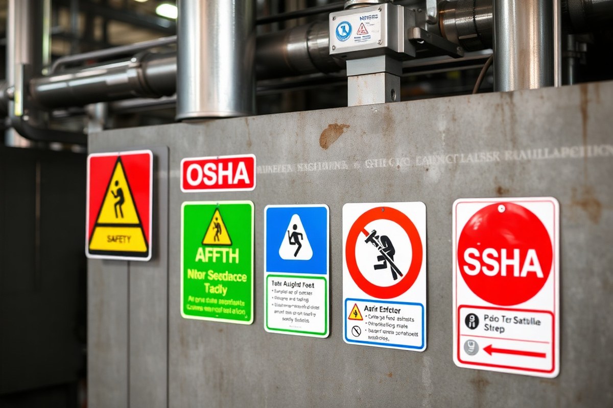
OSHA safety sign colors represent specific messages tied to hazard communication and safety instructions, each color indicating a certain level of risk or action required by workers. Red signals danger or prohibition, often marking fire equipment locations or emergency stops. Yellow or amber warns of potential hazards such as forklift traffic or slippery surfaces, prompting workers to slow down and proceed carefully. Blue indicates mandatory actions, like wearing eye protection, while green denotes safe conditions or emergency information, like first aid stations. These colors provide an immediate visual cue, helping workers recognize the type of hazard or required response without reading the full sign.
Color coding is critical in workplace safety because it standardizes visual communication, reducing confusion and response time during potentially dangerous situations. When a worker sees a red sign, they instantly understand to stop or avoid the area, while a yellow sign triggers caution and vigilance. Studies show that color-coded warnings improve hazard recognition speed, which is important in emergencies where every second counts. The consistent use of these colors aligns with OSHA and ANSI standards, ensuring clear expectations across different industries and facilities.
To effectively use OSHA safety sign colors, conduct a thorough hazard assessment of your workplace to identify all physical hazards and where safety instructions must be communicated. Assign the correct color to each sign according to OSHA 1910.145 and ANSI Z535 guidelines. For example, place red signs to mark fire extinguishers or emergency stop buttons and yellow signs to highlight caution zones such as around forklifts or wet floors. Ensure mandatory safety actions, like personal protective equipment use, are indicated with blue signs. Regularly inspect signs for visibility and condition, replacing any that fade or become damaged to maintain clear communication.
Costs mainly involve purchasing compliant signs and periodic replacement as needed. High-quality, durable signs designed for your facility’s environment can range from $10 to $50 each, depending on size and material. Implementing proper color coding can reduce accidents and improve overall safety culture, thus cutting down costs related to workplace injuries and compliance violations. Poor or incorrect use of these colors often results in mixed messages, slower hazard recognition, and increased risk of accidents or non-compliance penalties during OSHA inspections.
In workplaces with varying hazard levels, adjust the placement and combination of signs to improve clarity. For instance, a slippery floor near fire equipment may require adjacent yellow and red signs, ensuring workers know both to exercise caution and locate emergency tools. In noisy or low-visibility areas, complement colors with reflective materials or lighting. Strong color contrast also improves quick recognition, especially under time pressure or stress.
OSHA Regulations Governing Safety Sign Colors and Standards

OSHA’s safety sign colors and related rules come from two main regulations: 29 CFR 1910.144 and 29 CFR 1910.145. Regulation 1910.144 sets a color system to identify physical hazards in general industry settings. It assigns colors such as red for danger or stop, orange to warn of risks, yellow for caution, green for safety and first aid, blue for general information, and purple indicating radiation hazards. These guidelines help you label equipment, hazards, and barriers properly to comply with legal standards and make hazards easier to see.
OSHA 1910.145 focuses on accident prevention signs and tags, setting minimum requirements for their content, format, and application. While 1910.145 does not explicitly require certain colors for accident prevention tags, it strongly recommends using the colors defined under 1910.144 and following ANSI Z535 guidelines to maintain consistency and clarity. Using clear language and appropriate symbols helps ensure signs are easy to understand, reducing risks and improving compliance.
Together, these standards affect compliance by requiring facility supervisors and safety managers to use consistent colors and formats for workplace signage. Selecting or purchasing signs that comply with these regulations can require investing in OSHA-compliant signs that meet font size, signal word, color, and symbol standards. These signs must be maintained in visible, legible condition. Not meeting these requirements can lead to OSHA citations during inspections, especially in high-risk areas such as around electrical panels, chemical storage, or heavy machinery.
To comply, start by identifying hazards and the appropriate color codes under 1910.144. Purchase or create signs using 1910.145’s specifications for size, wording, and design. For example, a danger sign must use red for backgrounds or borders and include the word “DANGER” prominently. Caution signs use yellow backgrounds with black text. Signs should be placed where hazards are present, including entrances to danger zones or near equipment. Maintain signs to prevent fading or damage that could reduce legibility.
Cost considerations vary depending on sign material quality and quantity, but investing in OSHA-compliant signs minimizes legal risks and helps build a safer work environment. This approach ensures workers quickly recognize hazard severity and type, helping reduce injuries and improving overall safety culture. In complex workplaces with multiple hazard types, following these regulations carefully prevents confusion and keeps safety messaging straightforward and reliable.
Always verify that new or replacement signs meet OSHA 1910.144 and 1910.145 requirements before installation to avoid costly rework or fines.
Differences Between OSHA and ANSI Z535 Color Codes
OSHA safety sign colors and ANSI Z535 color codes serve related but distinct roles in workplace safety signage. OSHA sets the mandatory rules for employers to follow, defining what hazard colors must convey under federal law. ANSI Z535, meanwhile, is a voluntary American National Standard that OSHA frequently references for detailed design guidance. It expands OSHA’s color rules into a complete system specifying exact color shades, signal words, and sign layouts to improve clarity and consistency across facilities.
The practical result is a partnership where OSHA enforces legal requirements and ANSI Z535 provides the technical specifics. OSHA’s regulations mandate the use of key colors like red, yellow, and orange for danger, caution, and warning signs, but ANSI Z535 precisely defines the hues and their usage. For example, ANSI Z535.2 requires that Danger signs use a red header panel with “DANGER” text and that red dominates the sign’s design to avoid confusion with less severe messages. This level of precision helps maintain uniformity across signs, which supports immediate hazard recognition and reduces accidents.
Facilities often follow OSHA’s mandatory requirements but rely on ANSI Z535 for detailed implementation. Because ANSI Z535 is widely accepted and recognized by OSHA inspectors as the industry benchmark, adopting its color codes and design rules offers the clearest path to compliance. This also means signage from different manufacturers or different departments within the same workplace consistently communicates risk levels, which is important in complex or multilingual environments. The table below compares OSHA’s mandatory color rules with the ANSI Z535 voluntary but widely used standards:
| Aspect | OSHA | ANSI Z535 |
|---|---|---|
| Regulatory Status | Mandatory federal regulations | Voluntary consensus standard |
| Color Coding Detail | Basic color assignments (e.g., red for danger) | Exact color shades, tolerances, and extended palette |
| Sign Design | General requirements for safety signs | Specific layout, text, symbols, and color dominance |
| Signal Words | Basic required words (Danger, Warning, Caution) | Standardized words linked to precise color codes |
| Enforcement | OSHA inspectors enforce compliance | Reference used by OSHA inspectors for sign adequacy |
| Applicability | Federal workplaces under OSHA jurisdiction | Industry best practices and voluntary adoption |
Choosing between OSHA and ANSI standards depends on your facility’s compliance needs and risk environment. Employers must meet OSHA’s mandatory rules but following ANSI Z535 standards typically ensures thorough compliance and clear hazard communication. Opting not to use ANSI Z535 may lead to signs that technically meet OSHA rules but lack standardized color precision, possibly causing confusion during emergencies or inspections. Dedicating resources to printed signs that match ANSI’s exact color specifications may have upfront costs, but it improves overall safety and inspector satisfaction.
In workplaces with complex hazards or multiple languages, relying on ANSI Z535’s detailed color system and symbol standards improve understanding and compliance. Conversely, smaller facilities with simple signage needs may choose cost-saving OSHA-compliant signs without full ANSI color matching, but they should verify that legibility and recognition are not compromised. In all cases, matching sign colors precisely to ANSI Z535 definitions helps ensure consistency across signs and labels, which supports safer, more efficient workplaces.
Decoding OSHA Color Codes with Signal Words and Their Meanings
OSHA and ANSI establish a clear hierarchy of signal words paired with specific colors to communicate the severity of hazards effectively. This system helps you visually match a warning’s urgency to its color, allowing workers to recognize risks quickly and respond appropriately. The four main signal words, Danger, Warning, Caution, and Notice, each correspond to a color that reflects the level of threat.
Understanding the Danger Signal Word
The signal word Danger represents the highest level of hazard and uses the color red. It indicates an immediate risk that could result in death or serious injury if ignored. You’ll find Danger signs on equipment like live electrical panels, areas with flammable liquids, or fire protection devices.
Because Danger signs communicate life-threatening risks, the color red demands fast recognition and action. Red is highly visible and intuitively linked to stop or prohibition, reinforcing the critical nature of the message.
When to Use Warning and Caution
The Warning signal word signals hazards that could cause death or serious injury but are less immediate than Danger. OSHA pairs Warning with the color orange, which stands out but is less urgent than red. Typical orange Warning signs flag exposed machinery, moving parts, or chemical exposures.
Caution applies to hazards that may cause minor or moderate injuries, often warning about slippery floors, low clearances, or trip hazards. The associated yellow color alerts workers to be careful without implying immediate serious danger. Yellow signage fits situations where risk management reduces the threat but still requires awareness.
Role of Notice in Safety Communication
Notice communicates important but non-hazardous information, usually related to safety procedures or operational instructions. The color blue identifies Notice signs, which point to things like authorized personnel only areas or equipment instructions. It supports communication beyond hazard warnings by providing essential guidelines that improve safety culture. Unlike Danger, Warning, and Caution, Notices do not relate directly to potential injury but keep workers informed of policies or conditions they must follow for safety and efficiency.
Applying Signal Words with Colors Correctly
Using OSHA signal words and colors properly ensures your safety signs convey the right level of urgency. You must first identify the hazard severity and then select the listed combination of color and signal word. The established hierarchy runs from most severe to least: Danger (red), Warning (orange), Caution (yellow), and Notice (blue). Follow these steps when creating or inspecting safety signs to maintain compliance and clarity:
- Assess the hazard’s severity considering potential injury outcomes.
- Choose the correct signal word corresponding to that severity.
- Use red for Danger signs where death or serious injury can occur immediately.
- Select orange for Warning signs indicating serious but less immediate hazards.
- Apply yellow for Caution signs involving minor to moderate injury risk.
- Reserve blue for Notice signs conveying important but non-hazardous information.
- Ensure signal words appear prominently and legibly on signs.
- Place signs where hazards are present and easily seen by affected workers.
Correctly matching colors and signal words not only meets OSHA and ANSI Z535 standards but also reduces guesswork and improves worker response times. Mistakes like mixing signal words with wrong colors can confuse employees, leading to underestimating hazards or ignoring warnings, increasing the risk of accidents.
How to Design OSHA-Compliant Safety Signs with Correct Colors
Designing OSHA-compliant safety signs starts with using the correct colors combined with clear text and symbols. The font size must be large enough to read from the expected viewing distance. Proper color contrast between text, symbols, and background ensures high visibility. Incorporating symbols correctly boosts understanding across language barriers. Each element must meet OSHA and ANSI Z535 layout and legibility requirements for maximum effectiveness and compliance.
Text Size and Visibility Rules
Text on safety signs should be sized to ensure readability from the distance at which the sign will be viewed. OSHA suggests that letters be at least 1 inch tall for viewing distances up to 25 feet. For every additional 25 feet of reading distance, increase the letter height by 1 inch. This scaling helps workers quickly recognize and understand important messages before entering a hazard zone. Use simple fonts like Helvetica or Arial to improve legibility.
Also, avoid overcrowding the sign with too much text. Limit wording to the essential message, keeping it short and directive. OSHA’s general wording rules require clear, concise language focused on the hazard or required action.
Color Contrast Best Practices
High contrast between background and text or symbols is critical for sign visibility under various lighting conditions. Use OSHA-mapped color codes such as safety red (close to Pantone 186) for fire safety signs with white text and symbols for maximum contrast. Safety instruction signs typically use green backgrounds with white text to indicate procedural requirements.
For signs indicating hazards, white or black text on bright yellow or red backgrounds provides clarity. Avoid color combinations that reduce contrast, like light green on white or yellow on orange. This improves sign recognition quickly, reducing time spent interpreting the message.
- Use white text on red, green, or black backgrounds for clarity
- Ensure symbols and text have at least a 70% contrast ratio
- Check colors under workplace lighting before finalizing signs
- Follow OSHA’s fixed color code paired with signal words for consistency
- Reserve safety green for safety instructions and white for backgrounds in info signs
- Use spot color printing for sharper and cost-effective results
Proper contrast prevents sign confusion and supports quick hazard recognition during emergencies or routine operations.
Using Pictograms and Symbols
Pictograms and symbols on OSHA safety signs should follow ANSI Z535.3 design rules to effectively communicate messages regardless of language differences. Symbols must be simple, standardized images, easily understandable without additional explanation. These can accompany text or replace it where appropriate to speed recognition.
Mandatory action symbols, like wearing eye or hearing protection, typically use blue backgrounds, while danger symbols use red or black with white details. Text panels should be placed below or beside symbols, never cluttering the graphical elements. Align your layout with ANSI Z535.4 specifications to maintain proper spacing and positioning. Adding symbols also helps compliance in multicultural workplaces where some employees may not be fluent in English.
Always verify that pictograms remain sharp and legible after printing; blurry symbols can cause misinterpretation.
Material and Print Color Accuracy
The choice of material affects durability and visibility. Use weatherproof, UV-resistant materials like aluminum or high-grade vinyl for outdoor signs exposed to sunlight or harsh conditions. Reflective sheeting may be necessary in dimly lit areas.
Color accuracy is essential to maintain compliance and uniformity across a facility. Ordering your signs with spot color printing that matches the exact OSHA or ANSI Pantone shades ensures consistent visual cues. Using 2-color spot printing for signs can reduce costs while preserving sharpness and color fidelity. Check with printing services experienced in OSHA standards to get precise color matching and expert advice on material choices based on workplace conditions.
Proper Placement, Visibility, and Maintenance of OSHA Safety Signs
OSHA safety signs must be placed where they are clearly visible to all employees exposed to hazards, ensuring effective communication of risks and required precautions. Regular inspections, at least quarterly, help maintain visibility and compliance. Signs should be replaced immediately if colors fade or physical damage hinders legibility, considering environmental factors like sunlight, weather, and chemical exposure that can reduce sign longevity.
Critical Sign Locations in the Workplace
Signs need to be located directly at or near the hazard they warn about, ensuring employees see them before entering dangerous areas. Key locations include entry points to hazardous zones, near machinery with moving parts, chemical storage rooms, electrical panels, and fire safety equipment. OSHA requires signs to be visible from typical viewing distances, which usually means placement at eye level or slightly above, depending on the area’s layout and expected worker positions. In open areas, signs may require mounting on free-standing posts or walls where obstructions do not block sightlines.
Placement should also consider lighting conditions, signs must be illuminated or have reflective properties in low-light environments. For outdoor or harsh settings, signs need to withstand weather while maintaining color integrity. The goal is clearly communicating the specific risk the sign relates to, so situational awareness and accessibility are essential in determining exact placement.
Inspection and Cleaning Procedures
Regular inspection keeps safety signs effective and compliant. Establish a checklist to guide routine reviews:
- Confirm all required signs are present and positioned at appropriate hazard points.
- Check for fading or discoloration that reduces contrast between text and background.
- Look for physical damage such as cracks, peeling, graffiti, or dirt accumulation.
- Verify sign illumination or reflective properties if used in dim environments.
- Ensure message clarity, including legibility of text and symbols.
- Confirm compliance with current OSHA and ANSI standards for color and layout.
Cleaning should use mild soaps and soft cloths to avoid abrading the surface or removing printed information. Avoid harsh chemicals that can degrade sign materials or colors. Document inspection dates and corrective actions taken in your safety records to support ongoing compliance and continuous improvement.
Replacing Faded or Damaged Signs
Replace signs immediately when inspections identify faded colors, illegible text, or physical damage. Environmental conditions shorten sign life: UV radiation from sunlight can fade pigments in as little as 6 to 12 months outside, while indoor signs may last several years but still require monitoring. Chemical exposure in industrial settings can also deteriorate sign surfaces faster.
Choosing durable materials such as UV-resistant vinyl, laminated aluminum, or weatherproof plastics can extend sign life but typically costs $20 to $50 per standard sign. Evaluate the workplace environment to select appropriate materials balancing durability and budget. Prompt replacement is critical; poorly visible or damaged signs fail to alert workers, increasing injury risk and compliance violations.
Before installation, verify that new signs use the correct OSHA colors for the specific hazard and that print quality meets ANSI Z535.2-2023 guidelines for readability. Install replacements in the exact original location or a more visible nearby spot if needed, ensuring the new sign is securely mounted and unobstructed.
When OSHA Safety Sign Colors Are Legally Required
OSHA mandates specific safety sign colors primarily in workplaces where certain hazards are present and must be clearly identified to protect employees. Industries such as construction, manufacturing, chemical processing, and healthcare commonly require color-coded signage because the risks in these environments are well-defined and regulated through OSHA standards. For example, OSHA’s standard for hazardous waste operations (29 CFR 1910.120) demands red signs for fire protection equipment and specific biohazard symbols with defined colors in healthcare settings. These requirements ensure that workers recognize dangers quickly and respond appropriately, which can prevent accidents and improve overall compliance with safety protocols.
Not all hazards require color-coded signage. OSHA tends to require color use when a particular hazard poses an immediate threat that workers must recognize without hesitation. For instance, fire equipment, emergency stops, and prohibited actions often mandate the use of red, while caution areas might need yellow. Blue signs indicate mandatory actions, like a required use of personal protective equipment. However, in scenarios where OSHA does not explicitly require a safety sign, facilities often use color coding based on best practices or ANSI Z535 recommendations to maintain consistency and clarity in communication. This is especially common in complex workplaces where many hazards exist, but OSHA hasn’t issued specific color mandates for each.
Exceptions to these requirements occur when the hazard is controlled through other means or when signage might not contribute significantly to safety. For example, in low-risk office environments, OSHA doesn’t require the extensive use of color-coded safety signs. In some cases, OSHA may cite failures to provide adequate warning signs based on the “general duty clause,” even if no specific sign color is mandated. This clause holds employers responsible for informing employees about recognized hazards, which often leads industry professionals to adopt OSHA’s color coding voluntarily to reduce liability.
Implementing OSHA-required safety colors involves selecting the correct shades, such as safety red that closely matches Pantone 186 for consistency. Using Pantone spot color printing rather than process color helps maintain uniformity batch after batch, which is important for immediate recognition. Custom decals and signs tailored to specific equipment or hazards enable organizations to meet both OSHA and ANSI standards and fit unique workplace environments. The cost for custom OSHA-compliant signage varies, but investing in durable materials and precise color matching reduces replacement frequency and improve safety communication.
Adhering to OSHA’s color coding requirements leads to clearer hazard communication and fewer workplace incidents. Conversely, failing to use mandated colors or symbols can result in OSHA citations, increased risk of accidents, and confusion among workers. Keep in mind that color is just one element of safety communication, it works best combined with clear wording, proper placement, and ongoing maintenance to ensure effectiveness throughout the sign’s lifespan.
Common OSHA Safety Sign Color Mistakes and How to Avoid Them
Using the wrong colors or poor contrasts on OSHA safety signs is a frequent violation during workplace inspections. Typical errors include mixing colors that do not align with OSHA standards, such as writing warning messages in green or using red backgrounds for caution signs. These mistakes dilute the message and increase the risk of accidents. Signs with low contrast between text and background further impair visibility, especially in dim lighting or from a distance.
Incorrect color use confuses employees and visitors who rely on these visual cues to recognize hazards quickly. Also, signs exposed to ultraviolet (UV) light may fade, making colors less distinct. OSHA requires that safety signs maintain their colors and contrast to fulfill their purpose effectively.
- Follow OSHA color codes carefully: use red to signal danger, orange for warnings, yellow to caution, and green to mark safety information
- Apply high-contrast combinations, such as black text on yellow or white text on red, to ensure readability
- Avoid using colors interchangeably for different hazard levels to prevent misinterpretation
- Regularly inspect signs for fading or discoloration, especially in outdoor or UV-exposed areas
- Replace signs immediately if colors fade or the message is not clear within 10 feet from eye level
- Use weather-resistant materials or UV-protective coatings when signs are outdoors or near windows
- Train personnel responsible for sign maintenance on OSHA color standards and proper placement
Mixing or appropriating colors outside OSHA guidelines reduces sign effectiveness and can lead to compliance violations. Review your existing signs to ensure each uses the correct background and text colors paired with appropriate signal words. For example, a danger sign must have a red panel with white lettering, not yellow or green. Choose contrasting colors that meet OSHA’s minimum luminance difference, generally ensuring the text stands out sharply.
Check your safety signs quarterly and replace any faded or poorly contrasting signs to stay compliant and keep hazards clearly marked.
Costs vary depending on sign size and material but generally range from $15 to $60 per sign. The investment in proper colors prevents costly fines and reduces workplace accidents. Fading and poor contrast not only jeopardize safety but also waste the money spent on producing effective signage. In complex facilities, color consistency reinforces hazard awareness and facilitates quick response.
Using OSHA Safety Sign Colors in Multilingual and Complex Workplaces
OSHA does not explicitly require bilingual safety signs, but using them is highly recommended in workplaces with non-English-speaking employees. Including translations helps ensure everyone understands hazards and safety instructions, reducing accidents and improving compliance. OSHA’s color system combined with pictograms from ANSI or ISO 7010 standards provides clear, universally recognized messages that transcend language barriers.
Employing OSHA colors, such as red for fire hazards or yellow for caution, assists non-English speakers by reinforcing the meaning through familiar visual cues. Adding pictograms that meet ISO 7010 guidelines complements these colors by showing the specific hazard or required action. Pictograms like a flame icon for flammable materials or a hand with a wrench indicating mechanical hazards clarify risks without relying solely on text. When designing bilingual OSHA safety signs for complex or multilingual workplaces, consider this checklist:
- Include OSHA’s specified background and text colors for each hazard type to maintain legal compliance.
- Use clear, simple wording in both languages, avoiding technical terms that may confuse readers.
- Place pictograms adjacent to or above the text for immediate hazard recognition.
- Ensure sign size and font meet OSHA visibility and legibility standards, typically no smaller than 1 inch for letters.
- Position signs at natural eye level where employees perform related tasks for maximum noticeability.
- Use ISO 7010-compliant pictograms to maintain consistency and international recognition.
- Review signs periodically for language updates, wear, or damage that could impair comprehension.
Multilingual signs cost more upfront, roughly 15 to 30 percent more depending on the number of languages and size, but they decrease the risk of injury claims and fines by improving communication. Properly combining colors, translations, and pictograms also streamlines safety training and daily operations. Poorly designed multilingual signage risks confusion, leading to overlooked hazards and regulatory penalties.
In workplaces with diverse language groups or high visitor traffic, using OSHA colors along with pictograms and bilingual text enables quick risk recognition regardless of language proficiency. For high-hazard areas, consider adding audio alerts or supplemental training materials aligned with the sign content to reinforce safety messages. Adapting signs as your workforce changes helps maintain effective communication and compliance.
How to Choose Between OSHA and ANSI Colors for Your Facility
Use OSHA color coding when compliance with federal regulations mandates specific sign colors and formats. OSHA requires certain colors for danger (red), caution (yellow), and notice signs (blue or green), primarily to flag hazards that involve immediate injury risks or property damage. These are legally binding in workplaces under OSHA jurisdiction. ANSI colors, as defined by ANSI Z535 family standards, offer expanded color options and symbol clarity to improve communication with workers. ANSI adds colors such as orange for warning and green for safety instruction, improving visual differentiation in more complex settings.
To decide between OSHA and ANSI colors, apply this rule: follow OSHA colors where federal regulations are explicit, particularly for mandatory hazard warnings. Choose ANSI colors when additional clarity is needed for diverse hazards or layered safety messages at your facility. ANSI’s standards support both product safety labels (ANSI Z535.4) and facility signs (ANSI Z535.2), offering consistent color and symbol conventions that align with OSHA but extend sign usefulness.
For practical application, start by conducting a hazard assessment that considers the nature of risks and employee exposure. Map out workplace zones and identify areas needing signs. Confirm OSHA color requirements for those hazards (e.g., red for fire equipment locations or immediate danger). For complex or low-severity hazards, select ANSI signage to use its wider palette and better symbol standards. Custom decals or fabricated signs should strictly follow ANSI Z535 color and format standards to maintain uniform communication and compliance.
| Aspect | OSHA Colors | ANSI Z535 Colors |
|---|---|---|
| Applicability | Mandatory for OSHA-regulated hazards | Recommended for complete safety communication |
| Color Code Examples | Red (danger), yellow (caution), blue/green (notice) | Red (danger), orange (warning), yellow (caution), green (safety), blue (information) |
| Sign Types | Facility signs, hazard warnings | Facility signs, product labels, tags |
| Legal Enforcement | Regulatory requirement in OSHA inspections | Industry best practice; supports OSHA compliance |
| Flexibility | Limited to required hazard indications | Broad color and symbol options to address complex hazards |
Ensuring your signs meet both compliance and usability means selecting colors and symbols clearly understood by your workforce and suited to the risks present. Keep signs visible with appropriate placement and lighting, and refresh them when colors fade or messages become outdated. Training employees on sign meanings according to the chosen standard reinforces effectiveness. Costs vary depending on sign quantity and customization but expect that ANSI-compliant signs may cost slightly more due to their detailed design requirements.
Common pitfalls include mixing OSHA colors with ANSI designs without full alignment, leading to confusion and non-compliance risks. Avoid generic color use that does not correspond to legal or standard definitions. Regular audits help identify outdated or inappropriate signage before they impact workplace safety performance.
Your Quick-Start Action Plan for Implementing OSHA Safety Sign Colors
Follow these steps to ensure your facility’s safety signs meet OSHA requirements and effectively protect your workers.
- Before you begin: Review your current safety signage and note any missing or improperly colored signs. Confirm compliance by checking against OSHA color standards.
- Day 1: Train your safety team on OSHA color codes and signal words. Verify understanding with a brief quiz or discussion to ensure accurate application.
- Week 1: Design or update your safety signs using OSHA-compliant colors and appropriate signal words. Have a compliance officer approve the designs.
- Week 2: Install safety signs in required locations ensuring visibility and proper placement. Conduct a walk-through to verify all signs are clearly visible and correctly positioned.
- Week 3: Implement a maintenance schedule to regularly inspect sign condition and visibility. Track maintenance in a log to ensure timely replacements or repairs.
- One month: Evaluate the effectiveness by gathering worker feedback on sign clarity and usefulness. Adjust signage if workers report confusion or missed warnings.
- Ongoing: Stay updated on OSHA and ANSI standards and retrain staff annually or when standards change. Document training sessions for compliance records.
Frequently Asked Questions
What Are the Nine OSHA/ANSI Safety Sign Types and Their Colors?
OSHA and ANSI define nine safety sign types including Danger (red), Warning (orange), Caution (yellow), Safety Instruction (green), and Notice (blue), each color signaling a different level or type of hazard or information to maintain workplace safety effectively.
Why Is Gray Not Considered a Safety Color in OSHA Standards?
Gray is not part of OSHA’s safety color code, so gray signs carry no official safety meaning; workplaces use black and white for aisles and boundary markings instead to avoid confusion.
What Does OSHA Say About the Wording on Safety Signs?
OSHA requires sign wording to be clear and easy to read to ensure quick understanding of hazards or safety instructions, minimizing workplace accidents and improving compliance with safety standards.
Does OSHA Specify Safety Sign Colors for Different Industries?
OSHA’s regulations apply broadly across general industries, but high-visibility colors like yellow-green and orange are recommended for specific tasks like road or rail work to match visibility needs.
How Do OSHA and ANSI Standards Interact for Safety Sign Colors?
OSHA sets the minimum legal requirements for safety sign colors and design, while ANSI provides detailed standards and templates for color use, symbols, and layout to improve communication and uniformity.
Can I Use OSHA Safety Sign Colors for Employee Uniforms?
OSHA colors for signs differ from uniform colors, but high-visibility OSHA colors like yellow-green and orange are commonly adopted for safety apparel to improve worker visibility, especially in traffic zones.
Final Thoughts
Applying OSHA safety sign colors correctly reduces hazards and supports clear communication on site. Begin by verifying your existing signs and educating your team on the standards. Take action now to audit your signage and start improving workplace safety today.