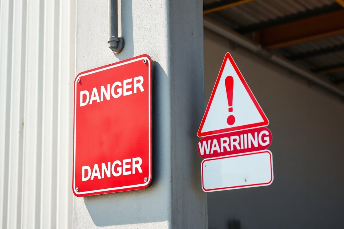
Difference Between Danger and Warning Signs: Complete Safety Guide with Practical Tips
Danger signs point to hazards that could cause death or serious harm when not avoided, while warning signs highlight possible hazards that might lead to serious injury. Begin by assessing the risk level to choose the right sign for clear hazard communication.
Key Takeaways
- Use danger signs exclusively for immediate, life-threatening hazards requiring urgent attention and special precautions.
- Apply warning signs for moderate risks where injury is possible but less severe than danger-level hazards.
- Follow AS/NZS 1319:1994 standards to differentiate danger from warning signs by risk severity and visibility requirements.
- Incorporate specific colors, red for danger signs and orange for warning signs, to improve immediate recognition.
- Choose U3-grade materials to ensure compliance and durability for both danger and warning signs in industrial environments.
- Place signs at eye level near the hazard source to maximize visibility and effectiveness in preventing accidents.
What Is the Key Difference Between Danger and Warning Signs?
The fundamental difference between danger and warning signs lies in the severity of the hazard they indicate and the urgency of the response they require. Danger signs communicate the presence of immediate, life-threatening hazards. These signs signal conditions that demand immediate attention and action to prevent death or permanent disability. Warning signs, on the other hand, highlight potential hazards that could cause serious injury or illness but do not pose an immediate threat to life. They call for heightened awareness and caution rather than immediate avoidance.
Hazard severity distinguishes these signs clearly. Danger signs represent high-risk situations where exposure to the hazard can lead to death or permanent disability. For example, danger signs appear near high-voltage electrical equipment or confined spaces with toxic gases. Warning signs address medium-risk hazards where serious injury or illness might occur if precautions are not taken, such as areas with forklifts in operation or slippery floors. This difference matters because it directs employees and visitors to prioritize their level of attention and urgency based on the probable consequences.
Your expected reaction to a danger sign is immediate and decisive. Stopping work, avoiding the area, or taking specific safety measures should happen without delay. The wording on these signs tends to be direct and unmistakable, often using red as the dominant color to catch attention quickly. Seeing a danger sign requires you to understand that failing to respond instantly could have severe or fatal consequences. In contrast, a warning sign asks you to proceed with caution. You should increase vigilance, use personal protective equipment, or follow safety procedures carefully. Warning signs use colors like yellow or orange to signal caution while indicating the risk is serious but not immediately critical.
Applying these signs correctly impacts workplace safety significantly. Installing a danger sign where only a warning sign is needed can cause unnecessary alarm and reduce credibility. Using a warning sign where a danger sign is proper might lead to underestimating the hazard and increased risk exposure. For safety managers, the key is assessing the hazard’s nature: what is the likelihood and severity of harm? Then select the sign reflecting that risk level. For example, areas with electrical hazards over 600 volts typically require danger signs due to the immediate risk to life, while a potential fall risk zone might only require warning signs urging caution.
Understanding these distinctions saves lives and ensures compliance with standards like AS/NZS 1319:1994. Familiar signs communicate quickly during critical moments, giving workers the chance to act appropriately. Regularly review your site’s hazards and update signage to maintain clear distinctions between danger and warning. Well-maintained, clearly visible signs with precise wording help create a safer environment where employees know what dangers require urgent action and which require vigilance and care.
How Do Regulatory Standards Define and Differentiate These Signs?

Regulatory standards provide clear definitions and specifications for danger and warning signs to ensure workplace safety compliance. ANSI Z535 and OSHA 1910.145 set signal words, colors, and usage rules that help you communicate hazards effectively. Australian standards, specifically AS/NZS 1319:1994, align with these principles but emphasize strict use of danger signs for life-threatening risks and warning signs for moderate hazards.
ANSI Z535 specifies that DANGER signs mark hazards that pose an immediate threat of death or severe injury. These signs use white text on a red background and include a warning icon. WARNING signs identify risks that might lead to serious injury or death, using black text on an orange background with the same symbol. OSHA’s 29 CFR 1910.145 primarily defines Danger and Caution signs for general industry, reserving danger signs for urgent hazards that require special safety measures.
Warning signs are less explicitly categorized by OSHA in general industry, but they appear as optional tags in certain OSHA standards and are used extensively in construction per the ANSI four-level system referenced in OSHA 1926.200. The Australian AS/NZS 1319:1994 regulation requires businesses to reserve danger signs strictly for life-threatening situations and use warning signs for moderate risks, complementing the ANSI approach.
| Sign Class | Signal Word | Panel Colors | Definition | Alert Symbol? | Regulatory Source |
|---|---|---|---|---|---|
| Danger | DANGER | White letters on Red background | The hazard presents a risk that will cause death or serious injury unless avoided. | Yes | ANSI Z535, OSHA 1910.145(c), AS/NZS 1319:1994 |
| Warning | WARNING | Black letters on Orange background | The hazard could cause death or serious injury if it is not avoided. | Yes | ANSI Z535, OSHA (optional tags), AS/NZS 1319:1994 |
| Caution | CAUTION | Black letters on Yellow background | Hazard could cause minor or moderate injury if not avoided | Yes | ANSI Z535, OSHA 1910.145(c) |
| Notice | NOTICE | White italic letters on Blue background | Non-hazardous safety information or instructions | No | ANSI Z535 |
For day-to-day compliance, ensure that safety signs follow both the design rules of ANSI Z535.1 for colors and ANSI Z535.2 for layout, as the OSHA regulation 1910.145 references these standards in combination. You should mark each sign with the proper ANSI format and OSHA classification to clearly document compliance. In Australia, closely adhere to AS/NZS 1319:1994 rules, reserving danger signs for true life-threatening hazards and using warning signs for moderate dangers to avoid sign inflation, which can reduce their impact.
Use danger signs only when immediate death or severe injury could occur; overusing them for lesser hazards weakens their effectiveness and may violate standards.
What Colors, Symbols, and Wording Identify Danger vs Warning Signs?
Danger and warning signs use distinct colors, symbols, and wording to clearly convey the severity of hazards. Danger signs are designed to signal life-threatening risks and feature red backgrounds with white text and icons to grab immediate attention. Warning signs indicate less severe hazards and typically use yellow backgrounds with black text and symbols, providing a strong but less urgent alert.
Standard Colors and Their Meanings
The color scheme is one of the most important visual cues for differentiating between danger and warning signs. Danger signs use a red background with white lettering and symbols, which stands out sharply to indicate an imminent risk that could cause death or serious injury. The color red is universally associated with stop signals and extreme caution, helping these signs command prompt attention.
Warning signs use a yellow background with black text and symbols. Yellow signals caution but implies a lower hazard level compared to danger signs. It alerts individuals to risks that might result in injury or unsafe conditions but are not immediately life-threatening. This color contrast offers good visibility in most environments and communicates urgency without the intensity of a red danger sign.
Common Hazard Symbols on Signs
Both types of signs use symbols to supplement their signal words and improve comprehension, especially for those who may have language barriers. Danger signs often include strong, clear icons such as a skull and crossbones for toxic hazards, a lightning bolt for electrical shock, or a flame for fire risk. These bold white symbols are placed against the red background to maximize impact.
Warning signs usually feature symbols like an exclamation mark, a slipping person for wet floors, or mechanical hazards like a hand caught in machinery. These icons are black on yellow, maintaining good contrast while conveying moderate hazards that require awareness but not immediate evacuation or emergency action.
- White skull and crossbones on red for poisonous materials
- White lightning bolt on red for electrical dangers
- Black exclamation mark on yellow for general warnings
- Black slipping figure on yellow for slick surfaces
- White flame on red for fire or flammable risks
- Black hand caught in gears on yellow for mechanical hazards
Consistent use of these established symbols aligned with the sign’s color scheme ensures fast hazard identification and supports compliance with occupational health and safety standards.
Effective Signal Words and Wording
The signal words “DANGER” and “WARNING” play a critical role in communicating the level of risk. The word “DANGER” is capitalized, usually in a bold, uppercase font that is simple and sans serif, printed in white against red. This word is direct and commands immediate attention, indicating a high probability of death or serious injury if the hazard is not avoided.
“WARNING” appears in uppercase black letters on a yellow background, typically also in a bold sans serif typeface to maximize readability. It alerts individuals to a hazard that could cause injury or harm but is not as urgent as a danger condition. Below the signal word, both sign types include brief descriptive text explaining the hazard and necessary precautions. The clarity of the wording, combined with the correct color and symbol, improves hazard communication and helps individuals quickly understand the risk and required response steps.
When Should You Use Danger Instead of Warning Signs?
Use a danger sign whenever an immediate hazard poses a high risk of severe injury or death without proper precautions. This applies when a hazard is imminent and likely to cause serious harm if not avoided right away. Warning signs suit potential hazards that require caution but are less likely to lead to fatal outcomes or severe injuries immediately.
Assessing Hazard Severity and Certainty
Start by defining the hazard’s severity, determine if injury or death can result from exposure. Danger signs are mandatory when hazards present a direct threat causing serious injury or death immediately upon contact or exposure. When the hazard might cause injury or death but doesn’t pose an immediate threat, warning signs are sufficient.
Certainty matters as well. A hazard is imminent when risk assessment shows it will almost certainly cause harm without intervention. Imminent, high-severity hazards require danger signs. Potential hazards, which may or may not cause harm depending on circumstances, are better indicated by warning signs.
Checklist for Danger Sign Usage
Use this checklist to determine if a danger sign is necessary for a specific hazard. Each yes strengthens the requirement for a danger sign:
- Does the hazard have a high likelihood of causing death or life-threatening injury?
- Is the hazard exposure immediate or unavoidable without protective measures?
- Could failure to recognize the hazard lead to serious injury within seconds or minutes?
- Is the hazard clearly confirmed through workplace incident history or hazard analysis?
- Are engineering controls or administrative controls insufficient to eliminate hazard risk?
- Would lack of a danger sign significantly increase the chance of workers unknowingly encountering the hazard?
- Does regulatory guidance or industry standard mandate danger signage for this risk?
After completing this checklist, presence of multiple affirmative answers indicates use of danger signs is appropriate. When few answers are affirmative and the hazard is less certain or severe, consider using a warning sign instead.
Examples of Immediate Danger Scenarios
Danger signs are required near electric panels energized at voltages exceeding 600 volts, where electrocution risk is immediate and death can occur within seconds without precautions. Another example is confined space entry into tanks with hazardous atmospheres presenting oxygen deficiency or toxic gas exposure that can cause rapid fatalities.
Moving machinery with exposed parts rotating at high speeds also calls for danger signage, as contact typically results in severe injury or amputation. High-temperature steam pipes accessible to employees require danger signs since the risk of severe burns is immediate on contact.
How to Correctly Choose and Place Danger and Warning Signs?
Choose safety sign size and placement to ensure clear, early hazard recognition. Position signs at eye level, between 1.4 and 1.7 meters high, to catch attention quickly. Adjust size and location depending on hazard severity, viewing distance, and environmental factors for compliance and maximum effectiveness.
Selecting Appropriate Sign Size
Select a sign size based on the distance from which it must be seen and the severity of the hazard. Danger signs should be larger than warning signs since they signal more severe risks and require immediate attention. For indoor areas where employees are close to the hazard, smaller signs might suffice, but outdoor or large spaces need larger signs to remain legible from farther away.
A general recommendation is that text and symbols should be readable from at least 15 to 25 feet away for warning signs and 30 to 50 feet for danger signs. Large, bold lettering with clear symbols increases legibility. Rounded corners prevent injury from sharp edges while maintaining compliance with standards like AS/NZS 1319:1994.
Recommended Placement Heights and Locations
Place signs at eye level, preferably between 1.4 and 1.7 meters (about 4.5 to 5.5 feet) from the ground, to ensure maximum visibility. Position them on clear sightlines where workers approach the hazard or where the hazard is most likely encountered. Avoid placing signs behind obstacles or in cluttered areas where they can be missed. Key placement tips include:
- Mount signs on solid surfaces, such as walls or posts, rather than flexible or moving objects.
- Ensure signs are placed before hazardous areas or equipment, giving workers time to react.
- Use multiple signs if the hazard extends over a large area or has several access points.
- Position signs where lighting conditions allow easy reading without glare or shadow.
- Check frequently for signs that may have been moved, obscured, or damaged.
Signs that are mounted too low or too high reduce hazard awareness and increase risk of accidents.
Proper placement reinforces compliance and helps workers consistently recognise hazards before exposure.
Adjusting for Environmental and Lighting Conditions
Environmental factors such as outdoor weather, indoor lighting, and traffic flow require adjustments in both sign materials and placement. Bright sunlight or shadows can cause glare or obscured text, so choose highly reflective or matte finish signs depending on conditions. In dimly lit or poorly illuminated areas, add supplementary lighting or position signs where existing light improve legibility. Consider the following environmental elements:
- Use weather-resistant materials for outdoor signs to withstand rain, UV exposure, and temperature changes.
- Place signs away from glare caused by windows or reflective surfaces.
- Ensure signs do not blend into backgrounds with similar colors or patterns.
- Account for dust, dirt, and corrosion that might reduce visibility over time.
- Review and update sign placement periodically to adapt to changes in the workspace or processes.
Adapting signs to these conditions maintains legibility and compliance through the life cycle of the workplace environment. Regular inspections ensure signs remain effective and safe.
What Are Common Mistakes Using Danger and Warning Signs and How to Fix Them?
Misusing danger and warning signs often erodes their credibility, making employees less likely to heed the alerts. When signs indicate different levels of risk inconsistently, people become confused about how seriously to take the hazard. For example, overusing danger signs for minor risks can cause workers to ignore true high-risk alerts, defeating the purpose of the hierarchy in safety communications.
Common errors that lead to confusion include placing a warning sign where a danger sign is warranted or mixing wording that downplays the threat. Another frequent mistake is poor maintenance, faded, dirty, or damaged signs lose visibility and clarity, reducing their effectiveness. Signs with unclear or technical language also hamper understanding, especially if employees have varying levels of safety training.
To fix these problems, regularly auditing sign placement and condition is essential. A safety manager can perform walk-through inspections monthly, checking for accuracy in the assigned alert level, legibility, and relevance to current hazards. Replacing worn signs promptly avoids miscommunication; costs typically run from $30 to $100 per sign, depending on size and material. Using templates with standardized wording that matches ANSI Z535.2 guidelines helps maintain clarity and consistency, reinforcing the difference between danger (red, highest risk) and warning (orange, serious risk).
- Review hazard assessments before installing or updating signs to ensure the correct alert level.
- Use ANSI Z535.2 specified colors and wording to differentiate hazard severity clearly.
- Schedule monthly inspections to spot faded, damaged, or misplaced signs requiring replacement.
- Train employees on sign meanings to reinforce correct responses and reduce misinterpretation.
- Keep sign wording concise and avoid jargon for maximum comprehension across all workers.
- Document sign audits and maintenance actions to ensure accountability and track improvements.
These corrective actions improve sign effectiveness over time, supporting a workplace culture attuned to actual risk levels. In contrast, neglecting maintenance or ignoring proper sign selection risks undercutting overall safety programs. Results include fewer accidents and clearer hazard communication on-site, which are important for compliance and employee protection.
How Do Danger and Warning Signs Compare to Caution and Notice Signs?
Workplace safety signs follow a clear hierarchy based on the severity of the hazard and the potential injury level. Danger signs indicate the highest level of risk, warning signs signal a moderate risk, caution signs address lower risk scenarios, and notice signs provide important information unrelated to physical harm. Choosing the correct sign depends on matching the communication to that risk level to ensure clear, consistent safety messages.
Understanding the differences between these signs matters because misusing them can cause confusion or reduce their effectiveness. For example, using a notice sign for a serious chemical hazard will not alert workers adequately, while excessive use of danger signs can lead to sign fatigue, causing workers to ignore them. Proper selection supports injury prevention and workplace compliance.
| Sign Type | Primary Color | Potential Injury Severity | Typical Use Case | Example Wording |
|---|---|---|---|---|
| Danger | Red | Severe injury or death | Immediate hazards that could cause serious harm or fatality | “Danger: High Voltage” |
| Warning | Orange | Serious injury | Potential hazardous situations with less immediate threat than danger | “Warning: Forklift Traffic” |
| Caution | Yellow | Minor or moderate injury | Hazards that could cause non-fatal injuries, such as slips or minor cuts | “Caution: Wet Floor” |
| Notice | Blue | No physical injury risk | Important safety-related information, policies, or reminders without injury risk | “Notice: Safety Glasses Required” |
Each level has its own place in effective risk communication, with danger signs reserved for the most critical hazards requiring immediate attention. Warning signs alert about serious hazards that might not be imminently life-threatening but still need caution. Caution signs are the workhorses in the hierarchy, helping prevent common injuries by highlighting less severe risks. Notice signs are distinct because they communicate important safety instructions or policies that do not involve physical harm but support a safe work environment.
Choosing the right sign starts with a hazard assessment. For a potential fatality risk like electrical shock or falling from heights, use a danger sign. For hazards such as moving machinery or exposed pinch points where serious but not fatal injuries may occur, assign a warning sign. For housekeeping issues like wet floors or low headroom, caution signs are appropriate. Notice signs fit where the purpose is informing or reminding employees about safe work practices rather than alerting to hazards.
Customizing caution signs to specific workplace conditions is common and encouraged, as long as the sign’s core purpose and color scheme remain clear and consistent. This flexibility helps integrate caution signs into a cohesive safety strategy without overloading any one sign type, maintaining their impact and supporting accident prevention efforts. Using this hierarchy and color coding allows your safety signage to clearly communicate risk levels and proper employee responses.
What Technology and Materials Ensure Durable Danger and Warning Signs?
Durability is essential for danger and warning signs, especially in harsh work environments. Signs made from advanced materials like U3 polymer and marine-grade metals withstand weather, UV exposure, and physical damage longer than traditional options. U3 polymer signs use a UV-blocking 2mm polymer resin layer that prevents fading and cracking even after years in direct sunlight. This quality helps maintain bright colors and clear lettering important for visibility over time.
Marine-grade aluminum is another top choice, known for resisting rust and corrosion in wet or salty conditions. Its strength keeps signs intact under impacts and rough handling, which often occur on construction sites or industrial facilities. Using marine-grade metals for danger signs ensures that important warnings do not deteriorate or become unreadable due to environmental wear.
The importance of durability is higher for danger signs because they signal the highest level of risk. A faded or damaged danger sign can lead to misunderstandings or ignored hazards, increasing the risk of injury or fatal accidents. Ensuring the sign’s colors, symbols, and wording stay legible after installation is critical for continual compliance with workplace safety standards. Durable signs reduce maintenance and replacement frequency, offering cost savings and ongoing protection.
To install durable signs effectively, choose products certified for your industry and environment. For outdoor use, signs with UV-resistant coatings or made from polymers like U3 improve longevity against sun exposure. Marine-grade aluminum suits areas exposed to moisture, salt, or chemicals. Signs should be mounted securely using corrosion-proof hardware to prevent loosening or damage. Regular inspections will catch early signs of wear and allow timely repairs or replacements.
The cost for durable signs varies but investing in high-quality materials pays off by extending service life beyond basic plastic or low-grade metal signs. For example, U3 polymer signs may cost more upfront but can last several years longer without losing clarity. Marine-grade aluminum also commands higher prices than standard metals, reflecting its resistance to harsh conditions. Brands specializing in regulatory-compliant signage often combine these materials to meet Australian or OSHA standards ensuring legal adherence and workplace safety assurance.
Place danger and warning signs where they are clearly visible and protected from physical damage, but avoid shadows or glare that can reduce legibility over time.
Step-by-Step Action Plan for Using Danger and Warning Signs Correctly
Follow these steps to ensure your workplace uses danger and warning signs effectively and stays compliant with safety regulations.
- Before installation: Assess all hazards in your facility to determine which require danger signs (immediate, severe risk) and which need warning signs (potential hazards).
- Day 1: Select signs with correct colors, symbols, and wording according to OSHA and ANSI standards to clearly differentiate danger from warning.
- Within the first week: Place signs at visible locations near the hazard source, ensuring proper height and lighting to maximize employee awareness.
- Week 2: Train employees on the meaning of each sign type and correct responses using real workplace examples to reinforce understanding.
- Month 1: Inspect all posted signs for damage, fading, or incorrect placement; replace or relocate signs as needed.
- Ongoing: Review and update signage with any changes to equipment, processes, or regulations to maintain compliance and effectiveness.
- Quarterly: Audit sign usage against common mistakes, such as mixing danger and warning signs inappropriately, and correct these issues promptly.
Frequently Asked Questions
How Does Visibility Differ Between Danger and Warning Signs?
Danger signs have higher visibility with bold red and black colors to alert to life-threatening hazards, while warning signs use orange and black for moderate risks. This helps prioritize immediate attention to the most severe risks.
Can Danger Signs Be Reused in Different Workplaces?
Yes, danger signs can be reused if the hazard and risk levels remain the same. Confirm the workplace conditions haven’t changed before reusing to stay compliant and effective.
Do Employees Need Training on Interpreting Danger and Warning Signs?
Yes, training helps employees understand the severity differences and appropriate responses. This reduces accidents and improves hazard communication on site.
Are Digital Displays Suitable for Danger or Warning Signs?
Digital displays can be used if they meet visibility and durability standards set by regulations. Ensure they remain clear and legible under all conditions where risks exist.
Can Danger Signs Ever Use Colors Other Than Red?
Danger signs typically use red for high severity hazards to stand out clearly. Using other colors might reduce recognition and cause confusion, risking safety compliance.
How Often Should Danger and Warning Signs Be Inspected in the Workplace?
Inspect signs regularly, at least quarterly, to ensure they remain visible, legible, and intact. Replace damaged or faded signs promptly to maintain safety.
Wrapping Up
Clear differentiation between danger and warning signs is essential to managing workplace risks and ensuring compliance. Start by accurately assessing your hazards and choosing signs that match each risk level. The next step should be employee training on the meaning and response to these signs to maintain a safe environment. Taking action now can reduce accidents and improve safety awareness immediately.