How to Make a Family Name Sign by Hand a Complete Guide with Steps, Tools & Tips
Knowing how to make a family name sign by hand means crafting a unique piece that adds charm and personality to your home. The best way starts with choosing quality wood, designing personalized lettering, and applying finishing touches that highlight your craft. Begin by picking wood that balances durability and appearance for a lasting sign.
Key Takeaways
- Select hardwoods like oak or maple for durability, or softwoods like pine for easier cutting and painting.
- Keep your family name letters between 8 to 10 cm tall for easy readability on your front door sign.
- Create your lettering layout by hand using simple sketching tools or a font generator for balanced composition.
- Transfer your design neatly by tracing with carbon paper or lightly drawing with a pencil on the wood surface.
- Cut letters with sharp hand tools or a precision cutter and sand edges for a smooth, polished finish.
- Apply clear sealants or wood preservatives to protect your sign from indoor or outdoor weather damage.
What Materials and Tools Do You Need for a Hand-Crafted Name Sign?
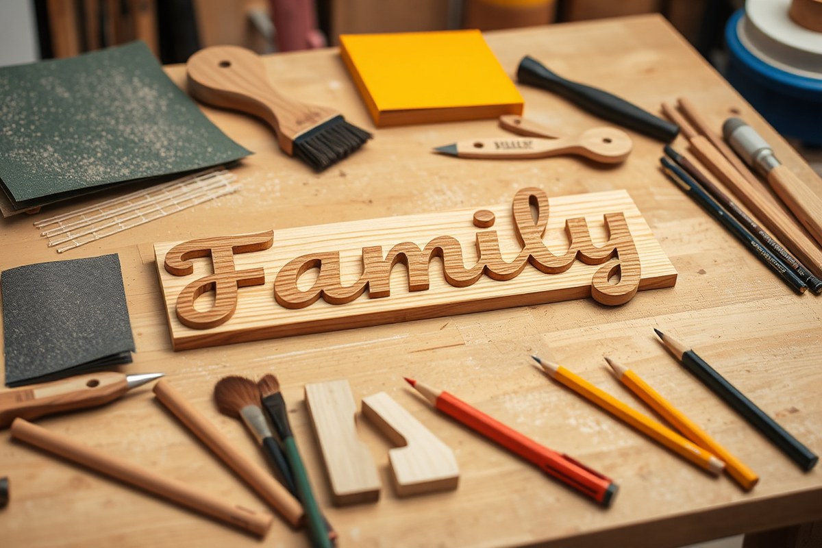
To make a family name sign by hand, you need a few basic materials and tools that are easy to find and budget-friendly. Start with a suitable piece of wood like pine or cedar if you want an affordable option. Scrap wood can also work well if it’s smooth and without major cracks. Wood stain and a rag or foam brush will help you add color or preserve the wood’s natural look. For attaching letters or decorations, a hot glue gun offers a quick solution without complicated hardware.
Hand tools are essential to shape and personalize your sign. A fine-toothed saw or coping saw lets you cut your wood to size, while a sanding block or sandpaper (around 120 to 220 grit) smooths the surface and edges for a professional finish. A pencil and ruler help map out your layout before you start cutting or painting. If you plan to carve letters by hand, a small set of carving tools can be very useful but is optional for painting or glued-on lettering.
- Wood board (pine, cedar, or scrap wood around 1/2 to 3/4 inch thick)
- Wood stain or paint and foam brush or rag
- Hot glue gun with glue sticks
- Pencil and ruler or measuring tape
- Fine-toothed saw or coping saw
- Sanding block or sandpaper (120-220 grit)
- Optional: carving tools set for hand-carved letters
Choosing your supplies impacts the project’s ease and final look. Select a smooth board free of knots, which can make cutting and painting difficult. Foam brushes spread stain evenly without brush marks. Using a hot glue gun is faster than nails or screws, especially for lightweight letters or decorations. Budget-conscious crafters can repurpose leftover wood and household tools, trimming costs while still crafting a durable and attractive sign.
Investing time in sanding prevents paint or stain from peeling later. Testing the stain on a scrap piece first ensures the color matches your vision. Simple tools paired with a solid plan can produce results that look more expensive than the materials you started with. Avoid using rough wood or skipping sanding, since uneven surfaces cause paint or stain to blotch.
How to Select the Perfect Wood for Your Family Name Sign
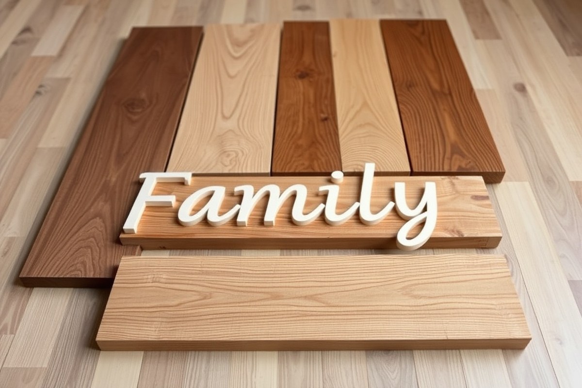
Choosing the right wood directly affects how your family name sign looks, lasts, and how easy it is to craft by hand. Different woods offer unique grain patterns, cost points, and finish qualities. For a durable and attractive sign, select wood that holds paint or stain well while being easy to cut or carve. Thickness matters: a 3/4-inch thickness for the backer board provides stability for cut or glued letters, while 1/2-inch materials work well for clear, sharp lettering. The size also depends on placement; letters around 8 to 10 cm tall suit front door signs visible from a walkway, while smaller sizes fit indoor entryways.
| Wood Type | Grain | Cost | Finish Quality |
|---|---|---|---|
| Maple Plywood | Fine, smooth | Moderate ($) | Excellent stain and oil absorption, smooth for painting |
| MDF (Medium-Density Fiberboard) | Uniform, no grain | Low ($) | Great for painting but must be primed to prevent soaking |
| Oak | Coarse, strong grain | Higher ($$) | Stains well with rich, warm tones but rougher texture |
| Pine | Soft, pronounced knots | Low ($) | Absorbs stain unevenly; best with paint for uniform finish |
| Cedar | Fine to medium | Moderate ($) | Good natural resistance to moisture; stains and paints nicely |
Maple plywood is a popular choice for the sign backer because it cuts cleanly with tools like a circular saw and offers a smooth surface ideal for staining and oil finishes. Using a 3/4-inch thickness provides a firm foundation that supports glued letters without warping. Letter pieces often use lighter materials like 1/2-inch MDF for crispness, but MDF needs priming before painting since it soaks up moisture and paint irregularly. Hardwoods like oak deliver durability but require more skill to carve and may cost more. Softwoods such as pine are affordable but can absorb stains unevenly due to knots, making paint a better option for a clean appearance.
Size your sign to its expected viewing distance. For example, if the sign is at your front door meant to be read easily from the walkway, letters about 8 to 10 cm tall work well. For smaller indoor space signs, reduce letter height accordingly to maintain readability without overpowering the area. Measure the space available, then add a comfortable margin around the name to avoid a cramped look.
Practical tip: Test your stain or paint on scrap wood of the same type before applying it to your actual sign to prevent unwanted blotches or color surprises.
How to Design Your Family Name Layout and Lettering by Hand
Designing your family name sign by hand involves picking clear fonts, planning letter size and spacing carefully, and drawing your layout with simple guidelines. Each step ensures your sign looks balanced, readable, and fits the space where it will hang. You can do this with just pencil, ruler, and eraser, no special software needed.
Choosing Appropriate Fonts for Visibility
Start by deciding on a font style that suits your home’s vibe and makes your family name easy to read from a distance. Simple, bold fonts like serif or sans-serif styles typically work best because they keep letters distinct and legible. Avoid overly ornate or overly thin fonts, which can be hard to paint neatly and read clearly. For a handmade look, try block letters or simple script fonts with moderate thickness.
Stick with letter heights between 6 and 10 inches for family name signs meant to be viewed from several feet away. Larger letters increase visibility but need more space. Choosing a font with consistent stroke width helps when painting or carving by hand, making it easier to maintain even lines and spacing.
Drafting Size and Spacing on Wood with Guidelines
Using pencil and ruler, start by marking horizontal guidelines lightly on your wood surface. These lines keep your letters straight, just like lined paper does when you practice handwriting. Plan for one guideline for the baseline of letters and one for the cap height. If using script or mixed case, add a midline for lowercase letters.
Spacing is key for a balanced look. Space letters evenly but avoid equal gaps between every pair of letters; some letters naturally fit closer or require more space. Allow about 0.5 to 1 inch of space between letters for best readability.
Letter size should scale to your wood piece’s dimensions. For example, on a 24-inch wide board, letters around 8 inches high spaced comfortably produce a readable, balanced layout with about 2 to 3-inch margins on each side.
Finalizing Design Before Transferring
Before drawing on your wood, sketch your layout on paper to confirm balance and spacing. You can print or hand-draw your name using your chosen font style and size on a sheet the same width as your sign. Tape the paper to the wall or space where the sign will hang and step back to check visibility and proportions at typical viewing distance.
Next, use the paper sketch as a template. Lightly pencil guidelines on your wood again, then lightly sketch each letter inside the lines based on your draft. Focus on keeping the bottom of letters on the baseline and keeping tops even on the cap height line.
Adjust spacing on the wood by lightly redrawing letters closer or farther apart until everything looks balanced and centered. Dry-fit your letters with paper cutouts or masking tape shapes for a final check. This process reduces mistakes before you commit to painting or cutting.
- Measure the area where your sign will hang to determine maximum sign size.
- Choose a clear, bold font style suited for handmade signs, avoiding overly thin or decorative fonts.
- Print or hand draw your family name on paper at your planned size and spacing to visualize the design.
- Tape the paper template where the sign will hang; step back to verify overall readability and balance.
- Lightly draw horizontal guidelines on your wood to mark letter baseline and cap height.
- Sketch each letter on the wood following the guidelines, adjusting spacing for balance and legibility.
- Use paper cutouts or tape letter shapes as a dry-run to fine-tune placement and spacing.
- Make any final spacing tweaks to achieve a centered, visually pleasing layout before transferring permanently.
What Are the Best Ways to Transfer Your Design Onto Wood by Hand?
Transferring your design onto wood by hand can be done accurately using graphite or carbon paper, hand-cut stencils, or freehand tracing. Each method has its strengths based on your design’s style, complexity, and the tools you have available. Picking the right technique depends on the font type, the detail you want, and the level of precision you need.
Using Graphite or Carbon Paper for Tracing
Graphite and carbon papers are straightforward and affordable tools for transferring lettering. They work well for block letters or simple fonts and are especially useful when you want an exact copy of your paper design on wood. Graphite paper is reusable and less messy, while carbon paper often gives a darker, more visible line but can smudge more easily.
To use them, place the graphite or carbon paper between your printed design and the wood surface. Trace over the lettering with a pencil or ballpoint pen, applying firm pressure for clear transfer. This method requires a steady hand for best results but is forgiving since you can erase light pencil lines with a sanding block. For curved or script fonts, graphite paper allows the pen to follow the smooth contours accurately without breaking the line.
Creating and Applying Hand-Cut Stencils
Hand-cut stencils are the best option when you plan to paint your letters onto the wood with crisp edges. They work well for both block and script fonts, although delicate scripts need manual bridges, small connectors that keep inner parts of letters attached so the stencil holds together.
Making your own stencil involves printing your design on stiff paper or cardstock and carefully cutting out the letter shapes using a sharp craft knife. This takes time but results in reusable stencils that help keep your design consistent and balanced.
- Print your design mirrored if you want to paint through the back side; otherwise, print normally.
- Secure the printed design onto a cutting mat.
- Use a sharp craft knife to carefully cut out letters, working slowly on curves and delicate sections.
- Add manual bridges where parts inside letters would fall out, typically on script fonts.
- Remove the cutout pieces to create your stencil.
- Position the stencil on the wood and tape it down firmly to prevent shifting.
- Use a stencil brush or sponge with chalk paint or acrylic paint to apply the color in light, dabbing motions to avoid bleeding.
- Remove the stencil carefully once the paint is dry or nearly dry to avoid smudging.
Stenciling gives a polished look, but precision during cutting and painting influences the result. Using Dixie Belle’s Fluff Chalk Paint can help produce solid colors and minimize bleeding.
Freehand Transfer Techniques and Tips
Freehand transfer works best for experienced crafters or small designs where precision is less critical. You can sketch your design directly onto the wood using a pencil or use a light wash of graphite rubbing from the back of your paper design for a faint outline. This method suits small signs or font styles with lots of curves and flourishes, like script fonts.
For clearer outlines, shade the back of your paper with graphite pencil then tape it onto the wood. Trace over your letters, pressing firmly to deposit graphite onto the surface. This gives a lighter guide that you can refine freehand with a pencil or paintbrush. Keep your pencil sharp and your strokes light to make erasing and adjustments easier.
Using freehand can save time but requires a steady hand and some artistic confidence. Practice on scrap wood before working on your final sign to build comfort with your lettering style and avoid mistakes.
How to Carefully Cut or Paint Your Letters for a Polished Look
You can either paint your letters directly onto the wood or cut them out by hand for a more dimensional look. Both methods need steady hands, patience, and the right tools to achieve sharp, polished edges without smudges or uneven lines.
Choosing Between Painting and Cutting Letters
Painting letters on your sign works well if you want a smoother, flat finish. It takes fewer tools and less time but requires proper brush selection and control to avoid streaks or drips. Cutting the letters out gives a boutique-style, raised look but demands more skill and tools such as a scroll saw or craft knife. Cut letters often have a more rustic, handmade charm and allow for creative effects like layering or distressing.
Painting is usually faster and costs less since you only need paint and brushes. Cutting involves extra steps like sanding and assembling letters onto a backer board, which adds to the project’s time and materials cost but yields a unique textured effect.
Tools for Hand Cutting Letters
For clean cut letters on wood, use a scroll saw for precise curved and straight cuts, especially if your font has detailed curves or thin parts. A craft knife can work on thinner or softer woods or if your design has simple shapes. Before cutting, mark your letters clearly on the wood with a pencil. Sand the edges with fine-grit sandpaper (around 220 grit) to smooth any rough spots and prepare for painting or finishing.
Taking your time and cutting slowly helps reduce mistakes and splintering. If you have a miter saw, you can cut 45-degree angles on your frame edges to help fit the sign pieces together neatly. For beginners, starting with thicker stock like 3mm plywood makes cutting easier and more forgiving.
Paint Types and Brush Choices for Crisp Lines
Acrylic paint is a good choice for wood signs because it dries quickly and has good adhesion. Use small, flat-tipped brushes or fine detail brushes to paint the edges and curves of the letters with control. Multiple thin coats work better than one thick coat to avoid drips and uneven coverage. Allow 15 to 30 minutes drying time between coats depending on temperature and humidity.
Using a steady hand supports clean edges, but you can also mask edges with painter’s tape for extra precision. Matte or semi-gloss paints highlight rustic or vintage looks, while gloss paints create sharper, bolder finishes. Avoid very glossy paints if you plan to distress or sand the surface afterward.
Common Painting Mistakes and How to Prevent Them
Brush strokes that show, paint drips, and smudges are the most common problems. Using the right brush size reduces the chance of strokes being visible. Thin your paint slightly with water to produce smoother layers and avoid heavy brush marks. Always remove any dust or dirt from the wood surface before painting to stop bumps or uneven areas.
Allow enough drying time before handling or applying a second coat. Write your letters lightly first so you can erase or correct before painting fully. Work in a well-lit, dust-free space so you can clearly see where paint covers and avoid accidental drops or smears.
Finishing Touches for a Polished Result
After painting or cutting, lightly sanding the edges of your letters can soften harsh lines and help blend painted surfaces. Distressing with fine sandpaper creates a weathered, rustic effect if desired. Attaching cut letters securely to a solid plywood backer with wood glue or small nails ensures your sign stays stable and looks professional over time.
Take your time with each cut or paint stroke, and keep your workspace clean to avoid smudges and rough edges that are hard to fix later.
What Finishing Techniques Protect and improve Your Name Sign?
Choosing the right finishing technique depends largely on where you plan to display your family name sign and the look you want. Paint offers vibrant color and strong coverage, ideal for creating bold letters or backgrounds. Stain works well if you want to improve the natural wood grain while adding color. Sealing is essential for protection, especially outdoors, as it guards against moisture, dirt, and sunlight, which can cause fading and warping over time.
For indoor signs, a clear polyurethane sealer or a water-based varnish is sufficient to protect the wood without changing its color. These finishes dry relatively quickly and keep the texture of the wood visible. Applying two to three even coats using a synthetic brush or a foam applicator will usually provide enough protection. Lightly sanding with fine-grit sandpaper between coats helps avoid bubbles and rough spots, resulting in a smooth surface.
Outdoor signs need a more durable finish. Look for spar urethane or marine-grade sealers, which resist UV rays and moisture. These finishes can often cost between $15 to $30 for a quart but are worth the investment to keep your sign looking good for years. Apply at least three coats, allowing each to dry fully according to the label’s instructions, usually 4 to 6 hours in temperatures above 50°F. Applying the sealer in thin, even layers reduces drips and ensures better adherence.
Staining before sealing can deepen the wood’s color and add character, but it requires some care. Start by wiping the wood with a damp cloth to open the grain, which helps absorb stain evenly. Use a lint-free rag or foam brush to apply the stain in the direction of the grain, letting it sit 5 to 10 minutes before wiping off excess. This method provides a look closer to wood that has been “painted” rather than fully covered. Let the stain dry for 24 hours before applying sealer.
Painting your family name sign often requires more coats for a polished finish. Applying five coats of paint per letter helps achieve intensity and durability, especially for signs with small or detailed lettering. Use a small, flat brush for control, and wait 20 to 30 minutes between coats. Light sanding with ultra-fine sandpaper before the final coat smooths brush strokes, creating a clean, professional appearance.
A helpful tip for even application is to use a tiny spacer, like a thin scrap of wood or a quarter, beneath your brush or applicator when sealing or painting edges. This prevents your tool from sticking and ensures consistent pressure. Always work in a dust-free environment with good airflow to speed drying and reduce imperfections.
How to Size and Mount Your Family Name Sign for Best Display
When sizing your family name sign, consider where it will be displayed and how far away viewers will typically stand. For a door sign, 12 to 18 inches wide usually fits a standard front door nicely. Hallway or living room wall signs benefit from widths between 24 and 36 inches, allowing for easier readability at 5 to 10 feet distance. Letter height should correspond so people can read the sign without squinting. As a rule of thumb, each inch of letter height provides good visibility for about 10 feet. For example, 2-inch tall letters are clear from 20 feet away indoors.
Balance matters in both size and placement. Position the sign at eye level, roughly 57 to 60 inches from the floor to the center of the sign, to catch attention naturally. On doors, center the sign horizontally and place it around 48 to 60 inches from the bottom for visibility when approaching. Avoid oversized signs that crowd the space or small signs that look lost and unreadable. It will also help to keep ample space around your lettering to prevent a cramped appearance.
Secure mounting is critical to protect your wood sign, especially outdoors. Use mounting hardware rated for the sign’s weight and environment. For indoor mounting on drywall, picture hanging hooks or wall anchors that can support at least 10 pounds are sufficient for most family name signs. Outdoor mounting demands stronger fixtures like stainless steel screws with plastic anchors or coat hooks to resist rust and weather. Adhesive strips might work temporarily indoors but are not reliable long term. Always pre-drill holes in your wood sign to avoid splitting. Here is a mounting hardware checklist to prepare before installation:
- Self-drilling screw anchors or wall plugs rated for weight
- Stainless steel screws or exterior hooks for outdoor use
- Drill and drill bits sized to hardware
- Level tool to ensure straight placement
- Measuring tape and pencil for precise positioning
- Stud finder for wall mounts to increase support
- Rubber or felt pads to protect wall finish
For balanced placement, measure your available wall or door space first and mark the center point. Use a level and mark mounting points so your sign hangs straight. When mounting outdoors, consider mounting with two points of contact at least 1/3 of the sign’s length apart to reduce stress from wind or vibration. Indoors, one or two secure hooks suffice for signs under 10 pounds. Following these practices will keep your family name sign looking great and securely mounted for years.
Common Mistakes and Quick Fixes When Making a Sign by Hand
Spacing problems on hand-lettered signs often happen when letters crowd together or sit too far apart. This makes your name hard to read and can look unprofessional. To fix uneven spacing, use a ruler to mark equal intervals lightly with a pencil before painting or carving. Notice uneven spacing after painting? Use a small craft knife or fine sandpaper to carefully fix the edges once the paint is dry, then touch up the paint as needed.
Paint smudges and drips are another common issue. They typically happen when paint is too thick or applied too quickly. A slow, steady hand keeps spray paint or brush strokes smooth without unwanted blobs. Get a smudge? Let the paint dry fully, then gently sand it with 220-grit sandpaper before repainting. This sanding step smooths out imperfections and prevents buildup that makes future layers uneven.
Wood damage like warping or splintering can ruin your sign’s appearance and durability. Wood warps mainly because of moisture or uneven drying. You can help prevent warp by choosing kiln-dried wood and storing it flat in a dry place before starting. Wood warps? Clamp it flat between several boards and leave it for a few days to help it straighten out. For splinters or rough edges, sand the area well with 120 to 180-grit sandpaper, wearing a dust mask to protect your lungs.
- Mark letter spacing with pencil guidelines before painting or carving.
- Apply paint in thin layers, allowing drying between coats.
- Use 220-grit sandpaper to smooth paint mistakes after drying.
- Choose kiln-dried wood to reduce warping risk.
- Clamp warped wood flat and wait several days to straighten.
- Sand splintered edges carefully before finishing.
- Keep work area dry to protect wood from moisture damage.
Always test your paint on scrap wood first to adjust thickness and drying time, avoiding surprises on your finished sign.
Good results show even, clear letters spaced so the family name is easy to read from a distance. Paint should look flat and smooth without ridges, bubbles, or drips. The wood surface must feel stable and solid, free from high spots or splinters under your fingers. Rushing any step tends to cause mistakes that require extra sanding and repainting, costing you more time and materials. Patience and careful measurement prevent most of these common problems.
Step-by-Step Action Plan
Follow these steps to create your own handcrafted family name sign, ensuring each phase is complete before moving on.
- Before you start: Gather all materials and tools listed, including wood, paint, brushes, and sanding supplies. Confirm you have everything to avoid interruptions.
- Day 1: Choose your wood carefully by checking for smooth surface and minimal knots. You’ll know it works if the wood feels sturdy and looks clean.
- Day 2: Sketch your family name layout on paper using pencil and ruler. Once satisfied, test readability and balance visually.
- Day 3: Transfer your design onto the wood using carbon paper or freehand drawing. Make sure the transfer lines are clear without smudges.
- Day 4: Carefully cut or paint your letters, focusing on steady hands and consistent strokes. Check your progress by stepping back to view the overall sign.
- Day 5: Apply finishing techniques like sanding, sealing, and staining to protect and improve the sign. The surface should feel smooth and the finish even.
- Day 6: Measure and mark where you’ll mount the sign, considering wall or door placement height. Use a level to confirm straightness after mounting.
- After mounting: Inspect the sign daily for the first week to catch any loose edges or fading, and address small fixes immediately.
Frequently Asked Questions
How to Make a Family Name Sign by Hand?
Start by choosing wood, sketching your design, transferring it to the wood, then cutting or painting your letters. Finish with sanding and protective coating to make it last. Patience and precision improve the final look.
What Is the Best Way to Create a Botanical Wreath for a Family Sign?
Use the Family Wreath Generator to design a classic wreath around your name easily. It gives a polished look that frames your name perfectly without complicated drawing skills.
How Large Should Letters Be for an Outdoor Family Name Sign?
Letters around 8 to 10 cm tall work well for front door signs to ensure visibility from the walkway. Adjust size based on viewing distance and available space.
Can I Use a Bandsaw or Scrollsaw to Cut My Name Sign Letters?
Yes, both saws are great for cutting precise letters and learning woodworking skills. Choose a smaller blade for tight curves and detailed lettering.
How Do I Personalize a Family Name Sign Beyond the Basic Design?
Add unique styles, colors, or textures to match your home décor. Personal touches make the sign more meaningful and reflect your family’s personality.
What Types of Paint or Stain Protect Family Name Signs Best?
Exterior wood stains or outdoor acrylic paints offer protection and color. They resist weathering and help your sign look vibrant for years.
Wrapping Up
Handcrafting your family name sign lets you add a personal touch to your home décor. Taking the time to work carefully through each step improves your results and satisfaction. Start by selecting your wood today and enjoy the process of creating a sign that reflects your family’s style.